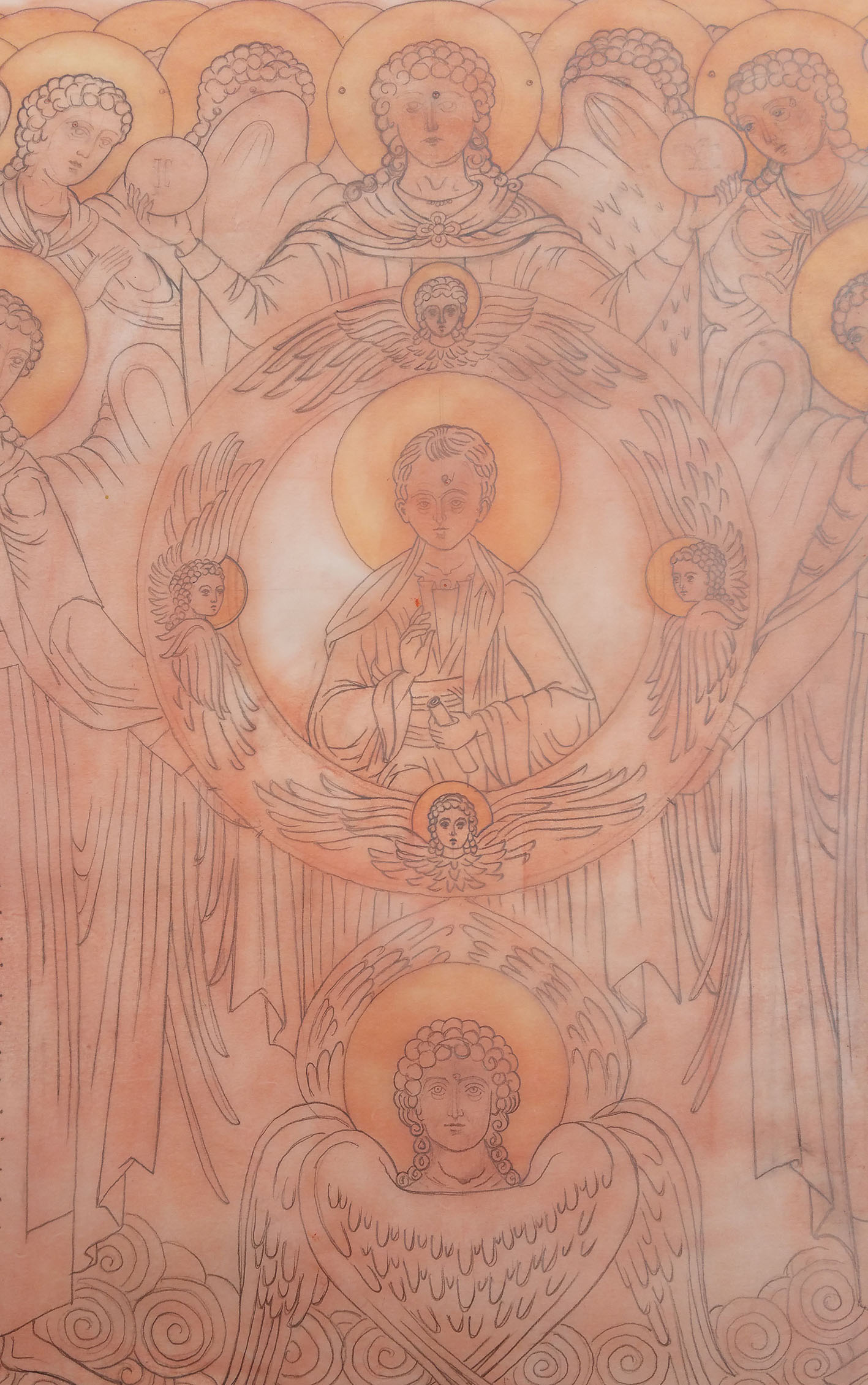
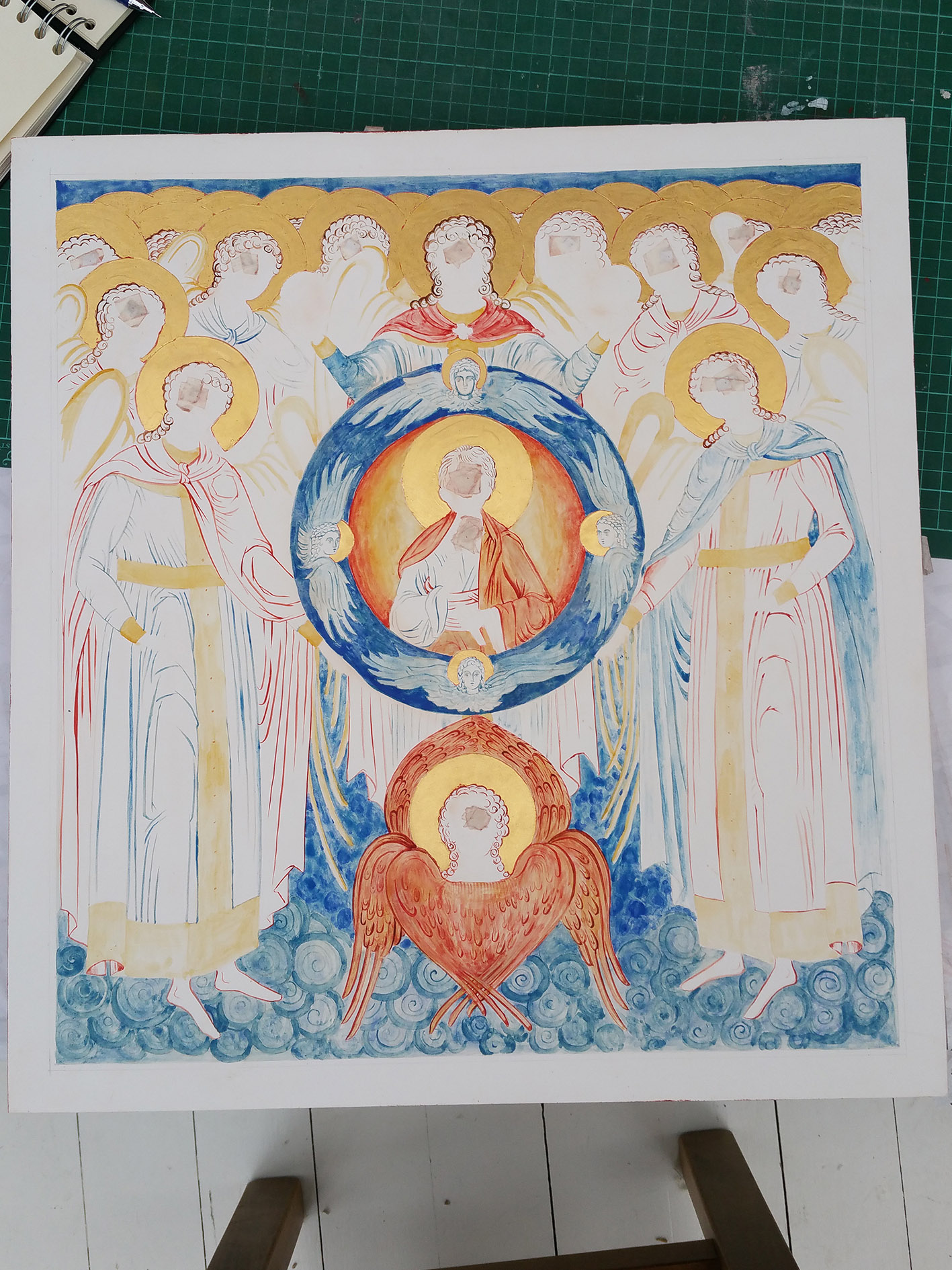
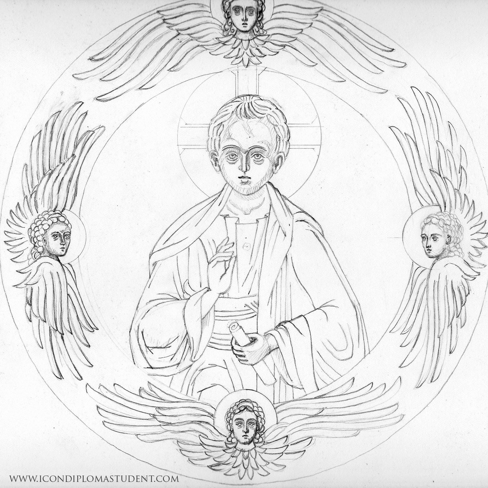
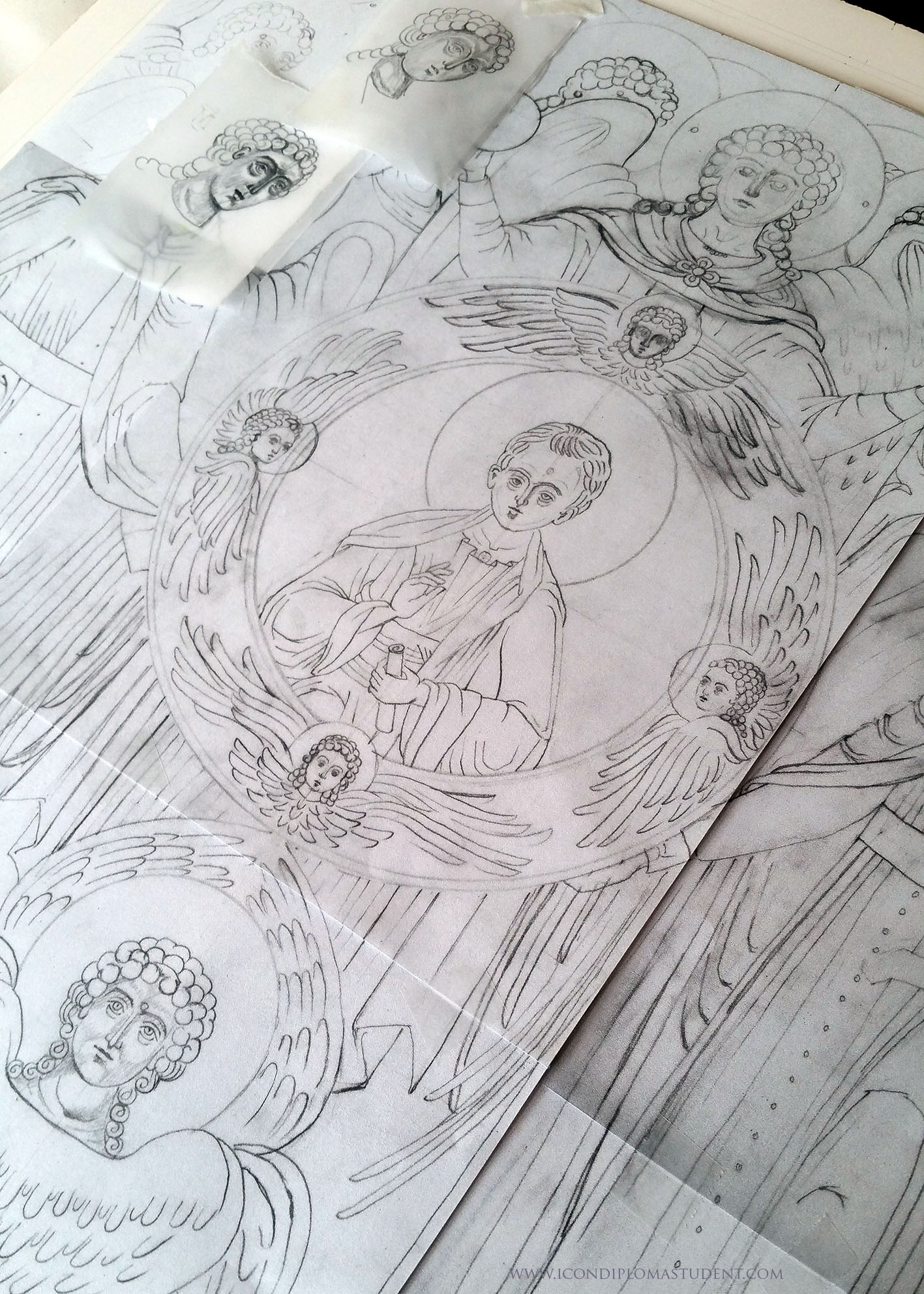
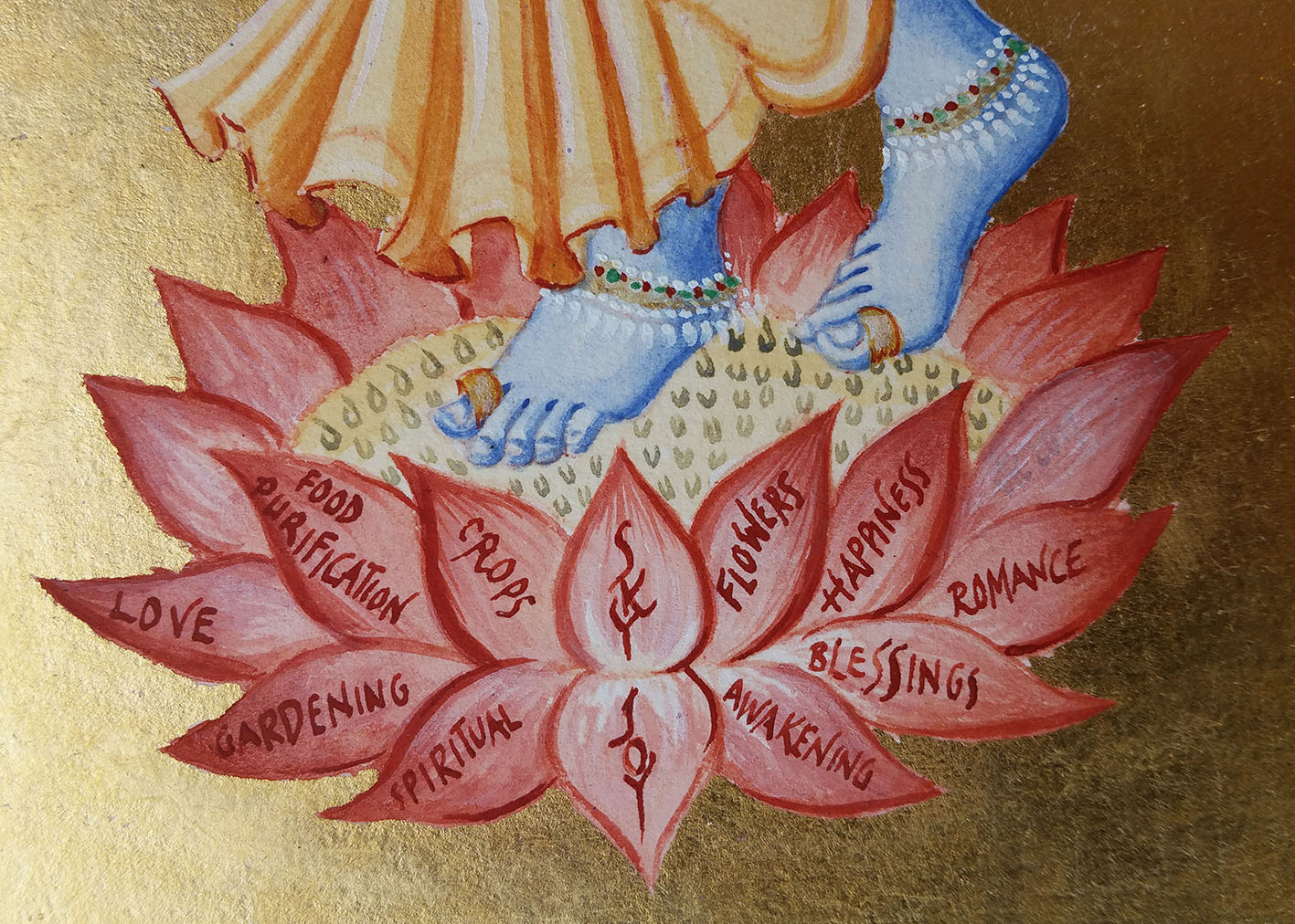
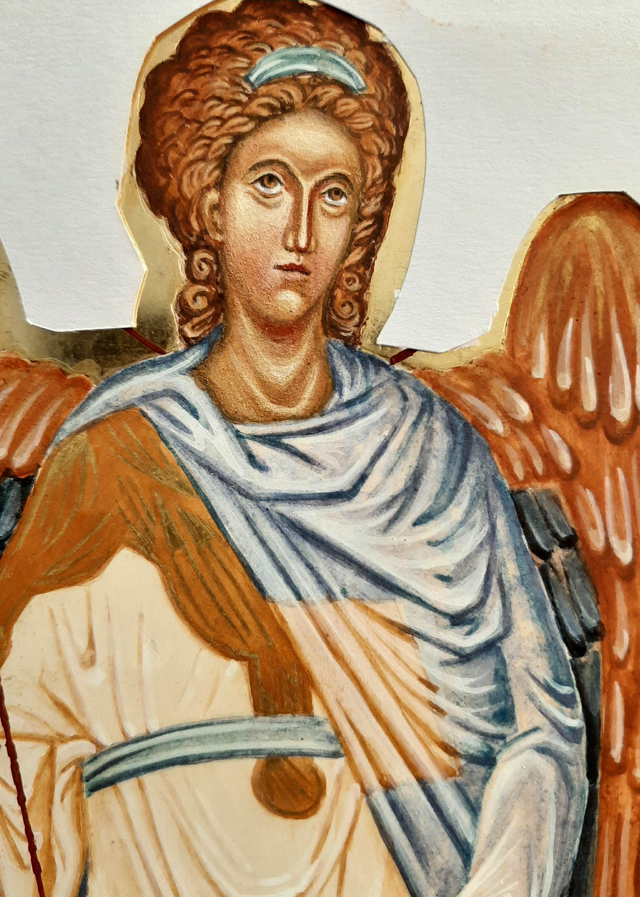
Face up to the detail

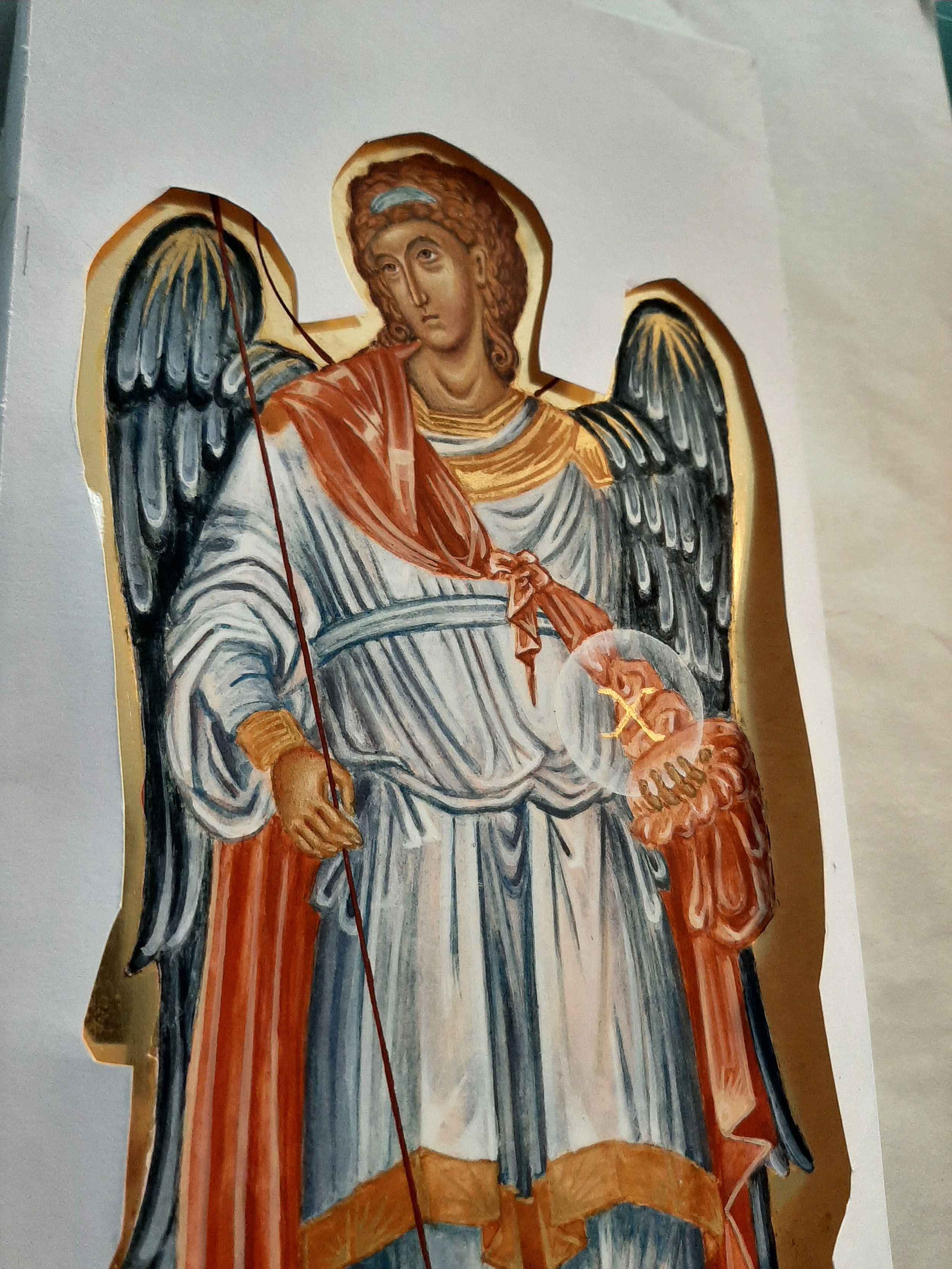
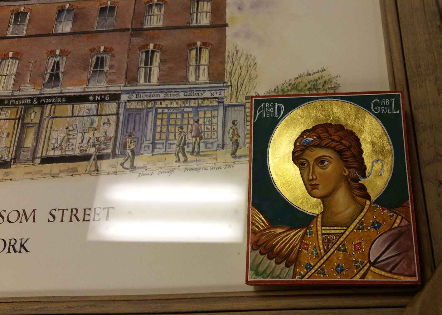
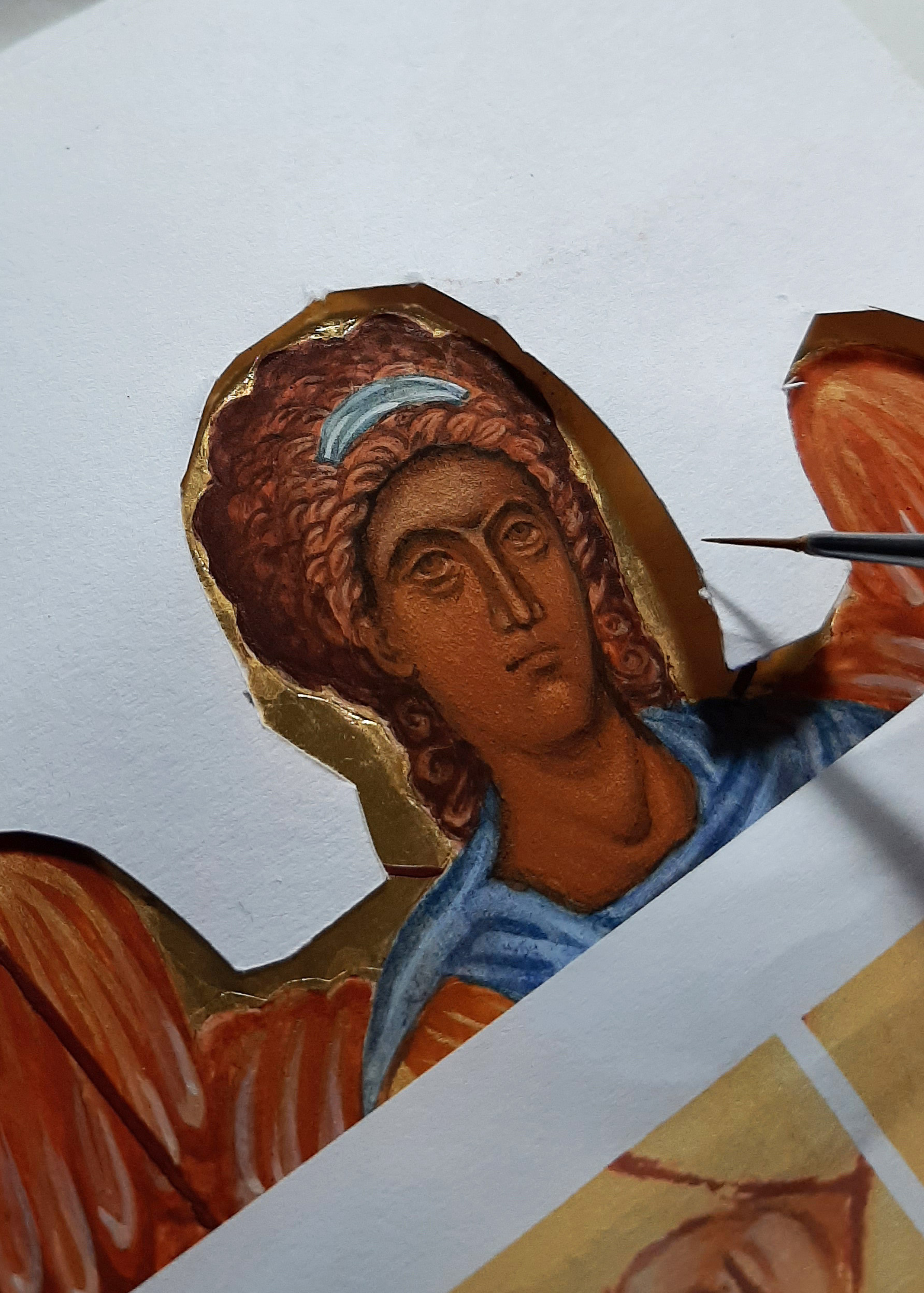
This icon is of Archangel Raphael, one of a pair of standing angels which are based on the frescos of Chora in Istanbul, painted high up in the dome. As I mentioned in my last post, I was not too pleased with the expression.
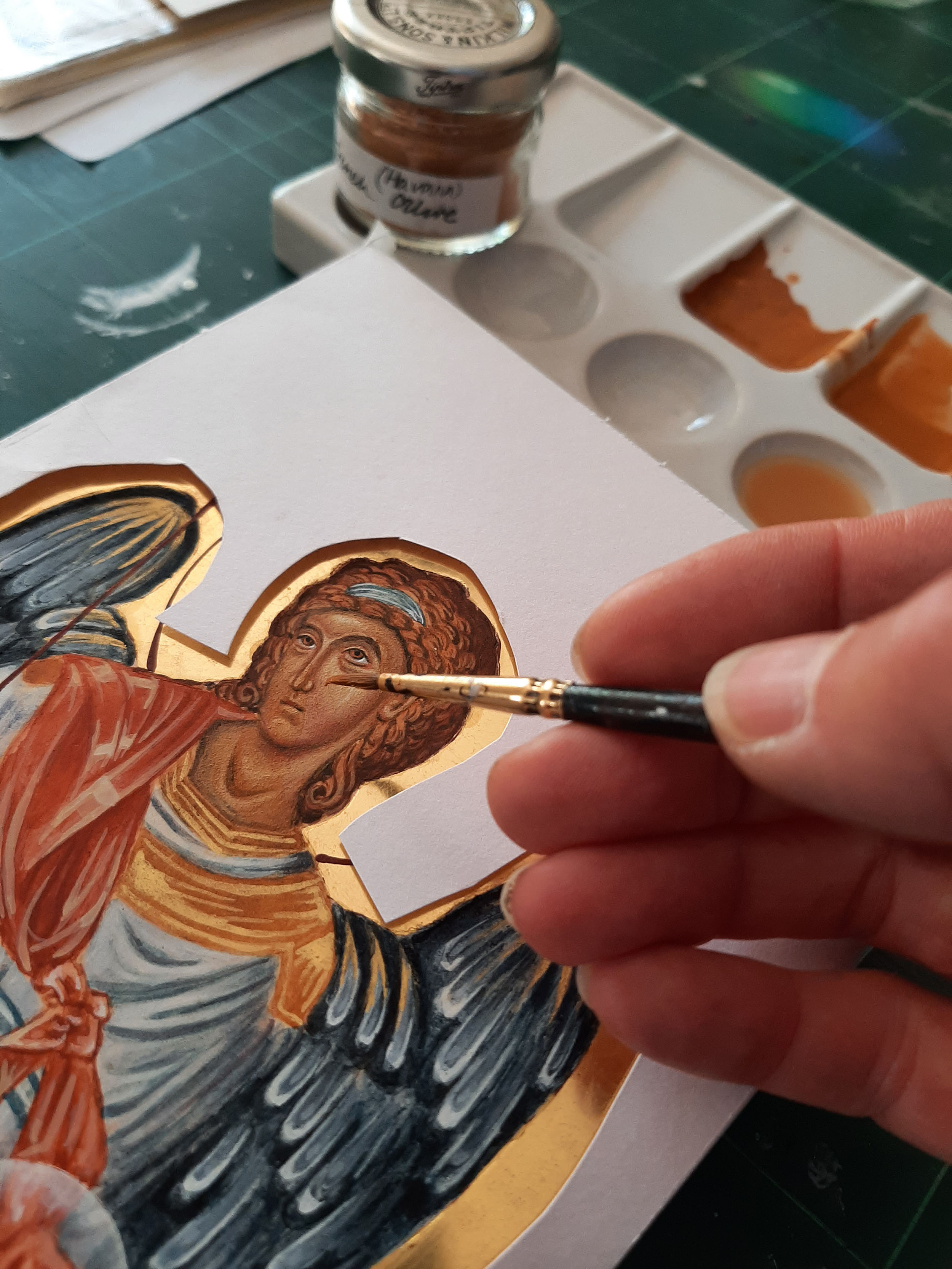
To make a start adjusting the features, I covered the face with four or five glazes of French Ochre Havanna. This helps to return to the point where you make the first glazes over the underpainting.
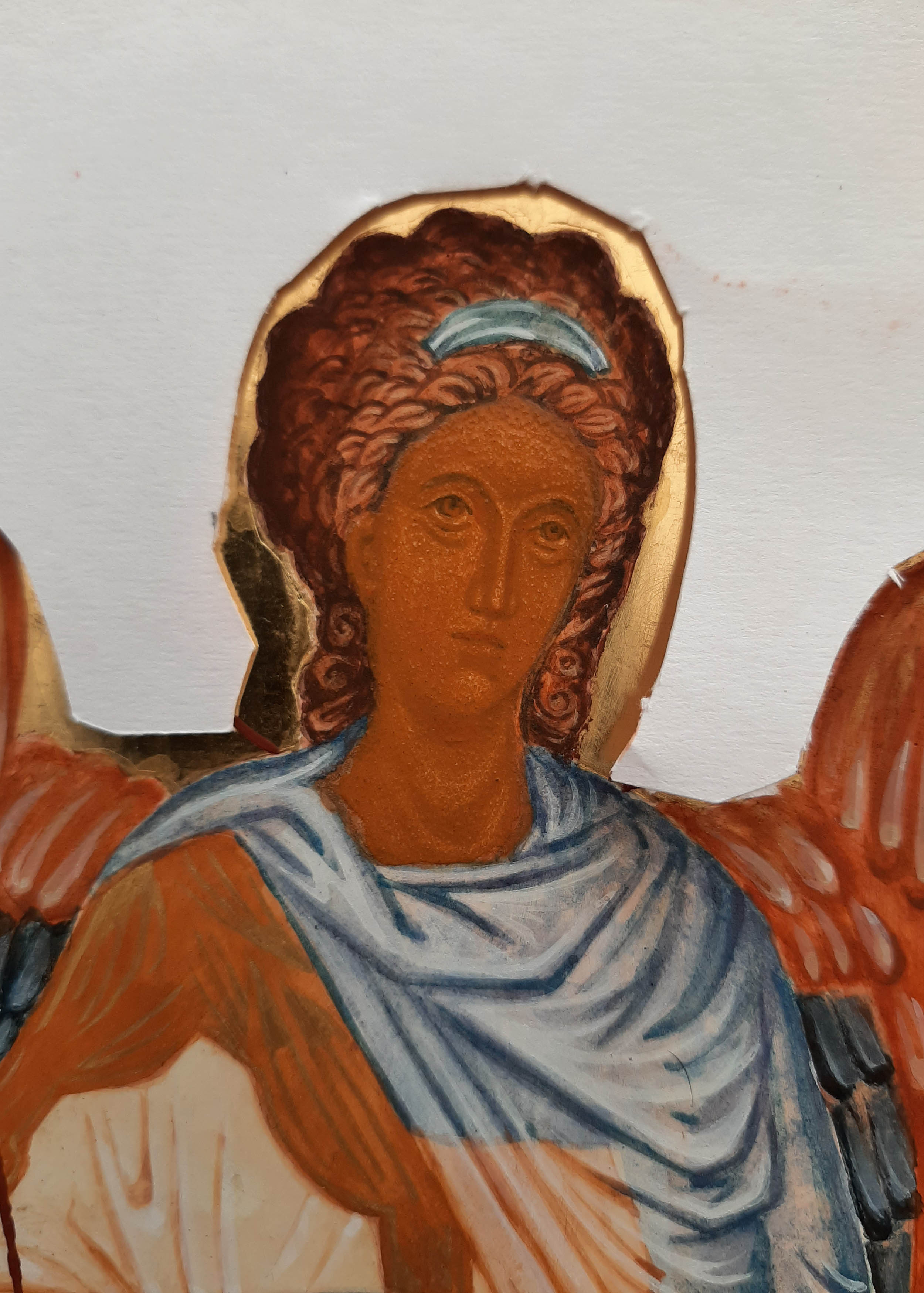
Then, taking Ochre Avana and a very small amount of raw umber, deepen the hair, brow and jaw line.
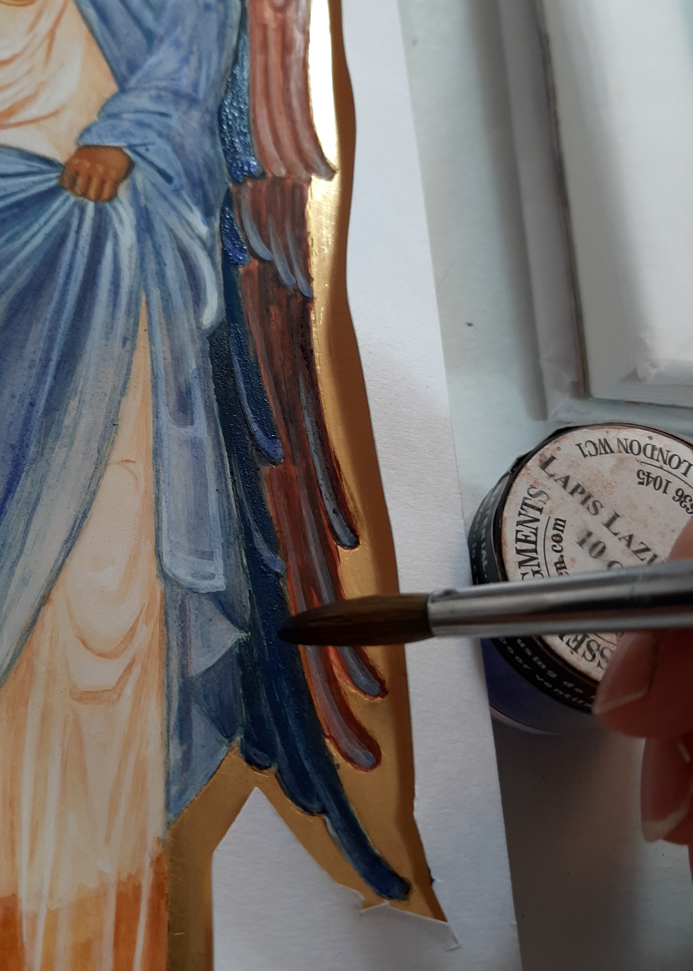
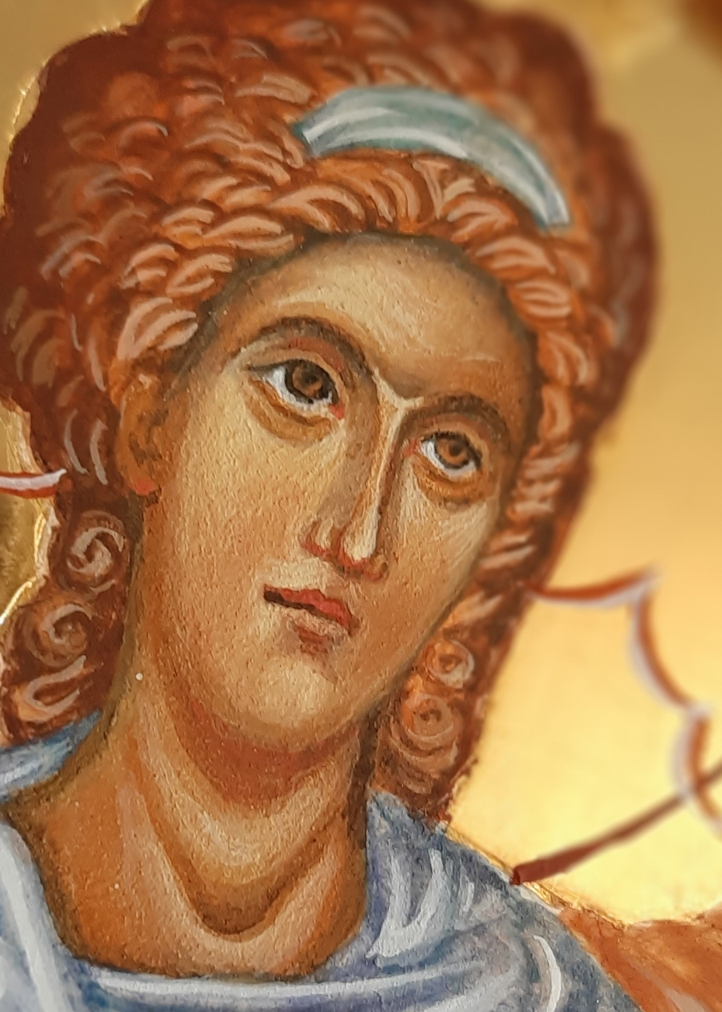
I also decided to deepen the colour of the wings with a few more glazes of lapis lazuli to send them back so to speak.
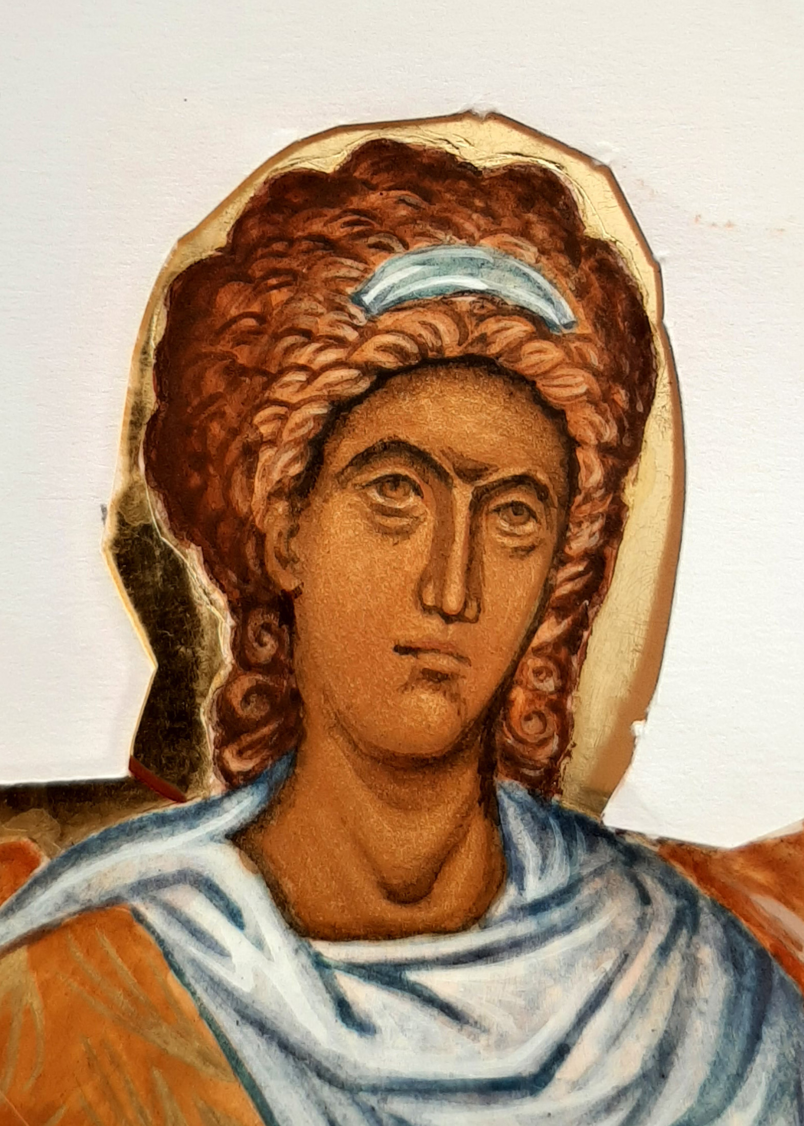
In the photos below, I have added more layers of light glazes for the facial highlights. Somewhere along the line, the gaze of the angel moved to a different direction. The tiniest detail makes all the difference.


To summarise – the hair is deepened with red ochre and a touch of black. The right eye brow has been lowered and softened. The brow has been adjusted to remove the central highlight and instead bring the highlight towards the viewer. The highlights below the eyes adjusted. The nose is still a work in progress but the shape fits better with the face. The mouth has a warmth and the chin is less pointed.
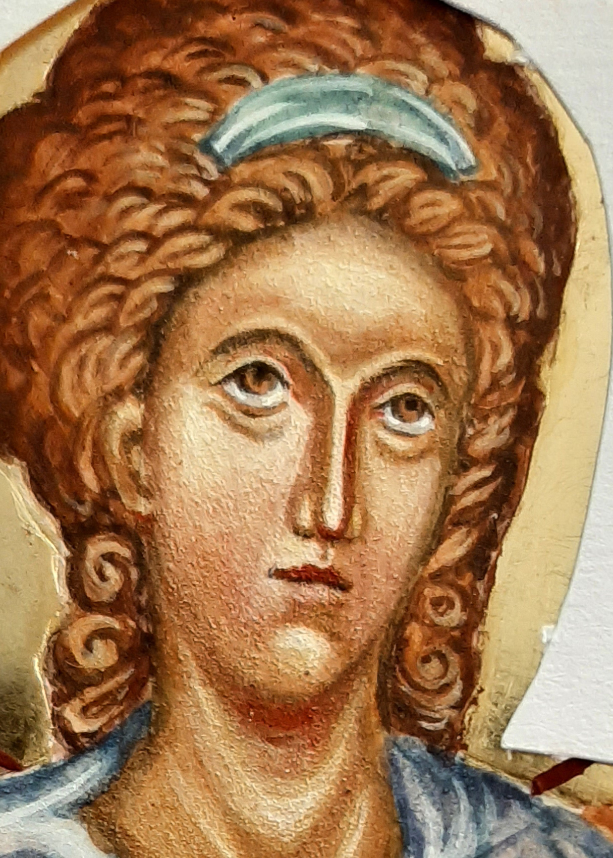
I’m so glad I worked on these faces! It’s easy to leave things as they are when you have already put so much time into the icon but egg tempera is a wonderfully versatile medium and revives easily. Painting over faces with glazes is a straightforward way to make the adjustments that you know are needed. Another thing that helps is to take a photo of the face, turn it to black and white and print it off. That way, you can see clearly what isn’t working and what needs to be done.
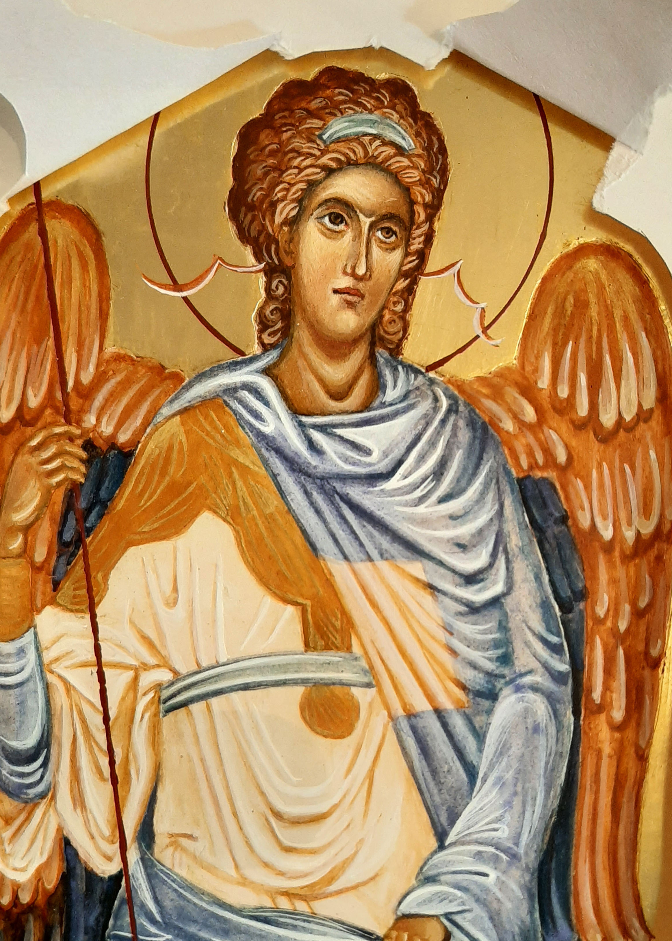
Here’s the finished icon complete with the ribbons which symbolise Divine Listening.
The finished icon can be seen here .
As ever, thanks for reading!
Ronnie 🙂