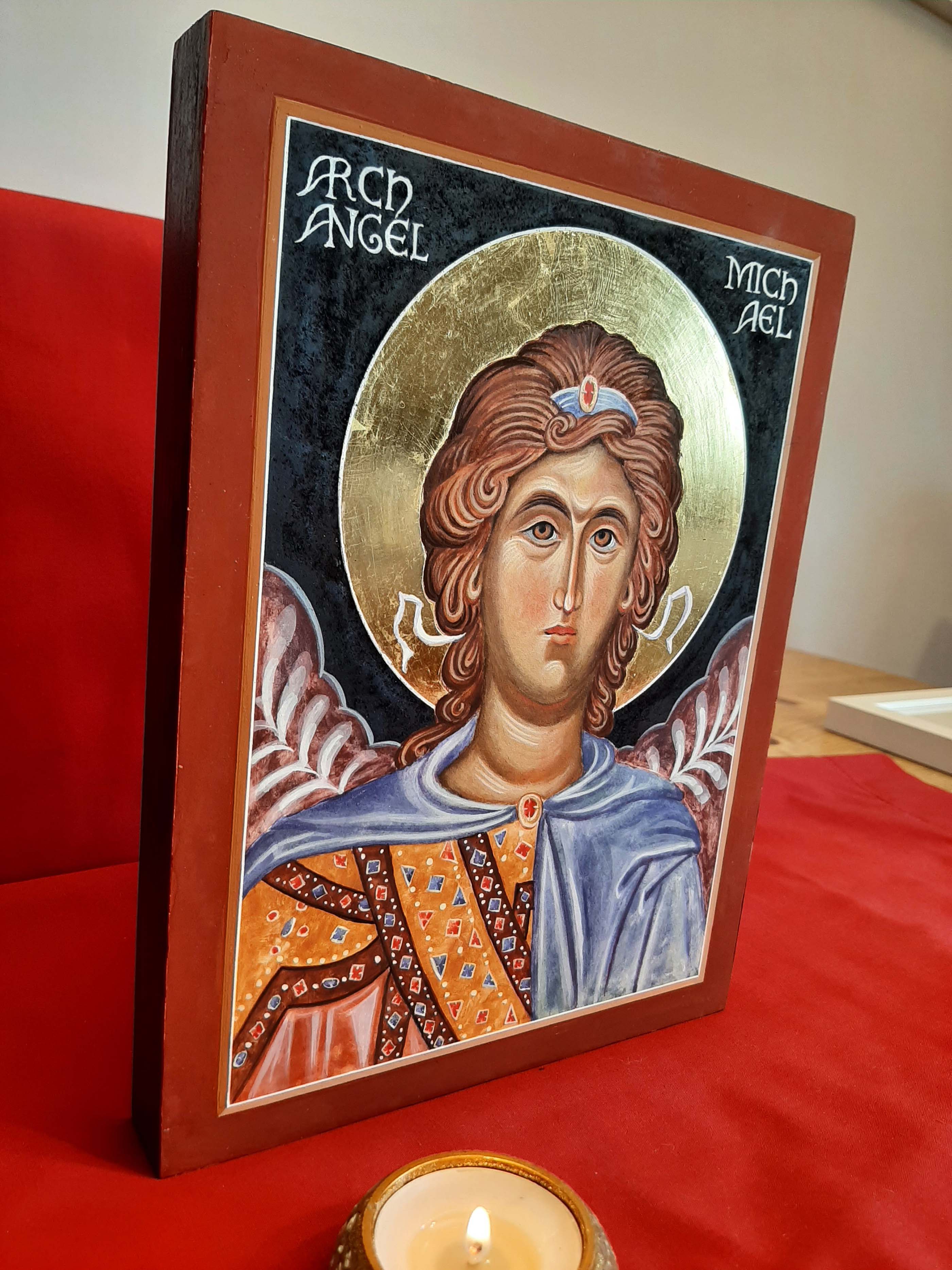
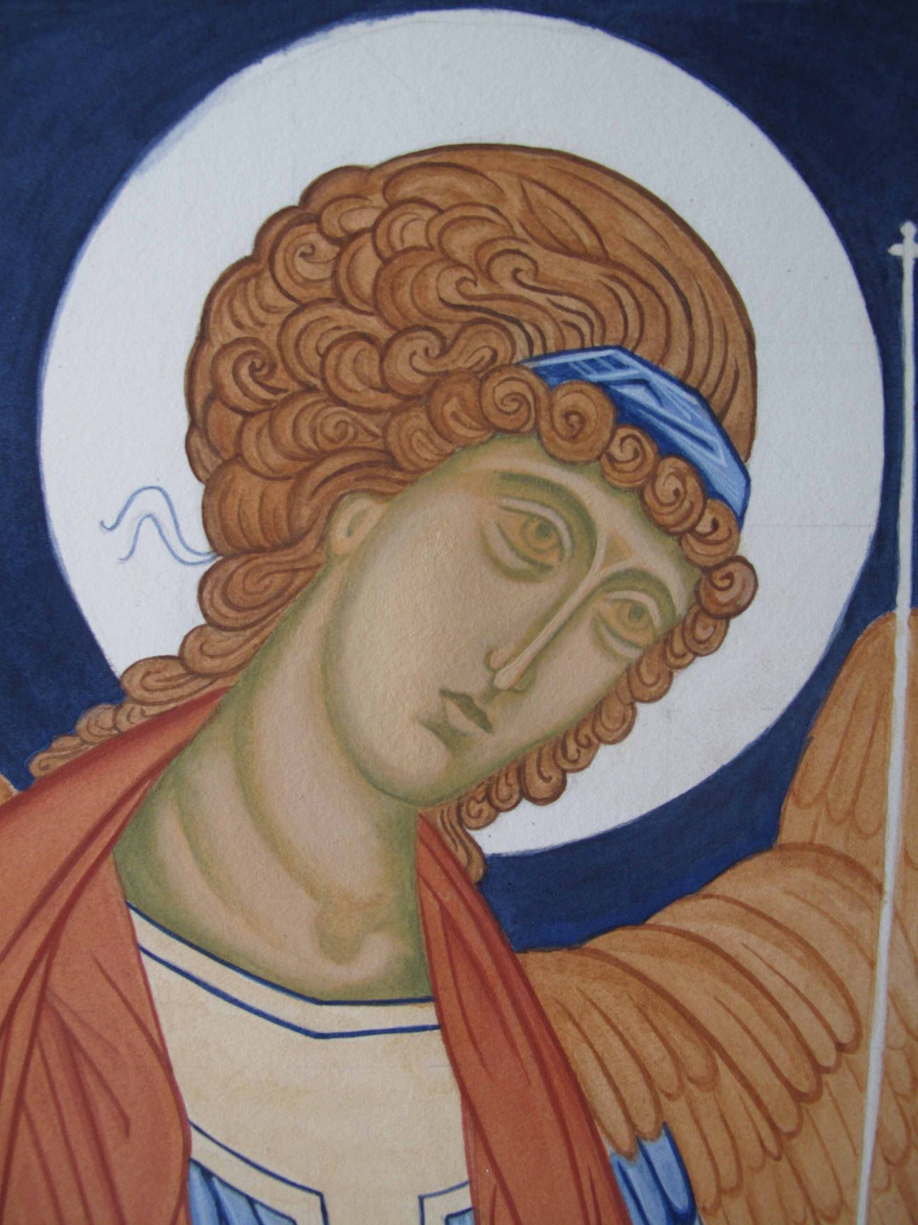
Welcome back to the last of this series – the final stage of painting the face where everything (hopefully) all comes together with some final rose tints, deep shadow lines and snow highlights….
The warm rose tints have been applied here
Hints of rose are applied to the lips (just the upper middle part – leave shadows in the corners), cheeks, side and lower tip of the nose, crease of the upper eye, the lower part of chin and a triangular shape in the corner of the eye. Take care to apply in a thin wash blending with care.
Rose tints can be applied as a wash on the face between shaded areas and highlights. Options for the rose red are: a. Yellow Ochre Light (Maimeri) with a pinch of English Red Light b. Yellow Ochre Light (Maimeri) and vermilion.
The dark raw umber details and hairline shadow still need to be applied..
Eyes: Most of the eye whites are filled with the shadow tones and painted in two stages. The first is to mix raw umber and white – not using too much white or it becomes stark and opaque. Note the crescent shape of the eye and that the grey appears only on one side of the eye – the side opposite the direction that the face is looking. Leave the other side of the eye in the underpainting – something that I’ve completely overlooked with this one! Then apply the white crescent highlights around the iris. The pupil and edges of iris are black.
Dark raw umber shadows applied to lip creases, eye lids, ears, brow and hair line
Adding the red line under the chin gives a glow. I add the final white ‘snow’ highlights last of all – if they look too stark, add a wash of French Ochre. At the final stage, add a glaze of dilute egg stock over the entire face.
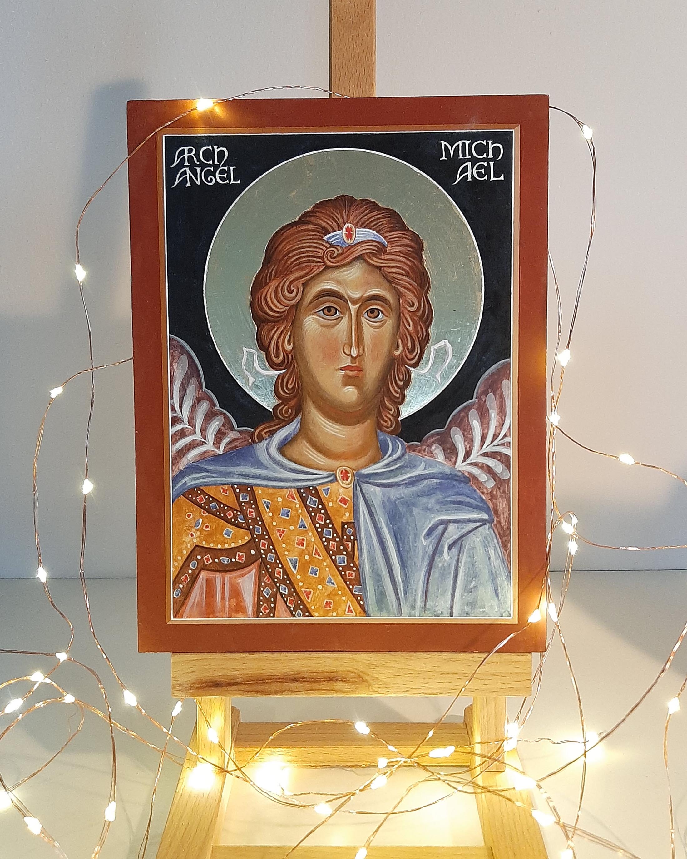
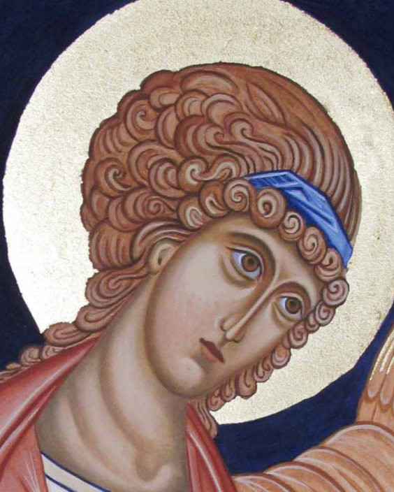
Done, but not finished! Time to add the ribbons and hair band, add highlights to the garments and finish details of jewels then finally to add the name.
The background paint will be well and truly dry by this time and will be a lot easier to apply the lettering. I draw the lettering out on paper then trace it on. I rub white pigment into the back of the tracing paper and trace that down on the icon. This leaves a faint outline of the name which I can paint over with white egg tempera using a fairly stong blend of white to get a creamy consistency.
I fit a picture cord to the back with a small certificate of authenticity.
In wrapping up this mini- series, I’d like to wish you and yours a very happy and peaceful Christmas and as always, thank you for joining me here.
First thin layers of highlights applied to define the main forms of the face.
Hello again!
It’s time to add some face highlights. I’ve been looking through my old class notes (from 2014) and found some really helpful reminders. Aidan (Hart) recommends that we should aim to apply 3 (but no more than 4) layers of highlights – easier said than done!
First layer of face highlights: Start by mixing plenty of the golden yellow (you don’t want to run out as it is very hard to remix the same shade). Use a light yellow which brightens gradually by approx. 20% with each layer. Mix yellow ochre light (Maimeri) and a touch of Titanium White. Paint sample swatches to see the contrasts as you want to avoid a big change such as 50%. The photo below shows me trying to find the 20% difference – I will keep trying! It might also help to use a palette with bigger dimples but this was for a different smaller icon.
Mix the white separately before adding to the yellow in very small quantities.
Include a brush of highlight over the lower lip.
You can’t tell if it is the right colour until you have applied a thin layer and let it dry. Start very lightly on the ear. Wait till it dries before you proceed with the colour. You are aiming for 20% lighter than the membrane layer.
Paint with accuracy. Look carefully 2 or 3 times before you begin. Use this opportunity to correct your underpainting.
With a size 3 brush, (maybe size 2), apply the paint thinly over the higher parts of the face, and feather out with dry brush technique. Use a watered down mix of your colour to feather out edges, but brush out most of the paint on your testing paper first. Build up layers thinly and watch out for puddling!
At this stage the layers have got quite patchy – a wash of ochre havanna will blend this.
Leave the eyes till a later stage, but include the flesh around them.
Tip: Look for curves and equally, don’t round up sharp corners.
Leave space around the highlights so the mid tone underpainting remains. Wait till it dries then apply another layer of the same mix as it will dry close to the colour of the membrane. Don’t cover all of the membrane.
Make sure the brow bone is deep. Keep the angles of the brow. Mind the direction of your brush strokes and spread the brush to feather out.
Second layer: Make sure first layer has properly dried. Look closely at the original and identify the high points of the eyebrows, forehead, nose, cheeks, chin, ears. Note the direction of the face. Make sure you highlight the upper cheekbone to keep the width of the cheekbone next to the eye.
Add a little more white to your mix and test.
Tip: if you go too light too soon, add a thin warm glaze of Italian Warm ochre (French Havanna is very similar). It also acts a harmonising layer when all the highlights (except the ‘snow’) have been applied.
‘No confusion, no division’.
Third layer of highlights Repeat the process over a smaller area. Be careful to look closely at the high points. The paint has more white and is more opaque. Again, be careful to apply thinly, not too much water, feather out edges and build up in layers. If it looks too white, add a warm glaze.
Tip: avoid sudden changes of depth or contrast. Shading should all be gradual.
These two photos show that I’ve made a start on the eyes but I will cover the finishing details in my next post. I find the final highlights quite tricky and nearly always go adrift. That said I now leave the work for a week or so and come back to it with fresh eyes. I take a black and white photo and see where it’s out of balance. Or I cover the face with paper and start work building up the garments. There’s always plenty to work on!
I hope to be back soon to finish this sequence of posts and the final ‘snow’ highlights on the face but in the meantime, wishing you a peaceful and happy Advent.
Welcome back to this reminder to myself as to how I painted this icon of Archangel Michael. By this time, the underpainting should be dry and stable ready for the membrane layers.
These layers give the middle tone and I’ve found them quite tricky and easy to go wrong! I’ve learnt that if I smear or smudge it at any stage, just leave it! Go have a cup of tea and wait till the layer has fully dried and only then paint over it. If I do try and tidy up too soon – it leads to patchy holes back to the gesso.
Using Yellow Ochre light (Maimeri) and a little Vermillion or English Red Ochre light and a touch of Titanium White, mix up a warm golden orange. French Ochre Havannah is another favourite of mine for the membrane. Go easy with the white as it’s a strong pigment. It’s best to mix it up separately then add a dash with the tip of your brush until you get a warm rich red gold. Paint out samples of the colour on some paper to see how it looks.
Build up layers until you have a rich deep gold for the mid tones.
With a large squirrel mop held at 45 degrees or less to the board, not upright, sweep a light, even wash of membrane colour over the face but NOT the hair. Apply at least 4 or 5 membranes until you get a rich even golden colour. This is where you see how important it is to have a strong underpainting. If there are area on the membrane which are patchy, apply another layer and puddle in extra pigment where thin.
I’ve added a glaze over the hair to seal the bare gesso
When the membranes are complete, you can apply a separating glaze of 10% egg, 90% water.
Aidan’s Tip: Go easy with the dilute egg stock mix – too much egg leaves a slippery surface which is hard to paint on.
Next stage is to work to deepen the shadows using Avana and a dash of ivory black or raw umber dark.
Modelling the shape of the face with the darker layers
Again, building the forms up in thin layers – deepen the upper and lower eye sockets, the sides of the nose, the cheeks, jaw and hair lines. Deepen the upper lip, the shadow below the nose tip, the mouth meeting line, the corners of the mouth and the dip below the lower lip and round the chin. Model the shape of the neck and where the garments leave a shadow. Last of all, finish the shadows with a thin glaze of dilute egg stock and leave it at least overnight.
Aidan’s Tip: If you get a paintbrush hair (or cat hair!) in the mix leave it alone until the paint is dry, then brush it off. It’s really easy to mess up at this stage and damaging the underpainting.
That’s all for this post…to be continued with adding the highlights.
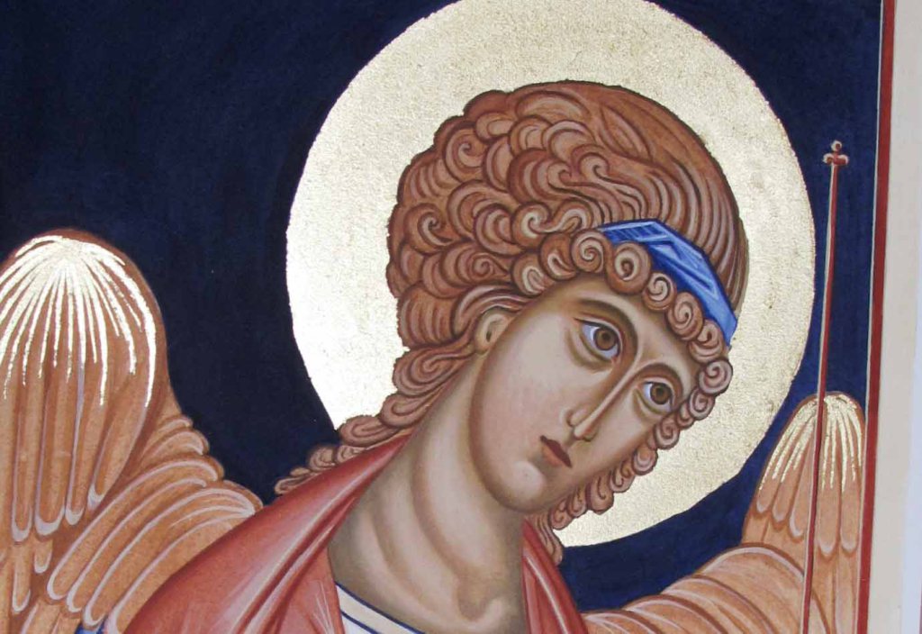
In the meantime, if you’d like to see the finished icon for encouragement – it’s over here…
A warm welcome and thanks to new subscribers – you’ve nudged me to write! It’s been a while since I painted an icon so I thought I’d write a reminder to guide myself and maybe encourage others to pick up the brush again.
I’m looking back on the process of painting this icon of Archangel Michael (9.5 x 7” on 1” birch ply) looking in particular at the face painting stages with a summary of the earlier steps.
Working from my drawing of this icon, I transferred the key lines using tracing paper. I rubbed a pinch of deep red ochre pigment into the back of the paper with cotton wool, then located the tracing paper image on to the icon board and taped it top and bottom. Using a hard pencil (H or 2H) I traced the lines to transfer the image on to the gesso.
Egg stock in the left dimple and a diluted mix alongside for glazing .
Next step is to fix the powdery lines to the gesso by painting over them with a dilute mix of red ochre. My lines look a bit heavy-handed (see below) but the underpainting should be quite definite to withstand at least six or seven membrane layers.
Going right back to basics here: the egg stock is made up of 50% egg yolk, 25% distilled water and 25% alcohol (gin or vodka). A diluted mix of 20% egg stock and 80% water is used for thinning the paint/glazing. When mixing paint, add the pigment to the stock until it reaches consistency of thin cream. This mix can then be further watered down to get thin layers.
Definite underpainting lines – important to get these in the right place at this stage! Note the small piece of card taped in place to protect gesso from compass point.Masking film applied either side of halo.
When the key lines are in place it’s time to water gild the halo. Water (and oil) gilding needs a chapter, let alone a single post! I’ve covered much of this technique in previous posts but a helpful tip is to apply liquid masking film (I use Winsor & Newton) before gilding. I apply it around the edges of the bole in a band of about ¼” (5mm). Gold sticks to gesso during the gilding process and it can be fiddly to remove.
Applying background in thin layers
After burnishing the gold, I paint the background surrounding the halo before starting on the face. To get a crisp line for the halo, the compass line sits best on bone-dry tempera so I leave the background at least overnight. I use a compass with scribing nib attachment for the line around the halo. I draw the halo line before painting the face to avoid placing the compass point into the finished face. I tape a small piece of card to the centre of the halo to protect the gesso from the compass point.
Compass with the adjustable ink attachment
To paint the halo line I put a few drops of a fairly strong mix of white titanium (single cream consistency) into the side of the nib using a brush to transfer the paint. Dipping the nib directly into the paint usually leads to blobs!
Gilding, background and halo line all in place – ready to start work on the face
Make sure all the features are where you want them to be. It’s a lot easier to move them at this stage! I double check my work by taking photos with my phone and zooming in/out to look again.
Aidan’s Tip: ‘Remember to paint with Distinction and Unity – there is no unity without distinction and no distinction without relationship’.
After gilding, I apply a wash of dilute egg stock (10% egg stock 90% water) to seal the gesso using a squirrel mop brush. This offers an even surface for painting over. I apply these thin coats throughout the process – usually when I’m wrapping up the day’s painting session.
Aidan’s Tip: Remove any pigment which has strayed on to the gilding with a dry cotton bud. Do this as soon as possible as clay pigments set hard and will lift off the gold.
Once the lines are in place then the underpainting and modelling of the face begins (I’ve used a different icon undepainting for this example). I’ve learnt that it’s important to spend time on this stage. Keep your drawing/icon master image close to refer to. Using Avana pigment, paint the form of the face evenly in thin layers ensuring that line weights vary in the appropriate places. For example, brows are thicker, eye socket line is light, the upper brow dense and the lower lid light. The underpainting should be clear and well shaded enough to withstand 6-7 membrane layers.
Building up the underpainting (a different icon)
Larger and more dominant shapes need stronger modelling whilst minor/ shallow forms are best left to be modelled by highlights.
Other colours can be used for underpainting skin tones such as Yellow Maimeri mixed with a little Ivory Black. Also 80% terre verte and 20% yellow ochre (Maimeri light). It’s worth experimenting to see the difference each combination makes.
I cut a paper mask to protect all the other areas where I’m not working.
When the underpainting is in place I apply a very thin wash of avana over the face and leave it. The longer the better! Applying the membrane can be a bit tricky as it’s easy to make ‘holes’ during the process and disrupt the underpainting. If the underpainting has tempered/dried for at least a week it’s more stable to work over. Again not forgetting I live in cool, damp Scotland!
My next post will be about applying the membrane layers and deepening the shadows but in the meantime, if you’d like to see the finished icon for encouragement – it’s over here…
Thanks for reading and all the best with your own icon painting!
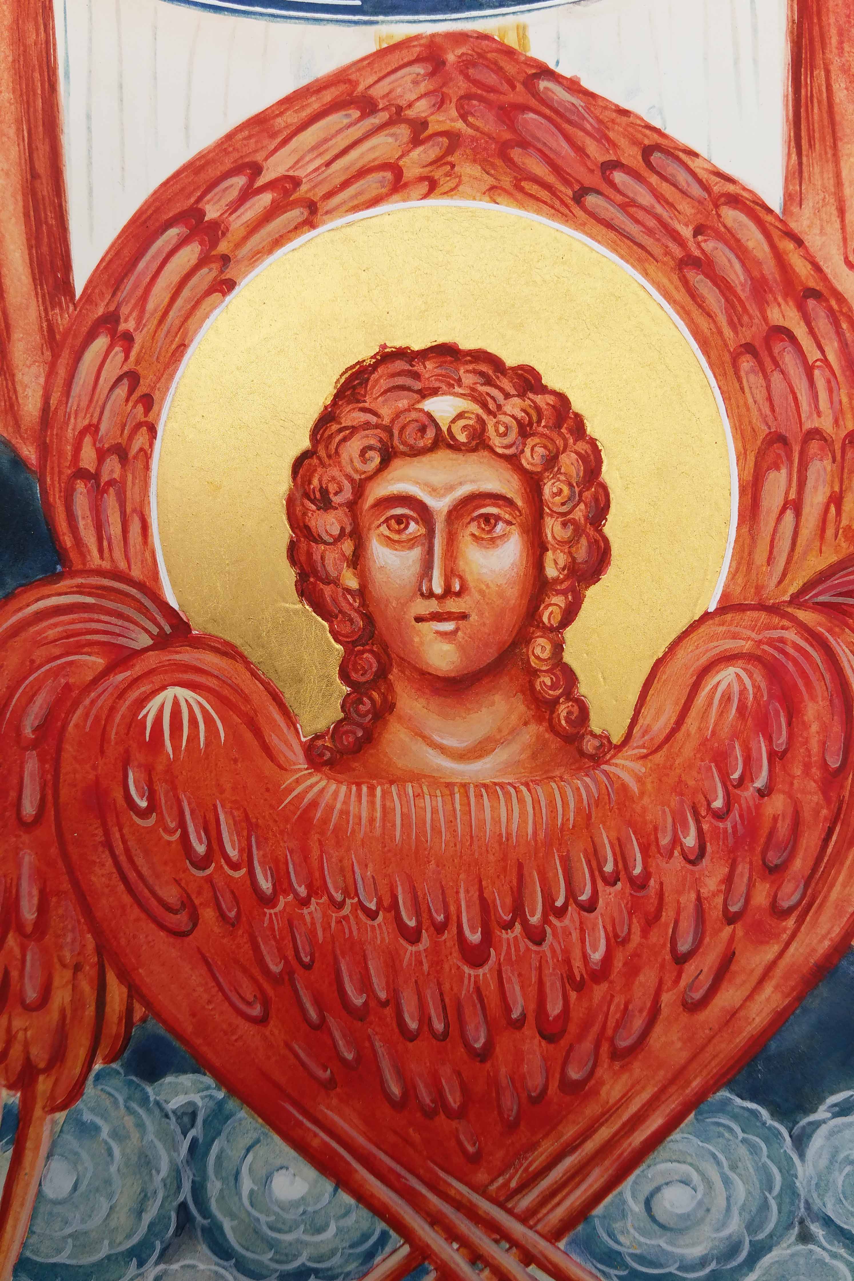
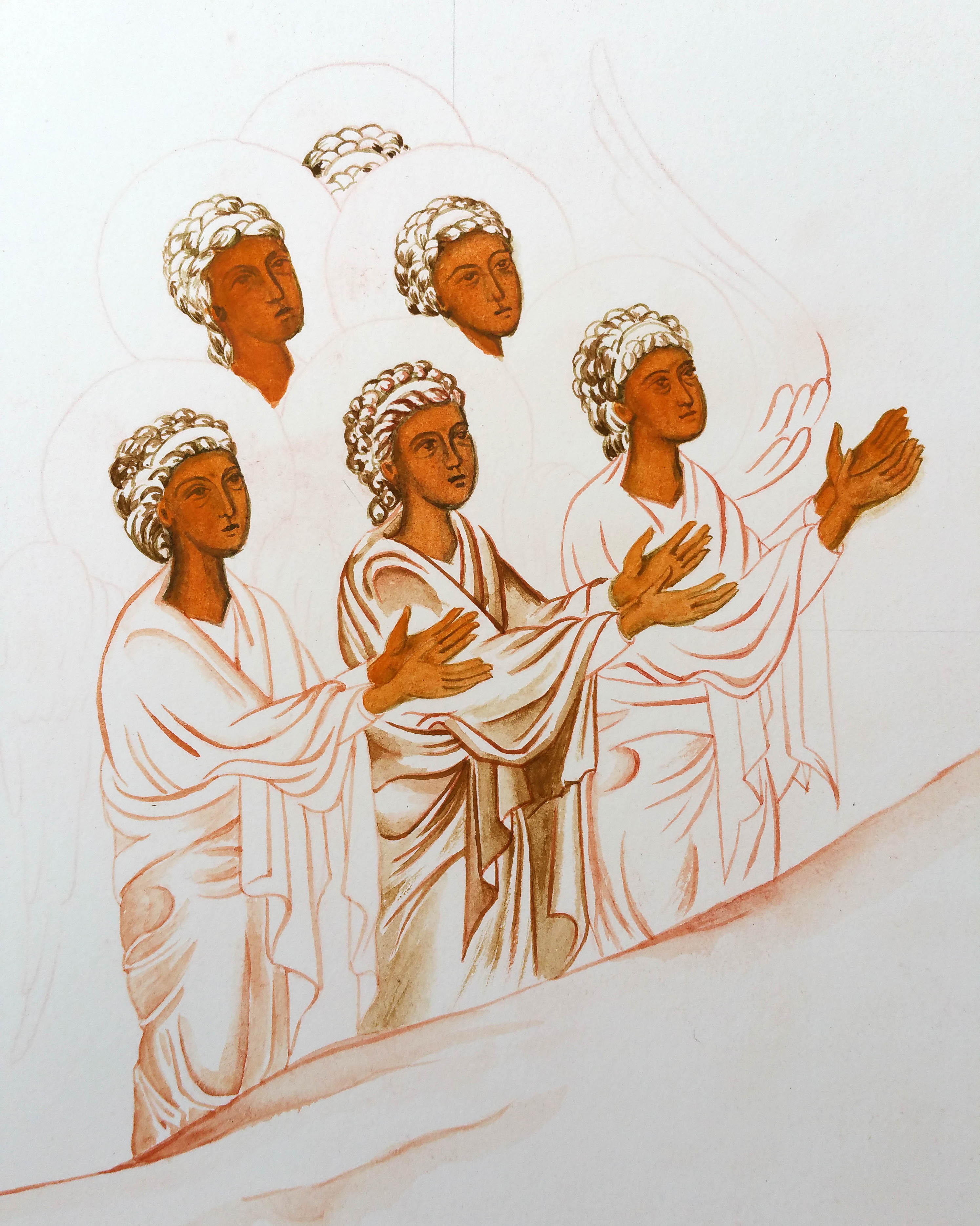
With the swirling clouds in place, I moved on to the central part of the icon of the Council of Archangel Michael and the red winged Cherub below. I’m going to zoom close up on what is quite a small face – about 2cm diameter.
For clarity, I’ve mentioned previously that on historic examples of this icon, there has been some fluidity in the colours, positions and naming of cherub(im)/seraphim/standing angels. If you google ‘The Synaxis of Archangel Michael‘ you will see some of these but for now, I’ll refer to the multi-winged angel here as Cherub.
Each phase of icon painting is a fresh start. I find it helpful to start with something simple and here I picked up by underpainting the hair of the standing angels in English Red Ochre pigment. I also used it for the Cherub’s hair even though this figure will be mostly painted in Vermilion.
I painted the wings in thin layers of Vermilion and Italian Gold ochre. This reflects the sphere of red-gold surrounding the Christ child. There are many yellow ochres – any of the brighter ones will work.
The clump of masking tape left sitting in the blank face is now going to be useful – for a reminder I wrote about this here. The layers of tape protect the gesso from the compass tip puncturing it and the tiny centre point is still there to locate the compass again. For the line around the gold halo, I mixed Titanium White egg tempera to a consistency of single cream – it’s worth testing the paint flow before you start.
Time to draw the white line around the halo
When the paint on the upper wings has fully dried out – at least overnight, set up a compass with a dip nip. Scribing lines around halos takes practice – do a few trial runs before you go for it! If the paint hasn’t fully dried, the white line will spread or bleed. If this happens, just remove the paint with a brush and do something else and revisit it a good bit later!
When the line is in place, you can remove the masking tape and go back to the drawing and transcribe the face ready for the underpainting.
Here’s my drawing of the Cherub.
Working with English Red Light pigment I under-painted the Cherub’s face. I’ve learnt over the years that although egg tempera dries fast, it isn’t that stable to work over for at least for 24 hours. It’s all too easy to apply a membrane/glaze over a finely painted face but then if I apply a little bit too much brushwork, the under-layer can move!
It helps to paint several other things at the same time – in this instance I had plenty of other angel faces to underpaint.
Underpainting of the face in English Red Light ochre
The rest of the faces are under-painted in a mix of Yellow Maimeri and a tiny dot of Ivory Black to make a soft green.
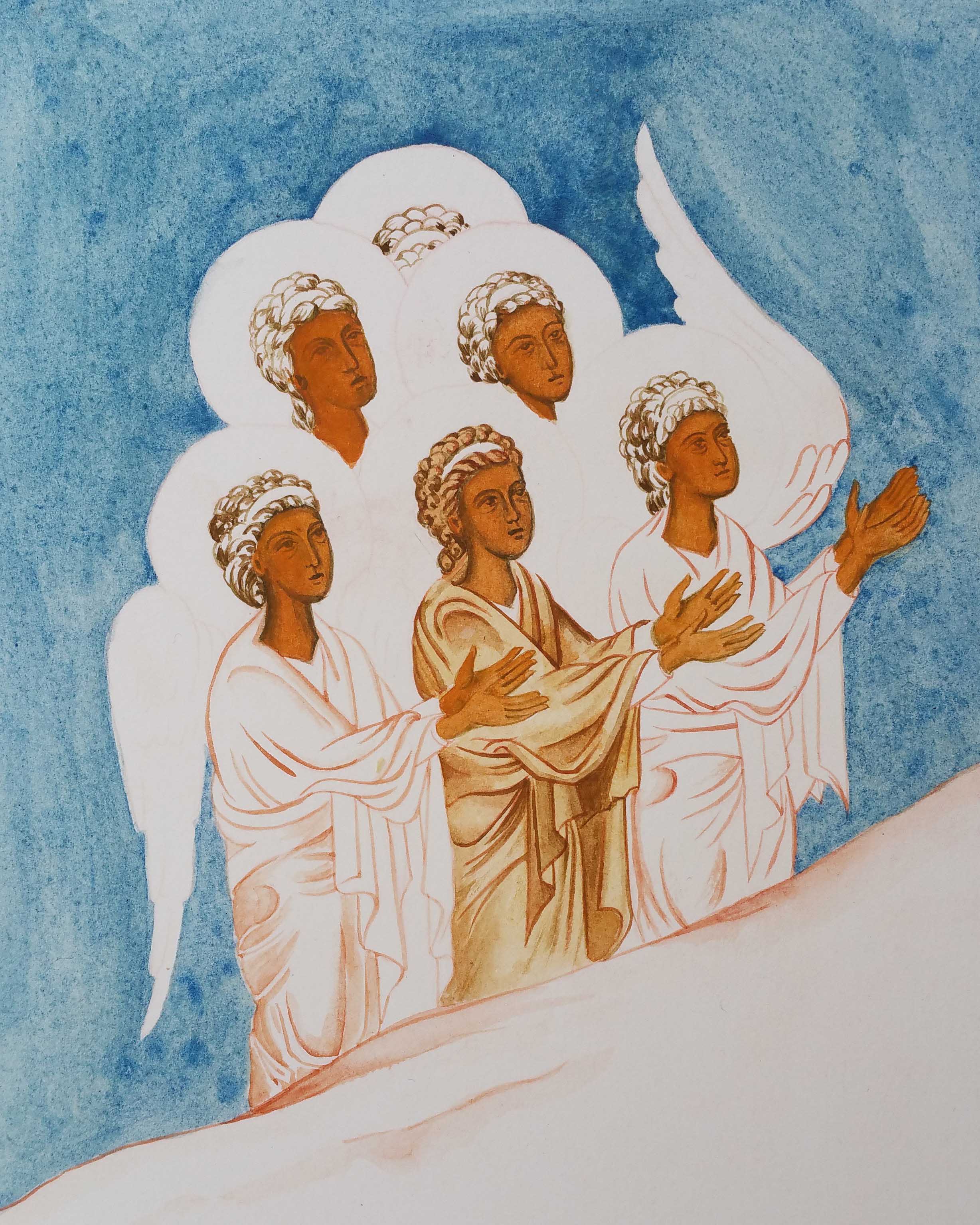
Here’s a little bit of work-in-progress with the rest of the icon.
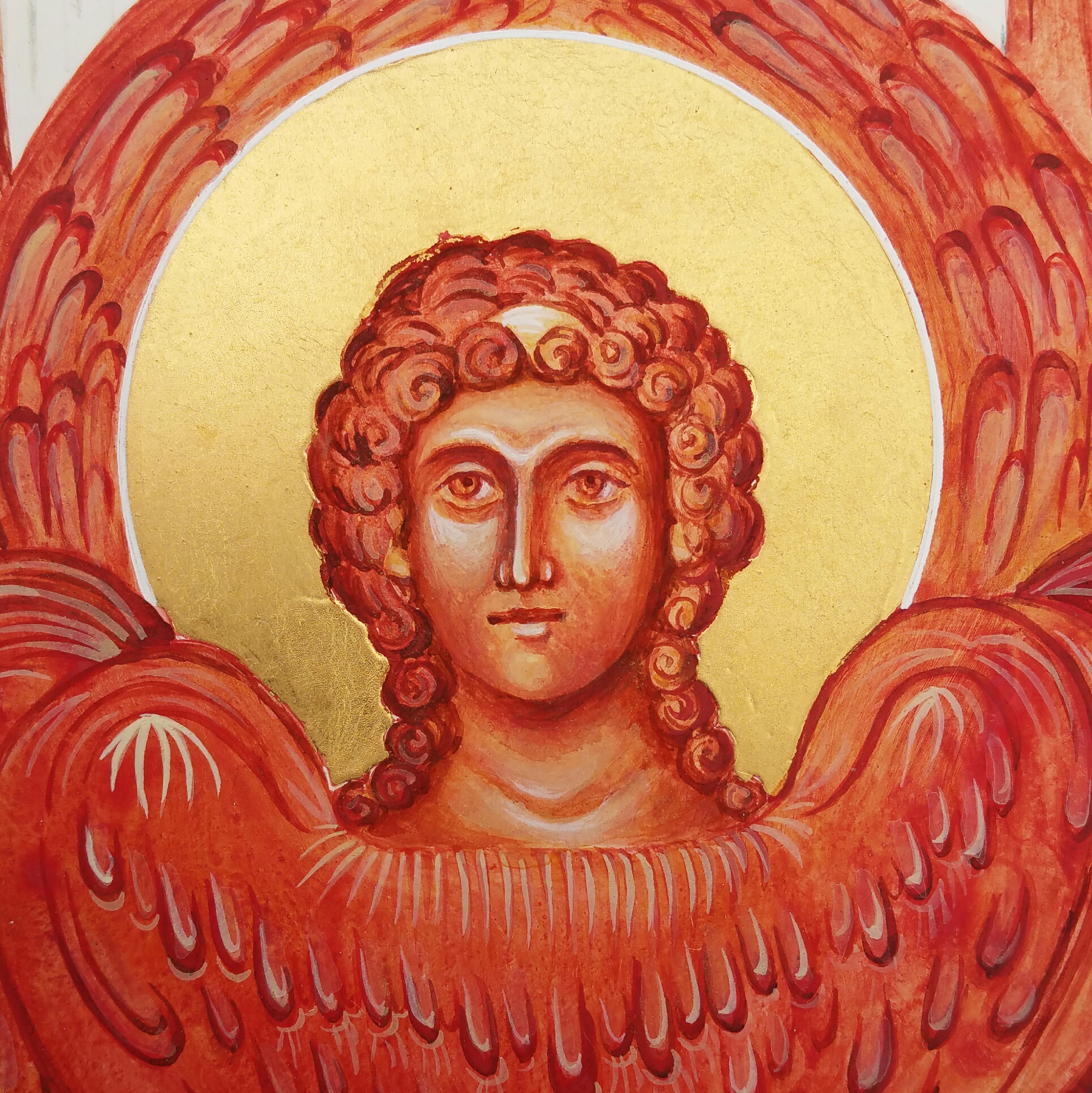
I’ve used English red deep for the darkest parts of underpainting the Cherub’s face and hair. Every now and again, apply a thin glaze of clear egg mix.
Build up a strong face with deep shadows and bright light areas – then you are ready to apply the membrane layers.
Add a few clear egg glazes to bind the underpainting.
I used Italian yellow gold pigment in several thin glazes over both the face and hair.
Gradually add thin layers of highlights in white to the brow, eyelids, cheekbones, nose tips, lower lip and neck.
Finally, there are the highlights to the wings, the sides of the eyes, headband and a little light gold to highlight the curls.
I hope this has been a help or given you a nudge to pick up your brush.
The Icon of the Council of Archangel Michael – Part 3
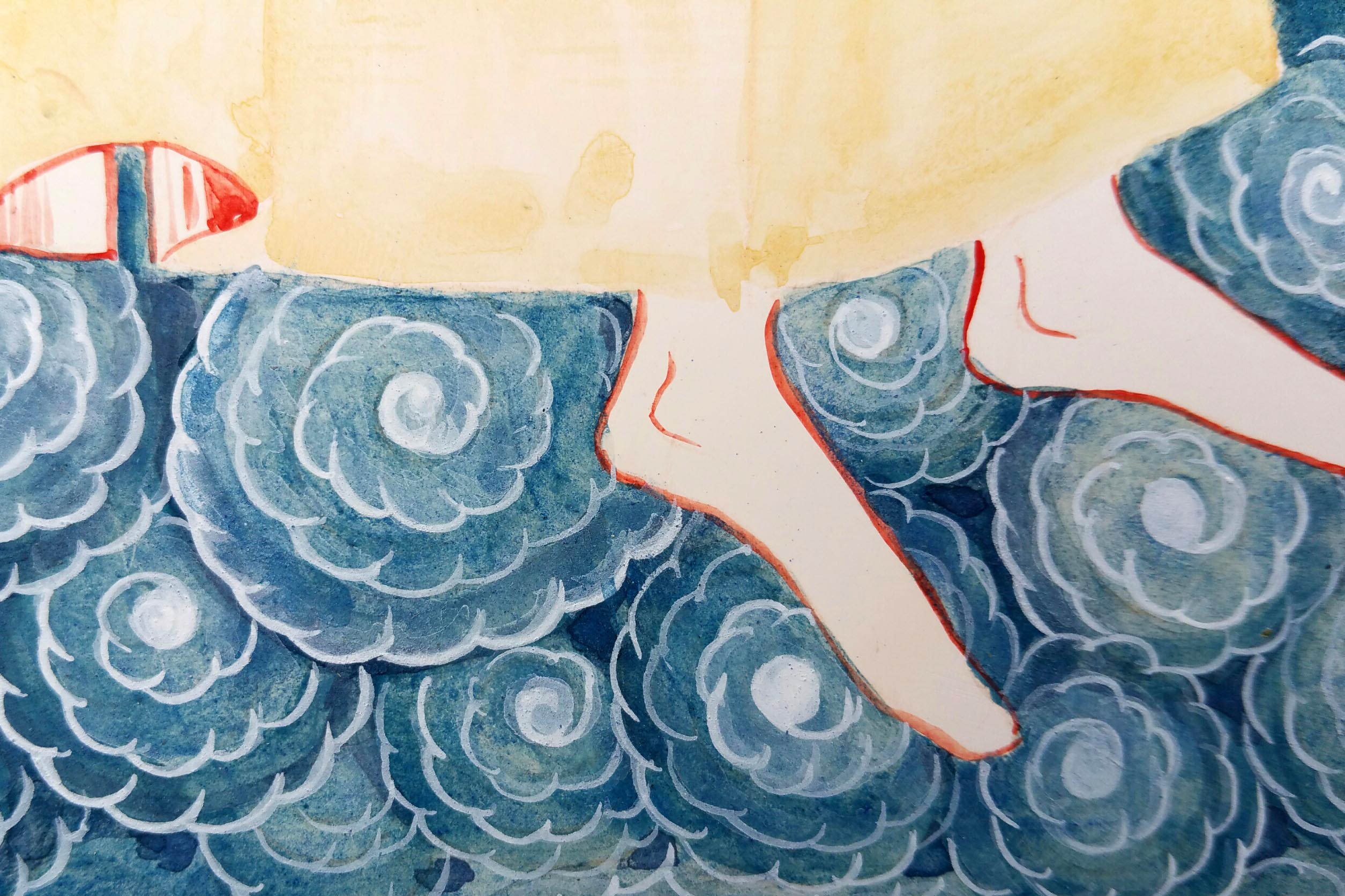
Underpainting of the angel’s feet standing on swirls of clouds
Where was I? Oh yes, sometime ago (maybe 2018?) I began to share my work-in-progress photos of this large icon of the Council of Archangel Michael here on my blog. I’m sure you’ve forgotten all about it like I did but now that I’ve mentioned it, you’d like to see what happened next!
Here’s a reminder of where I left off:
Outlines in place, gilding of halos complete and starting to lay down layers of background underpainting.
After I had drawn the figures in place and applied the gilding, I wanted to work from out to in, by painting the lower clouds and outer ring of Seraphim. It helps me to break things down into manageable parts and start with the easy things. This way I feel I’m making progress.
Before I start work on bare gesso, I apply a coat of egg tempera glaze: a watered down layer of egg tempera mix. This helps seal the porous surface of the gesso ready to receive the paint. Let this glaze dry out.
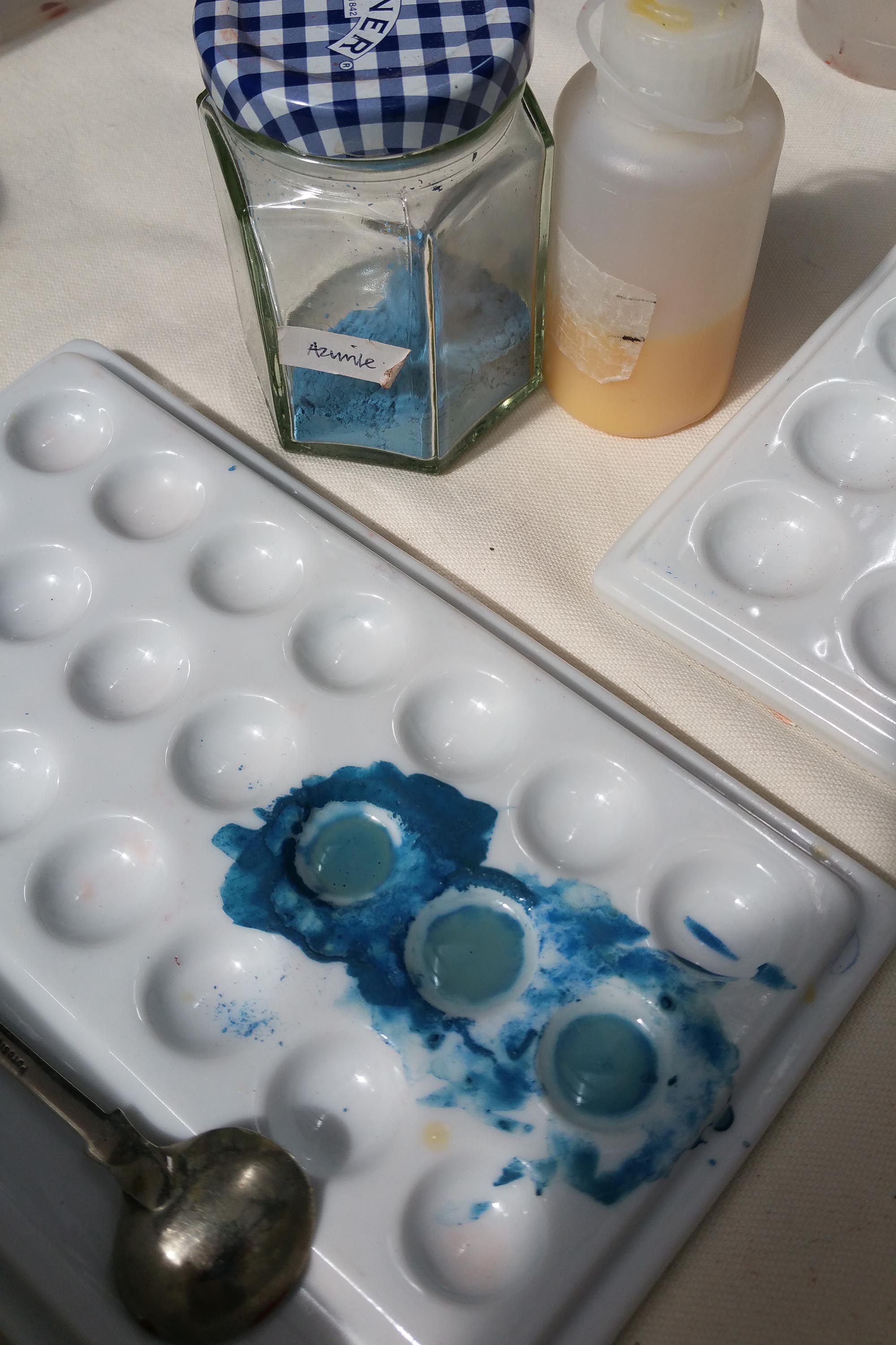
Azurite is a beautiful semi-precious mineral – I mix small quantities at a time
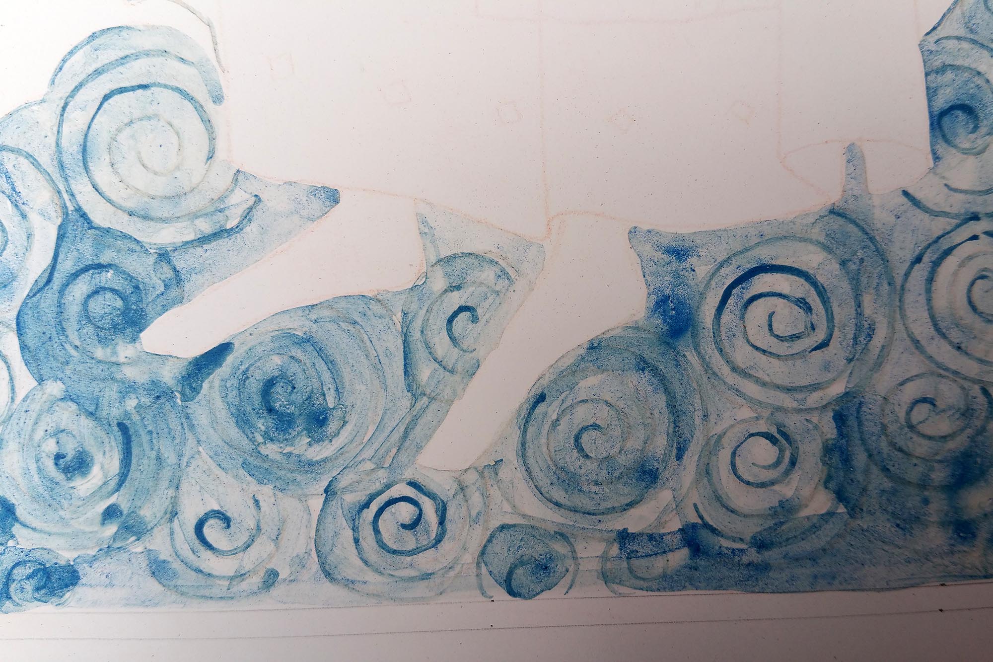
Mixing Azurite for the cloud base, I painted the circular forms, gradually darkening the outer edges by applying several layers of azurite.
It always looks really messy at this stage – the chaotic stage – but the variety of tones and marks will come into their own as the work progresses.
Look for the spaces between the cloud formations and deepen these by building up the layers of azurite. The underpainted spiral lines will be guides for the white highlights at the next step.
Strating from the central eye of the clouds, work outwards with ‘eyebrows’ of thin layers of Titanium White. Whilst the paint is still wet, use another fine brush to draw out a fine glaze of white from the eyebrows.
One of the benefits of working on a large icon like this is that whilst you are waiting for things to dry in one place, you can start work in the next area – such as here where I’ve laid down some glazes of yellow and red ochres on the wings of the Cherubim. At least, I think it is the Cherubim here – a singular image given with a plural name on the original icon.
I find it a bit confusing how this icon (seen here) has been shown in many different iterations – the Seraphim and Cherubim have been shown in interchangeable positions and colours along with a variety of positions for the standing archangels. Either way, I chose this icon because I loved the strength of the overall composition, the beautiful loving faces and their expressions, the colour, balance and harmony.
Although egg tempera dries quickly, it’s very easy to disturb the layer you’ve just laid down unless you leave it to really dry well. There’s no harm if you can only work on small areas at a time and you have to pick up the brush months later.
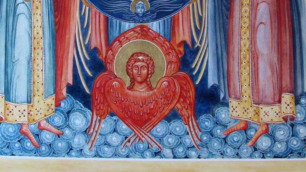
Here’s a look at the finished cloud layer along with a look at the completed Cherubim.
My next post will look at the stages for painting this Cherubim and it won’t be such a long wait as I have things in mind for February 2023. Watch this space!
In the meantime, my next post will take you through the steps of painting this Cherubim which would make a wonderful stand alone icon in its own right.
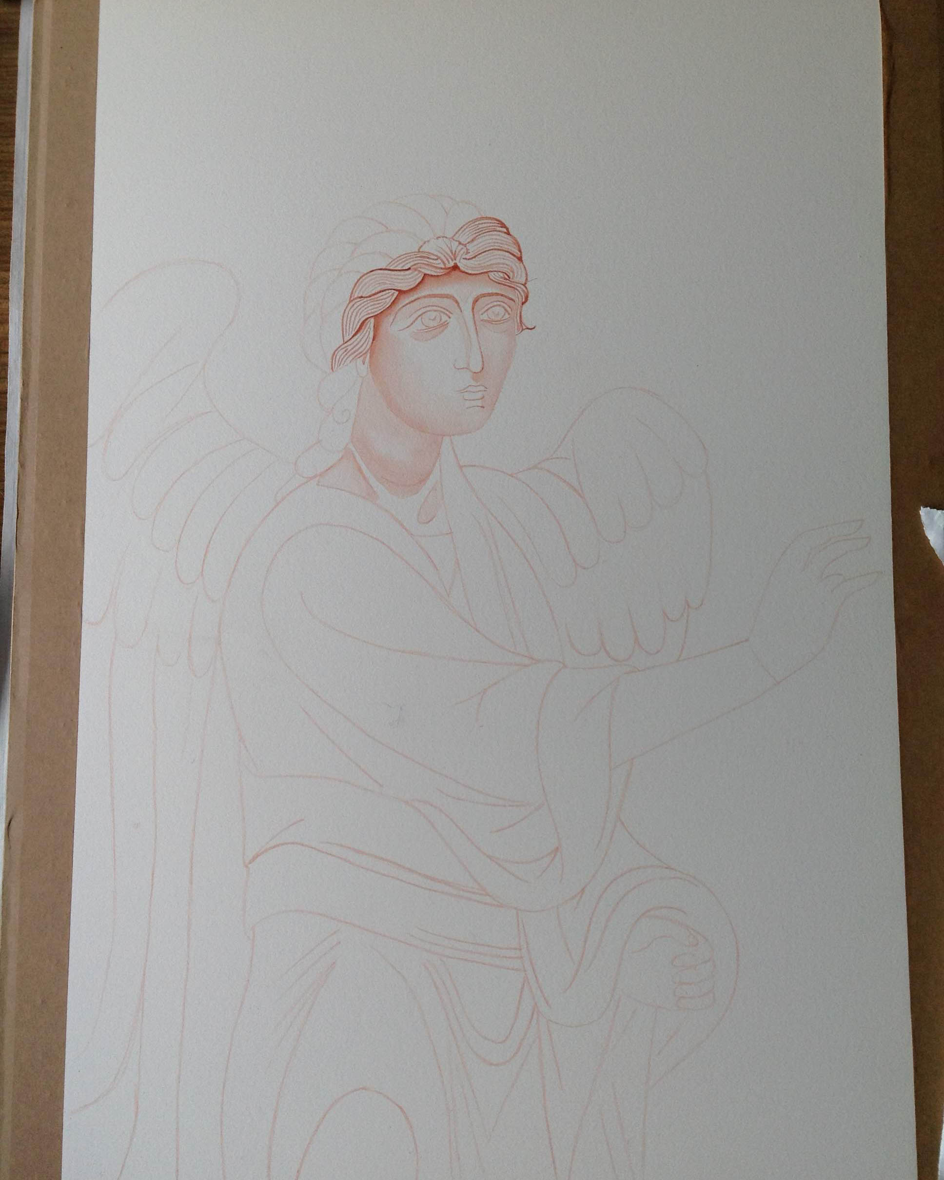
Every now and again, I’m asked how to get started icon painting. I always recommend painting monochromes on smooth (hot pressed) best quality watercolour paper. I recall the first time I saw some of these red ochre studies by Aidan Hart’s past students and I found them captivating. They were on the wall in a workshop given by Aidan Hart at Walcot Hall over 10 years ago.
Use a very thin light line of ‘English Red Light’ red ochre egg tempera with a sable brush to mark the outlines.
For the last few weeks, I’ve been having a bit of a sort out of my studio (and my overspill areas). Over the last few years I’ve gathered quite a gallery of work that’s lying unseen as I have no more wall space!
I made a decision to go through all my work and list it for sale in my Etsy shop as I can’t keep holding on to things – there’s no room to move! Also, letting go of things makes way for the new so let’s make a start with looking back over this large monochrome of Archangel Gabriel.
Gradually build up the shape of the face in very thin washes. I’ve been impatient with the dark hair lines
Before I go any further, I have already written about this monochrome here. It’s really interesting to reflect back on this post from 8 years ago as I’ve become a lot kinder to myself. I can see that things I once thought weren’t good enough actually were a great foundation – they just needed a bit more work and creativity. SO – if you are being hard on yourself – put your work away for a few years then revisit when you have had a few edges knocked off and away you go – again!
Building up the forms of the hair and face
The best way to start as always is with a drawing. Sometime this too can be daunting so be kind to yourself – this is a learning process. You can always make a tracing of the icon you want to paint by outlining the main forms to get familiar with the shapes, shadows, proportions and lines. You could also try laying a grid over the prototype, then draw into your own grid at a larger scale. This can help you can anchor the key features.
With this monochrome – I drew onto a large sheet of cartridge paper (inexpensive paper is fine for this stage), then traced over and rubbed red ochre pigment into the back of the tracing paper. It is them ready to transcribe on to the watercolour paper. You could use pencil but the graphite smudges and I wanted to keep the paper clean.
The paper has been stretched with a damp sponge and taped to a board.
I use Fabriano Artistico Hot pressed watercolour paper, 300gsm. You can use other brands, but the weight and the hot pressed finish are really well suited to monochromes. I stretched this one but I didn’t really need to. Even though the paper can buckle, it can also be flattened as I discovered later. There are plenty of You Tube videos to help you do this but in short: face the artwork down on a clean dry sheet of paper, place a spray dampened sheet of paper over the back, then place a pile of books on top and leave for a few days. This works a treat.
The face of Archangel Gabriel…but there’s something missing…
Once you have the red ochre line in place from the tracing – it’s best to fix it in place using a dilute mix of egg tempera in red ochre or whatever colour you are using – the red/gold/earth ochres all work well. I think the most valuable thing I’ve learnt from painting these is not to rush them – work in the finest layers you can and build up very gradually.
The almost finished Archangel – with a finely layered background of very thin washes of red ochre.
Looking back through my old notes from Aidan’s class, I wrote as follows:
Eyebrows: When painting the eyebrows, the top line is soft and the ends are also soft. Look at an eyebrow, the hair is densest lower down, then feathers upwards (not as I have done here!). When painting the brow, show the graduation of tone. Facial features grow out of the background. Find the high point of the eyebrow in relation to the rest of the curved brow. Pay attention to the descent of the brow.
Lips: Look at the lips in profile, the light falls and hits the lower lip, the upper lip is drawker and in shadow. The lower lip projects and the recess below the lip is alos in shade. Note the gap at the corner of the lips.
This monochrome of Archangel Gabriel has only had a few brief outings since my diploma. Once in a short lived exhibition at the Bar Convent in York and a couple of weeks on the walls of the Tolbooth, Lanark. Lockdowns – say no more!
Protect the icon with paper and start to map the outline of the head band
When I looked at this the other day I realised there was something missing…the hairband and ribbons! This is quite significant as Archangel Gabriel is the patron of communication and this goes two ways – listening and responding. The ribbons either side of the ears are symbolic of listening – important! I had based this icon on the prototype of the Ustyug Annunciation icon. This doesn’t show the ribbons but since I have learnt the symbolism of the ribbons – they are too significant to leave out – so on they go – very late but much needed additions.
Adding a film of titanium white to form the headband
Final headband and ear ribbons
Gold leaf is not the best surface to paint over but I laid a dilute layer of egg tempera mix first, let it dry and built up in layers. I used quite a lot of egg mixed with the white pigment and applied it thinly. It goes on with a lot of beading at first but as it dries, each layer helps the next.
Finished monochrome of Archangel Gabriel.
The finished size of the overall mounted work is 50 x 70cm and now listed in my Etsy shop. Postage and insurance have shot up, especially overseas. The weight, packaging and protecting the glass of a large frame really bumps up the price so I’ve taken this out of its frame and will post in its mount and backing ready for the new owner to frame.
As always, thanks for reading and for still being here on this meandering path with me 🙂
The orchard is cloaked in darkness as I write and there’s a mid-winter owl hooting outside our window. There’s something magical about this time of year. For many, this is the busiest, most hectic time of year so I only want to share a few photos of the stages of painting this cluster of angels on paper.
This was a study for the Nativity icon – working on thick 600gsm hot-pressed paper. It’s a luxurious surface to work on.
The following photos show some of the painting stages – colours include English Yellow Ochre and French Ochre Havana with the skies in Azurite.
The halos are gilded with two layers of dilute pva glue applied to the paper, with red ochre added to give some depth. The halos are then gilded using transfer gold applied whilst the pva is still a little tacky.
Faces are worked up in layers starting with underpaintings in Terre Verte and washes of Red Ochre and Yellow Maimeri. Shadows and highlights built up to model the faces.
Here’s the final study in the Nativity workbook; deep azurite skies with a thin wash of indigo to deepen. We’re still in difficult times with another new variant on the rise. If you’re still here then I’d like to thank you for being with me.
Here’s trusting that you and yours are lovingly upheld by a cluster of angels over the days and weeks of Christmas-tide ahead. Stay well!
It’s Advent as I write and timely to reflect on some of the foundation work for the Festal Nativity Icon which I worked on in the third and final year of the diploma course (2013-16) with Aidan Hart. I know that this is a silly-busy time of year for many of us but you don’t have to read it now – it’s here for later!
Detail from icon study on paper acknowledging the prototpye by Gabriel Toma Chituc
Before I get started, I also want to say that the British Association of Iconographers have an online exhibition ‘Icons Emerging from Lockdown 2021’ sharing the work of over 46 icon painters. The work is worth leaving this page right away and having a look!
Back to the Nativity icon – In this post, I want to look at the starting point of the icon – looking at the choices and decisions behind the composition.
We were invited to work on a festal icon of our choice and to design a new composition which emphasised a particular aspect of the feast. I chose the Nativity – with the theme of praise and thanksgiving so beautifully expressed here in the Festal Menaion – Nativity Vespers:
Lettering in mapping pen and gold gouache on paper
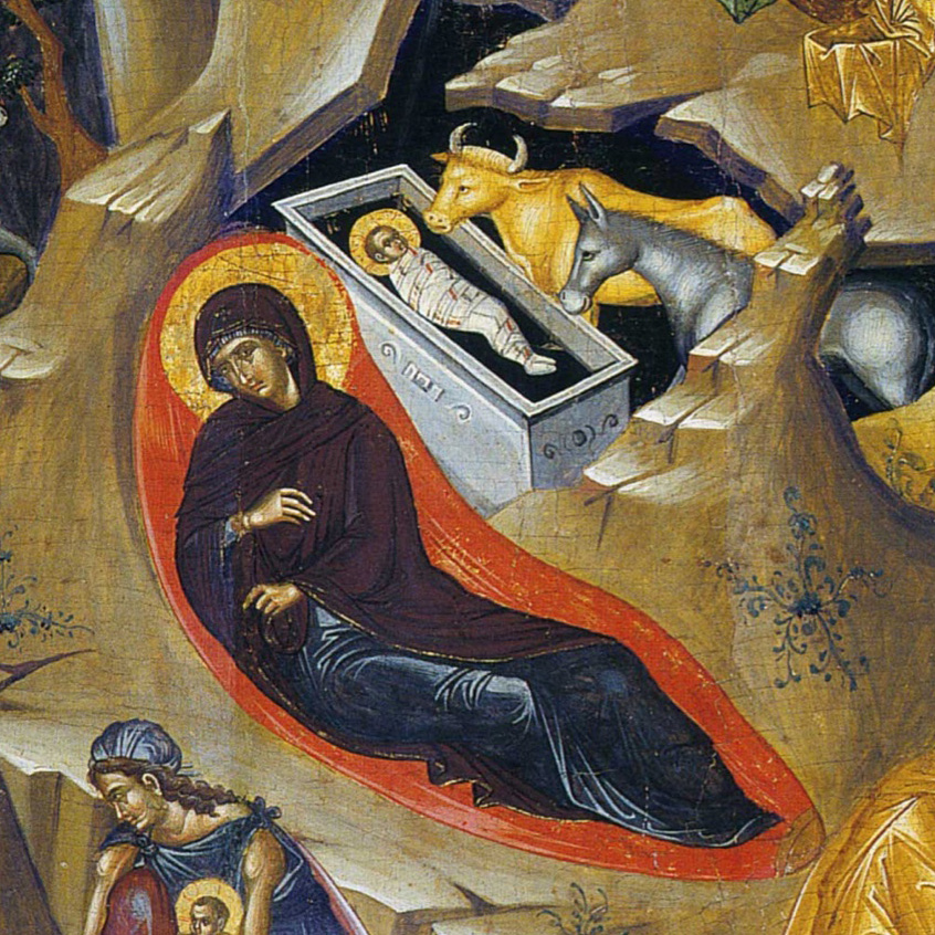
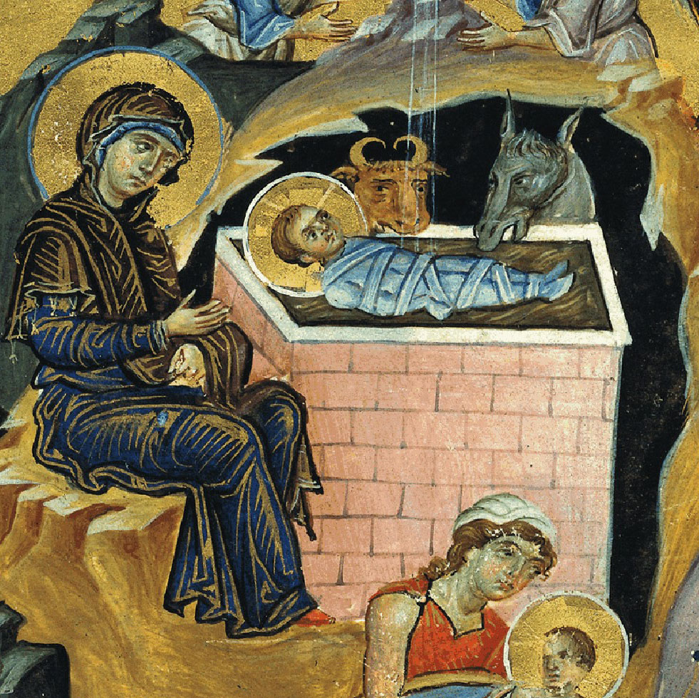
We were encouraged to study good examples of our chosen festal icon referring to frescos and manuscripts. At first, the variety of prototypes felt overwhelming (just google ‘orthodox nativity icon‘) but I have a particular love of manuscripts and one in particular spoke to me with its beautiful simplicity – the Armenian Nativity by Toros Roslin, painted in the 13th century, so much so that I painted a reproduction on vellum (blog post here).
Armenian Nativity, from the Toros Roslin manuscript, 13thC egg tempera painted on vellum
In October 2015, we made a course field trip to Thessaloniki to explore some of the beautiful icons and frescos that reach back into antiquity. In particular I loved the frescos of St Nicholas Orphanos Church (14thC), including this one of the Nativity. You can get a flavour of this trip in my post here.
St Nicholas Orphanos Church fresco, Thessaloniki showing the Nativity
Looking at the layout of the Orphanos fresco, light from heaven is directed vertically to the Christ Child, centrally placed in the heart of the cave where high contrast and curved lines frame the Blessed Virgin. Your eye is then led gently down and around to take in all the surrounding figures and back to centre.
The most perplexing aspect of the composition for me was settling on a layout of the Virgin and Child which are diverse as you can see from a few examples below. I felt that it was unusual for a mother to turn away from her child, let alone this one!
Examples of various compositions of the central figures
I made a start on the cartoon – sketching out the overall composition on a large sheet of cartridge paper cut to the size of my gessoed panel (53 x 42cm). To help keep things fluid at this stage, I made separate sketches of each cluster of figures which I was able to photocopy, cut out and move around. I had also been working on the figures and colours in a workbook (you can see some examples here).
It was important to align the composition with our chosen theme and to allow the viewer’s eye to flow and pause in a rhythmical and meaningful way around the icon. You can see on this example, I had shown the Virgin looking towards her infant being bathed by the midwives – I wasn’t entirely happy with this but this was the exploration stage.
Looking back at my notes I have found some helpful comments from Aidan and Sr Petra Clare:
The mountains are not responding to the light of the star – move them to turn towards the light of the star and so they curve to contain the angels.
The length of the Virgin’s legs not quite right, the knee to heel should be the same on both legs.
Archangel Gabriel too high up the mountain and right wing not quite right.
Adjust the shepherd cluster to flow directionally towards the Virgin and Child
Magi better in a linear format to direct the eye back up the icon to the star.
Finally, Aidan reminded me that ‘the star represents heaven so it needs to be joined up to some form of half circle to show a connection between heaven and earth through the incarnation. A star in the sky by itself doesn’t convey this connection so well.’
It was somewhere during this exploration stage that I came across the translucently beautiful work of the Romanian master iconographer Gabriel Toma Chituc. This detail from his Nativity icon was an answered prayer for me as it expressed so eloquently the union of heaven and earth, Mary placed vertically and the Christ Child horizontal with the light of the star reaching into the cave.
Nativity by Gabriel Toma ChitucProgress on the cartoon but not amended the star yet.
For the ancient Greeks, the cave symbolised the convergence point of divine or cosmic energies and was considered a sacred point where the soul could enter earth and subsequently leave and return to earth.
Shorthand version of preparing the gessoed board! Tips on gessoing here.
I will close here for now showing the cartoon transferred on to the panel, using red ochre rubbed on to the back of the traced paper image and setting the lines with a dilute mix of red ochre tempera. If you would like to see the finished icon, you can see it here.
As always, thanks for reading and wishing you a peaceful and blessed Advent.
Ronnie
Final composition settled and outline painted on to the panel
As September gives way into darker evenings and mornings, it pulls back many memories of the ancestral hearth for our family. It’s a time of remembering our loved ones and lighting a candle. It is the time to honour the Archangels on the feast of Michaelmas.
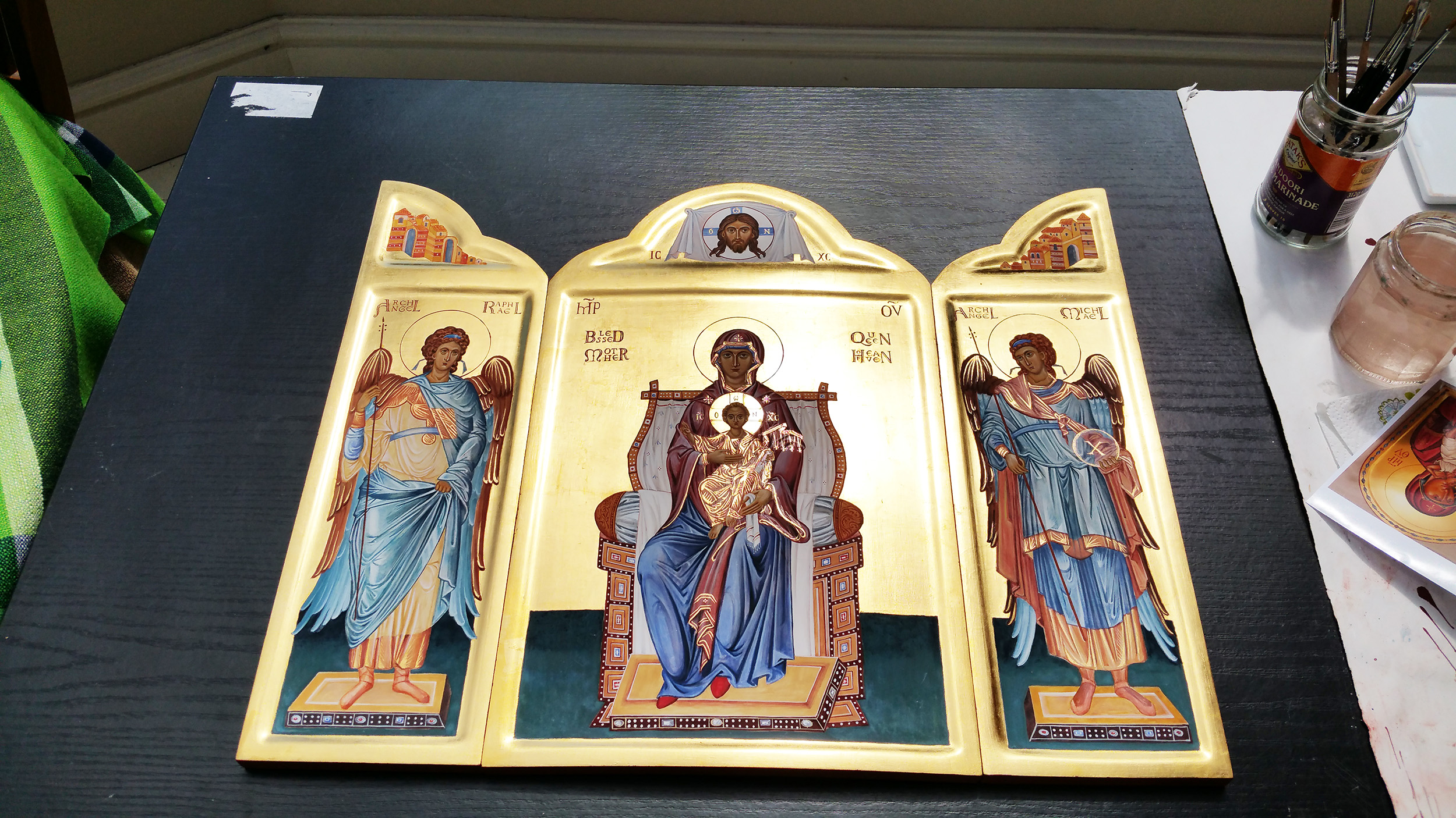
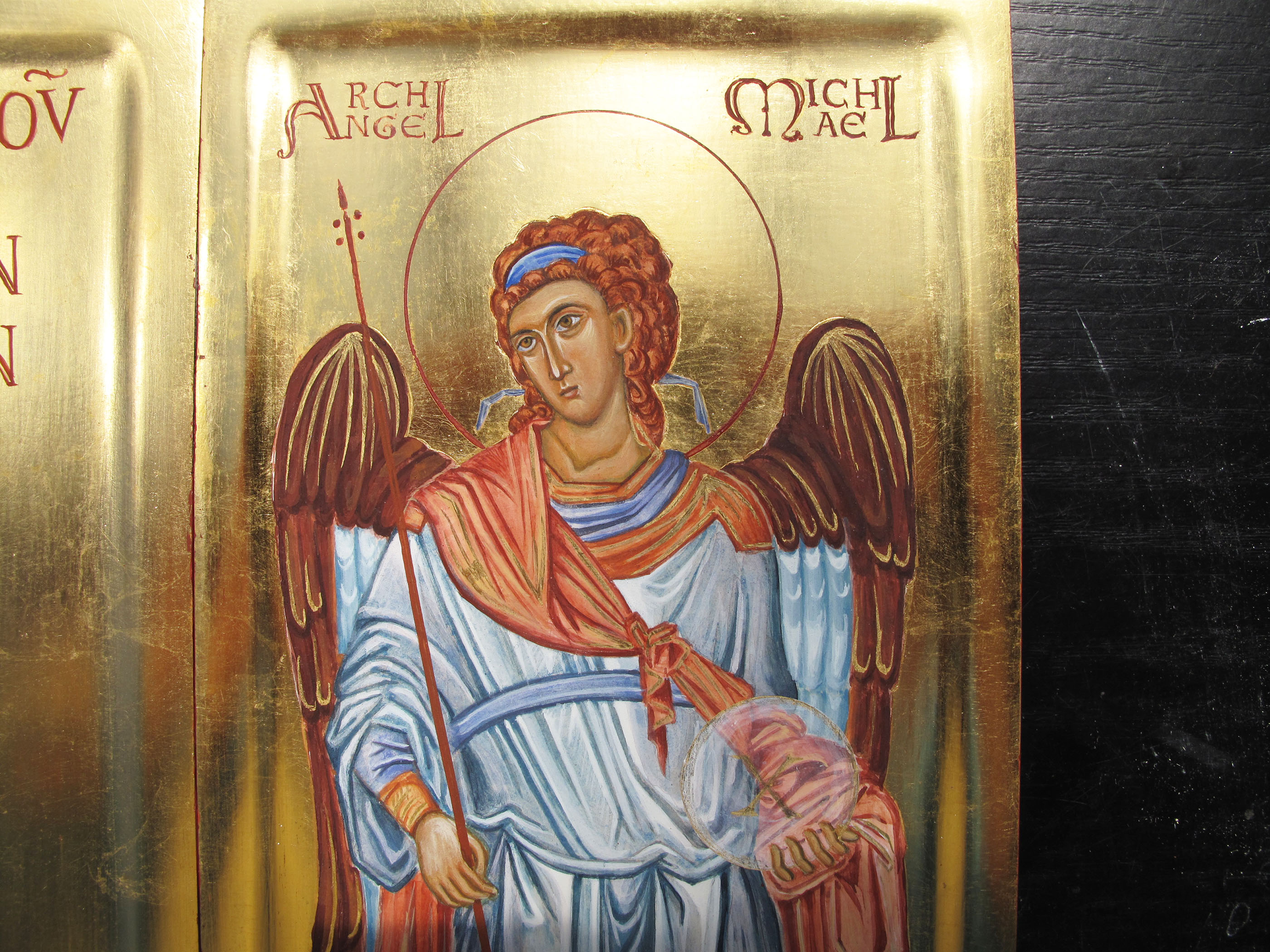
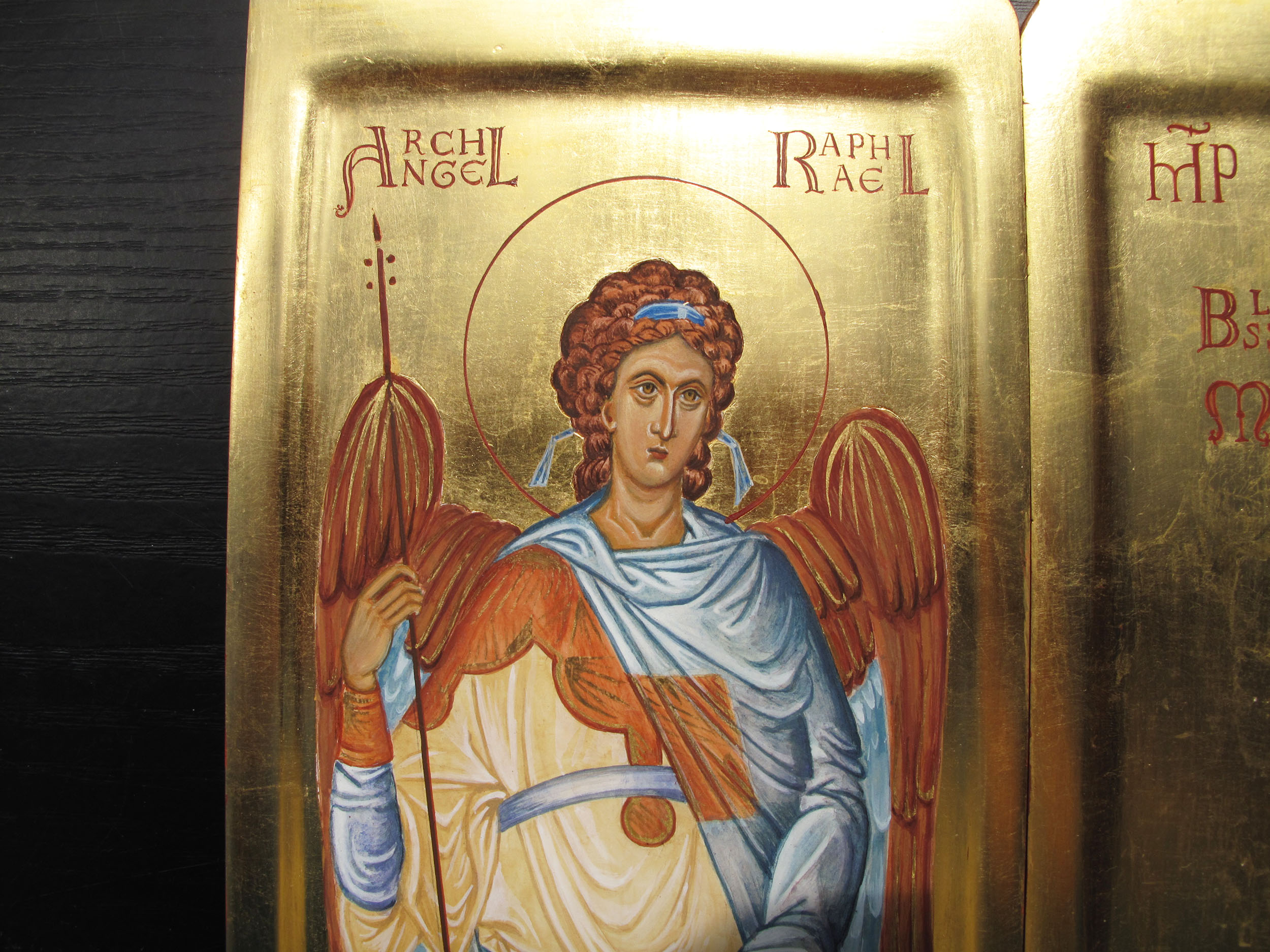
This was a triptych which I painted for my sister – she had seen a small version years ago and loved the way the doors opened up for the big reveal and had wondered if I could ever paint one for her one day. I’m so glad I did!
The images for these two Archangels which stand either side of the Blessed Mother and the Christ Child are based on the frescoes of Chora in Istanbul, seen high up in the dome.
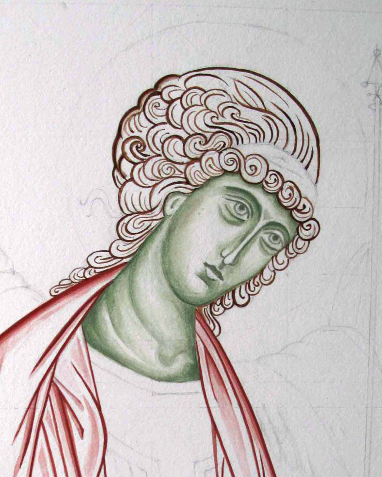
I’ve written about this triptych previously in this blog but for this evening, I wanted to include a sequence of work-in-progress photos of an icon which I painted on watercolour paper of Archangel Gabriel.
If you haven’t got a gessoed board ready prepared, some heavy 300-400gsm+ smooth hot pressed watercolour paper is a really beautiful surface to work on. If you can find cotton content paper then it will be archival and long lasting in the right conditions.
You will see from this photo that I’ve used a pencil grid to help draw the image – don’t hesitate to use all the help you can get as you go along. Turning the master image upside down to refer to also helps you to tune into the areas of light and shade, angles/directions, hard and soft edges and so on.
I have under-painted the face in the pigment Terre Verte. You could also use Yellow Maimeri and ivory black to get a different green.
I have used a mix of English Red Deep and French Ochre Havanna for the hair, wings and robes.
This is a thin wash of Yellow Ochre Maimeri and a touch of Red Ochre light for the membrane over the skin. The red ochres are really strong pigments so you will only need a diluted drop of it for warmth.
Adding the facial highlights in thin layers of Yellow ochre Maimeri and titanium whiteBuilding up very thin layers to model the faceAdding shell gold to the wings
You can see this icon completed and framed together with a few other icons here on my Etsy shop page.
Final details of the red line around the halo and ribbons to denote listening
And finally to close this post on the Triptych – here it is complete in the UK and ready to fly to Australia – with my Aussie sis joining in a wee family gathering!
Triptych in UK – sister in Aus! Sisters!
In the meantime, trusting you all into the care of our celestial helpers.