Icon Diploma Student

Learning to see with the eye of the heart

Posts from the ‘Illuminated manuscripts’ category

Advent Two: The Shepherds Their Wonder

Quote from the Festal Manaion – Nativity Vespers

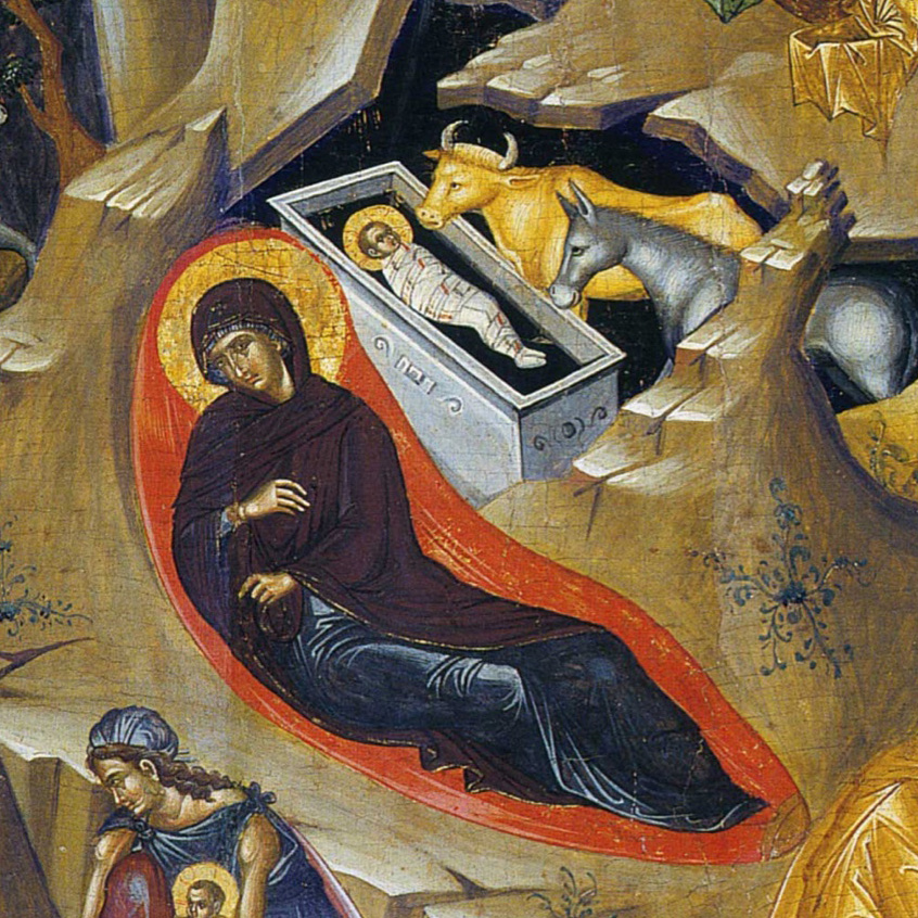
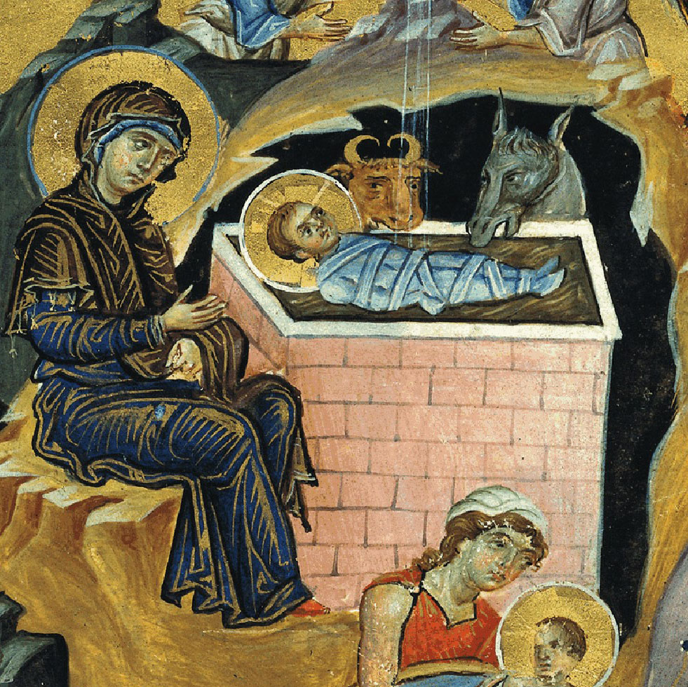
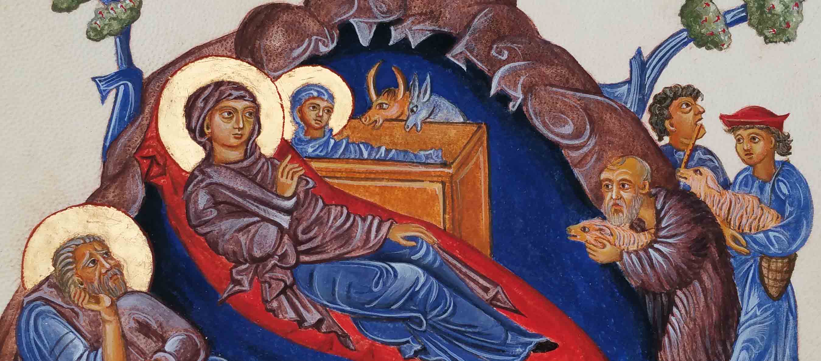
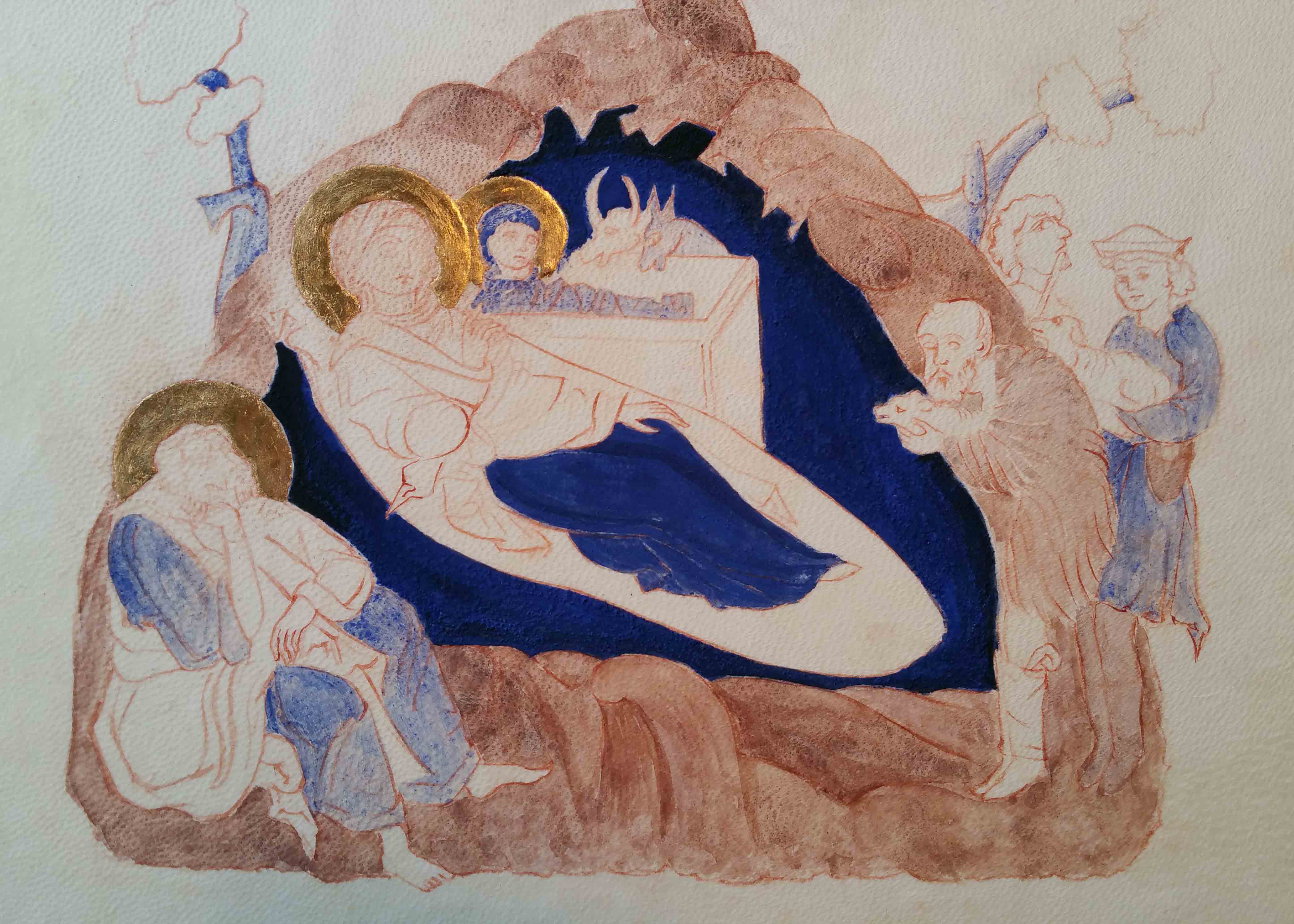
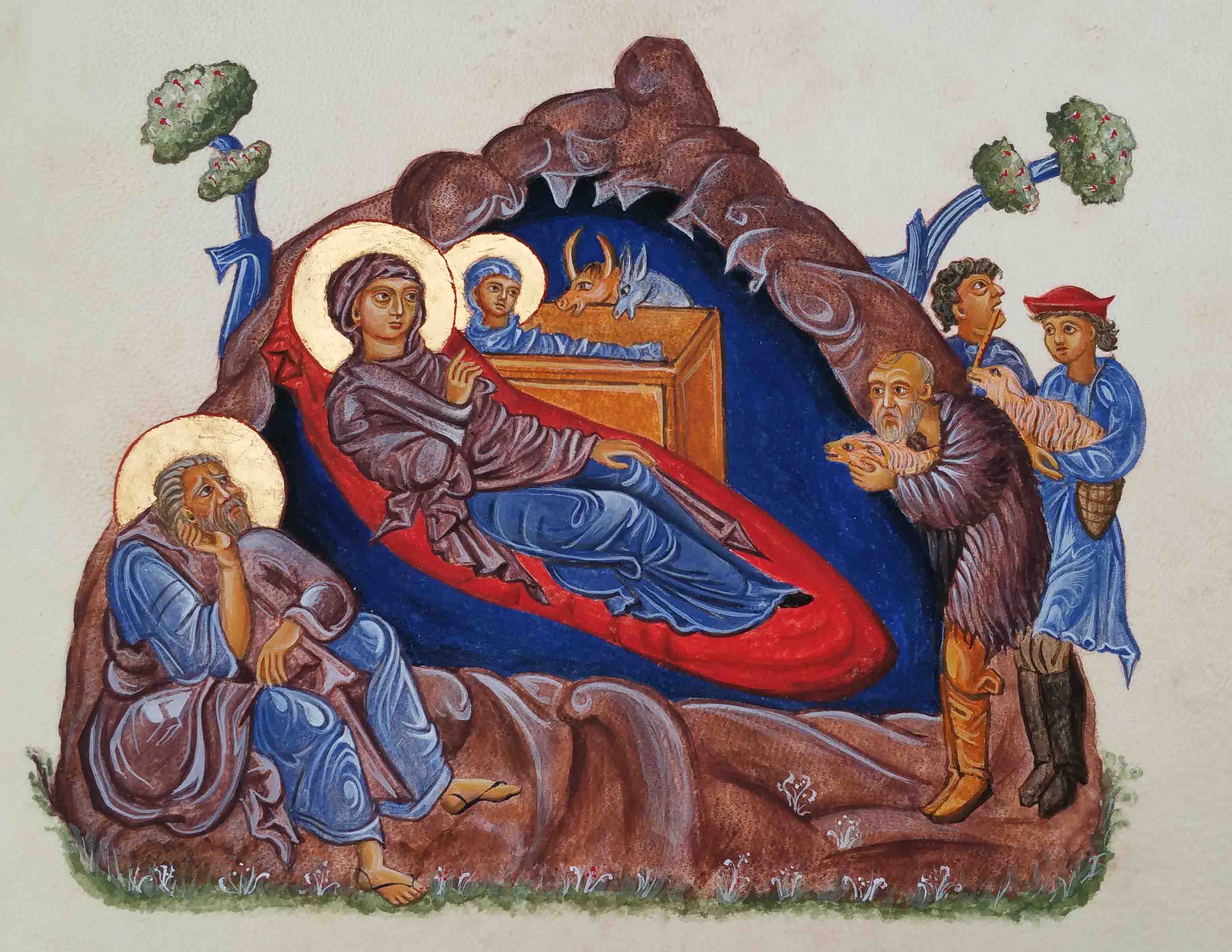
The profoundly beautiful Armenian Nativity created by T’oros Roslin in the 13th Century remains my favourite Nativity icon. I painted my own version on vellum back in January 2016 in preparation for the Festal Nativity icon (on a large gessoed panel) which was part of the final year of the Diploma.

This is a silly busy time of year for many of us but I’m posting this here now for you to find sometime in future when you do find a quiet moment.

The primary shepherd on the large Nativity icon (above left) was a direct reference to the figure in the Armenian Nativity scene. I liked his expression and woolly tunic! (If you want to refer to the finished diploma icon you can see it in more detail here).

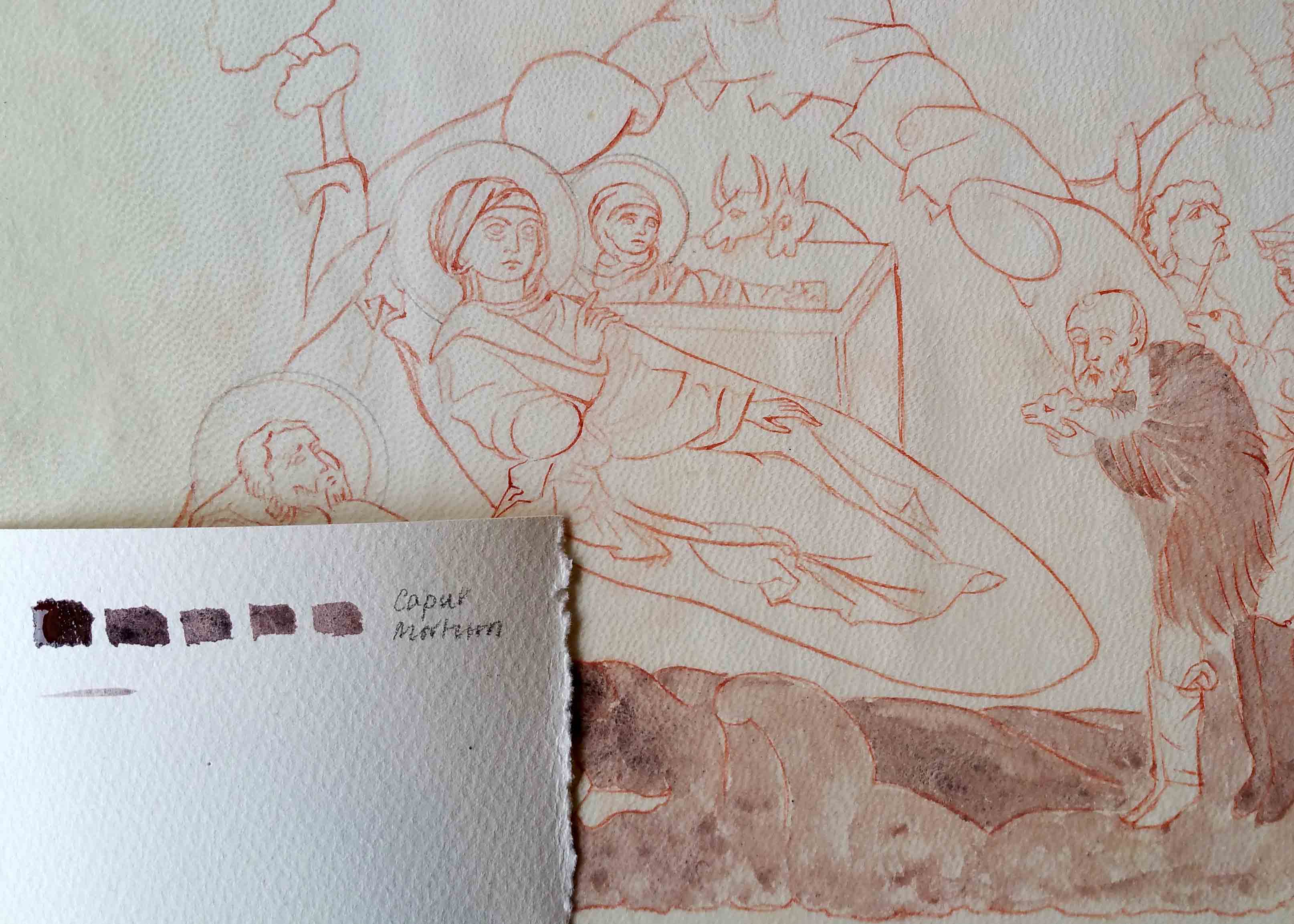
Caput Mortuum is a mysterious rich deep maroon colour and looks to me the colour used in the Armenian Nativity original. The name translation from Latin is ‘dead head’. In the Merriam Webster Definitions dictionary we find one definition “alchemy the residuum after distillation or sublimation” also “a red iron-oxide pigment made by calcining iron sulfate“. To me it’s the colour of an aubergine and when placed next to lapis lazuli, the colours sing.

Caput Mortuum next to Lapis Lazuli

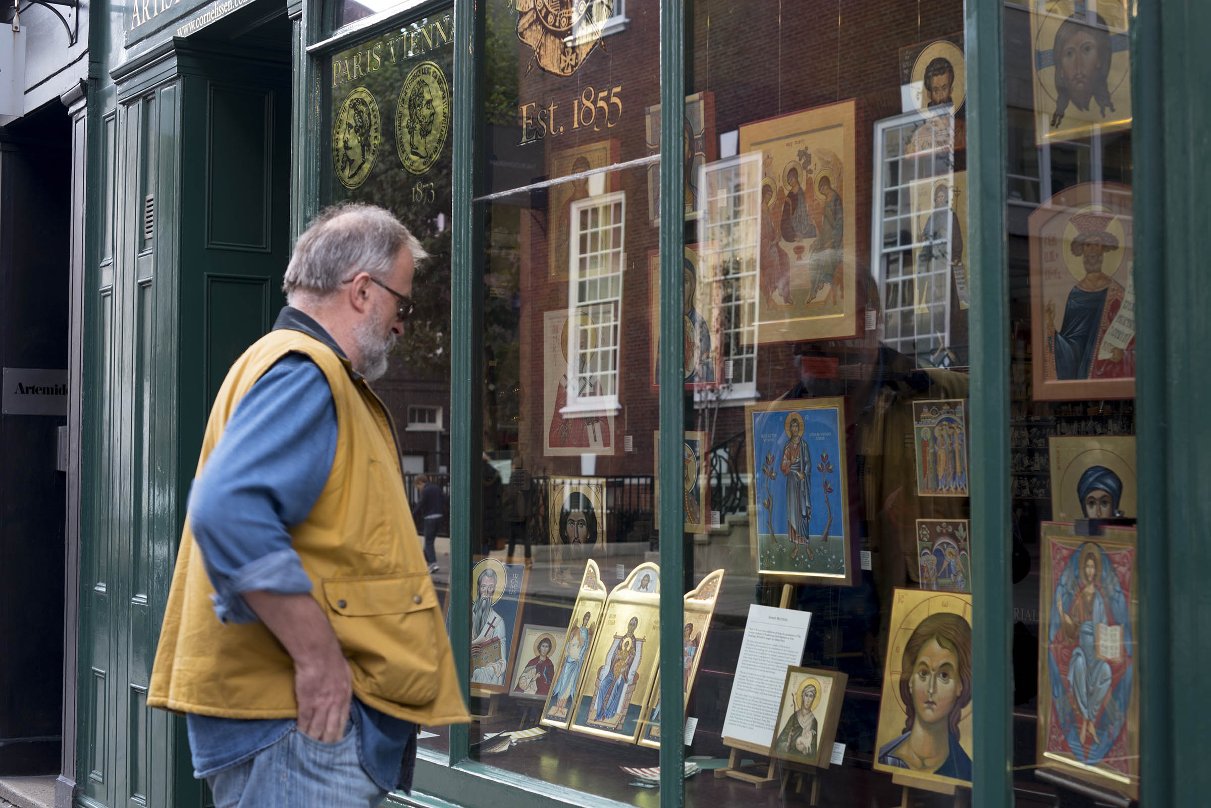
Reflecting back to the time that I painted the Armenian Nativity, you’ll have no idea how over the moon I was to participate in the exhibition curated by Patricia Lovett and held in the window of Cornelissen’s . It was all part of the Heritage Craft Week 2016 which I wrote about here. If you’ve never heard of Cornelissen’s then treat yourself to a minute inside their London shop here.

Patricia – if you are reading this, that exhibition and subsequent synchronicities led to the class of 2013-16 final-year diploma icons being displayed in the same window (below) and repeated three years later with the next icon student intake – THANK YOU!

Window shopping – Cornelissen’s, London

Back to work…

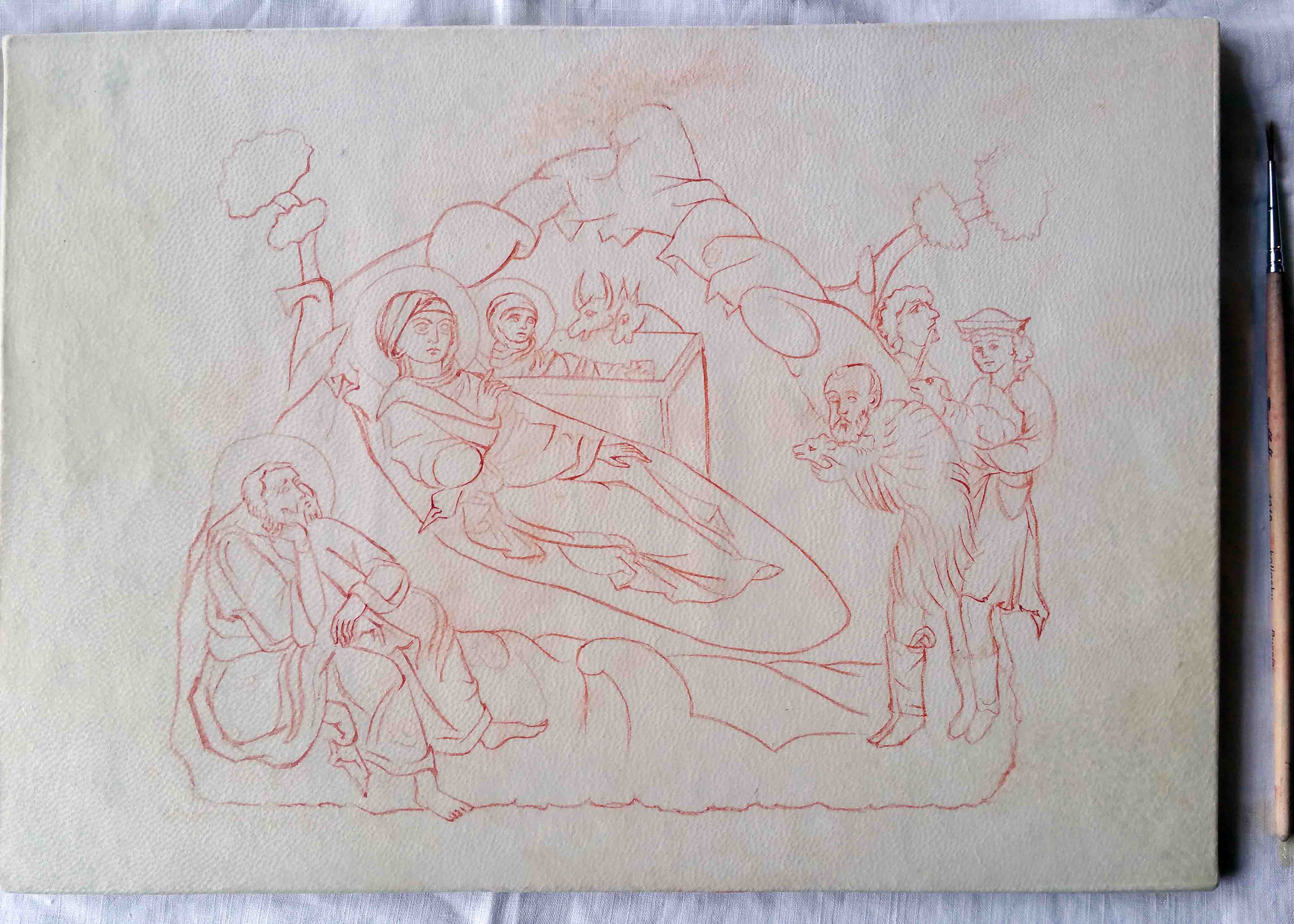
These shepherds have been shuffled around to get a balanced composition. Photocopying and cutting out the figures allows you to move them and see how they work in relationship to one another. It’s interesting how small shifts can make a difference in how your eye is led around the figures and around the overall composition.

Pencil drawing of three shepherds, photocopied and placed on the icon panel

Lines are transcribed onto the panel by rubbing red ochre onto the back of your traced drawing. The lines are fixed with a dilute mix of egg tempera in red ochre. Applying a dilute mix means it’s easy to blend into the layers that follow.

Composition settled and anchored on to the icon panel in a light red ochre line.

Yellow Ochre Maimeri and Ivory Black pigments mixed together give a lovely green for underpainting flesh tones – an alternative to Terre Verte which can be a bit sticky.

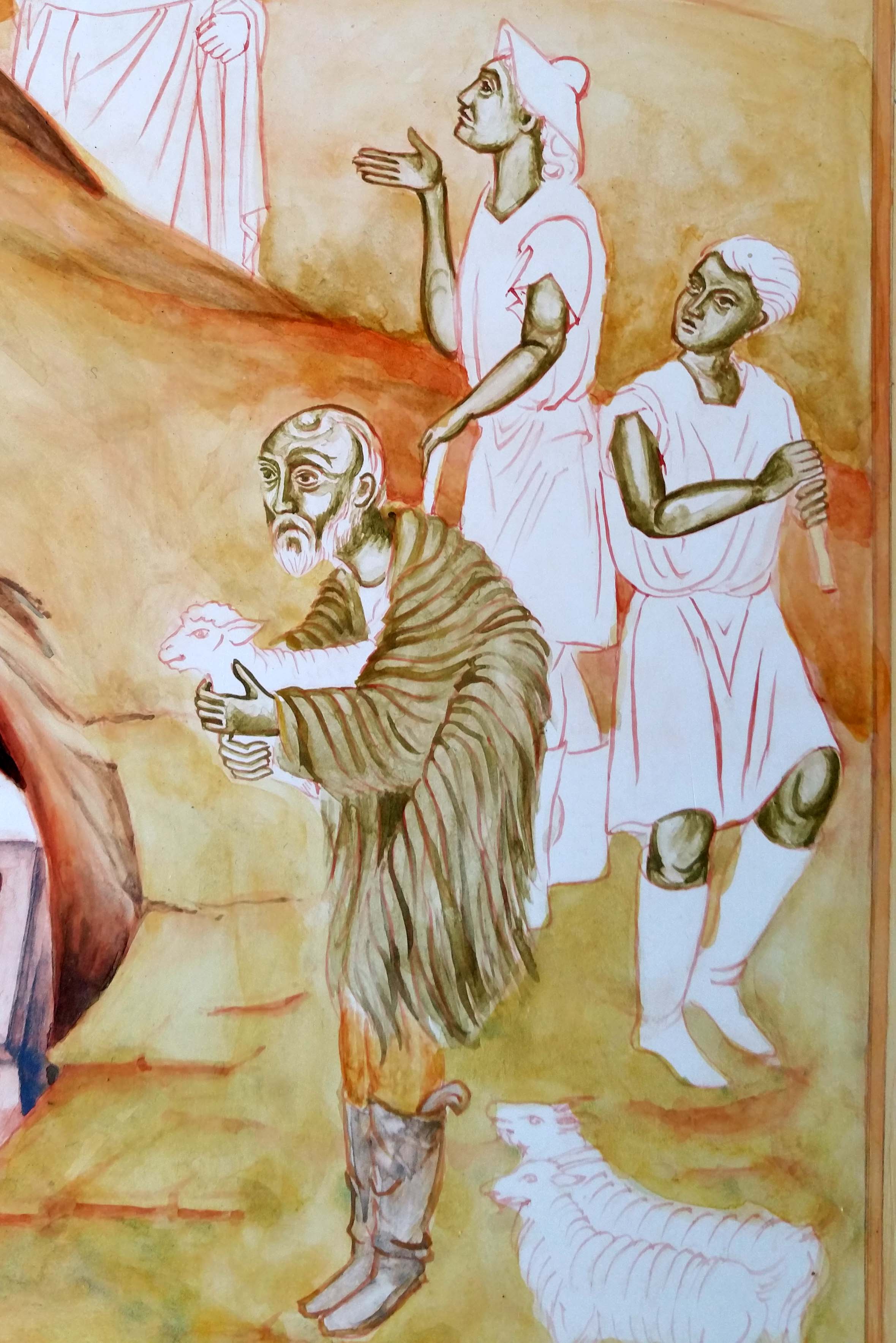
Since I had this earthy mix, I used it to under-paint the garments of the primary shepherd. I’ve used thin washes of earth ochre pigments to build up the landscape.

Colours vary here as I’ve taken photos at different times of the day.

When working on an icon, it’s important to work on it as a whole to keep it balanced. Sometimes weeks if not months go by between underpainting, mid-tones and highlights of the different clusters of figures.

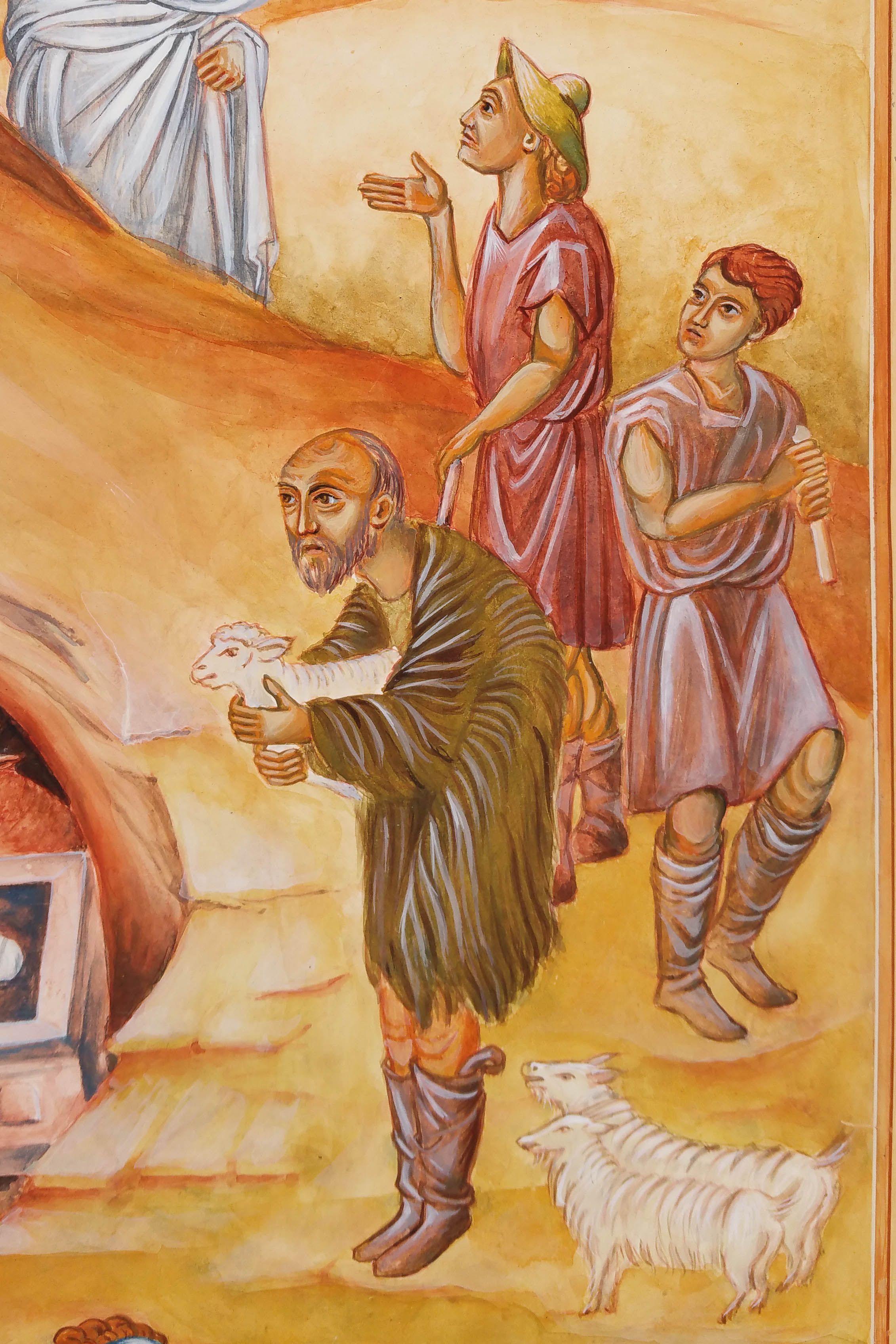
Let’s close this post on these shepherds – almost finished. Just a few more highlights to add on their faces and hair.

Thanks for reading, whenever that might be 🙂

Ronnie

Advent one: What shall we offer?

It’s Advent as I write and timely to reflect on some of the foundation work for the Festal Nativity Icon which I worked on in the third and final year of the diploma course (2013-16) with Aidan Hart. I know that this is a silly-busy time of year for many of us but you don’t have to read it now – it’s here for later!

Detail from icon study on paper acknowledging the prototpye by Gabriel Toma Chituc

Before I get started, I also want to say that the British Association of Iconographers have an online exhibition ‘Icons Emerging from Lockdown 2021’ sharing the work of over 46 icon painters. The work is worth leaving this page right away and having a look!

Back to the Nativity icon – In this post, I want to look at the starting point of the icon – looking at the choices and decisions behind the composition.

We were invited to work on a festal icon of our choice and to design a new composition which emphasised a particular aspect of the feast. I chose the Nativity – with the theme of praise and thanksgiving so beautifully expressed here in the Festal Menaion – Nativity Vespers:

Lettering in mapping pen and gold gouache on paper

We were encouraged to study good examples of our chosen festal icon referring to frescos and manuscripts. At first, the variety of prototypes felt overwhelming (just google ‘orthodox nativity icon‘) but I have a particular love of manuscripts and one in particular spoke to me with its beautiful simplicity – the Armenian Nativity by Toros Roslin, painted in the 13th century, so much so that I painted a reproduction on vellum (blog post here).

Egg tempera painting of the nativity on vellum
Armenian Nativity, from the Toros Roslin manuscript, 13thC egg tempera painted on vellum

In October 2015, we made a course field trip to Thessaloniki to explore some of the beautiful icons and frescos that reach back into antiquity. In particular I loved the frescos of St Nicholas Orphanos Church (14thC), including this one of the Nativity. You can get a flavour of this trip in my post here.

St Nicholas Orphanos Church fresco, Thessaloniki showing the Nativity

Looking at the layout of the Orphanos fresco, light from heaven is directed vertically to the Christ Child, centrally placed in the heart of the cave where high contrast and curved lines frame the Blessed Virgin. Your eye is then led gently down and around to take in all the surrounding figures and back to centre.

The most perplexing aspect of the composition for me was settling on a layout of the Virgin and Child which are diverse as you can see from a few examples below. I felt that it was unusual for a mother to turn away from her child, let alone this one!

I made a start on the cartoon – sketching out the overall composition on a large sheet of cartridge paper cut to the size of my gessoed panel (53 x 42cm). To help keep things fluid at this stage, I made separate sketches of each cluster of figures which I was able to photocopy, cut out and move around. I had also been working on the figures and colours in a workbook (you can see some examples here).

It was important to align the composition with our chosen theme and to allow the viewer’s eye to flow and pause in a rhythmical and meaningful way around the icon. You can see on this example, I had shown the Virgin looking towards her infant being bathed by the midwives – I wasn’t entirely happy with this but this was the exploration stage.

Looking back at my notes I have found some helpful comments from Aidan and Sr Petra Clare:

  1. The mountains are not responding to the light of the star – move them to turn towards the light of the star and so they curve to contain the angels.
  2. The length of the Virgin’s legs not quite right, the knee to heel should be the same on both legs.
  3. Archangel Gabriel too high up the mountain and right wing not quite right.
  4. Adjust the shepherd cluster to flow directionally towards the Virgin and Child
  5. Magi better in a linear format to direct the eye back up the icon to the star.
  6. Finally, Aidan reminded me that ‘the star represents heaven so it needs to be joined up to some form of half circle to show a connection between heaven and earth through the incarnation. A star in the sky by itself doesn’t convey this connection so well.’

It was somewhere during this exploration stage that I came across the translucently beautiful work of the Romanian master iconographer Gabriel Toma Chituc. This detail from his Nativity icon was an answered prayer for me as it expressed so eloquently the union of heaven and earth, Mary placed vertically and the Christ Child horizontal with the light of the star reaching into the cave.

Nativity by Gabriel Toma Chituc
Progress on the cartoon but not amended the star yet.

For the ancient Greeks, the cave symbolised the convergence point of divine or cosmic energies and was considered a sacred point where the soul could enter earth and subsequently leave and return to earth.

Shorthand version of preparing the gessoed board! Tips on gessoing here.

I will close here for now showing the cartoon transferred on to the panel, using red ochre rubbed on to the back of the traced paper image and setting the lines with a dilute mix of red ochre tempera. If you would like to see the finished icon, you can see it here.

As always, thanks for reading and wishing you a peaceful and blessed Advent.

Ronnie

Final composition settled and outline painted on to the panel

Lettering of the Melisende Psalter

hand made book of the Melisende letters

‘Melisende’ –  lettering from the 12th c

Long overdue, but here’s the last installment from my dissertation on lettering which would be lovely to see adapted for use on contemporary western icons. For the last subject, I chose the Melisende Psalter, an extraordinarily beautiful example of ‘East meets West’.

It was written in Latin and thought to have been produced in the scriptorium of the Monastery of the Holy Sepulchre, in the Crusader Kingdom of Jerusalem sometime between 1131 and 1143. It is attributed to the work of six artists, and a scribe who are thought to be of French or Italian origin as the work reflects their backgrounds.

The introduction features 24 full page miniatures of scenes from the life of Christ, with Greek inscriptions, painted with gold backgrounds.

Annunciation Melisende Psalter British Library crop.png

Detail from the Annunciation (image from the digitised British Library Manuscript)

The manuscript is held in the British Library Manuscripts Department (Ref Egerton MS 1139), London.   

The word psalter derives from the old English word psaltere/saltere which came from church Latin Psalterium and simply means ‘a volume containing the Book of Psalms’. These hand written and illuminated books often had other devotional material bound in as well and were most widely owned by wealthy lay persons. They predate the later emergence of the ‘Book of Hours’.

5-a-melisende

Letter A adapted from the Melisende Psalter

Looking at the letters in this manuscript, it was hard to know where to begin as there are so many examples to choose from. It really is a rich resource for both iconographers and calligraphers alike.

I decided to illuminate a few letters to bring out their qualities as stand alone designs. The letters are confident and stems terminate with a flourish and the double stems add a light but strong quality to the letters. This example is painted with Azurite and Malachite. I have applied a few washes of azurite over the malachite to get this velvety soft green.

letter B Melisende

Melisende letter B

This example is painted with lapis lazuli and malachite. I’ve washed a few layers of blue over the green to deepen the green and offset the brightness of the gold.

The letters themselves are on raised gesso – a slightly more flexible mix to the gesso used for icons. This is Patricia Lovett’s recipe and it gives a flexible surface which burnishes up a treat when gold leaf is applied. Patricia’s book ‘Illumination Gold and Colour’ gives more practical guidance on this and is on sale at Cornelissen’s in London (or by mail order)  where you can get all the materials needed to paint your own letters. If you do get a chance to visit Cornelissens in the next few weeks, you will see some of the work by the icon diploma students on display in the window – more about this in the next post.

Before I share the letters which I painted from this manuscript, I’d like to give you a taster of one of the illuminations in this psalter as how it’s a useful resource for icon painters.

magi bring ing gifts melisende

Melisende Psalter – Magi bringing gifts to the Christ Child, Image from the British Library Digital library

To see this image and others in the psalter, here’s the link to the British Library page.

I love the movement of the Magi and how their composition directs the viewer’s eye to observe them placing their gifts at the feet of the Christ Child under the stern direction of the angel. Even though these are tiny paintings, they are dynamic and vibrant.

Back to the lettering. I’ve attached an eight page document with a full alphabet of hand painted letters which are an interpretation of the letters in the Melisende Psalter. Feel free to print them off or save them till later for use on your own icons. I would love to see them in use one day! 11-melisende-letters-v1

letter C Melisende gilded lapis lazuli

Letter C in Lapis lazuli – based on examples in the Melisende Psalter

Thanks for reading,

Ronnie

Armenian Nativity on Vellum

1 banner armenian nativity Cruwys

Armenian Nativity on Vellum

Every now and then, I come across a manuscript or icon that captivates me. This is one of those pieces. The original can be seen here attributed to Toros Roslin, the 13th century Armenian illuminator.

Although I’m currently working on a large nativity icon for the diploma (which we have to compose ourselves rather than copy)  I side-tracked to paint this particular nativity scene on vellum as Aidan has encouraged us to study other icons to really get into the essence of the feast we have chosen.

Some 12 years ago, I went to Patricia Lovett’s Traditional Skills and Gilding course, which she ran over four days. I learnt how to stretch vellum and to prepare it for painting and gilding and she ignited an enthusiasm for this art which helped direct me towards embarking on the icon diploma. I had a piece of goatskin vellum from William Cowley already stretched on to a plywood board ready for painting so I set straight to work transferring the cartoon on to the vellum in the same way as I would for an icon, by rubbing red pigment in to the back of the cartoon paper, then setting the pigment with a watery red ochre line.

Red drawing outlines on to vellum

Transfer the cartoon on to the vellum

Next step was to lay the gesso for gilding. When we were on Patricia’s gilding course, she advised us to make detailed notes on the method. For anyone who would like to learn more, my notes from one of the gilding days are here and I would also recommend Patricia’s books and dvd’s on gilding available through her website. The ‘Gilding gesso on vellum’ notes can be downloaded as a pdf here.

First washes of Caput Mortum on vellum

Caput mortum used for the earth and shepherd figure

gesso on vellum

Laying gesso for halos, irregularities to be scraped and burnished then gilded.

close up of the gesso halo on St Joseph

Note the pin prick holes in the gesso that shouldn’t be there!

gold leaf on vellum

Applying the first layer of loose gold leaf

lapis lazuli and azurite pigments applied

Layers of azurite and lapiz applied to reach a deep blue within the cave

First wash of Caput Mortuum pigment applied on the earth and shepherd.

Blessed Virgin and Christ child painted in egg tempera on vellum

Close up of the tiny faces of the Blessed Virgin and Christ child

9 finished armenian nativity Cruwys

Completed illumination on vellum of the Armenian Nativity

Colour palette: Caput Mortuum, Azurite, Lapis lazuli dark, vermillion, terre verte, ivory black and titanium white.

All these pigments can be obtained from L. Cornelissen & Son, Great Russell Street, London where this piece is now on display as part of the Heritage Craft Association‘s exhibition with Cornelissen’s celebrating ‘Gold on Parchment’, for the upcoming London Craft Week, where some practical demonstrations will be taking place.

Thanks for reading!

Ronnie


Fragments of beauty from 8th C Avranches

Avranches banner 2a
Painted letters in the style of 8th century French uncial hand

I began my dissertation for the Icon Diploma with lettering discovered in Mont St Michel, France.  The style is a majuscule script known as ‘uncial’, written in capital letters, in common use from the 4th to the 8th century by both Latin and Greek scribes.

I stumbled upon this exceptional 8th century lettering some fifteen years ago, whilst on a family holiday in Normandy. Mont St Michel is home to some beautiful illuminated manuscripts, some of which can be seen by request in the town hall at Avranches, nearby.

Guerison du Paralytique 1 rev.jpg

Guerison du Paralytique, from the Gospel of St Mark

Whilst there, I bought the book l’Enluminure Romane au Mont-Saint-Michel” by Monique Dosdat which includes several fragments from a Book of Gospels. There are only a few of these pages which survive – the author and dedication are unknown.

Their history is intriguing as they were discovered bound into a later manuscript, at Mont St Michel. The two pages are identified by their full titles:

  1. “Fragment d’un Evangeliaire, Vllle siecle, Annonce aux Bergers, Luke 2, 12. Avranches, BM, ms 48.
  2.  “Fragment d’un Evangeliaire, Vllle siecle, Guerison du Paralytique, Marc, 2, 5-12  Avranches, BM, ms 71.

The author Dosdat writes: “These pages are an impressive witness of a beautiful, perfectly legible uncial lettering, its characters uniting a classic uncial calligraphy born in 4th Century Italy under the influence of Irish round hand lettering”.

This scribe had mastered the art of consistency, spacing, layout and rhythm so that the text itself is a work of art.

So let’s look at the lettering as examples for use on icons. This script would lend itself to early Celtic or French saints. The following studies are my second attempt at translating this quilled hand into painted letters.  I have ‘waisted’ the uprights and some letters will need to be refined but feel free to print them off and use them if you wish. I can see the serifs on the letter ‘C’ are pretty clumsy – so use the body of the letter C instead.

ABCDEF

DDD

Looking at the two types of ‘D’ used in the same manuscript.

GIJKLN

OGEC

MAQ

The right hand stroke of the letter A is a little top heavy.

ORSTUV


PQLH


WXXYZ

These ‘X’ and ‘Y’ letters are my favourite!

Thanks for reading.

Ronnie

Gilders’ Punch Tools

Cropped image of Annunciation from French manuscript

‘The Annunciation’ detail of an illumination I painted in 2004 – based on a French or Flanders manuscript, 12th C (original size approx 150 x 100mm)

Over ten years ago, I attended a series of workshops run by Patricia Lovett on gilding and traditional egg tempera painting skills. Patricia is enthusiastic, highly skilled and a natural teacher and part of our learning was to paint our own illuminations based on good quality examples of manuscripts. It was a wonderful introduction to the world of gilding on vellum and Patricia still runs these workshops from time to time, from her home in Kent.

I am particularly drawn to manuscripts of the Romansque period such as the one above, the original which is kept in the British Library and can be seen in The Illuminated Page by Janet Backhouse. For anyone interested in manuscripts, it is a wonderful  book. I bought my copy in the Blake Head Bookshop, Micklegate, York in 1997. The shop has long gone which is a great loss, but the book is a favourite and still available.

Having leafed through this book many times, I would often wonder how certain things were done, such as how a gilded background was tooled. Having spent long hours last summer learning to gild icons (see my earlier posts) it is really quite a challenge to get the smooth mirror gold shine of water gilding. For the example above, I used the tip of a gilders pointed pencil burnishing tool. Looking back on it now, it is fairly crude, but I was pleased with how the tiny indents sparkled when catching the light.

To see a startlingly impressive example of tooled gilding, from a later period (c.1395–1399) I would highly recommend a visit to the National Gallery in London, to see the Wilton Diptych.

Image of the WIlton Diptych

Image of the WIlton Diptych courtesy of http://en.wikipedia.org/wiki/Wilton_Diptych

detail of Wilton Diptych tooling

Detail of background tooling on the above image of the WIlton Diptych

detail of tooled gilded background

Tooled background of the second panel of the WIlton Diptych

Crown detail Edward Confessor

Detail of crown of King Edward the Confessor from the Wilton Diptych

It has puzzled me as to the tools that might have been used to do this exquisite work and have googled high and low for anything that might be suitable. I discovered a blog by the classical realist painter Jerry Berg who described some of the tools which he had bought from a shop in Florence.

gilders punch tools

Gilders’ punch tools courtesy of Jerry Berg’s blog

Jerry gave an example of how the tool worked and I think that this might be worth investigating. So, this morning I was delighted to receive Cosimo Tasinari’s four page catalogue in the post which I have scanned for you here: Cosimo Tassinari Firenze Italy

gilders punch tools

Gilders punch tools courtesy of Jerry Berg’s blog

Contact details: Piero P. Fantechi, Ditta Cosimo Tassinari, Piazza S. Maria Novella 2r, Florence, 50123 Italy.      Ph: 0039 055-287-869    Fax: 0039 055-287-869      tassinari@infinito.it

Gilding, Tooling, and Stamping Supplies; Type – Hand Engraved Brass; Bookbinding Tools; Dies; Stamps and Rollers, Typeholders; Steel punchers for icons-gesso. Will cut tools to your design; hand-engraved seals made. English spoken.

I usually don’t like shopping but I would love a visit to this shop!

Hope this is useful and thanks for reading.

Ronnie