It’s now feeling uncomfortably close to the end of this course – and I haven’t finished one of my set icon pieces! So, for the last few days I have knuckled down and revisited my first project, the Mandilion. It’s been untouched now for two years and looking back I’ve learned a bit but there is much more still to practice.
Before we go on, if you’d like to see the earlier stages of this mandilion project, you can look back here and a bit later here.
I deliberately stopped working on the mandilion as I wanted to get a bit more experience under my belt before I finished it. I’m glad I did as looking at it afresh, I could see quite a few things that need attention.
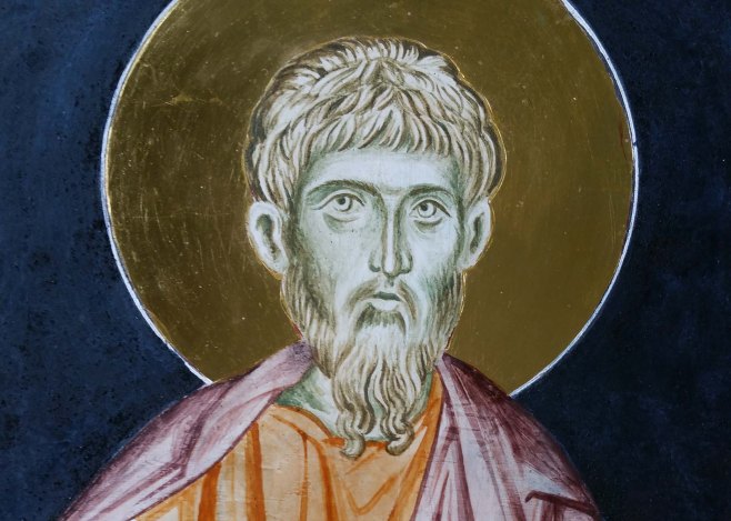
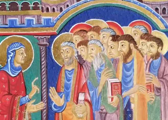
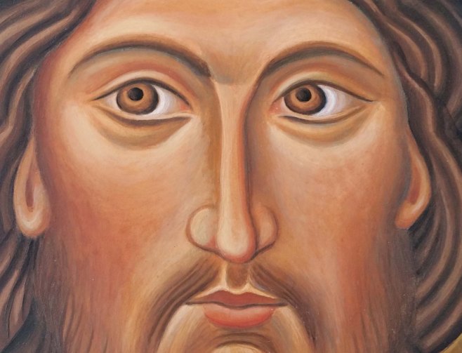
Before I set to work, I had a good look again at the prototype that I’m working from:

Christ from the Grand Deeisis, St Catherine’s monastery, Sinai
My version of the mandilion from two years ago.
Here’s the list of the main things to work on:
- Halo too bright. Vibrant lapis lazuli competes too much with the face.
- Left side is the ‘nearer’ side yet the righ eye is much bigger. Rebalance eyes and brow.
- Hair is a bit dull and lifeless.
- Facial tones lacks warmth.
- Strengthen eyebrows and shadows.
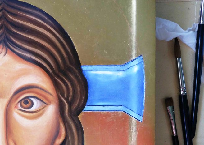
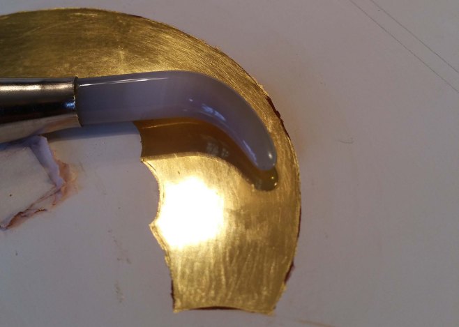
Scrubbing off the bright blue
Since it’s such a long time since I’ve worked on the icon, I started by applying a couple of glaze coats over the entire face and hair to provide a key between old and new. When these had dried I then applied two thin glazes of French Ochre Havanna over the face (but not hair/eyes). Whilst it was drying, I made a start removing the bright blue halo and the unsightly black lines – what was I thinking?! I still wanted a blue halo but not as vivid, so I used a flat headed brush to soak the paint and scrub most of it off. The black lines had set quite hard though and I ended up carefully scraping them off with the tip of a blade.

Underpainting the halo and adding shading to the hair parting
I had seen a graded blue halo on a contemporary mandilion which I thought would work, and began by underpainting the bands of blue using lapis lazuli dark, titanium white and a touch of ivory black .

When the paint is dry, I applied a weak egg glaze, then added a fine mist coat of white.
At first, the fine coat of white seems to cloak the colour too much but if it is applied as a thin layer, it soon dries much lighter and transulcent. It took three or four mist coats before the blues blended and softened.
While the paint was drying, I made a start on modelling the hair. I applied ivory black in thin layers to the parting and to the sides of the head to strengthen the form, paying attention to the ‘waves’ and the ‘ripples’.
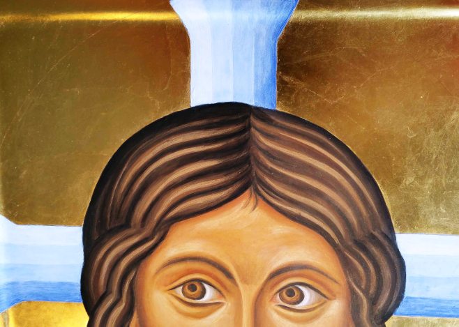
To add a little warmth to the hair, I added a thin layer of English Red Ochre either side of some of the ripples towards the front.
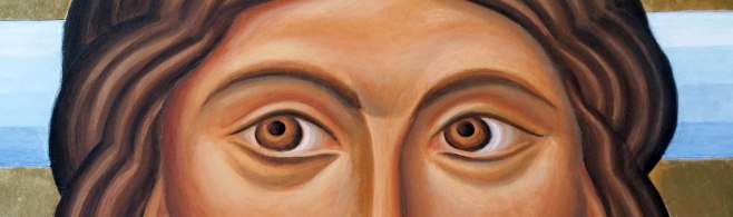
Now for the eye surgery. The eye on the right was much too big, especially as it is on the receding side. I applied a thin layer of white over the upper eye lid and it looked green! I reduced the right hand side of the iris and lowered the shadow between lid and brow. When all dry, I then applied French ochre havanah over the eye flesh to help harmonise the colours.
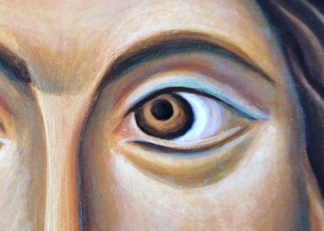
Eye surgery – lowering the upper lid and lifting the lower lid
Then, on the pic below, you can see where I added the new line of the upper eye lid. I may revisit this eye, but it’s step in the right direction.

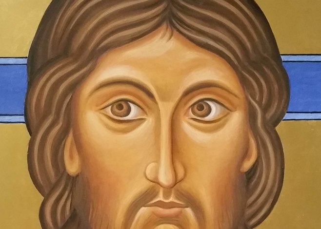
Red shadow under hair on near side to help it advance, green to the right
Warm colours advance and cool colours recede and you can often find faces with a wash of red somewhere on the near side and cool green on the far side. On this icon, the left side of the face is the nearest, so I used a thin wash of red ochre under the hair line to add a warm shadow and a light green (cool) on the right to help this side recede.
I added a little more cinnabar to the lips, corners of eyes, nose and ears (after this photo was taken) and will let it settle overnight.
Thanks for reading.
Ronnie
PS Prints and cards are now available to order from Smith York Printers.