
Archangel Michael part 3

Hello again!
It’s time to add some face highlights. I’ve been looking through my old class notes (from 2014) and found some really helpful reminders. Aidan (Hart) recommends that we should aim to apply 3 (but no more than 4) layers of highlights – easier said than done!
First layer of face highlights:
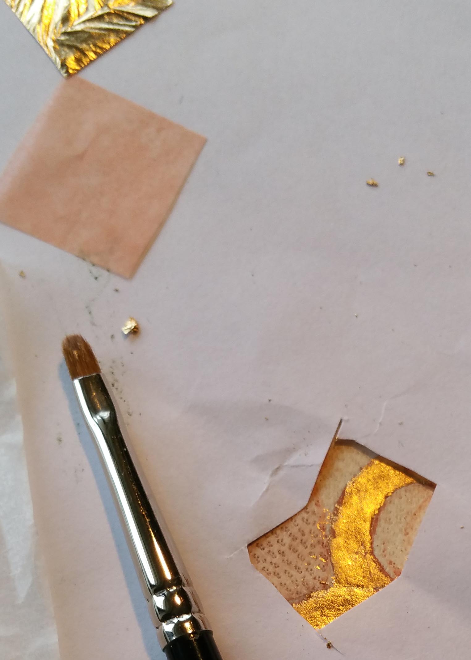
Start by mixing plenty of the golden yellow (you don’t want to run out as it is very hard to remix the same shade). Use a light yellow which brightens gradually by approx. 20% with each layer. Mix yellow ochre light (Maimeri) and a touch of Titanium White. Paint sample swatches to see the contrasts as you want to avoid a big change such as 50%. The photo below shows me trying to find the 20% difference – I will keep trying! It might also help to use a palette with bigger dimples but this was for a different smaller icon.

Mix the white separately before adding to the yellow in very small quantities.

You can’t tell if it is the right colour until you have applied a thin layer and let it dry. Start very lightly on the ear. Wait till it dries before you proceed with the colour. You are aiming for 20% lighter than the membrane layer.
Paint with accuracy. Look carefully 2 or 3 times before you begin. Use this opportunity to correct your underpainting.
With a size 3 brush, (maybe size 2), apply the paint thinly over the higher parts of the face, and feather out with dry brush technique. Use a watered down mix of your colour to feather out edges, but brush out most of the paint on your testing paper first. Build up layers thinly and watch out for puddling!

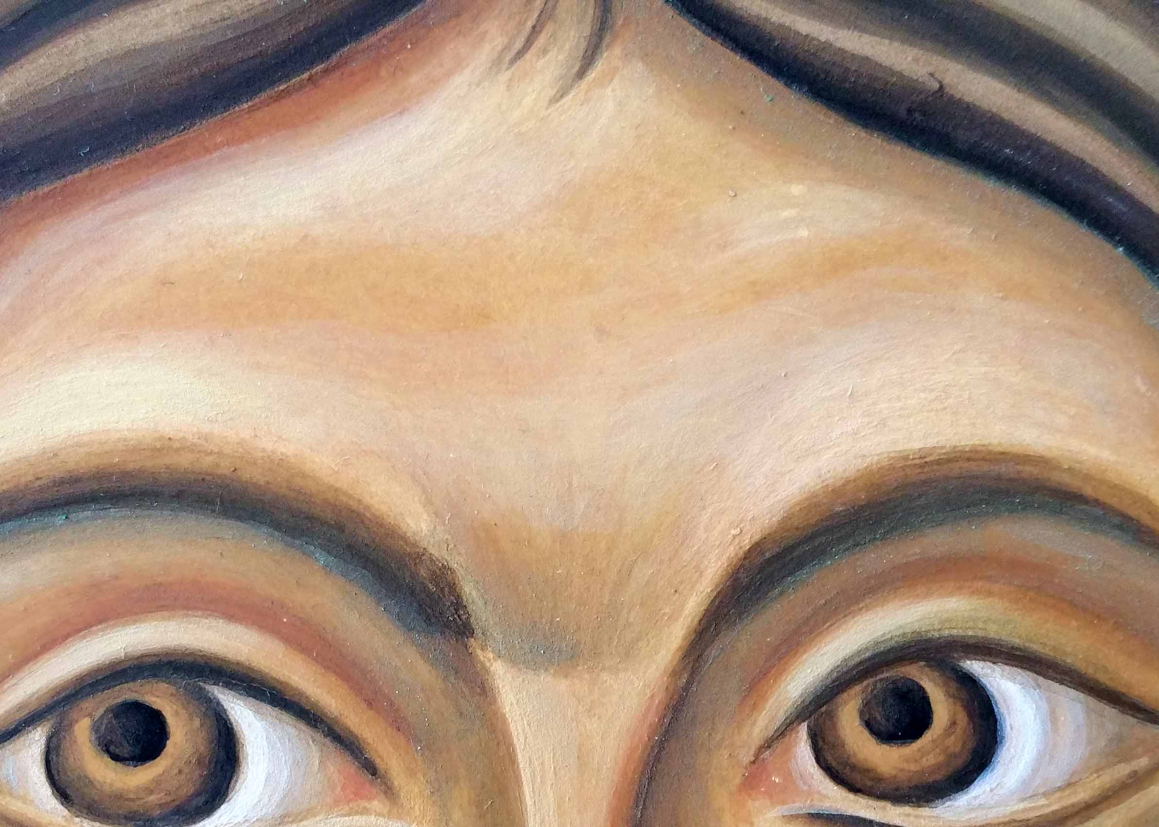
Leave the eyes till a later stage, but include the flesh around them.
Tip: Look for curves and equally, don’t round up sharp corners.
Leave space around the highlights so the mid tone underpainting remains. Wait till it dries then apply another layer of the same mix as it will dry close to the colour of the membrane. Don’t cover all of the membrane.

Make sure the brow bone is deep. Keep the angles of the brow. Mind the direction of your brush strokes and spread the brush to feather out.
Second layer:
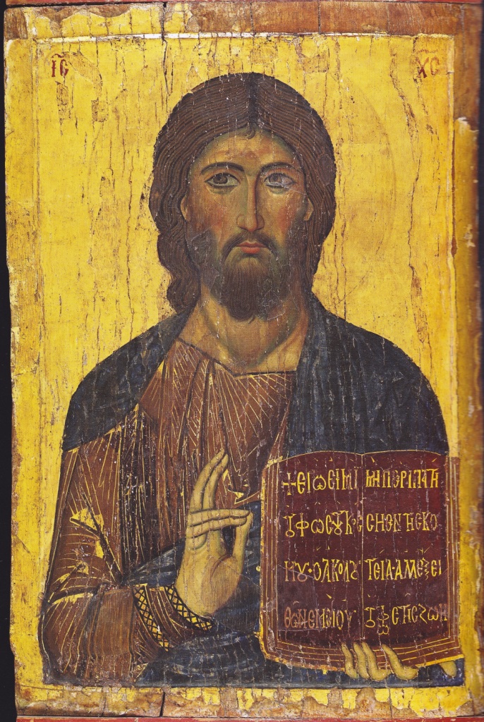
Make sure first layer has properly dried. Look closely at the original and identify the high points of the eyebrows, forehead, nose, cheeks, chin, ears. Note the direction of the face. Make sure you highlight the upper cheekbone to keep the width of the cheekbone next to the eye.
Add a little more white to your mix and test.
Tip: if you go too light too soon, add a thin warm glaze of Italian Warm ochre (French Havanna is very similar). It also acts a harmonising layer when all the highlights (except the ‘snow’) have been applied.
‘No confusion, no division’.
Third layer of highlights
Repeat the process over a smaller area. Be careful to look closely at the high points. The paint has more white and is more opaque. Again, be careful to apply thinly, not too much water, feather out edges and build up in layers. If it looks too white, add a warm glaze.

Tip: avoid sudden changes of depth or contrast. Shading should all be gradual.
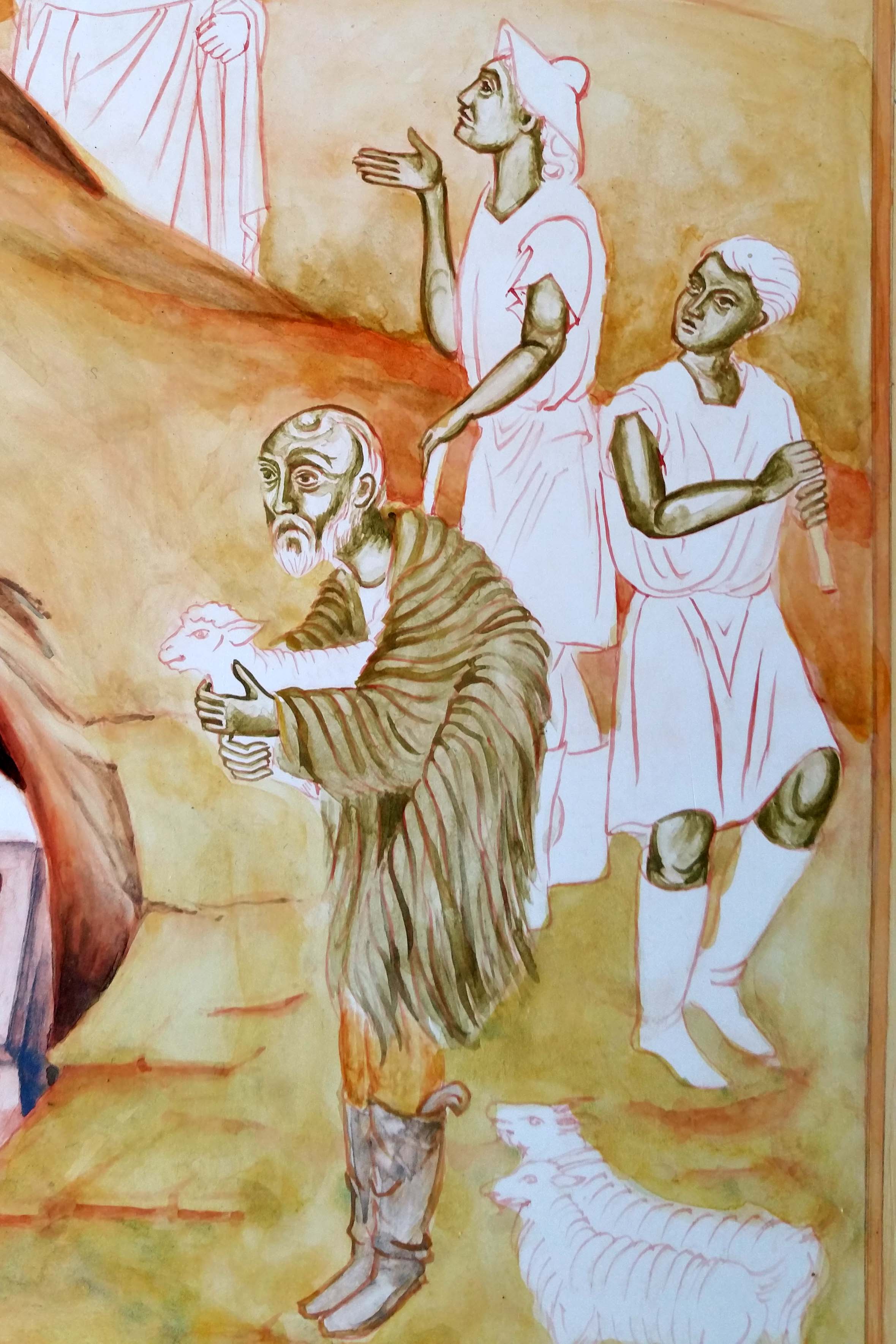
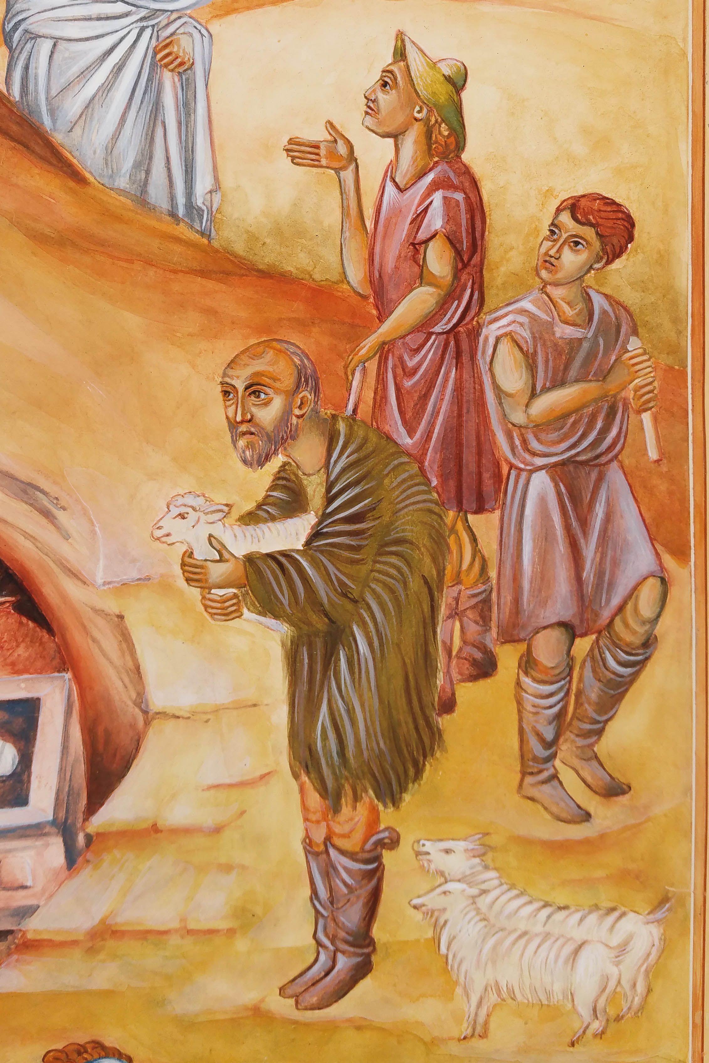
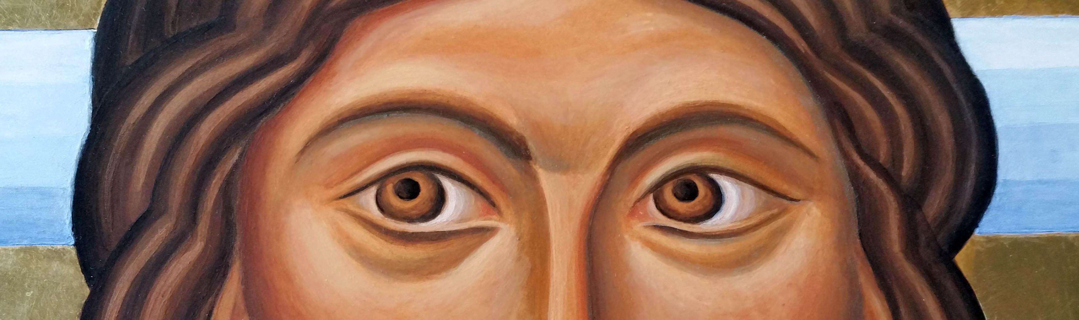
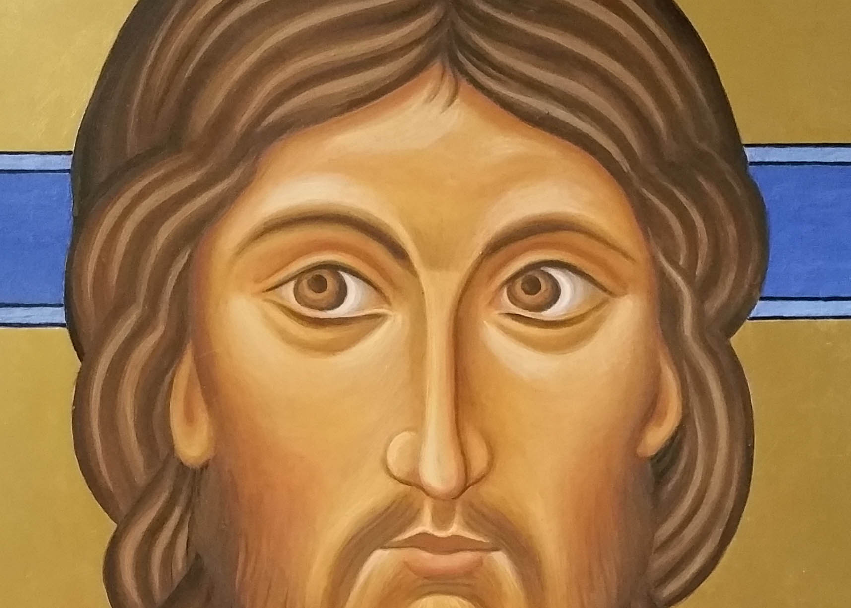
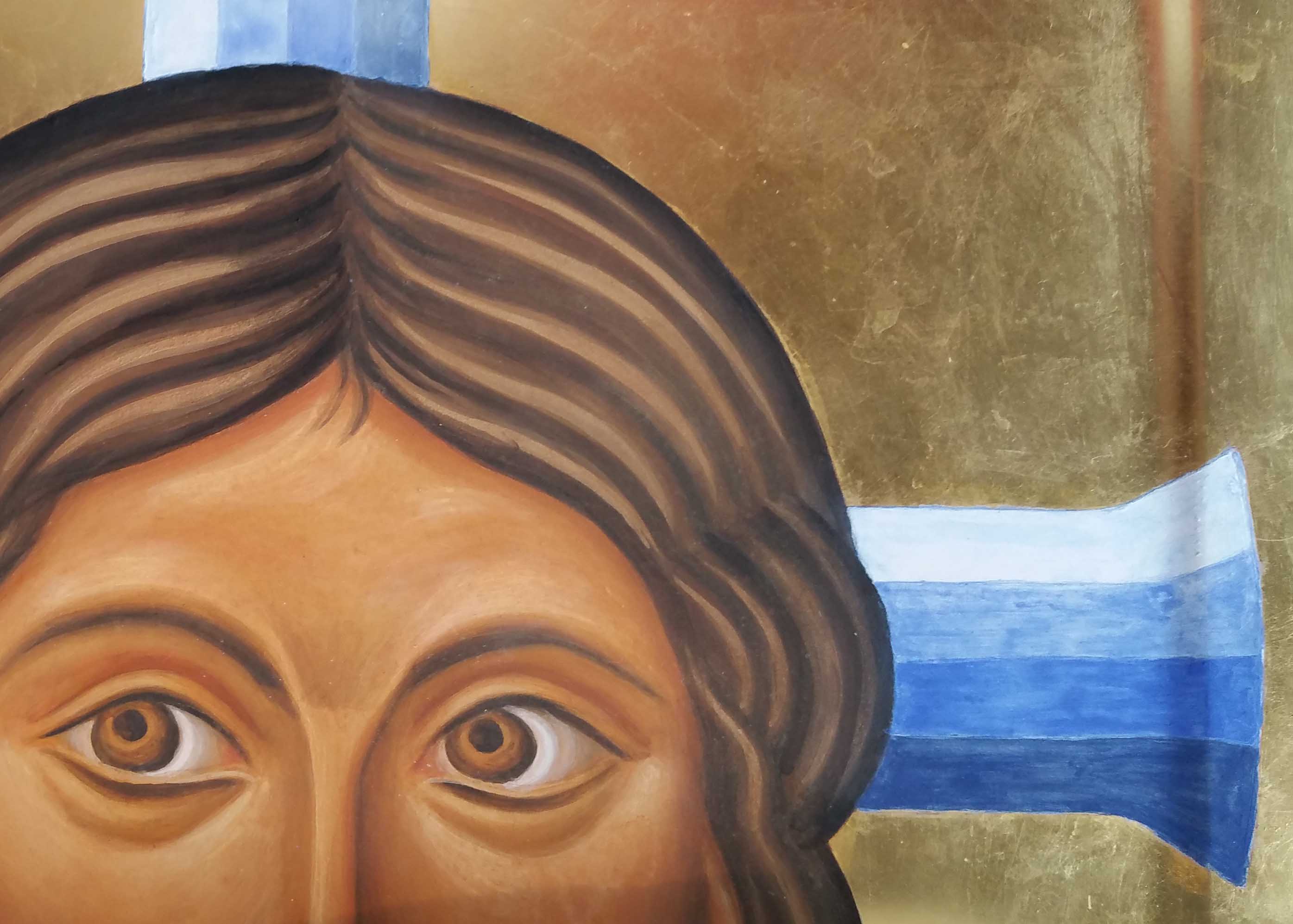
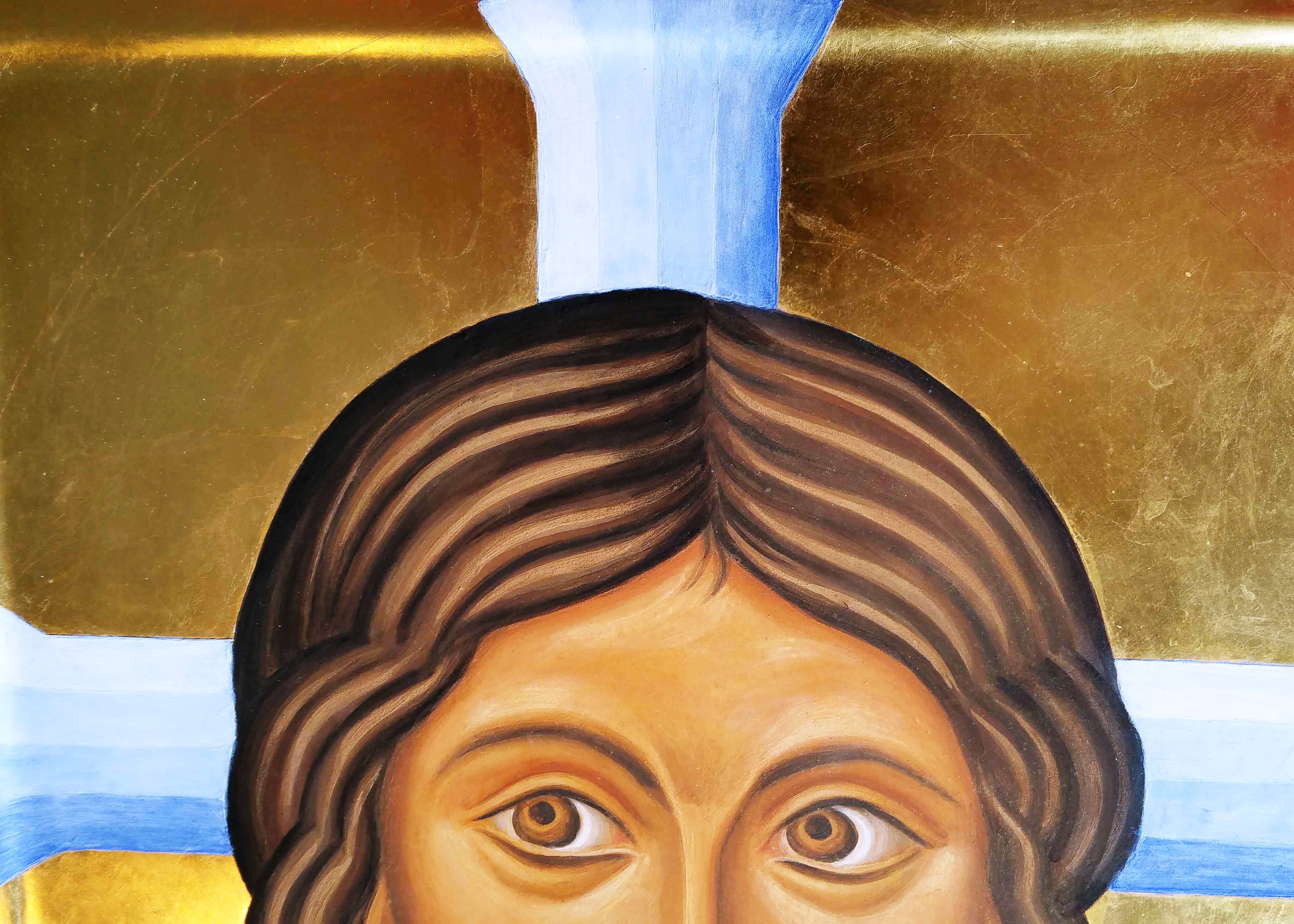
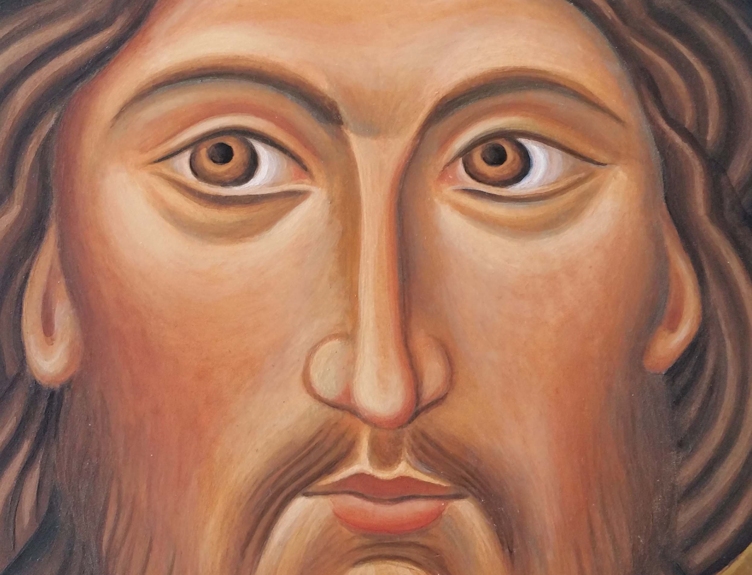
These two photos show that I’ve made a start on the eyes but I will cover the finishing details in my next post. I find the final highlights quite tricky and nearly always go adrift. That said I now leave the work for a week or so and come back to it with fresh eyes. I take a black and white photo and see where it’s out of balance. Or I cover the face with paper and start work building up the garments. There’s always plenty to work on!
I hope to be back soon to finish this sequence of posts and the final ‘snow’ highlights on the face but in the meantime, wishing you a peaceful and happy Advent.

Thanks for reading
Ronnie 🙂
Ps The finished icon can be seen here


