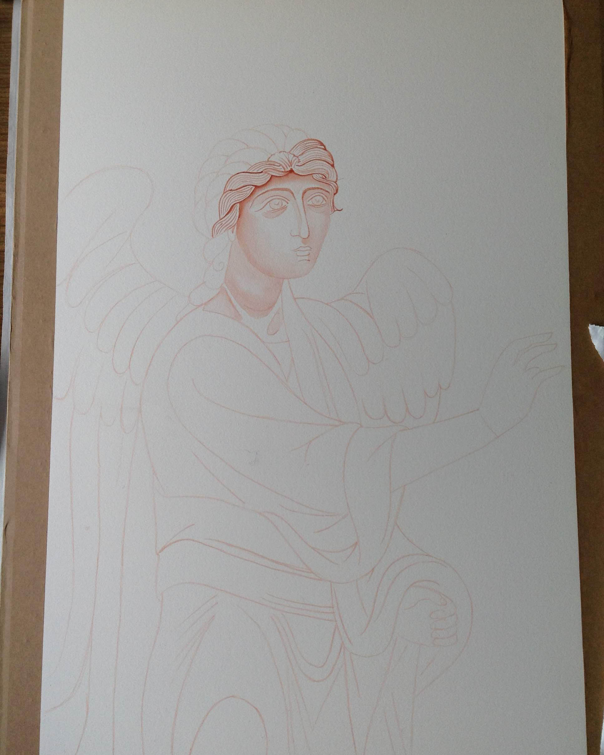
Welcome back to this reminder to myself as to how I painted this icon of Archangel Michael. By this time, the underpainting should be dry and stable ready for the membrane layers.
These layers give the middle tone and I’ve found them quite tricky and easy to go wrong! I’ve learnt that if I smear or smudge it at any stage, just leave it! Go have a cup of tea and wait till the layer has fully dried and only then paint over it. If I do try and tidy up too soon – it leads to patchy holes back to the gesso.
Using Yellow Ochre light (Maimeri) and a little Vermillion or English Red Ochre light and a touch of Titanium White, mix up a warm golden orange. French Ochre Havannah is another favourite of mine for the membrane. Go easy with the white as it’s a strong pigment. It’s best to mix it up separately then add a dash with the tip of your brush until you get a warm rich red gold. Paint out samples of the colour on some paper to see how it looks.
Build up layers until you have a rich deep gold for the mid tones.
With a large squirrel mop held at 45 degrees or less to the board, not upright, sweep a light, even wash of membrane colour over the face but NOT the hair. Apply at least 4 or 5 membranes until you get a rich even golden colour. This is where you see how important it is to have a strong underpainting. If there are area on the membrane which are patchy, apply another layer and puddle in extra pigment where thin.
I’ve added a glaze over the hair to seal the bare gesso
When the membranes are complete, you can apply a separating glaze of 10% egg, 90% water.
Aidan’s Tip: Go easy with the dilute egg stock mix – too much egg leaves a slippery surface which is hard to paint on.
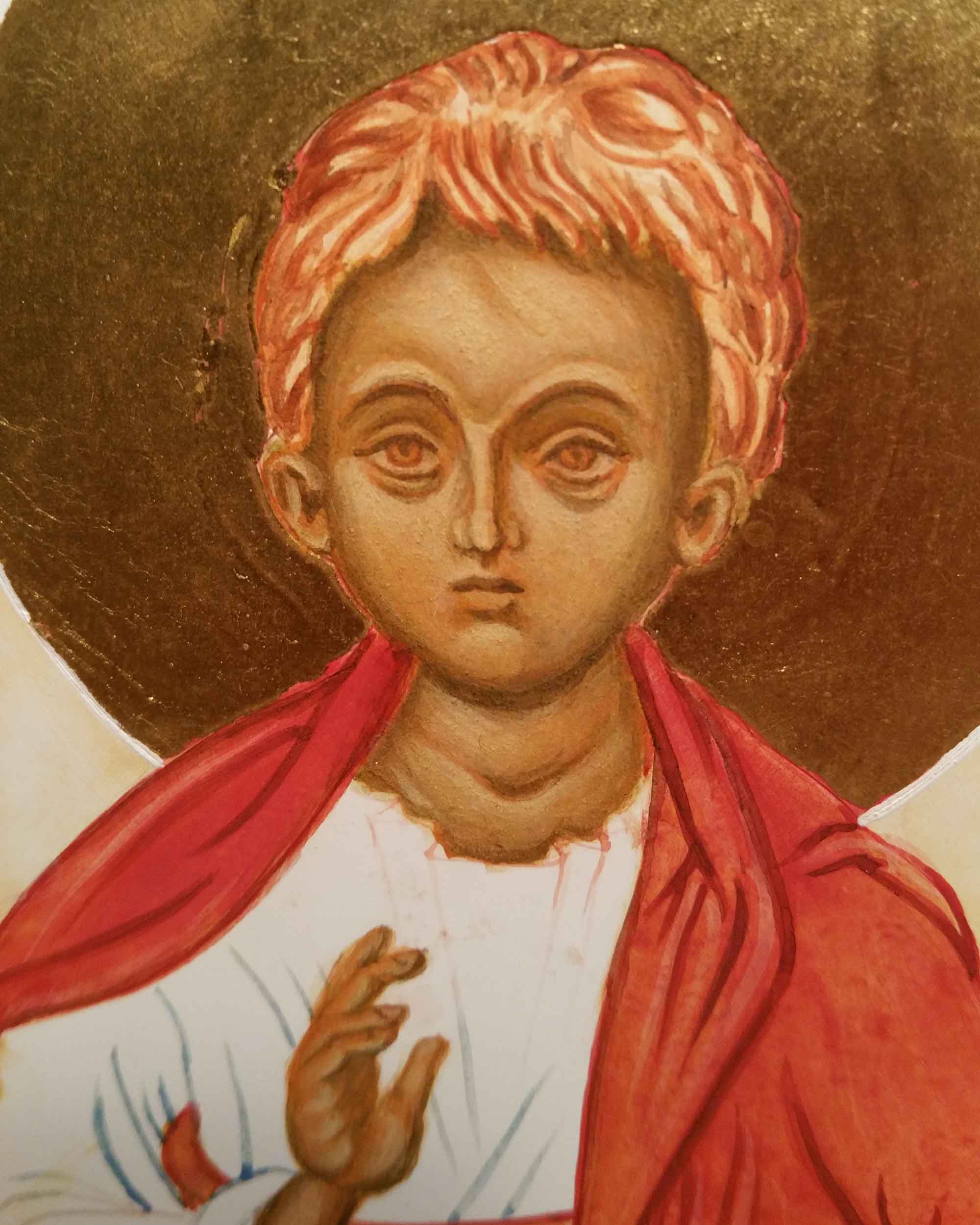
Next stage is to work to deepen the shadows using Avana and a dash of ivory black or raw umber dark.
Modelling the shape of the face with the darker layers
Again, building the forms up in thin layers – deepen the upper and lower eye sockets, the sides of the nose, the cheeks, jaw and hair lines. Deepen the upper lip, the shadow below the nose tip, the mouth meeting line, the corners of the mouth and the dip below the lower lip and round the chin. Model the shape of the neck and where the garments leave a shadow. Last of all, finish the shadows with a thin glaze of dilute egg stock and leave it at least overnight.
Aidan’s Tip: If you get a paintbrush hair (or cat hair!) in the mix leave it alone until the paint is dry, then brush it off. It’s really easy to mess up at this stage and damaging the underpainting.
That’s all for this post…to be continued with adding the highlights.
In the meantime, if you’d like to see the finished icon for encouragement – it’s over here…
A warm welcome and thanks to new subscribers – you’ve nudged me to write! It’s been a while since I painted an icon so I thought I’d write a reminder to guide myself and maybe encourage others to pick up the brush again.
I’m looking back on the process of painting this icon of Archangel Michael (9.5 x 7” on 1” birch ply) looking in particular at the face painting stages with a summary of the earlier steps.
Working from my drawing of this icon, I transferred the key lines using tracing paper. I rubbed a pinch of deep red ochre pigment into the back of the paper with cotton wool, then located the tracing paper image on to the icon board and taped it top and bottom. Using a hard pencil (H or 2H) I traced the lines to transfer the image on to the gesso.
Egg stock in the left dimple and a diluted mix alongside for glazing .
Next step is to fix the powdery lines to the gesso by painting over them with a dilute mix of red ochre. My lines look a bit heavy-handed (see below) but the underpainting should be quite definite to withstand at least six or seven membrane layers.
Going right back to basics here: the egg stock is made up of 50% egg yolk, 25% distilled water and 25% alcohol (gin or vodka). A diluted mix of 20% egg stock and 80% water is used for thinning the paint/glazing. When mixing paint, add the pigment to the stock until it reaches consistency of thin cream. This mix can then be further watered down to get thin layers.
Definite underpainting lines – important to get these in the right place at this stage! Note the small piece of card taped in place to protect gesso from compass point.Masking film applied either side of halo.
When the key lines are in place it’s time to water gild the halo. Water (and oil) gilding needs a chapter, let alone a single post! I’ve covered much of this technique in previous posts but a helpful tip is to apply liquid masking film (I use Winsor & Newton) before gilding. I apply it around the edges of the bole in a band of about ¼” (5mm). Gold sticks to gesso during the gilding process and it can be fiddly to remove.
Applying background in thin layers
After burnishing the gold, I paint the background surrounding the halo before starting on the face. To get a crisp line for the halo, the compass line sits best on bone-dry tempera so I leave the background at least overnight. I use a compass with scribing nib attachment for the line around the halo. I draw the halo line before painting the face to avoid placing the compass point into the finished face. I tape a small piece of card to the centre of the halo to protect the gesso from the compass point.
Compass with the adjustable ink attachment
To paint the halo line I put a few drops of a fairly strong mix of white titanium (single cream consistency) into the side of the nib using a brush to transfer the paint. Dipping the nib directly into the paint usually leads to blobs!
Gilding, background and halo line all in place – ready to start work on the face
Make sure all the features are where you want them to be. It’s a lot easier to move them at this stage! I double check my work by taking photos with my phone and zooming in/out to look again.
Aidan’s Tip: ‘Remember to paint with Distinction and Unity – there is no unity without distinction and no distinction without relationship’.
After gilding, I apply a wash of dilute egg stock (10% egg stock 90% water) to seal the gesso using a squirrel mop brush. This offers an even surface for painting over. I apply these thin coats throughout the process – usually when I’m wrapping up the day’s painting session.
Aidan’s Tip: Remove any pigment which has strayed on to the gilding with a dry cotton bud. Do this as soon as possible as clay pigments set hard and will lift off the gold.
Once the lines are in place then the underpainting and modelling of the face begins (I’ve used a different icon undepainting for this example). I’ve learnt that it’s important to spend time on this stage. Keep your drawing/icon master image close to refer to. Using Avana pigment, paint the form of the face evenly in thin layers ensuring that line weights vary in the appropriate places. For example, brows are thicker, eye socket line is light, the upper brow dense and the lower lid light. The underpainting should be clear and well shaded enough to withstand 6-7 membrane layers.
Building up the underpainting (a different icon)
Larger and more dominant shapes need stronger modelling whilst minor/ shallow forms are best left to be modelled by highlights.
Other colours can be used for underpainting skin tones such as Yellow Maimeri mixed with a little Ivory Black. Also 80% terre verte and 20% yellow ochre (Maimeri light). It’s worth experimenting to see the difference each combination makes.
I cut a paper mask to protect all the other areas where I’m not working.
When the underpainting is in place I apply a very thin wash of avana over the face and leave it. The longer the better! Applying the membrane can be a bit tricky as it’s easy to make ‘holes’ during the process and disrupt the underpainting. If the underpainting has tempered/dried for at least a week it’s more stable to work over. Again not forgetting I live in cool, damp Scotland!
My next post will be about applying the membrane layers and deepening the shadows but in the meantime, if you’d like to see the finished icon for encouragement – it’s over here…
Thanks for reading and all the best with your own icon painting!
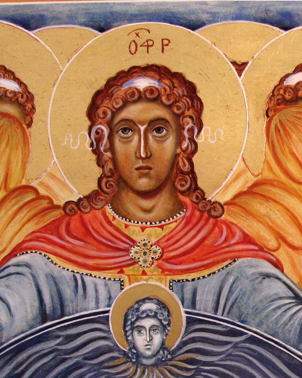
When I completed this icon back in 2018, I was unaware of the names of the angels standing behind the three most prominent archangels. However, when looking up old notes and running a few google searches, I’ve since discovered that similar icon examples show that the figures standing directly behind are as follows: to the left are Jegudiel and Selaphiel and on the right hand side, Uriel and Barachiel.
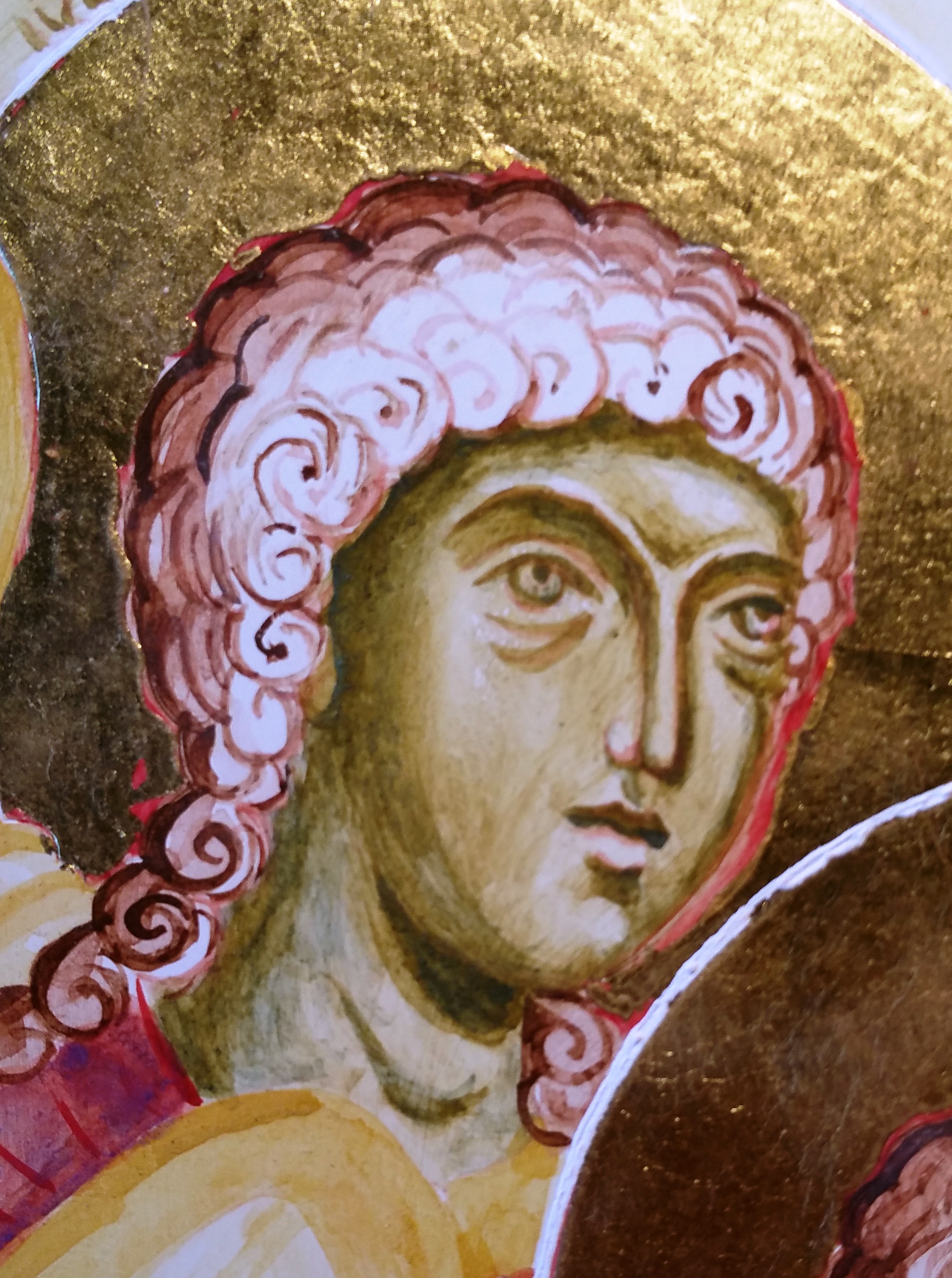
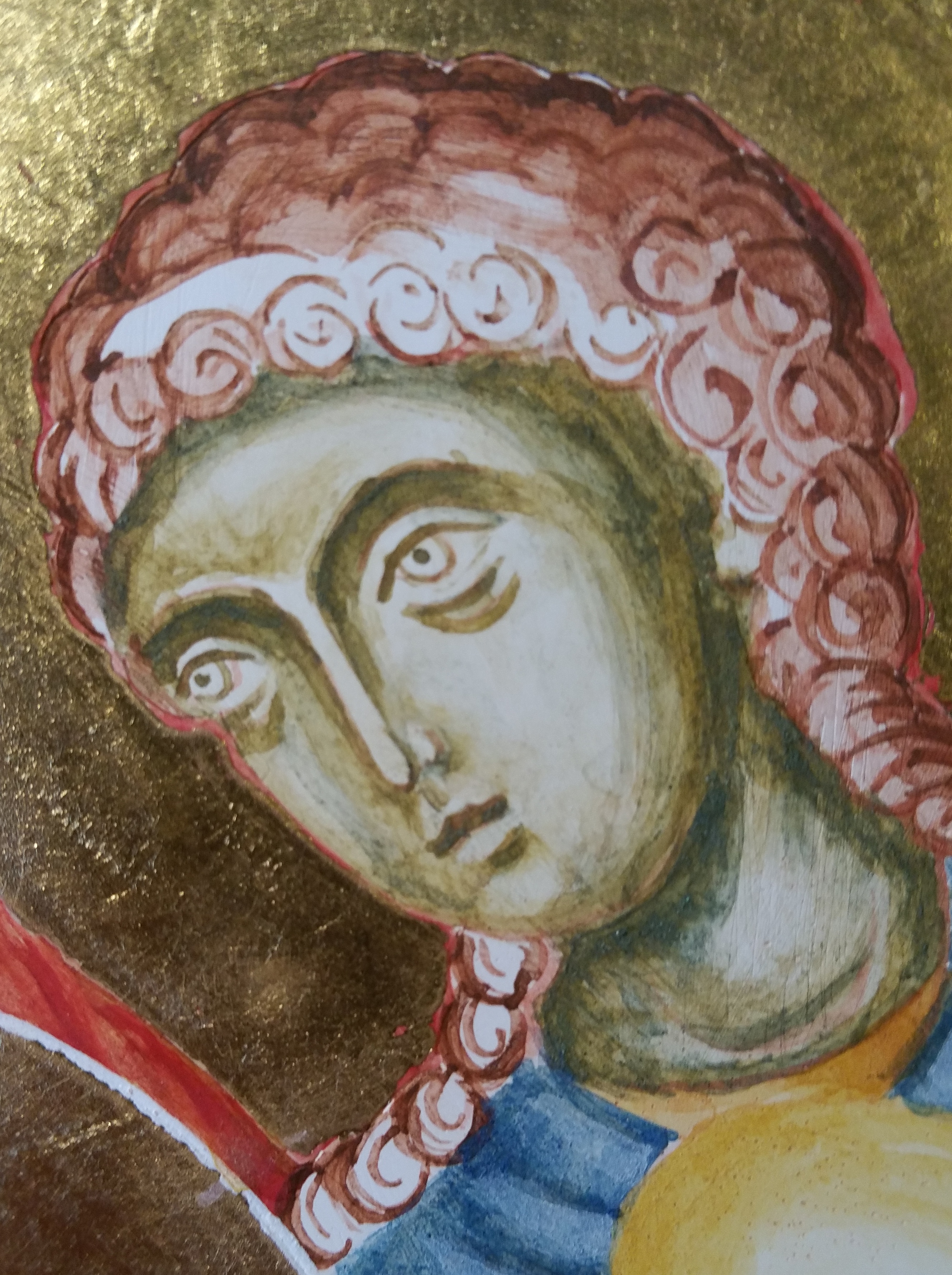
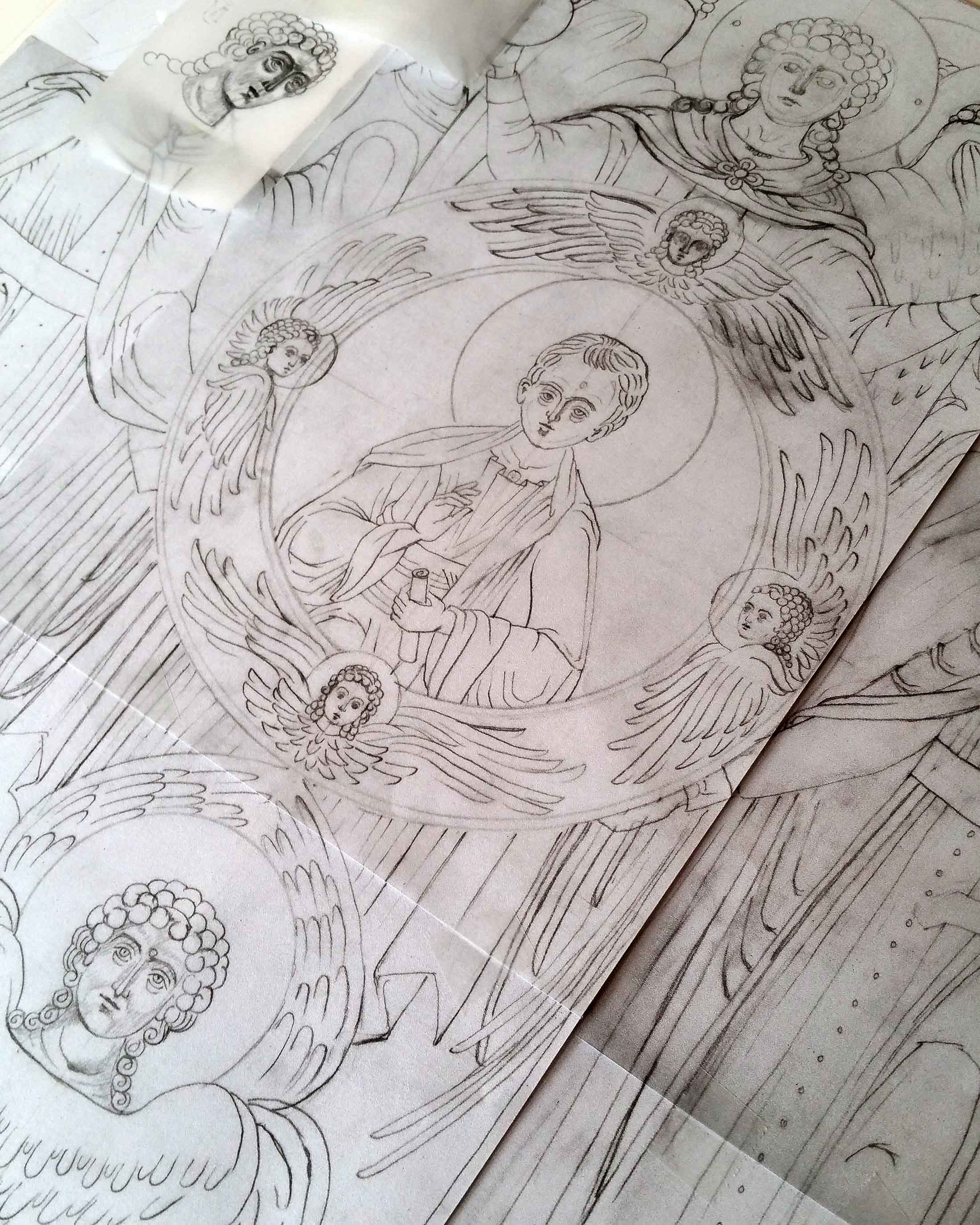
To follow on from the last blog post, I’d like to look at the stages of painting the angel faces. There’s a lot of them! The prototype that I’m referring to is a 19th century Russian icon The faces are captivating.
When painting a new icon, I start by making my own drawing to work from.
The underpainting stage looks quite rough and clunky but it helps to get strong definition at this stage.
Jegudiel (left) and Michael (right)Jegudiel with darkened shadows under chin, sides of lips and along the hairlineArchangel GabrielArchangel RaphaelSeveral layers of the red and yellow ochre membrane appliedMembranes added to all the faces. The face underpaintings have almost disappeared!
It’s somewhere at the stage when the first few layers of highlights go on that you think the face is nothing as you had intended!
These are small faces to paint so every brush move counts. Taking a black and white photo and printing it out at a larger size helps as then I take a pencil/crayon and work over it by referring back to my drawing and observing where I need to make changes.
Finished face of Archangel RaphaelFinished faces of Archangel Gabriel to the front with Uriel and Barachiel behindArchangel Michael to the front, Jegudiel and Selaphiel behind
This icon is now spoken for and soon will be making its way to a loving home.
Just a reminder that I’m holding a ten year anniversary sale on all my remaining icons listed here. As soon as someone makes an enquiry, I place it on hold and remove it from the list. I’m happy to give people time to consider.
As always, thanks for reading and happy icon painting.
When painting a large icon, it helps to try and progress things evenly across the panel. I’d like to show you how I approached this in this post but also want to focus on the steps taken as I painted the Christ Child at the heart of this icon. I also have some exciting news… more about that at the end of this post.
An icon with so many figures and halos can be quite tricky to paint so it’s worth pausing to think about the sequence of work. Top of the list is to remove the protective pads as soon as I can; they can leave a sticky residue if left on too long.
Small pieces of card taped to the gesso as protection pads.
Before I scribe defining lines around the halos, a certain amount of painting needs to be done around them first. The halo lines are adjacent to the hair of neighbouring angels and central the blue ring also touches the halos of the Seraphim. These need to be painted and allowed time to thoroughly dry out. I’ve found that when scribing lines on paint that hasn’t dried or ‘tempered’ for a day or so tends to spread.
Small triangles of hair meet edges of halos – better painted before the halo lines are scribed
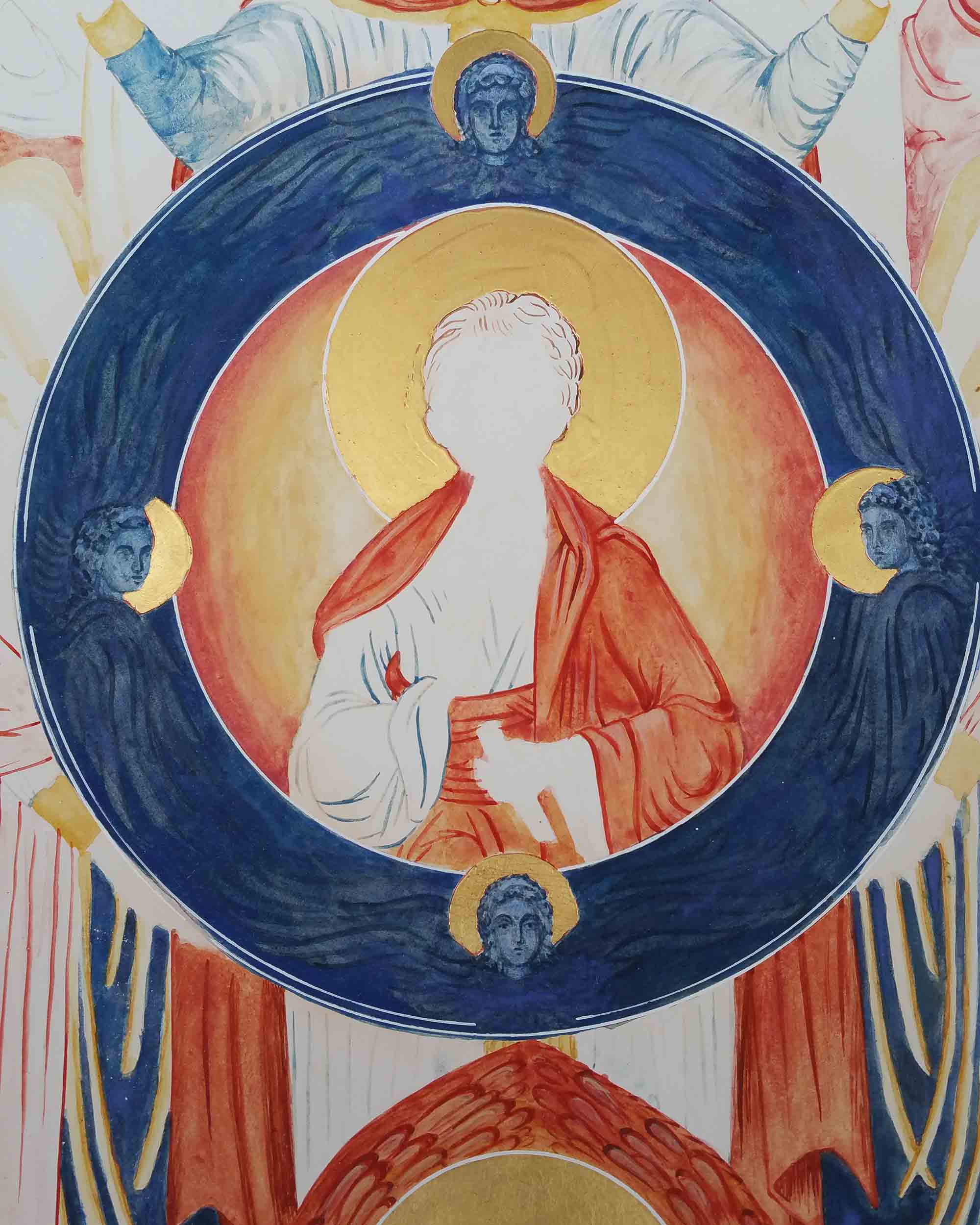
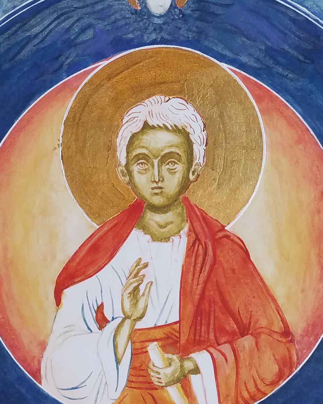
At the centre of this icon is the young Christ with one hand raised in blessing and the other holding a scroll. The young boy is wearing a rich vermillion cloak and sash, radiating a gold (yellow ochre maimeri) light contained in an outer circle of seraphim. I decided not to paint all the garments surrounding the ring as I thought I would be able to work fairly neatly up to these edges.
I referred back to my initial drawing to trace and transcribe the face.
I have learnt to be very careful with strong lines when underpainting a face – they can be hard to integrate later. Better to have just a few key lines in the right places as reference points to move from then shade in thin layers, building up depth gradually around the cheeks, below chin and brow, to the side of nose and under the hairline.
Below you can see I’m building up all the faces at the same time, gradually deeping the shading. I’ve used yellow ochre maimeri and a tiny dash of ivory black to give a greenish yellow underpainting. You can also use Terre Verte for underpainting faces but this pigment can be quite sticky for painting small fine facial details.
It’s worth going quite dark with the shading – it will all get held together by the membrane layers. Don’t forget to add a few glazes of your egg mix – diluted with a few drops of water and let it dry before you add the membrane. These are tiny details but they help bring it all together. The egg seals the gesso below to provide an even surface for the next layers.
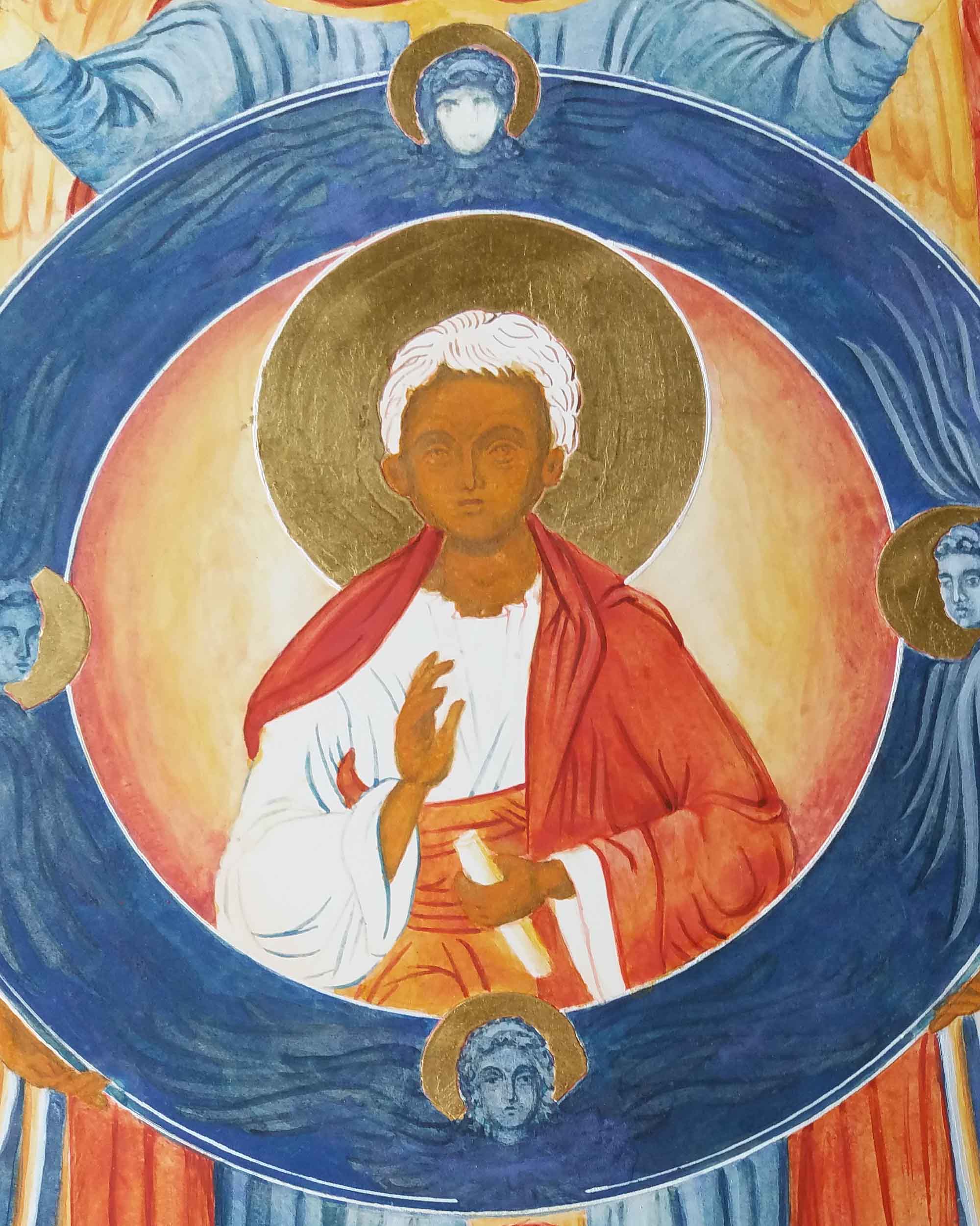
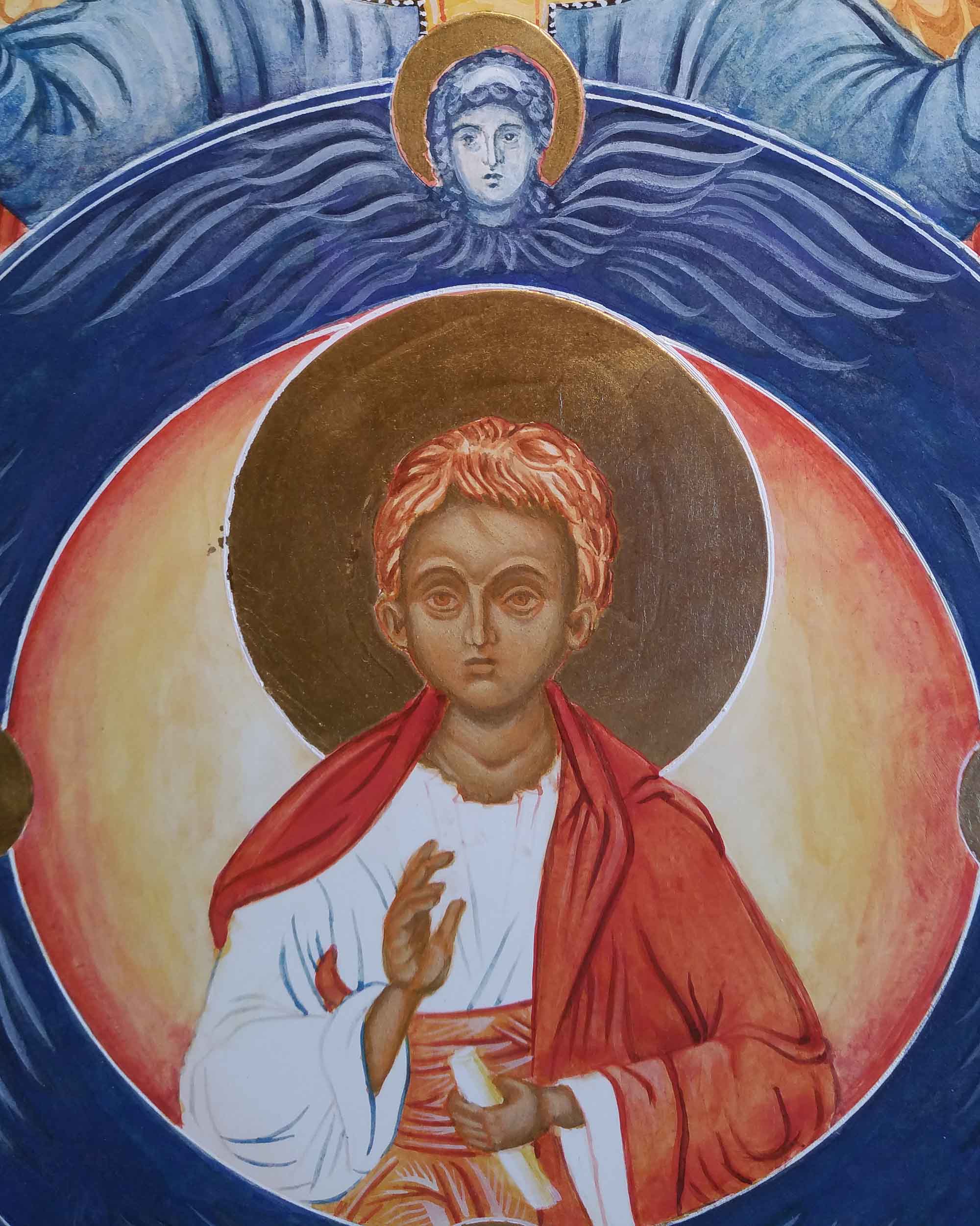
I’ve used English Red Ochre light and Yello Maimeri for the membrane layers. Add just enough membranes to make out the features. At this stage I leave things for at least a week and work on other areas. This is only something I’ve learnt. The more this layer is left to temper, the easier it is for you to correct mistakes without making a hole back to the gesso. You can read about that one here!
Darkening shadows and defining the features with ochre avana.
Building up highlights with very thin layers of yellow maimeri mixed with titanium white.
If at any time the highlights look too stark, add a few thin layers of French Ochre Havanna to even things out.
Finally, add whites of eyes, black pupils and eyelids, the lettering, ribbons, shell gold and fine jewel details on the garments.
Now for that exciting news… This year I’m celebrating ten years of icon painting and sharing my work here on this blog. As a big thank you for your company and comments over the years I am offering ALL my icons (including this one) in stock listed here at half price for the month of February. This offer will not be found on any social media page as it is excusive to all my readers, past icon buyers, friends and family. Postage will be added at cost and the icons will be sold on a first come first served basis – please get in touch if you would like one.
As always, thank you for reading and happy icon painting!
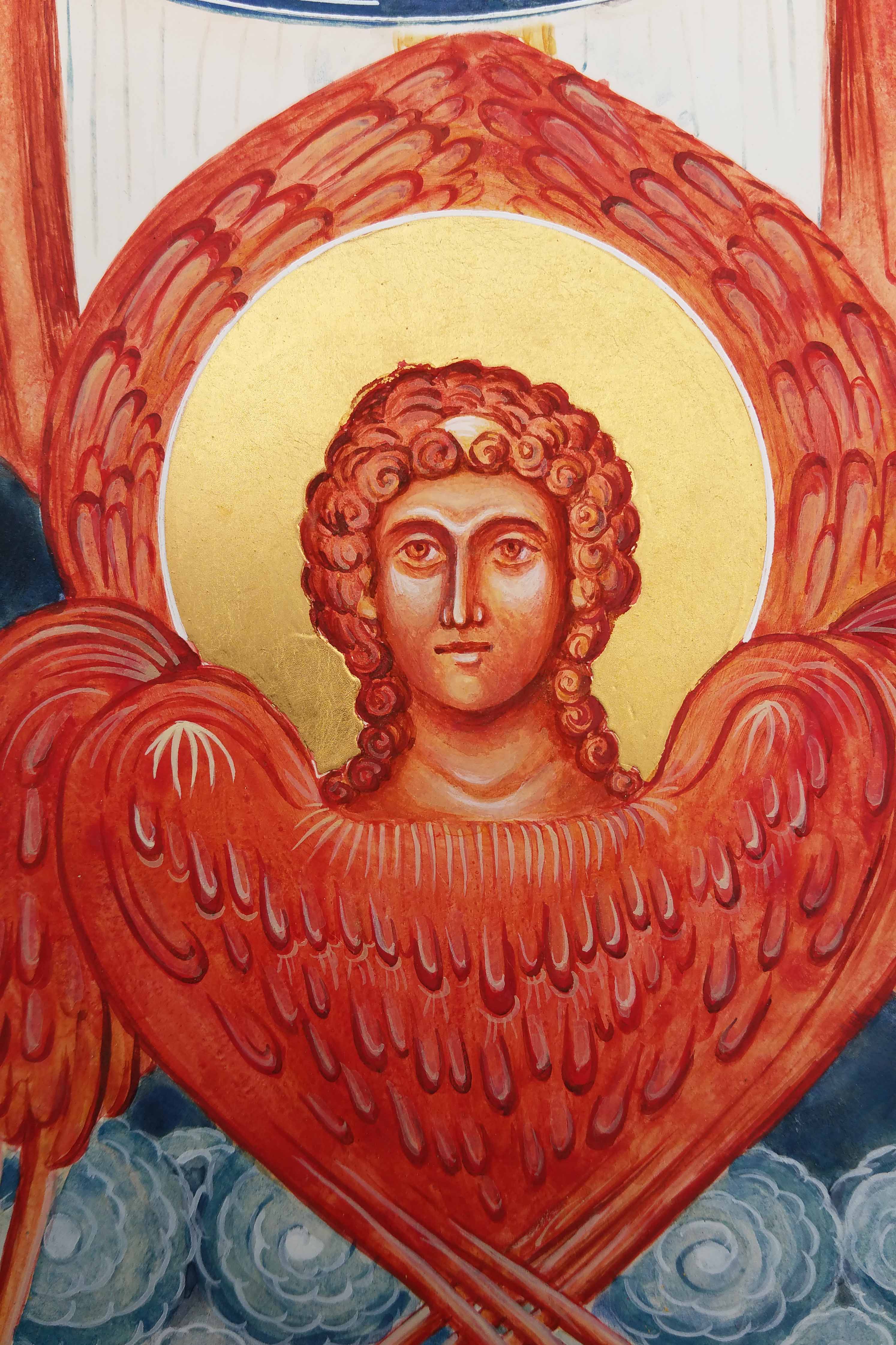
With the swirling clouds in place, I moved on to the central part of the icon of the Council of Archangel Michael and the red winged Cherub below. I’m going to zoom close up on what is quite a small face – about 2cm diameter.
For clarity, I’ve mentioned previously that on historic examples of this icon, there has been some fluidity in the colours, positions and naming of cherub(im)/seraphim/standing angels. If you google ‘The Synaxis of Archangel Michael‘ you will see some of these but for now, I’ll refer to the multi-winged angel here as Cherub.
Each phase of icon painting is a fresh start. I find it helpful to start with something simple and here I picked up by underpainting the hair of the standing angels in English Red Ochre pigment. I also used it for the Cherub’s hair even though this figure will be mostly painted in Vermilion.
I painted the wings in thin layers of Vermilion and Italian Gold ochre. This reflects the sphere of red-gold surrounding the Christ child. There are many yellow ochres – any of the brighter ones will work.
The clump of masking tape left sitting in the blank face is now going to be useful – for a reminder I wrote about this here. The layers of tape protect the gesso from the compass tip puncturing it and the tiny centre point is still there to locate the compass again. For the line around the gold halo, I mixed Titanium White egg tempera to a consistency of single cream – it’s worth testing the paint flow before you start.
Time to draw the white line around the halo
When the paint on the upper wings has fully dried out – at least overnight, set up a compass with a dip nip. Scribing lines around halos takes practice – do a few trial runs before you go for it! If the paint hasn’t fully dried, the white line will spread or bleed. If this happens, just remove the paint with a brush and do something else and revisit it a good bit later!
When the line is in place, you can remove the masking tape and go back to the drawing and transcribe the face ready for the underpainting.
Here’s my drawing of the Cherub.
Working with English Red Light pigment I under-painted the Cherub’s face. I’ve learnt over the years that although egg tempera dries fast, it isn’t that stable to work over for at least for 24 hours. It’s all too easy to apply a membrane/glaze over a finely painted face but then if I apply a little bit too much brushwork, the under-layer can move!
It helps to paint several other things at the same time – in this instance I had plenty of other angel faces to underpaint.
Underpainting of the face in English Red Light ochre
The rest of the faces are under-painted in a mix of Yellow Maimeri and a tiny dot of Ivory Black to make a soft green.
Here’s a little bit of work-in-progress with the rest of the icon.
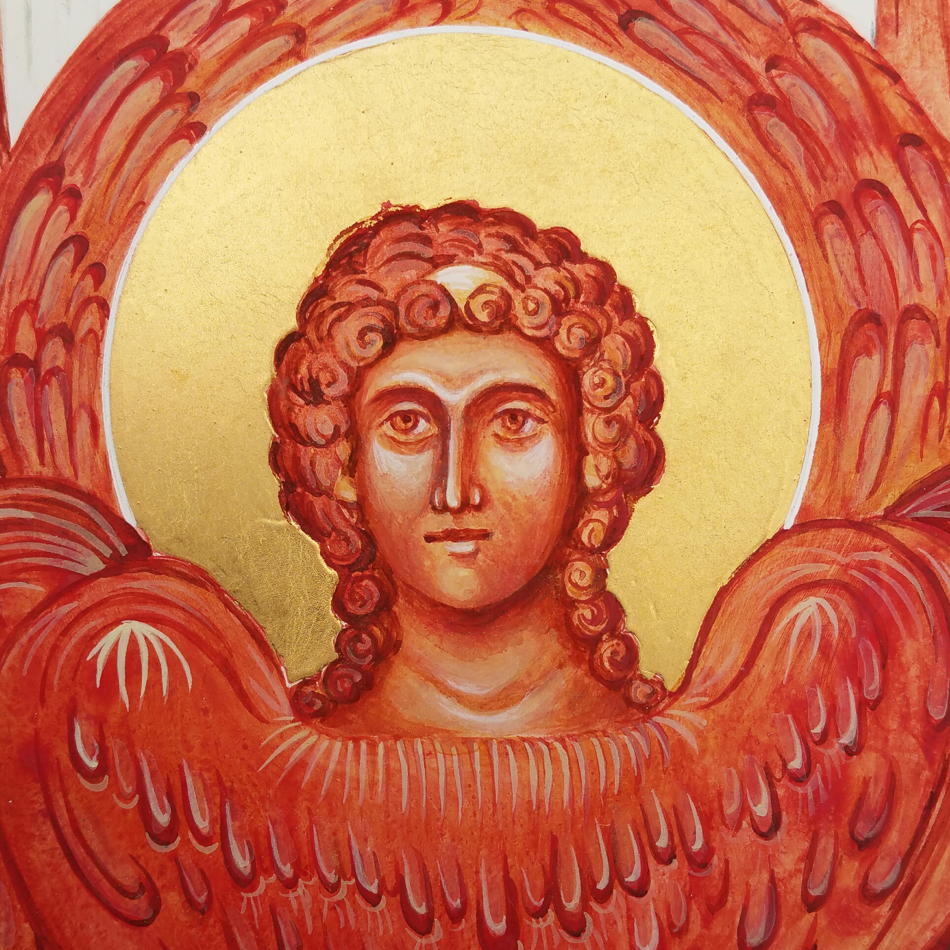
I’ve used English red deep for the darkest parts of underpainting the Cherub’s face and hair. Every now and again, apply a thin glaze of clear egg mix.
Build up a strong face with deep shadows and bright light areas – then you are ready to apply the membrane layers.
Add a few clear egg glazes to bind the underpainting.
I used Italian yellow gold pigment in several thin glazes over both the face and hair.
Gradually add thin layers of highlights in white to the brow, eyelids, cheekbones, nose tips, lower lip and neck.
Finally, there are the highlights to the wings, the sides of the eyes, headband and a little light gold to highlight the curls.
I hope this has been a help or given you a nudge to pick up your brush.
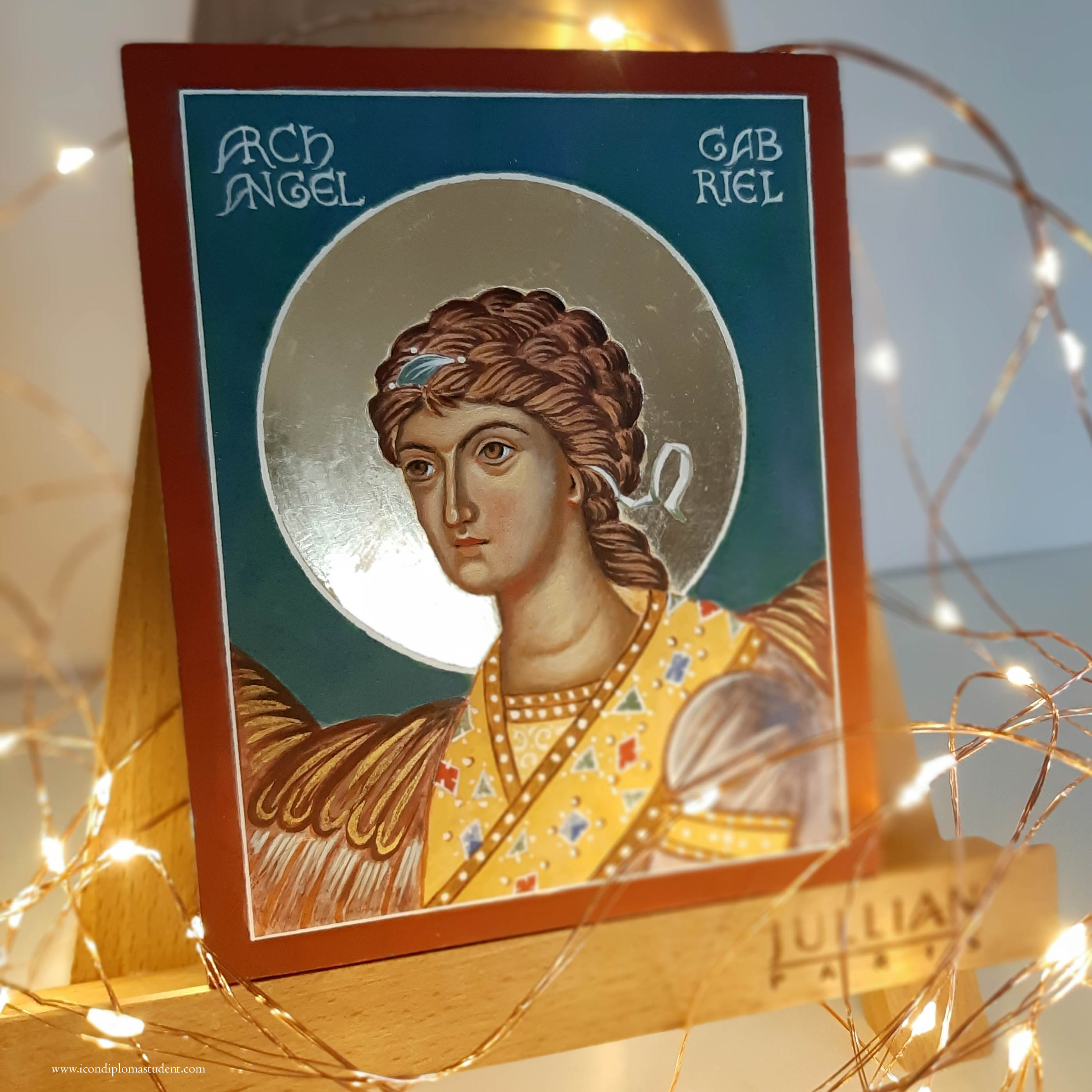
Archangel Gabriel, Icon size 14.5 x 11.5cm x 2.5 cm thick birch ply
Hand-sized icons are tactile and so beautiful. A few years ago, I had some thick birch ply cut into a selection of small sizes which I gessoed all at the same time. In many ways, they are just as much work as larger sized icons (and can be harder on your eyesight!) but they become such a relatable size.
Some photos below show a few steps of the process of painting a small icon – this one is of Archangel Gabriel. As we approach Christmas, I just wanted to close 2022 with a practical post, perhaps to inspire you for the New Year year ahead!
Below are a series of photos of the process of painting this hand-sized icon. Hope they help you in your own work!
Cut pieces of Birch Ply with scrim applied ready to gesso.Boards have been gessoed and now held in a Black and Decker work mate ready for me to sand off the rough edgesEdges all sanded. I also give a light sand to the gesso to remove the rough surface ready for hand sanding.Bole warming in a bain marie ready for gildingFirst layer of gold leaf applied to halo – note the masking tape over a small piece of card to keep the centre point of halo. Also I have applied masking fluid to save scraping off the gold from the gesso.Burnishing the halo after gildingPainting the background and letting it harden/temper overnight before adding the white line of halo (otherwise the paint spreads)Using the dip pen compass to apply the white halo line. Once in place, remove the masking tape/card from centre point. Applying a few coats of dilute egg glaze to seal the gesso ready for painting.I wrap the icon in tracing paper to protect it as I workUnderpainting the face using a mix of Yellow Maimeri and a little Ivory BlackApplying several thin layers of membrane in a mix of yellow ochre and a dash of red ochre glazesWorking into the darker areas of the face with Avana Ochre Gradually add thin layers of face highlights in Yellow Maimeri and white – if it all gets too stark, add a wash of warm Italian goldStudio audience!The next part is to complete the garment, hair and wings and then to add the lettering.Then finish the sides, add hooks and cord.
The finished icon can be seen here whilst available.
Wishing you and your families/friends the peace, light and love of Christmas!
Every now and again, I’m asked how to get started icon painting. I always recommend painting monochromes on smooth (hot pressed) best quality watercolour paper. I recall the first time I saw some of these red ochre studies by Aidan Hart’s past students and I found them captivating. They were on the wall in a workshop given by Aidan Hart at Walcot Hall over 10 years ago.
Use a very thin light line of ‘English Red Light’ red ochre egg tempera with a sable brush to mark the outlines.
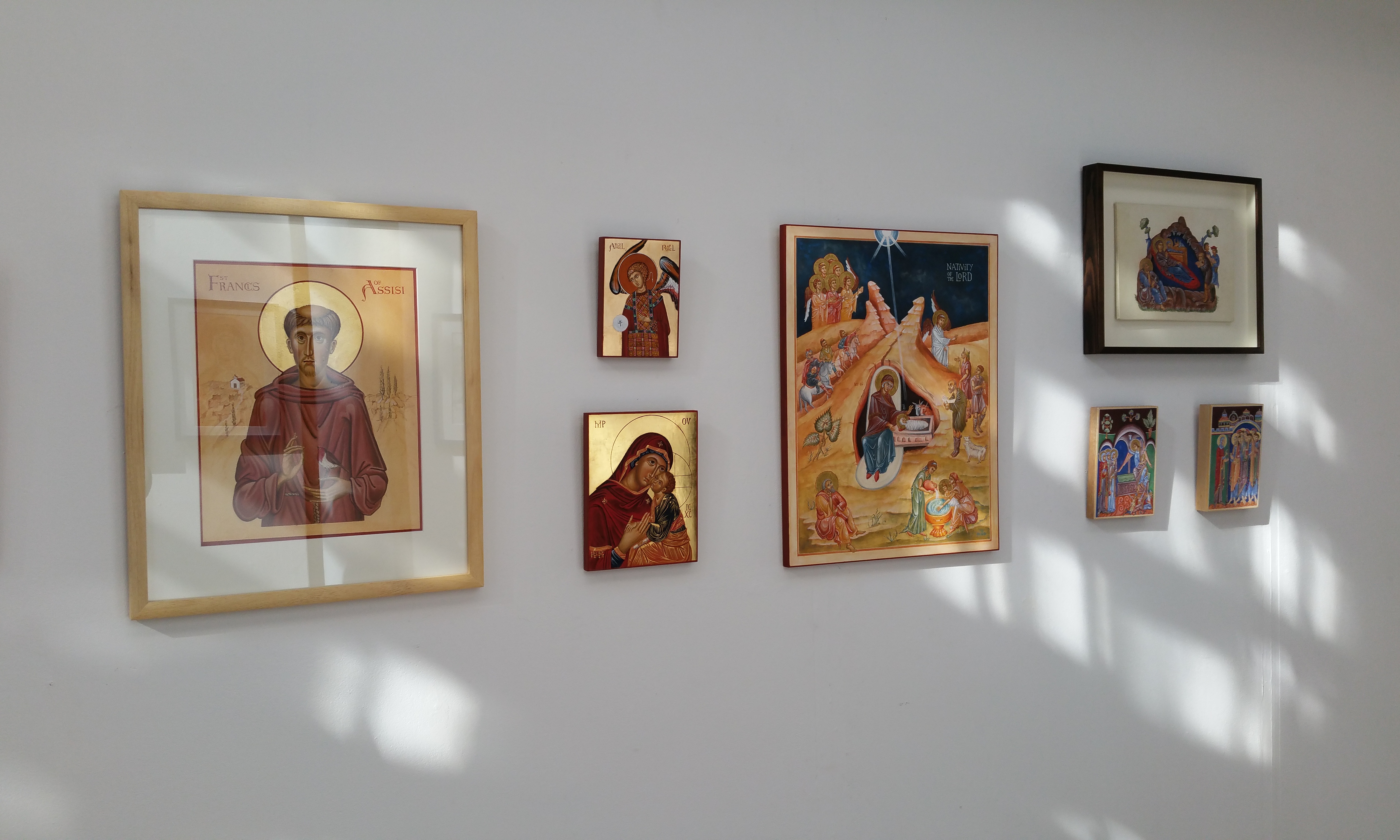
For the last few weeks, I’ve been having a bit of a sort out of my studio (and my overspill areas). Over the last few years I’ve gathered quite a gallery of work that’s lying unseen as I have no more wall space!
I made a decision to go through all my work and list it for sale in my Etsy shop as I can’t keep holding on to things – there’s no room to move! Also, letting go of things makes way for the new so let’s make a start with looking back over this large monochrome of Archangel Gabriel.
Gradually build up the shape of the face in very thin washes. I’ve been impatient with the dark hair lines
Before I go any further, I have already written about this monochrome here. It’s really interesting to reflect back on this post from 8 years ago as I’ve become a lot kinder to myself. I can see that things I once thought weren’t good enough actually were a great foundation – they just needed a bit more work and creativity. SO – if you are being hard on yourself – put your work away for a few years then revisit when you have had a few edges knocked off and away you go – again!
Building up the forms of the hair and face
The best way to start as always is with a drawing. Sometime this too can be daunting so be kind to yourself – this is a learning process. You can always make a tracing of the icon you want to paint by outlining the main forms to get familiar with the shapes, shadows, proportions and lines. You could also try laying a grid over the prototype, then draw into your own grid at a larger scale. This can help you can anchor the key features.
With this monochrome – I drew onto a large sheet of cartridge paper (inexpensive paper is fine for this stage), then traced over and rubbed red ochre pigment into the back of the tracing paper. It is them ready to transcribe on to the watercolour paper. You could use pencil but the graphite smudges and I wanted to keep the paper clean.
The paper has been stretched with a damp sponge and taped to a board.
I use Fabriano Artistico Hot pressed watercolour paper, 300gsm. You can use other brands, but the weight and the hot pressed finish are really well suited to monochromes. I stretched this one but I didn’t really need to. Even though the paper can buckle, it can also be flattened as I discovered later. There are plenty of You Tube videos to help you do this but in short: face the artwork down on a clean dry sheet of paper, place a spray dampened sheet of paper over the back, then place a pile of books on top and leave for a few days. This works a treat.
The face of Archangel Gabriel…but there’s something missing…
Once you have the red ochre line in place from the tracing – it’s best to fix it in place using a dilute mix of egg tempera in red ochre or whatever colour you are using – the red/gold/earth ochres all work well. I think the most valuable thing I’ve learnt from painting these is not to rush them – work in the finest layers you can and build up very gradually.
The almost finished Archangel – with a finely layered background of very thin washes of red ochre.
Looking back through my old notes from Aidan’s class, I wrote as follows:
Eyebrows: When painting the eyebrows, the top line is soft and the ends are also soft. Look at an eyebrow, the hair is densest lower down, then feathers upwards (not as I have done here!). When painting the brow, show the graduation of tone. Facial features grow out of the background. Find the high point of the eyebrow in relation to the rest of the curved brow. Pay attention to the descent of the brow.
Lips: Look at the lips in profile, the light falls and hits the lower lip, the upper lip is drawker and in shadow. The lower lip projects and the recess below the lip is alos in shade. Note the gap at the corner of the lips.
This monochrome of Archangel Gabriel has only had a few brief outings since my diploma. Once in a short lived exhibition at the Bar Convent in York and a couple of weeks on the walls of the Tolbooth, Lanark. Lockdowns – say no more!
Protect the icon with paper and start to map the outline of the head band
When I looked at this the other day I realised there was something missing…the hairband and ribbons! This is quite significant as Archangel Gabriel is the patron of communication and this goes two ways – listening and responding. The ribbons either side of the ears are symbolic of listening – important! I had based this icon on the prototype of the Ustyug Annunciation icon. This doesn’t show the ribbons but since I have learnt the symbolism of the ribbons – they are too significant to leave out – so on they go – very late but much needed additions.
Adding a film of titanium white to form the headband
Final headband and ear ribbons
Gold leaf is not the best surface to paint over but I laid a dilute layer of egg tempera mix first, let it dry and built up in layers. I used quite a lot of egg mixed with the white pigment and applied it thinly. It goes on with a lot of beading at first but as it dries, each layer helps the next.
Finished monochrome of Archangel Gabriel.
The finished size of the overall mounted work is 50 x 70cm and now listed in my Etsy shop. Postage and insurance have shot up, especially overseas. The weight, packaging and protecting the glass of a large frame really bumps up the price so I’ve taken this out of its frame and will post in its mount and backing ready for the new owner to frame.
As always, thanks for reading and for still being here on this meandering path with me 🙂
The profoundly beautiful Armenian Nativity created by T’oros Roslin in the 13th Century remains my favourite Nativity icon. I painted my own version on vellum back in January 2016 in preparation for the Festal Nativity icon (on a large gessoed panel) which was part of the final year of the Diploma.
This is a silly busy time of year for many of us but I’m posting this here now for you to find sometime in future when you do find a quiet moment.
Diploma NativityArmenian Nativity
The primary shepherd on the large Nativity icon (above left) was a direct reference to the figure in the Armenian Nativity scene. I liked his expression and woolly tunic! (If you want to refer to the finished diploma icon you can see it in more detail here).
Caput Mortuum is a mysterious rich deep maroon colour and looks to me the colour used in the Armenian Nativity original. The name translation from Latin is ‘dead head’. In the Merriam Webster Definitions dictionary we find one definition “alchemy : the residuum after distillation or sublimation” also “a red iron-oxide pigment made by calcining iron sulfate“. To me it’s the colour of an aubergine and when placed next to lapis lazuli, the colours sing.
Caput Mortuum next to Lapis Lazuli
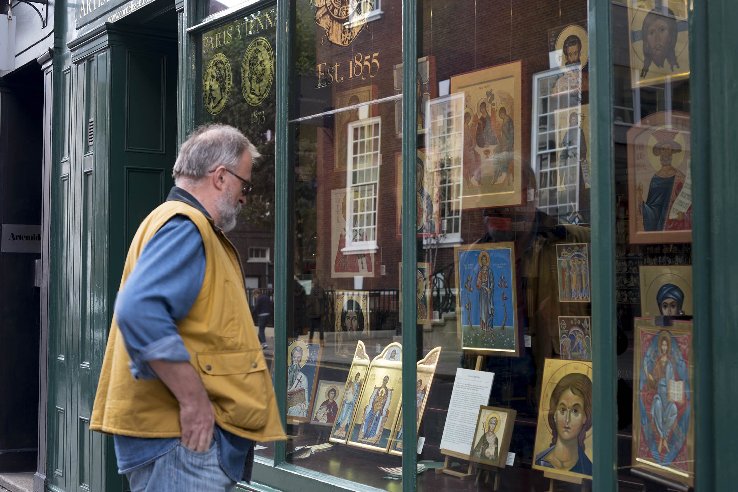
Reflecting back to the time that I painted the Armenian Nativity, you’ll have no idea how over the moon I was to participate in the exhibition curated by Patricia Lovett and held in the window of Cornelissen’s . It was all part of the Heritage Craft Week 2016 which I wrote about here. If you’ve never heard of Cornelissen’s then treat yourself to a minute inside their London shop here.
?Heritage Craft Week Exhibition 2016 in the window of Cornelissen’s, London
Patricia – if you are reading this, that exhibition and subsequent synchronicities led to the class of 2013-16 final-year diploma icons being displayed in the same window (below) and repeated three years later with the next icon student intake – THANK YOU!
Window shopping – Cornelissen’s, London
Back to work…
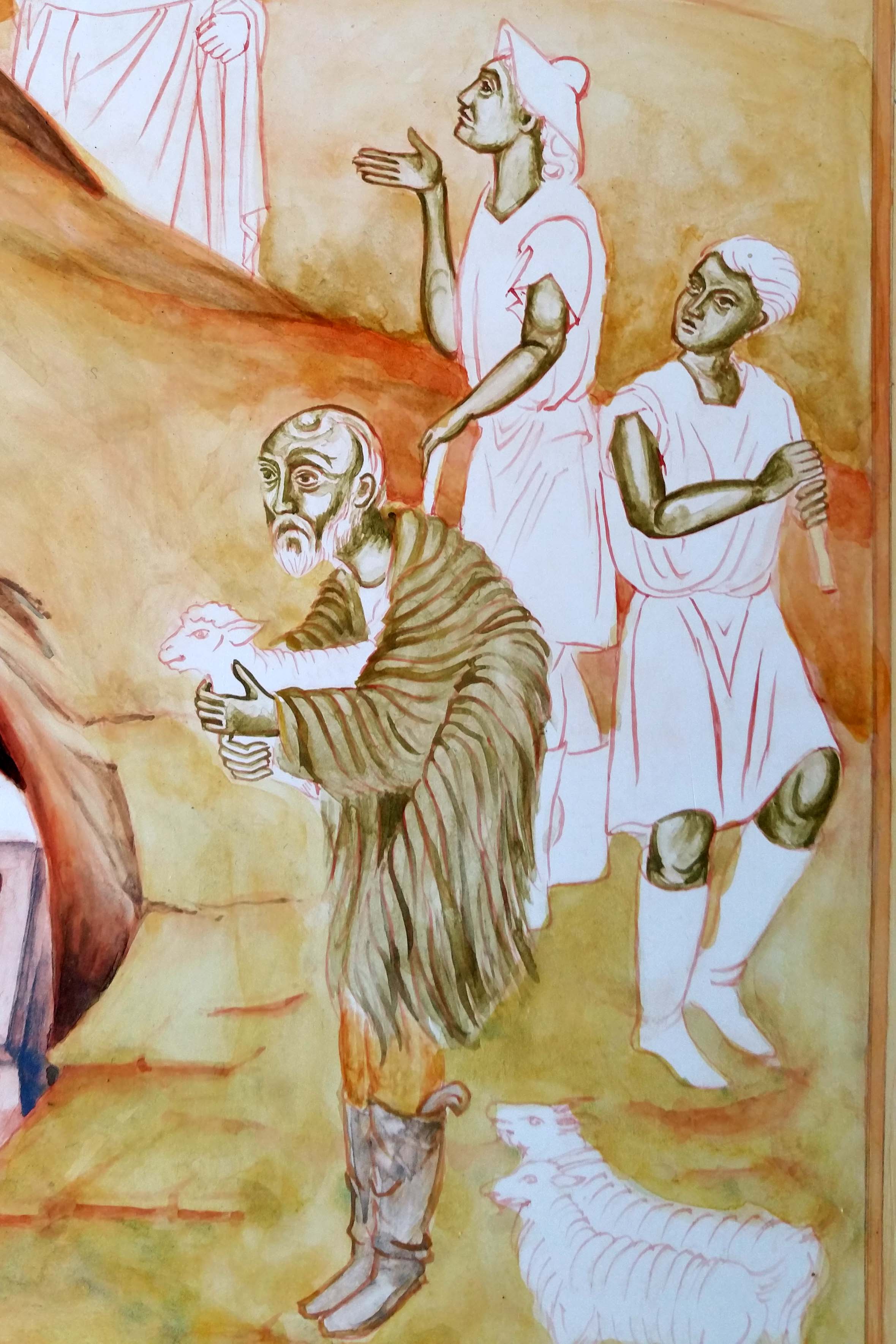
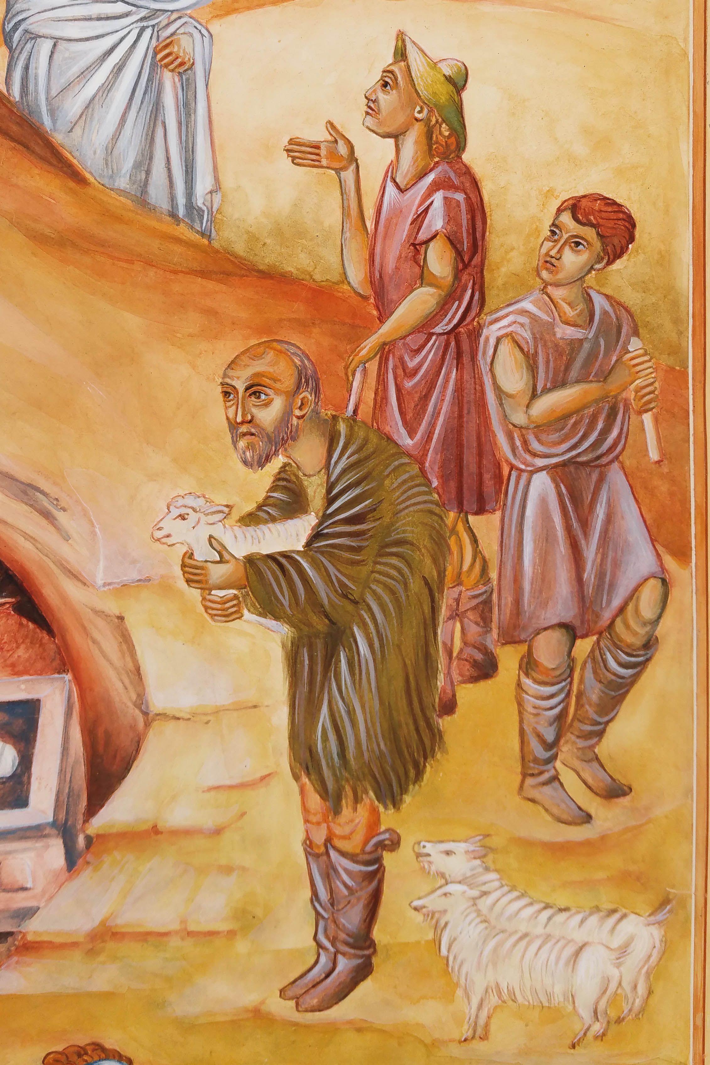
These shepherds have been shuffled around to get a balanced composition. Photocopying and cutting out the figures allows you to move them and see how they work in relationship to one another. It’s interesting how small shifts can make a difference in how your eye is led around the figures and around the overall composition.
Pencil drawing of three shepherds, photocopied and placed on the icon panel
Lines are transcribed onto the panel by rubbing red ochre onto the back of your traced drawing. The lines are fixed with a dilute mix of egg tempera in red ochre. Applying a dilute mix means it’s easy to blend into the layers that follow.
Composition settled and anchored on to the icon panel in a light red ochre line.
Yellow Ochre Maimeri and Ivory Black pigments mixed together give a lovely green for underpainting flesh tones – an alternative to Terre Verte which can be a bit sticky.
Since I had this earthy mix, I used it to under-paint the garments of the primary shepherd. I’ve used thin washes of earth ochre pigments to build up the landscape.
Colours vary here as I’ve taken photos at different times of the day.
When working on an icon, it’s important to work on it as a whole to keep it balanced. Sometimes weeks if not months go by between underpainting, mid-tones and highlights of the different clusters of figures.
Let’s close this post on these shepherds – almost finished. Just a few more highlights to add on their faces and hair.
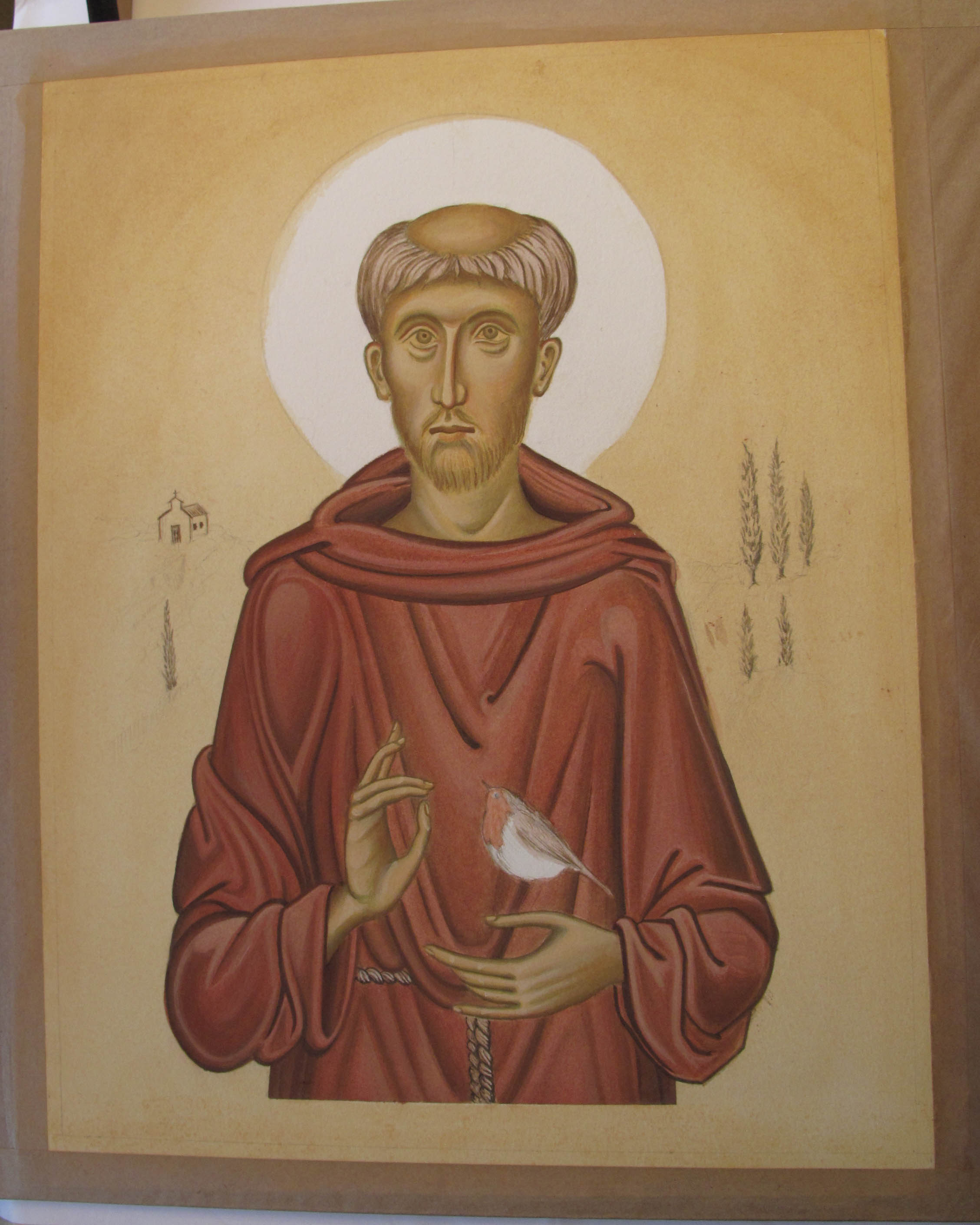
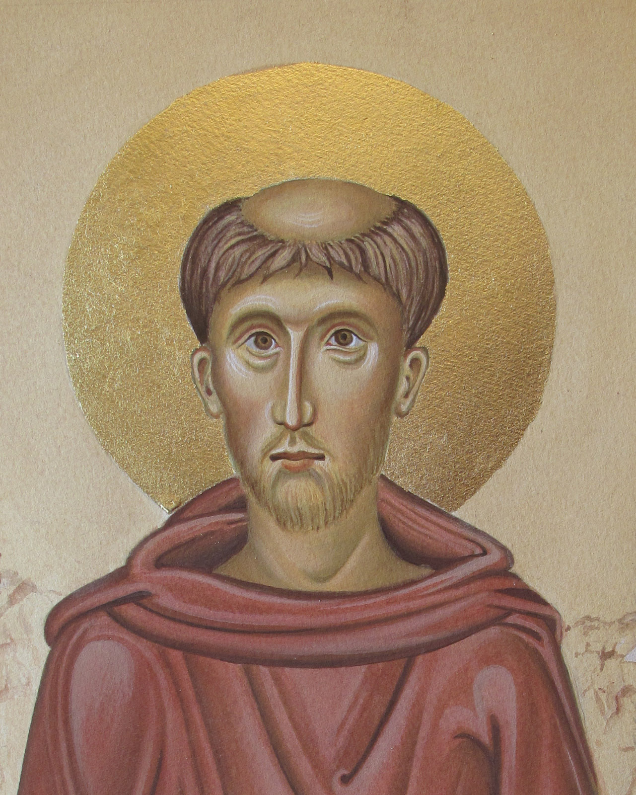
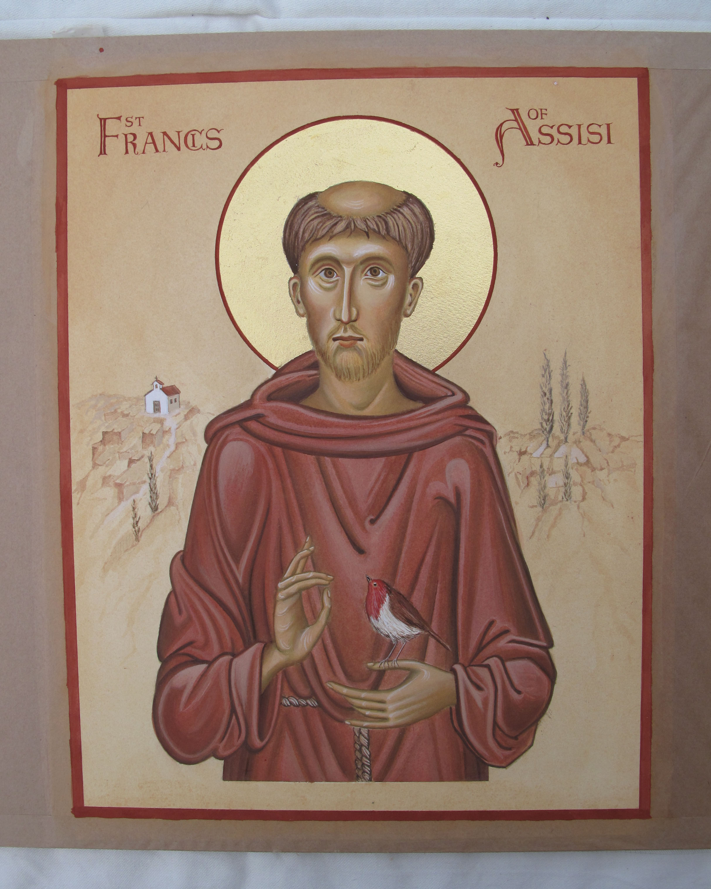
Today, 4th October is the Feast of St Francis. I’d like to share some of my work from my student days on Aidan Hart’s diploma course when we were encouraged to paint monochrome studies on watercolour paper. I found these studies a little less intimidating as they were ‘only on paper’ rather than the gessoed boards which we had all spent several days preparing.
I knew I was going to paint an icon of St Francis on a gessoed board so wanted to prepare a study on paper first.
However, instead of painting a monochrome, I decided to see how painting an egg tempera icon on paper would turn out. The drawing above is taken from one of Aidan Hart’s icons of St Francis. This is the traced outline over the pencil sketch which I made from his prototype which you can see here.
I can’t find any record photos of the underpainting on paper but it would have been with thin layers of Terre Verte pigment and a few washes of the Yellow Ochre Maimeri mixed with a tiny dash of English Red Ochre, applied in thin washes.
The process on paper is the same as on a gessoed board – I followed exactly the same steps.
Returning to the icon on paper, you can see both the underpainting of face and garments have had ‘membranes’ of colour and I’ve begun to add some facial shading and highlights.
I like faces to have soft highlights – I have often added the brightest areas only to wash them back with French Ochre Havanna so they blend in. There is a lot of flexibility in egg tempera – it is surprising how thin washes of one pigment over another can help things sit better together.
Finally we arrive at the lettering and gilding the halo.
Working on paper, I applied a dilute coat of upva glue (flexible when dry) over the surface to be gilded – this acts as a seal over the paper. About 20-30 minutes later I applied a second less dilute coat and as soon as it was just about dry I applied 23.5 carat transfer gold leaf.
I referred back to the drawing for the centre point of the halo, placed a strip of cardboard over the face for protection from the compass point, held it all very steady and drew a circle around the halo. I pencilled out the lettering and then traced and painted them on.
Finally, the work was framed and included in the final student exhibition at the PSTA in Shoreditch. It is now available to purchase from my Etsy shop here.
It’s almost the end of the day here but just in time to wish you peace and blessings on the feast of this gentle yet powerful saint.
My great aunt, Cornelia Maria Georgina Sharp, was born on 8th December 1891, the second child in a family of six. It was years later that we discovered a little more of this courageous woman’s life when Dad’s cousin researched into what had happened to his absent father.
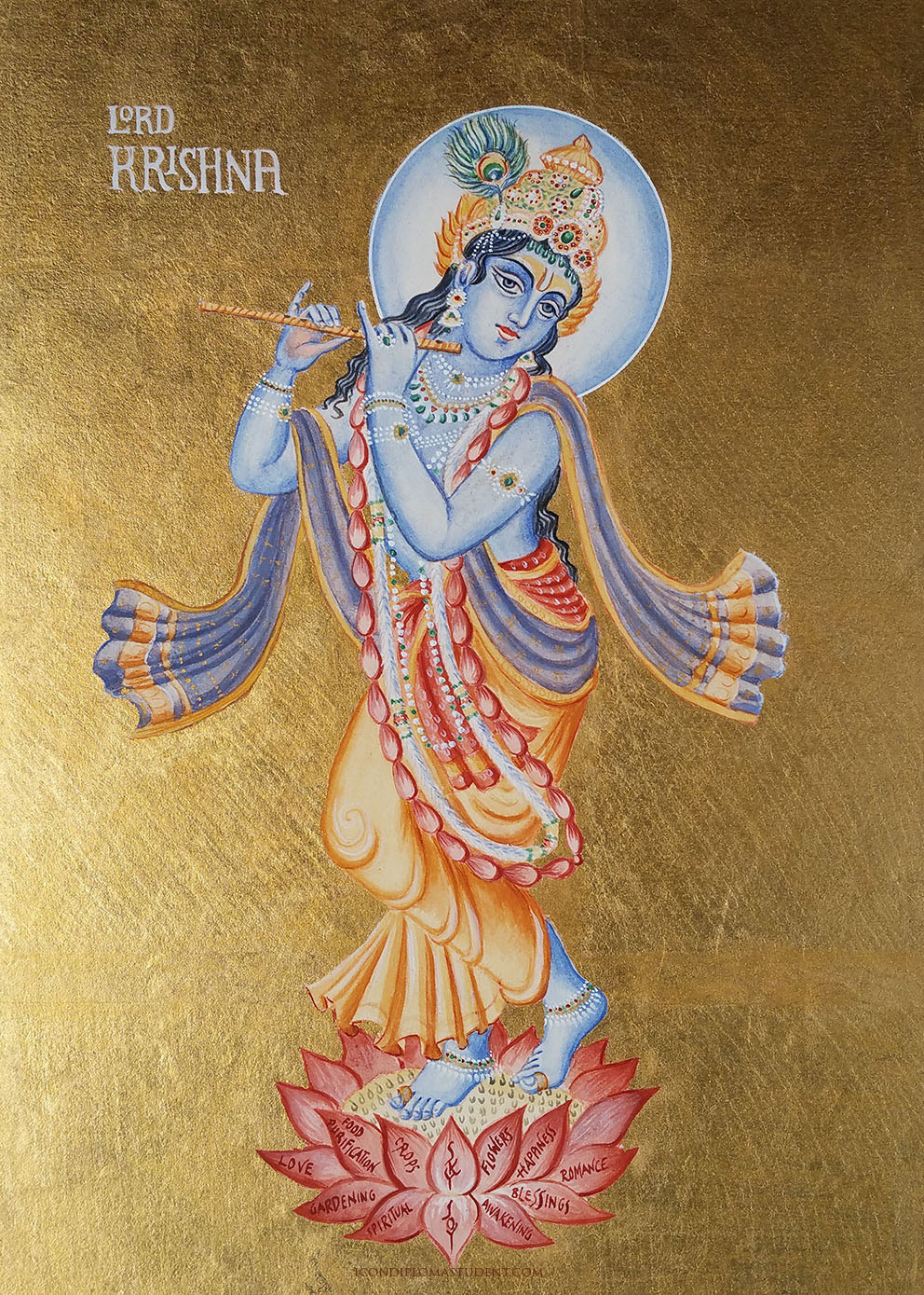
I am touching on her story here as I was delighted to be commissioned to paint an icon of Lord Krishna, the god of compassion, tenderness and love in Hinduism and happy that we have a family connection to this rich faith.
Transcribing the lines of outline drawing onto paper
In brief, Cornelia, a young English Catholic woman working in service, married a young Indian Hindu man named Hironmoy Roy-Chowdury in the Church of the Holy Rood, Watford. All the more extraordinary was that her new husband was the nephew of poet and winner of the Nobel Prize for literature Rabindranath Tagore
Hironmoy was a sculptor studying at the Royal College of Art. Their only child, Francis Roy Chowdury (Dad’s cousin), was born in October 1914 two months after the outbreak of the first world war. The marriage wasn’t to last long as Hironmoy went to France to volunteer in an abulance unit and then his family heard of the marriage and insisted he return to India.
First lines on paper
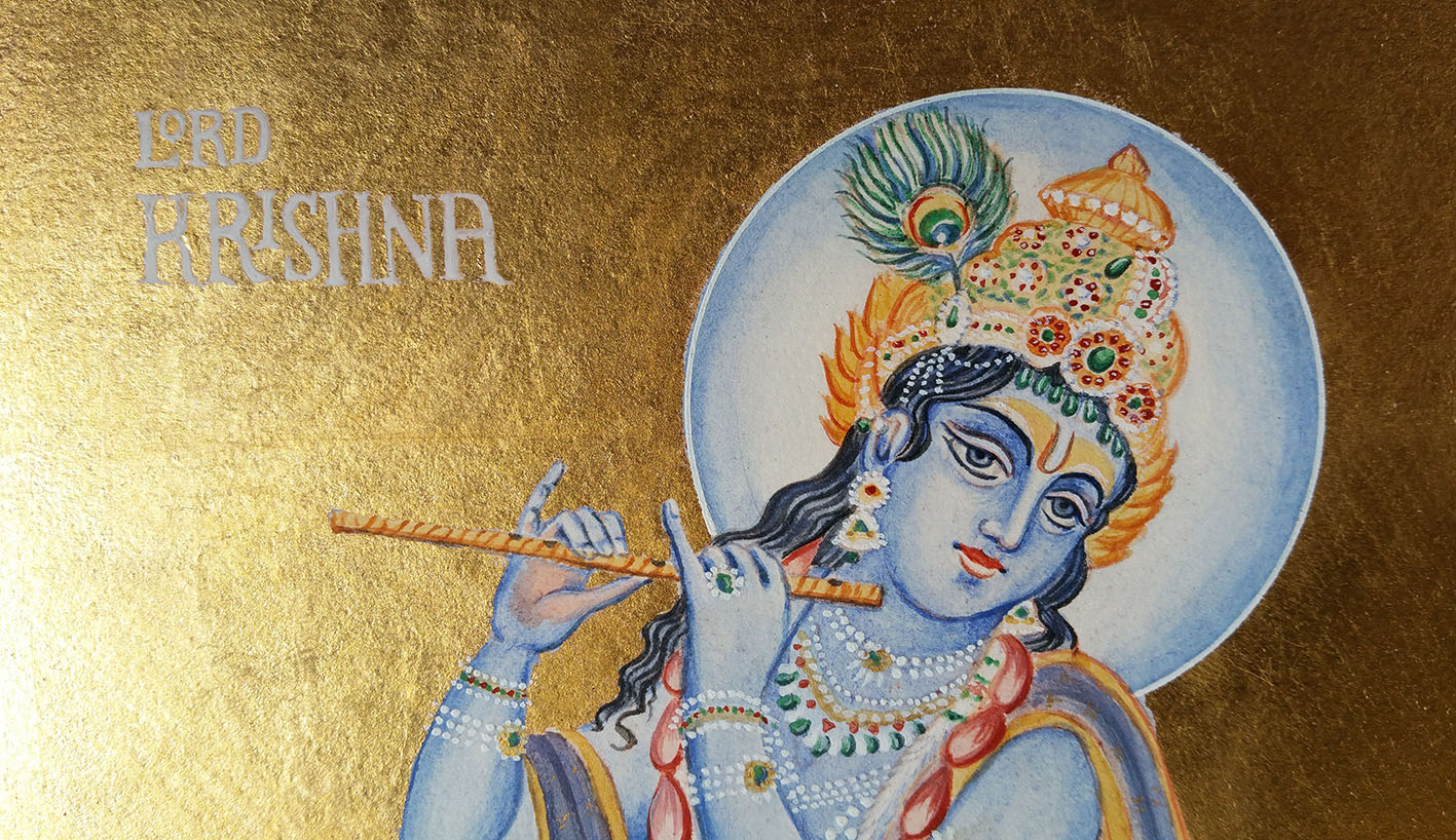
Back to the icon of Lord Krishna where I’ve depicted him as a young man playing the flute, standing on a lotus flower. He is painted on 600gsm hot pressed paper mounted on a 25mm ply board rather than on gesso thereby avoiding the use of rabbit skin size.
Applying 24 carat transfer gold leaf over acrylic size coloured with a little red ochre
Lord Krishna standing against the gold of heaven
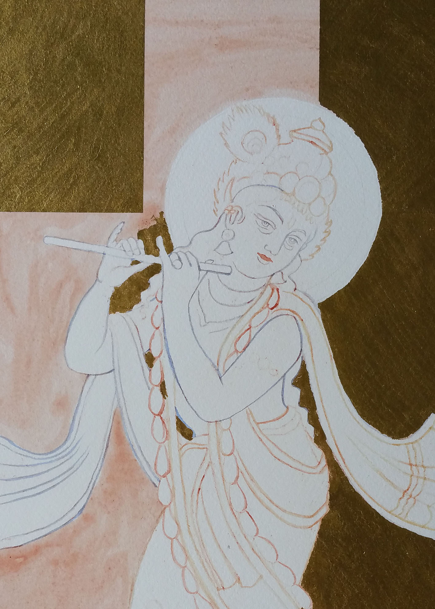
Underpainting the figure and garments
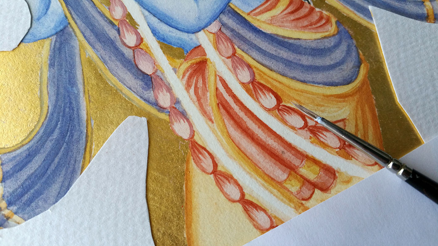
Applying the paint in thin layers
Flesh tones painted in Lapis Lazuli
The colours on images of Lord Krishna are vibrant but to avoid them clashing, I limited the palette to English red ochre, yellow ochre maimeri, lapis lazuli, black and white. The greens were mixed from malachite.
I chose to use Lapis Lazuli as its deep, celestial blue remains the symbol of royalty and honor, gods and power, spirit and vision, wisdom and truth. Its name comes from the Latin lapis, “stone,” and the Persian lazhuward, “blue.”
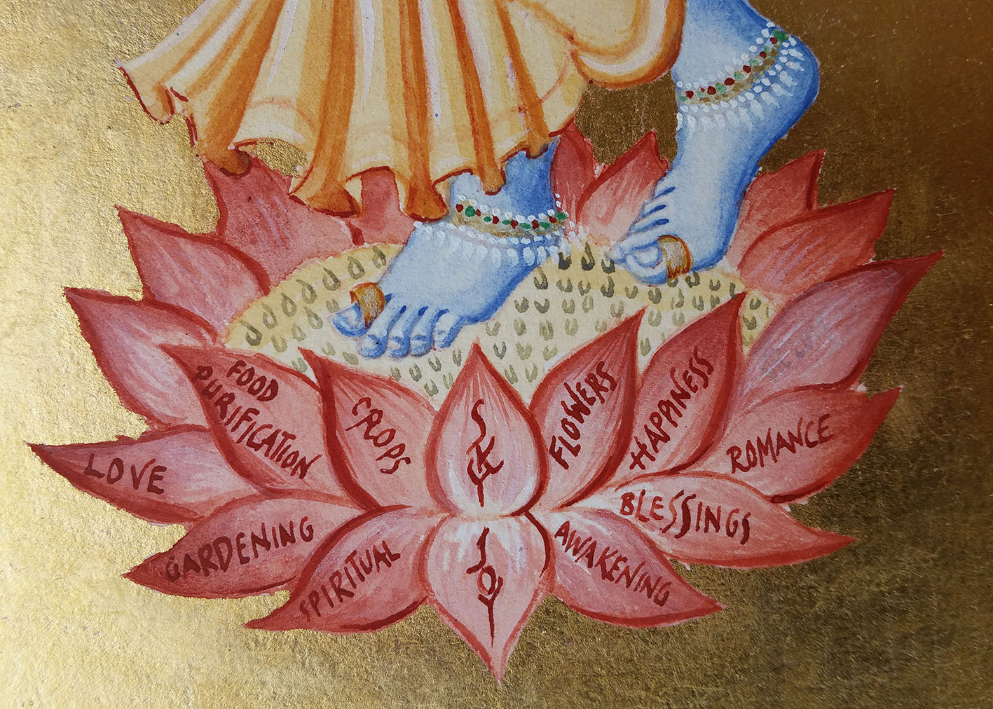
Some of the many qualities with which Lord Krishna is associated
Lord Krishna ready for his new home
There must be enough for a book on the subject of Cornelia and Hironmoy’s brief lives together and it is a treasure that we know of this through their son’s research.
I will close with a quote from ‘Fruit Gathering’ by Rabindranath Tagore;
‘Send me the love which is cool and pure like your rain that blesses the thirsty earth and fills the homely earthen jars.
Send me the love that would soak down into the centre of being, and from there would spread like the unseen sap through the branching tree of life, giving birth to fruits and flowers.’


