Fragments of beauty from 8th C Avranches

- Painted letters in the style of 8th century French uncial hand
I began my dissertation for the Icon Diploma with lettering discovered in Mont St Michel, France. The style is a majuscule script known as ‘uncial’, written in capital letters, in common use from the 4th to the 8th century by both Latin and Greek scribes.
I stumbled upon this exceptional 8th century lettering some fifteen years ago, whilst on a family holiday in Normandy. Mont St Michel is home to some beautiful illuminated manuscripts, some of which can be seen by request in the town hall at Avranches, nearby.

Guerison du Paralytique, from the Gospel of St Mark
Whilst there, I bought the book “l’Enluminure Romane au Mont-Saint-Michel” by Monique Dosdat which includes several fragments from a Book of Gospels. There are only a few of these pages which survive – the author and dedication are unknown.
Their history is intriguing as they were discovered bound into a later manuscript, at Mont St Michel. The two pages are identified by their full titles:
- “Fragment d’un Evangeliaire, Vllle siecle, Annonce aux Bergers, Luke 2, 12. Avranches, BM, ms 48.
- “Fragment d’un Evangeliaire, Vllle siecle, Guerison du Paralytique, Marc, 2, 5-12 Avranches, BM, ms 71.
The author Dosdat writes: “These pages are an impressive witness of a beautiful, perfectly legible uncial lettering, its characters uniting a classic uncial calligraphy born in 4th Century Italy under the influence of Irish round hand lettering”.
This scribe had mastered the art of consistency, spacing, layout and rhythm so that the text itself is a work of art.
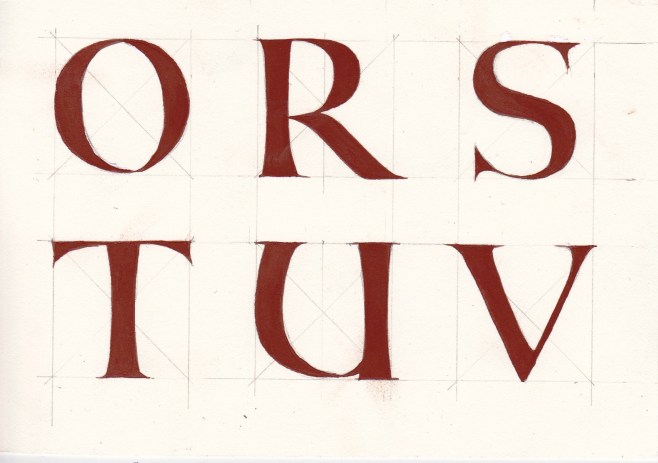
So let’s look at the lettering as examples for use on icons. This script would lend itself to early Celtic or French saints. The following studies are my second attempt at translating this quilled hand into painted letters. I have ‘waisted’ the uprights and some letters will need to be refined but feel free to print them off and use them if you wish. I can see the serifs on the letter ‘C’ are pretty clumsy – so use the body of the letter C instead.

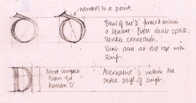
Looking at the two types of ‘D’ used in the same manuscript.


The right hand stroke of the letter A is a little top heavy.


These ‘X’ and ‘Y’ letters are my favourite!
Thanks for reading.
Ronnie

9 Responses to “Fragments of beauty from 8th C Avranches”
Thank you so much for this inspiration! Beautiful letters!
Delighted that you like them! 😀
Ronnie, you keep raising the bar. I absolutely love it. Thank you.
Thanks so much Gay! There’s a fair bit of refining to do to my letters but getting there!
I was very excited to find this article that you wrote about lettering and I cannot Griffey. I am learning to write icons in acrylics from YouTube videos, And lettering is not a topic that often covered. How fortunate you are to be attending Aidan Hart’s classes. His videos are very well done and informative. I enjoyed watching the classroom setting. I have a question. I have read that icons should always proceed from dark colors to light. I am working on one Right now, but I think the color of the habit is too light. Is it inappropriate to go over it with a dark wash in order to knock back the brightness of the color?
Hi Carolyn thanks so much for your comment. Will reply properly tomorrow, bye for now Ronnie
Hi Carolyn,
Thanks so much for your comment and so glad to hear that you find the videos helpful. Although I am not familiar with working with acrylic paint, I would think it would be fine to knock back the brightness with a darker wash. Aidan encourages us to apply thin layers of paint, building up the colour gradually, so perhaps you can apply the acrylic in dilute layers, then stop when it’s dark enough. I can’t really offer you any other help I’m afraid – I am still a learner! That said, when we went to Thessaloniki, we met a very experienced iconographer who had been painting icons his entire life. He told us that he felt he was a beginner – there was still so much he was discovering!
Thanks again for getting in touch, bye for now
Ronnie
Carolyn and Ronnie, I am working in acrylic more and more. Since I will be moving from here soon, I want to be able to put the finish on and leave some. I use very dilute layers to good effect. I use a matte medium and water to dilute my Utrecht liquid acrylics. Since they are sitting there in front of me, I also am likely to add some dry pigments where I feel it is necessary. On occasion I use just dry pigments and matte medium. The premixed acrylic liquids are somewhat limited in their pallet. Feel free to email me, Carolyn. gaypogue@mac.com
Hi Gay – you are a star! Thanks so much for these insights. Im sure they will be really helpful to any other readers who work in acrylics. Wonderful!
Ronnie