Icon Diploma Student

Learning to see with the eye of the heart

Posts tagged ‘Gold Leaf’

Last few days of 50% off all icons

February is about to give way to March and I will be closing my private sale of 50% off all my icon stock at the end of this month. I’m delighted that quite a few of my icons have found homes but I still have plenty left to choose from.

Here are a few examples of what I still have available with some detailed photos below. The remaining available icons are all listed here.

Archangel Gabriel, egg tempera, gold leaf on watercolour paper, framed.
Detail of Archangel Gabriel icon painted in egg tempera and with gold leaf on watercolour paper
Icon of the Feast of the Annunciation
Detail of icon ‘Feast of Annunciation’ with Archangel Gabriel and the Blessed Virgin
Our Lady of Mount Carmel with Christ Child
Detail of the icon of Our Lady of Mount Carmel with Christ Child

Please dont hesitate to get in touch if you would like to see more photos or need further information.

Blessed Virgin and Mandilion icons, latter also known as ‘The Face Not Made with Hands’
Icons side by side in Diploma show exhibition

Thanks for reading 🙂

Ronnie

Advent Three: A Multitude of Angels

The orchard is cloaked in darkness as I write and there’s a mid-winter owl hooting outside our window. There’s something magical about this time of year. For many, this is the busiest, most hectic time of year so I only want to share a few photos of the stages of painting this cluster of angels on paper.

This was a study for the Nativity icon – working on thick 600gsm hot-pressed paper. It’s a luxurious surface to work on.

The following photos show some of the painting stages – colours include English Yellow Ochre and French Ochre Havana with the skies in Azurite.

The halos are gilded with two layers of dilute pva glue applied to the paper, with red ochre added to give some depth. The halos are then gilded using transfer gold applied whilst the pva is still a little tacky.

Faces are worked up in layers starting with underpaintings in Terre Verte and washes of Red Ochre and Yellow Maimeri. Shadows and highlights built up to model the faces.

Here’s the final study in the Nativity workbook; deep azurite skies with a thin wash of indigo to deepen. We’re still in difficult times with another new variant on the rise. If you’re still here then I’d like to thank you for being with me.

Here’s trusting that you and yours are lovingly upheld by a cluster of angels over the days and weeks of Christmas-tide ahead. Stay well!

Thanks for reading – Ronnie

Advent one: What shall we offer?

It’s Advent as I write and timely to reflect on some of the foundation work for the Festal Nativity Icon which I worked on in the third and final year of the diploma course (2013-16) with Aidan Hart. I know that this is a silly-busy time of year for many of us but you don’t have to read it now – it’s here for later!

Detail from icon study on paper acknowledging the prototpye by Gabriel Toma Chituc

Before I get started, I also want to say that the British Association of Iconographers have an online exhibition ‘Icons Emerging from Lockdown 2021’ sharing the work of over 46 icon painters. The work is worth leaving this page right away and having a look!

Back to the Nativity icon – In this post, I want to look at the starting point of the icon – looking at the choices and decisions behind the composition.

We were invited to work on a festal icon of our choice and to design a new composition which emphasised a particular aspect of the feast. I chose the Nativity – with the theme of praise and thanksgiving so beautifully expressed here in the Festal Menaion – Nativity Vespers:

Lettering in mapping pen and gold gouache on paper

We were encouraged to study good examples of our chosen festal icon referring to frescos and manuscripts. At first, the variety of prototypes felt overwhelming (just google ‘orthodox nativity icon‘) but I have a particular love of manuscripts and one in particular spoke to me with its beautiful simplicity – the Armenian Nativity by Toros Roslin, painted in the 13th century, so much so that I painted a reproduction on vellum (blog post here).

Egg tempera painting of the nativity on vellum
Armenian Nativity, from the Toros Roslin manuscript, 13thC egg tempera painted on vellum

In October 2015, we made a course field trip to Thessaloniki to explore some of the beautiful icons and frescos that reach back into antiquity. In particular I loved the frescos of St Nicholas Orphanos Church (14thC), including this one of the Nativity. You can get a flavour of this trip in my post here.

St Nicholas Orphanos Church fresco, Thessaloniki showing the Nativity

Looking at the layout of the Orphanos fresco, light from heaven is directed vertically to the Christ Child, centrally placed in the heart of the cave where high contrast and curved lines frame the Blessed Virgin. Your eye is then led gently down and around to take in all the surrounding figures and back to centre.

The most perplexing aspect of the composition for me was settling on a layout of the Virgin and Child which are diverse as you can see from a few examples below. I felt that it was unusual for a mother to turn away from her child, let alone this one!

I made a start on the cartoon – sketching out the overall composition on a large sheet of cartridge paper cut to the size of my gessoed panel (53 x 42cm). To help keep things fluid at this stage, I made separate sketches of each cluster of figures which I was able to photocopy, cut out and move around. I had also been working on the figures and colours in a workbook (you can see some examples here).

It was important to align the composition with our chosen theme and to allow the viewer’s eye to flow and pause in a rhythmical and meaningful way around the icon. You can see on this example, I had shown the Virgin looking towards her infant being bathed by the midwives – I wasn’t entirely happy with this but this was the exploration stage.

Looking back at my notes I have found some helpful comments from Aidan and Sr Petra Clare:

  1. The mountains are not responding to the light of the star – move them to turn towards the light of the star and so they curve to contain the angels.
  2. The length of the Virgin’s legs not quite right, the knee to heel should be the same on both legs.
  3. Archangel Gabriel too high up the mountain and right wing not quite right.
  4. Adjust the shepherd cluster to flow directionally towards the Virgin and Child
  5. Magi better in a linear format to direct the eye back up the icon to the star.
  6. Finally, Aidan reminded me that ‘the star represents heaven so it needs to be joined up to some form of half circle to show a connection between heaven and earth through the incarnation. A star in the sky by itself doesn’t convey this connection so well.’

It was somewhere during this exploration stage that I came across the translucently beautiful work of the Romanian master iconographer Gabriel Toma Chituc. This detail from his Nativity icon was an answered prayer for me as it expressed so eloquently the union of heaven and earth, Mary placed vertically and the Christ Child horizontal with the light of the star reaching into the cave.

Nativity by Gabriel Toma Chituc
Progress on the cartoon but not amended the star yet.

For the ancient Greeks, the cave symbolised the convergence point of divine or cosmic energies and was considered a sacred point where the soul could enter earth and subsequently leave and return to earth.

Shorthand version of preparing the gessoed board! Tips on gessoing here.

I will close here for now showing the cartoon transferred on to the panel, using red ochre rubbed on to the back of the traced paper image and setting the lines with a dilute mix of red ochre tempera. If you would like to see the finished icon, you can see it here.

As always, thanks for reading and wishing you a peaceful and blessed Advent.

Ronnie

Final composition settled and outline painted on to the panel

For the Feast of St Francis

Today, 4th October is the Feast of St Francis. I’d like to share some of my work from my student days on Aidan Hart’s diploma course when we were encouraged to paint monochrome studies on watercolour paper. I found these studies a little less intimidating as they were ‘only on paper’ rather than the gessoed boards which we had all spent several days preparing.

I knew I was going to paint an icon of St Francis on a gessoed board so wanted to prepare a study on paper first.

However, instead of painting a monochrome, I decided to see how painting an egg tempera icon on paper would turn out. The drawing above is taken from one of Aidan Hart’s icons of St Francis. This is the traced outline over the pencil sketch which I made from his prototype which you can see here.

I can’t find any record photos of the underpainting on paper but it would have been with thin layers of Terre Verte pigment and a few washes of the Yellow Ochre Maimeri mixed with a tiny dash of English Red Ochre, applied in thin washes.

The process on paper is the same as on a gessoed board – I followed exactly the same steps.

Returning to the icon on paper, you can see both the underpainting of face and garments have had ‘membranes’ of colour and I’ve begun to add some facial shading and highlights.

I like faces to have soft highlights – I have often added the brightest areas only to wash them back with French Ochre Havanna so they blend in. There is a lot of flexibility in egg tempera – it is surprising how thin washes of one pigment over another can help things sit better together.

Finally we arrive at the lettering and gilding the halo.

Working on paper, I applied a dilute coat of upva glue (flexible when dry) over the surface to be gilded – this acts as a seal over the paper. About 20-30 minutes later I applied a second less dilute coat and as soon as it was just about dry I applied 23.5 carat transfer gold leaf.

I referred back to the drawing for the centre point of the halo, placed a strip of cardboard over the face for protection from the compass point, held it all very steady and drew a circle around the halo. I pencilled out the lettering and then traced and painted them on.

Finally, the work was framed and included in the final student exhibition at the PSTA in Shoreditch. It is now available to purchase from my Etsy shop here.

It’s almost the end of the day here but just in time to wish you peace and blessings on the feast of this gentle yet powerful saint.

Thanks for reading,
Ronnie

Our Lady of Mount Carmel

Our Lady of Mt. Carmel is the patroness of the Carmelite Order.

Har Ha-karmel is the Hebrew name for Mount Carmel, a mountain range in north-west Israel. The name dates back to biblical times and is derived from the Hebrew word kerem, meaning ‘vineyard’ or ‘orchard’, referring to the mountains’ fertile soil over the centuries. Since I live on the side of ‘Black Hill’ an Iron Age hill fort with grapes growing in the greenhouse (yes in Scotland!) and apples in the orchard, I can picture a place rich with human history.

Mount Carmel is mentioned as a holy mountain in ancient Egyptian records and was also sacred to the early Christian hermits who settled there during the 12-13th centuries. These early Carmelites built a chapel dedicated to the Blessed Virgin, calling her the ‘Lady of the Place’.  

Our Lady is holding a scapular, known as a sacramental – a symbol of devotion to her.

The bright gold lines over the Christ Child’s garments are called ‘Assiste’ which I painted using 24 carat shell gold. I made this shell gold at a fantastic weekend workshop with Anita Chowdry when she had her studio on Woburn Walk, Bloomsbury. If you would like to make your own shell gold, Anita wrote a book describing the technique in great detail which is available as a downloadable book from her website above.

Making shell gold involves breaking down gold leaf into minute particles – washed away of any debris and mixed with pure gum arabic. It involves a lot of patience and a very clean room – no pet hairs! Hopeless for me now!

A year or so later and we were back down to London for UCL architecture summer show – which started with breakfast along Woburn Walk and a sketch. It is also not that far from Cornelissens where you can buy ready made shell gold – it’s a beautiful product but if you have the time, dedication and patience, but it is Anita’s recipe that really sparkles.

It’s not easy capturing the sparkle of the shine of water gilding and Assiste without seeing reflections of a mobile phone!

Here’s the finished icon painted a year or so ago. I’ve searched high and low for work-in-progress photos but they have been lost in the mix. The Virgin’s gown is painted mostly in lapis lazuli, with washes of red ochre and thin layers of Titanium white highlights, and French Ochre Havanna for the Christ Child’s garment. The background is water gilded in 24 carat gold.

The feast of Our Lady of Mount Carmel is celebrated on July 16.

Thanks as always for reading. The finished icon is now listed on my Etsy shop

Always we begin again

I recently unwrapped a pair of standing angel icons which I painted three years ago for the exhibition ‘A Street of Angels’ in York at Blossom Street Gallery. I remember thinking that the faces weren’t quite right but time had run out as we were relocating up to Scotland and so they went on display, got packed away afterwards and that was that.

Life has taken quite a turn since and I don’t get much time to paint icons however I have committed to revisiting and finishing off all the icons that had things that I considered weren’t quite right. I thought that it would be worth sharing how I get along with this exercise as it is a bit of an adventure!

Here are the two icons before I started work on them. It was Archangel Raphael’s expression that I thought needed most work. It’s hard to tell from these photos but the blending was a bit heavy handed and if I was to refresh one, then I should work on them both for consistency.

First thing was to ‘wake up’ the surface with several coats of an egg glaze. Using the tempera mix, I made a glaze with about 1 drop of egg to 10 drops of water. I also made a protective paper cover for the gilding and taped it down. Looking at these photos, the faces don’t seem so bad, but they were just not properly finished.

I let the glazes settle for a few days, then using the wonderful pigment French Ochre Havanna, I applied three or four glazes over the face. This pigment is warm and a great one to calm down clumsy highlights. These faces are fairly small, about 2cm from hairline to chin, so I used fine brushes for the details.

Applying glazes over the entire face.

Glazes of French Ochre Havanna even out the skin tones and deepen the gold mid tones. I also applied a few washes of English Red Ochre Light over the hair to deepen the mid-tones so I could tidy up the modelling. I’ve found that leaving the glazes to dry overnight means less likelihood of making holes in it when applying the next layers.

I’m putting on the darker tones here, with a 1010 kolinsky sable brush. I’ve mixed some English yellow ochre, raw umber and ivory black. I also used Ochre Avana which is another really versatile pigment. I have deepened the hair line and then used a thin egg glaze to feather and blend away the hard lines next to the brow. To get the highlights, I used Yellow Maimeri and titanium white, but I also added a small amount of French Havanna to keep the highlights a warm gold. I mix small quantities in this ceramic palette which comes with a lid – perfect to stop them drying out and keep the cats off!

Painting on the first layer of face highlights

I find that taking photos of my work as I go along helps as I can zoom in and see exactly where I need to tidy up. The other thing I do now is to add very thin glazes of ochre havanna as it helps with blending especially after I have been remodelling.

I added highlights in thin, thin layers, softened and shaped the eyebrows, moved the brow highlights to the right, eased back the highlights on the right of the neck, added vermillion to the nose tip, upper lip, under the chin and inner eye. Added white highlights to the eyes, with the sides of the eyes a grey mixed with black and white. Added a very thin glaze of vermillion to warm the cheeks. Then added the hair highlights back and added the ribbons which I had missed altogether. The finished face is on the left. I’m happy with this as the expression is much kinder! You can see the finished icon in my Etsy shop.

I hope that this is helpful in some way with your own icon painting. Thank you to everyone who has followed this blog during the quiet years, but I will go through the same process with Archangel Raphael in my next post.

Thanks as ever for reading and your patience!

Ronnie

Oil Gilding the Council of Archangel Michael (pt2)

Summer is the best time for gessoing icon boards. It’s a messy job and I like to make the most of working outside especially sanding the boards. I wrote about the method of gessoing on an earlier post here.

3 sanding the large icon board.jpg

Making the most of a dry sunny day to sand the gesso smooth

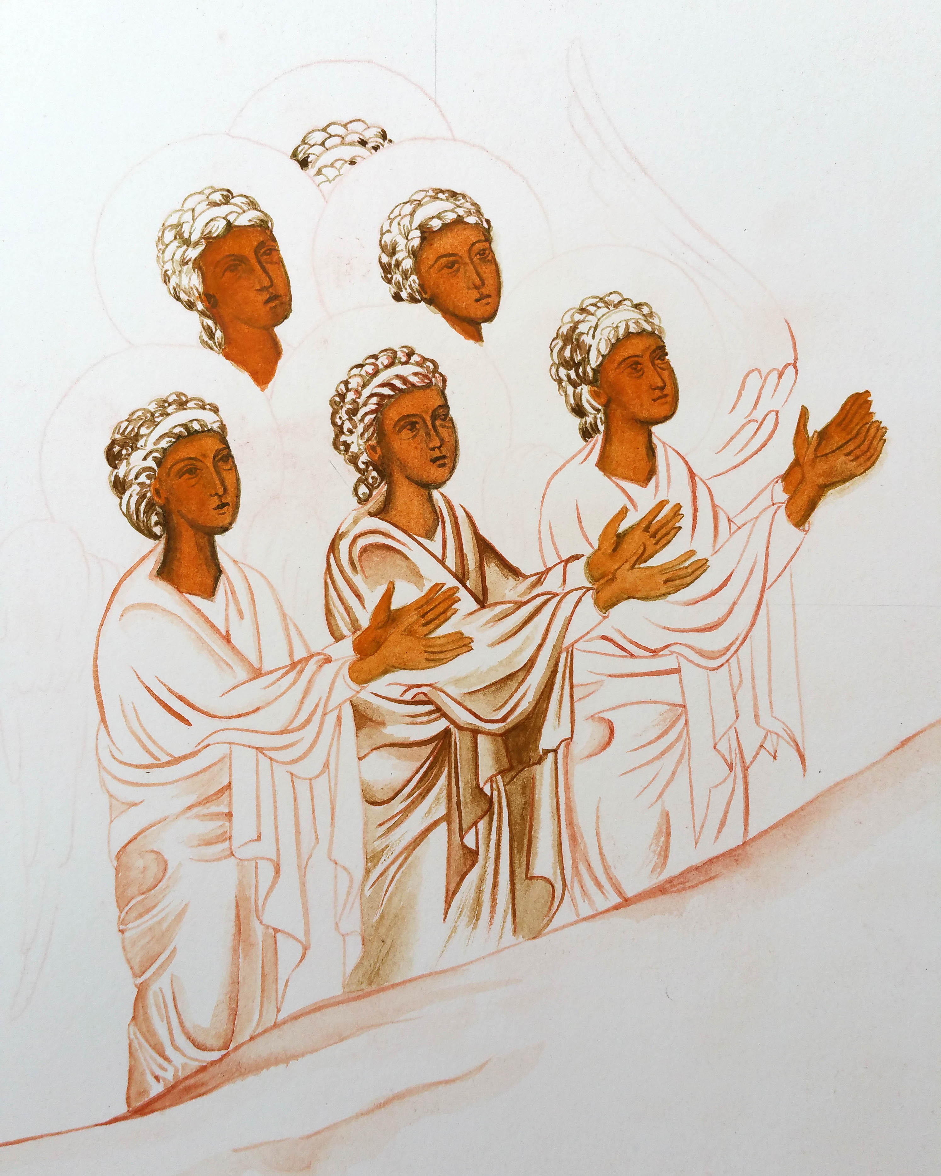
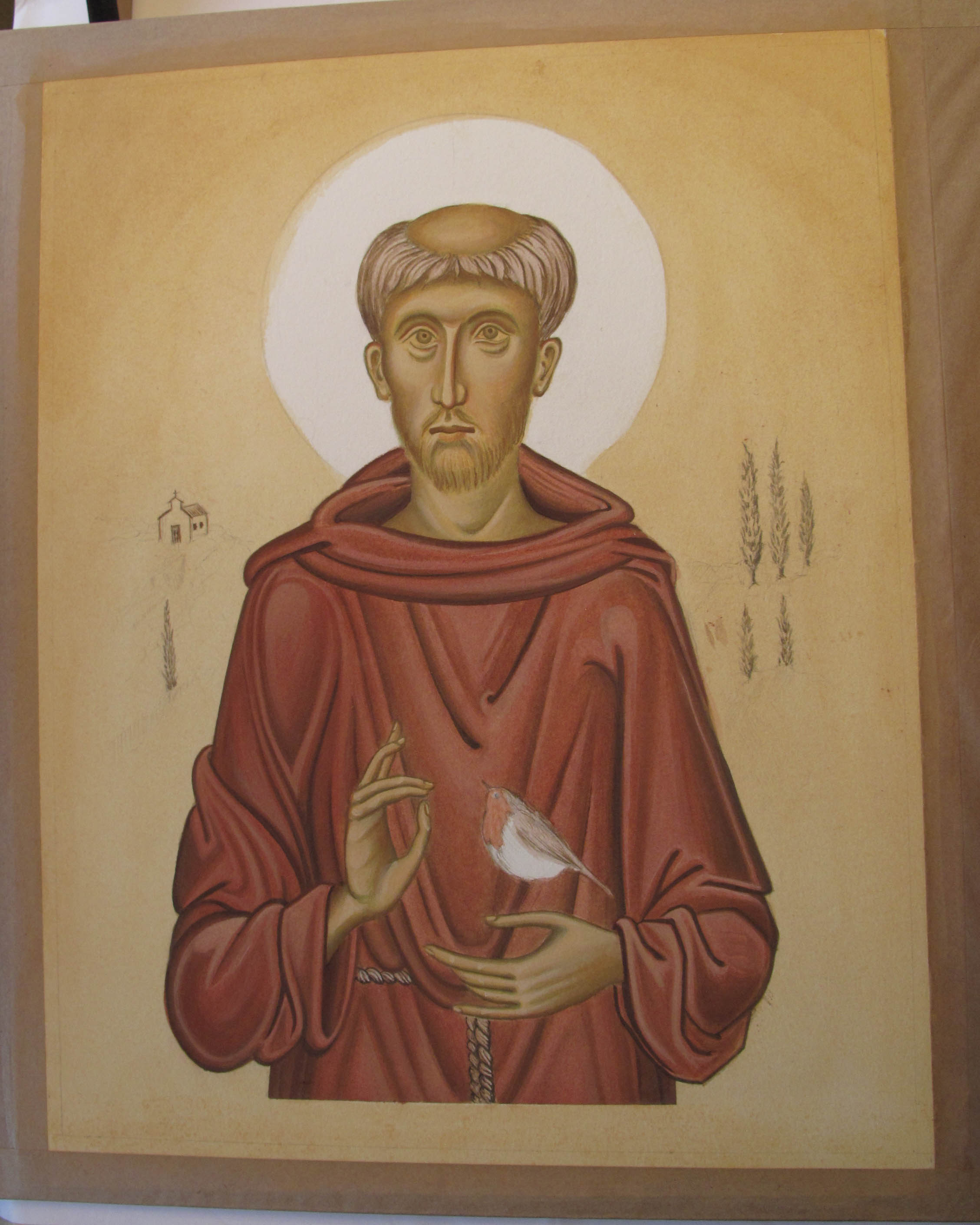
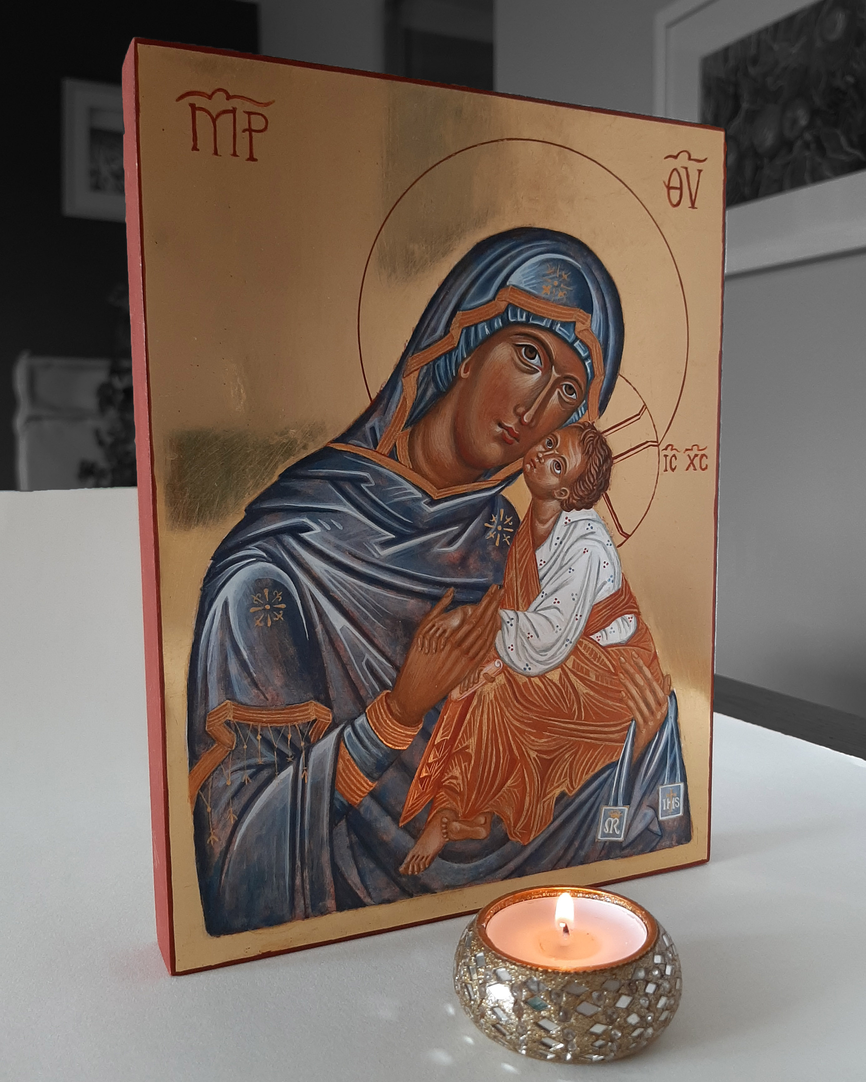
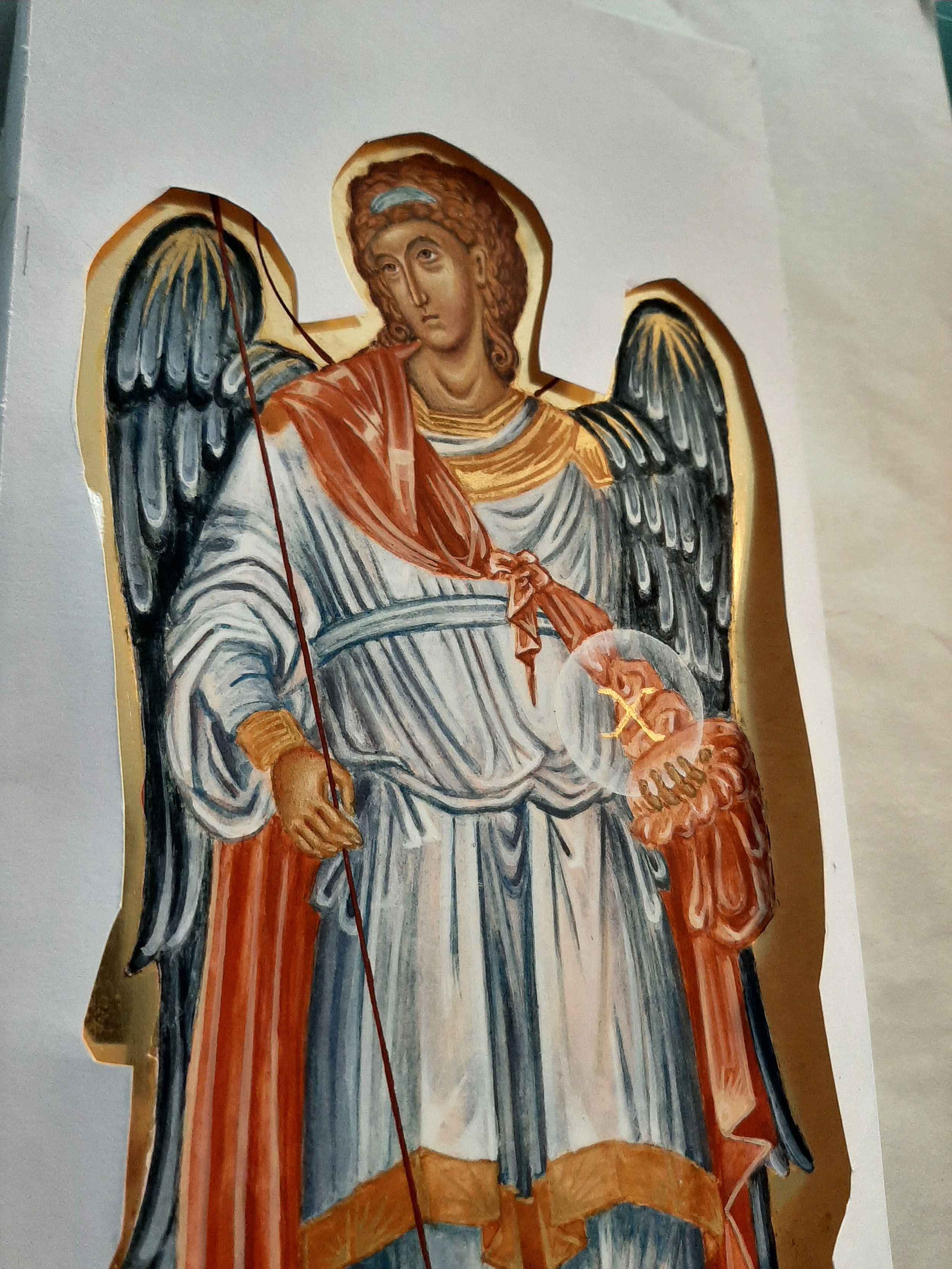
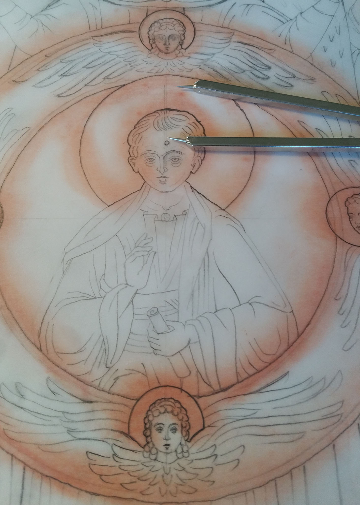
I felt that the icon of the Council of the Archangel Michael should be painted on a large board as there are a lot of figures. I don’t know the size of the original icon, but small faces can be tricky so the size I went for was the optimum I can work with at home: 40 x 42cm. With it being cut from 24mm birch ply it’s quite heavy.

I placed the board on a towel to prevent it from sliding around the table whilst I sand. Red ochre rubbed over the surface helps to show up any scratches I had missed.

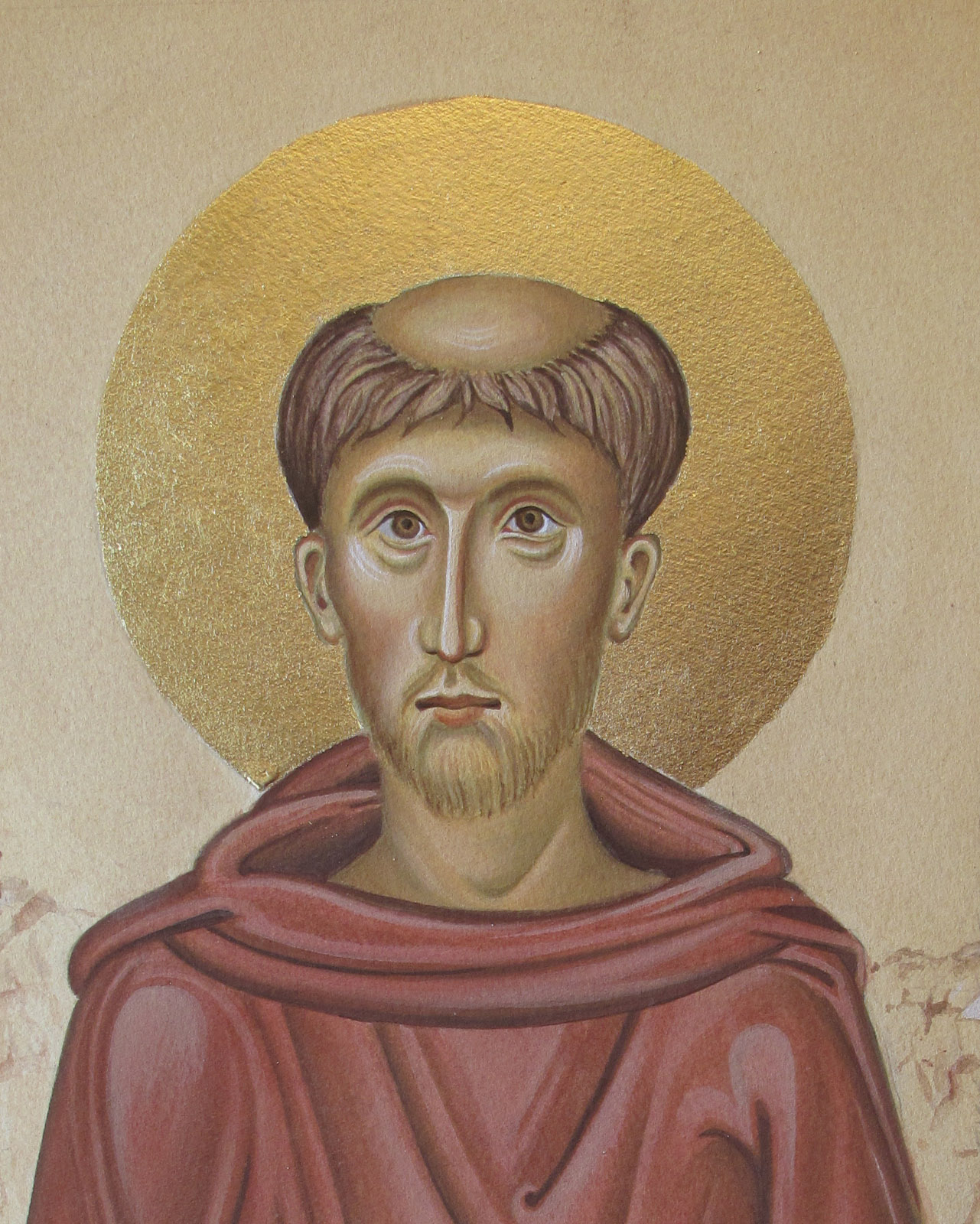
Once it had been sanded down with 1200 grade sandpaper, it was ready to oil gild. I chose the oil gilding method (matt finish gold) because it’s more robust than water gilding.  Having so many figures and faces it will be handled quite a bit during painting.

finding scratches

Red ochre shows up scratches which still need to be sanded

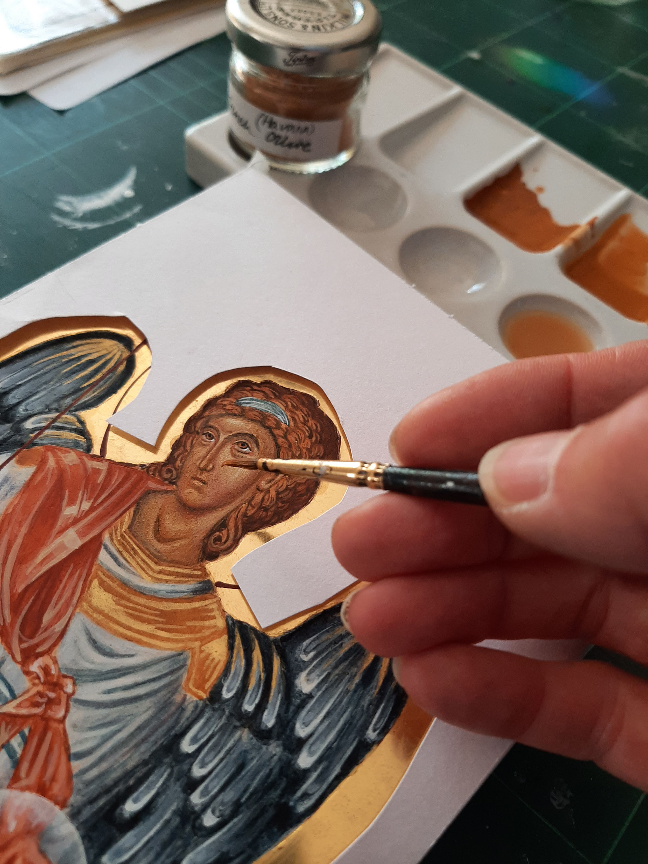
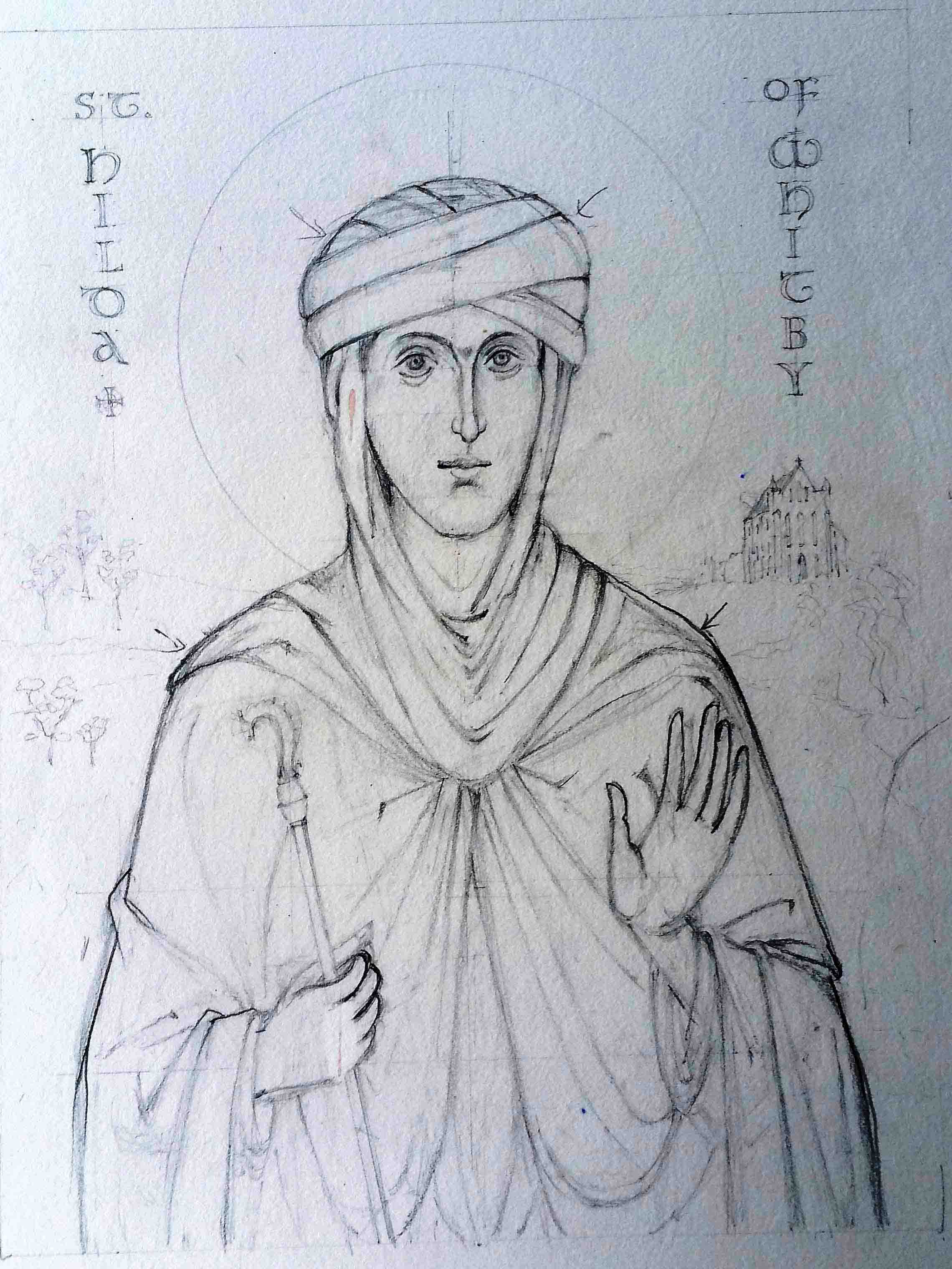
I moved my drawings on to tracing paper so it was ready to transcribe on to the gesso. Although it is possible to oil gild after painting, I prefer to gild before painting the faces. I find both methods of gilding challenging so I will keep practising!

It isn’t necessary to scribe the areas to be gilded with the oil gilding method but I find it helps contain the shellac. Aidan Hart protects the gesso from the compass points with a wooden ruler which works very well but if you don’t have a ruler to hand, several layers of masking tape over some card helps (see photos below).

transcribing halo on icon

compass points on gesso

Protecting the gesso from compass puncture marks

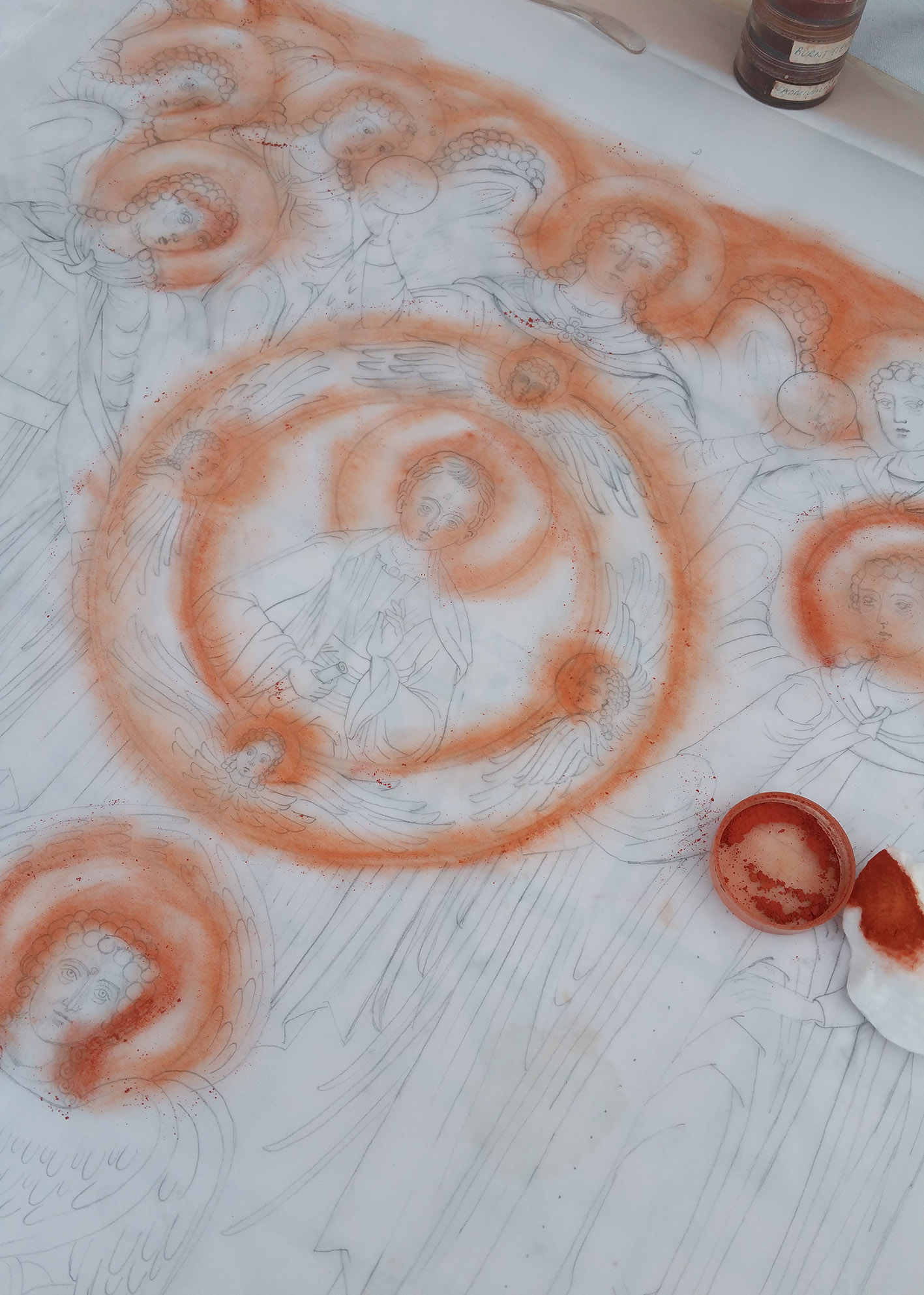
Anyone of a ‘certain age’ will understand when I say that some red ochre rubbed over the scribed areas helps me to see where I’m going!

transcribing drawing

Aidan taught us the following method of oil gilding which I will summarise below. You can also see some amatuer video clips from our class demonstration on You Tube here.

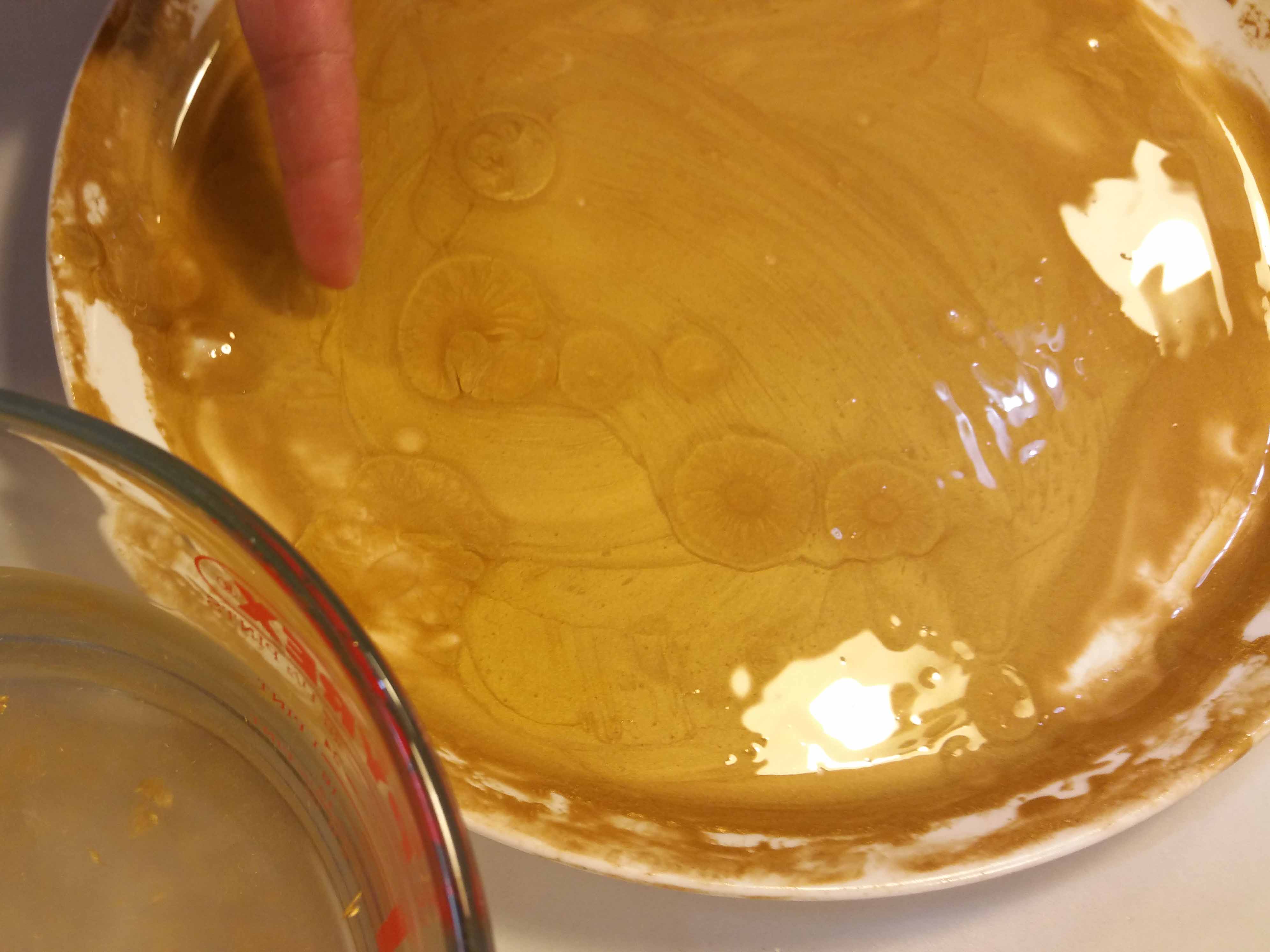
Gold transfer leaf is applied on to several layers of shellac but first the gesso is sealed by painting on a thin layer of tinted shellac. Tinting is done with a pinch of red ochre or vermillion. Leave it to dry for a day then lightly sand working your way through the sandpaper grades from 600-1200. The following day, repeat the process but using untinted shellac. Leave it for a day and then sand as before.

shellac on halos for icon gilding

Shellac ready to sand

It is then ready to gild. Aidan suggested using Le Franc’s 3 hour gold size. Shake well then apply one very thin layer and place it in a dust free place, like a plastic box.

Wait for an hour at least (1-3 hours) then test whether it is ready to gild by touching the surface with your knuckle. If it squeaks, it is ready to apply gold transfer leaf. If not, wait a little longer and re-test. Drying time depends on the thickness of the layer and the drying conditions.

Small areas of shellac are fiddly to sand smooth and as you can see under the scrutiny of the camera, there are a few missing dots. However, I’ve since touched these up with some shell gold.
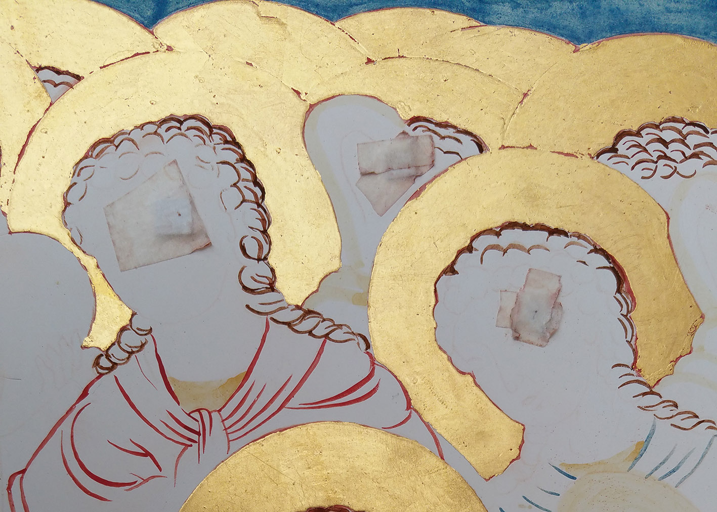
oil gilding on icon

Oil gilded halos

Wait two or three hours and then it should be ready to polish the gold using a gilder’s mop, working from light to medium pressure.

After waiting a few days to let the gilding harden, I could carry on with transferring the rest of my drawing.

transfer of whole drawing

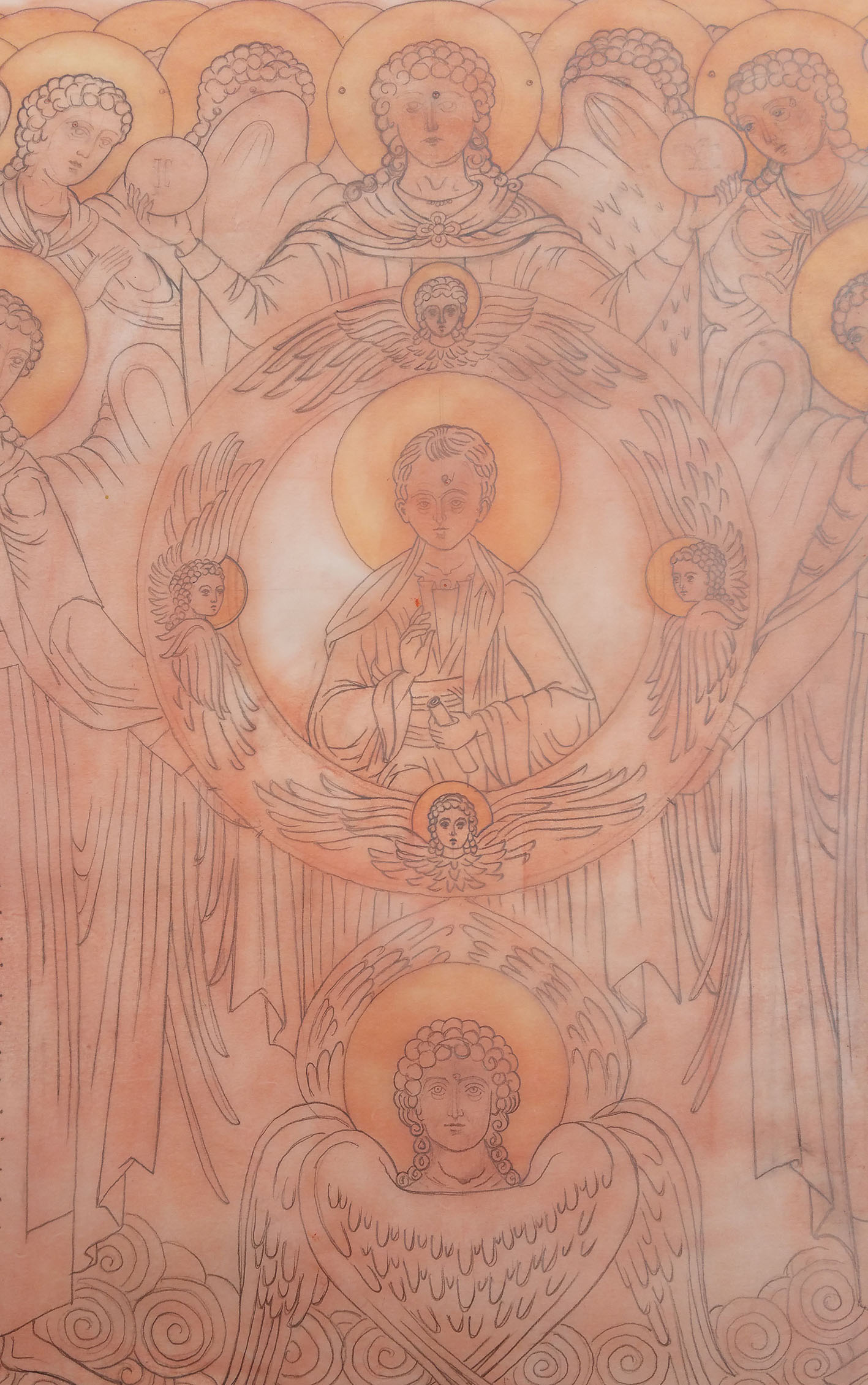
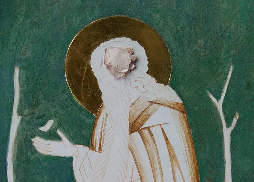
Gilding complete, time to transcribe the rest of the drawing

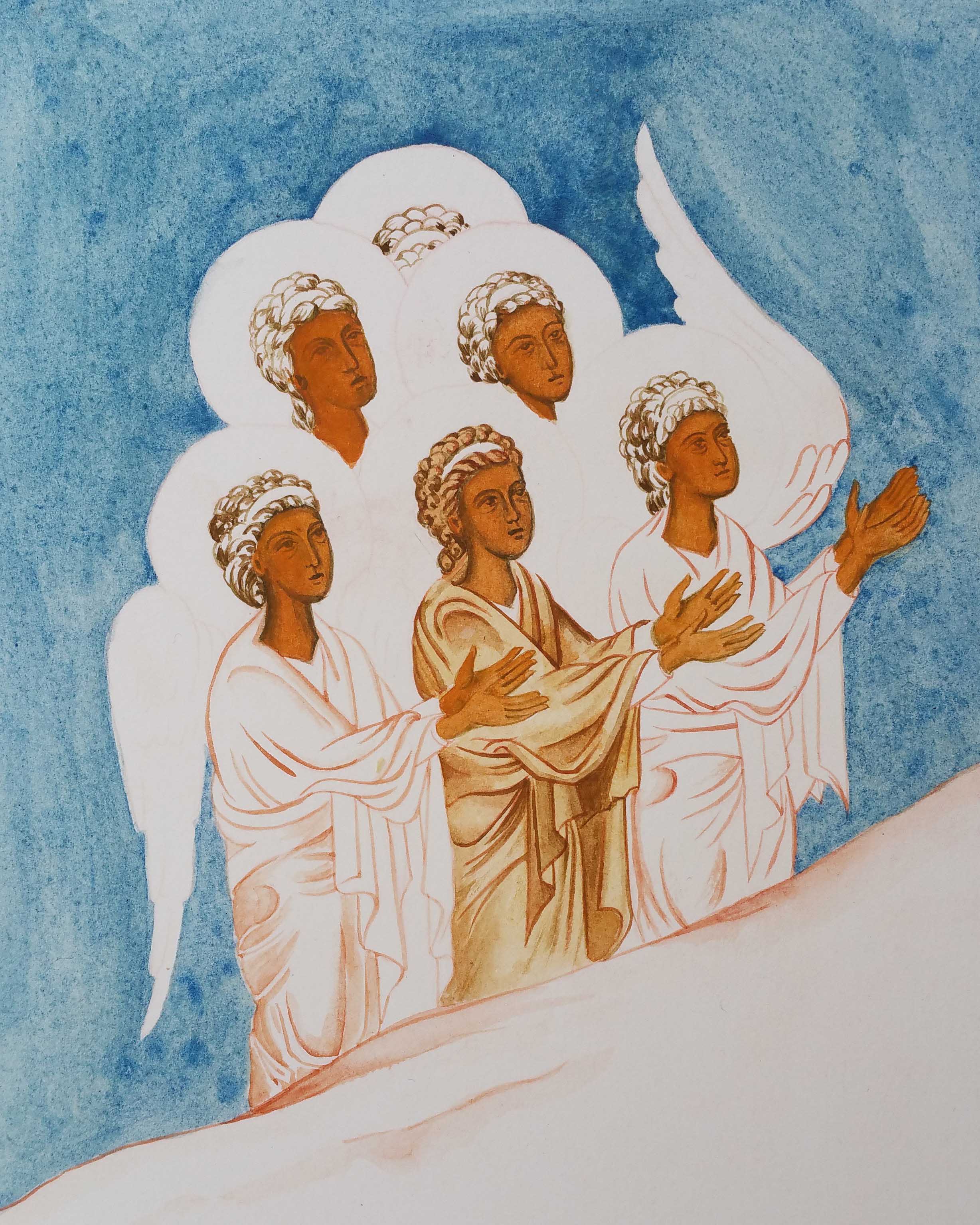
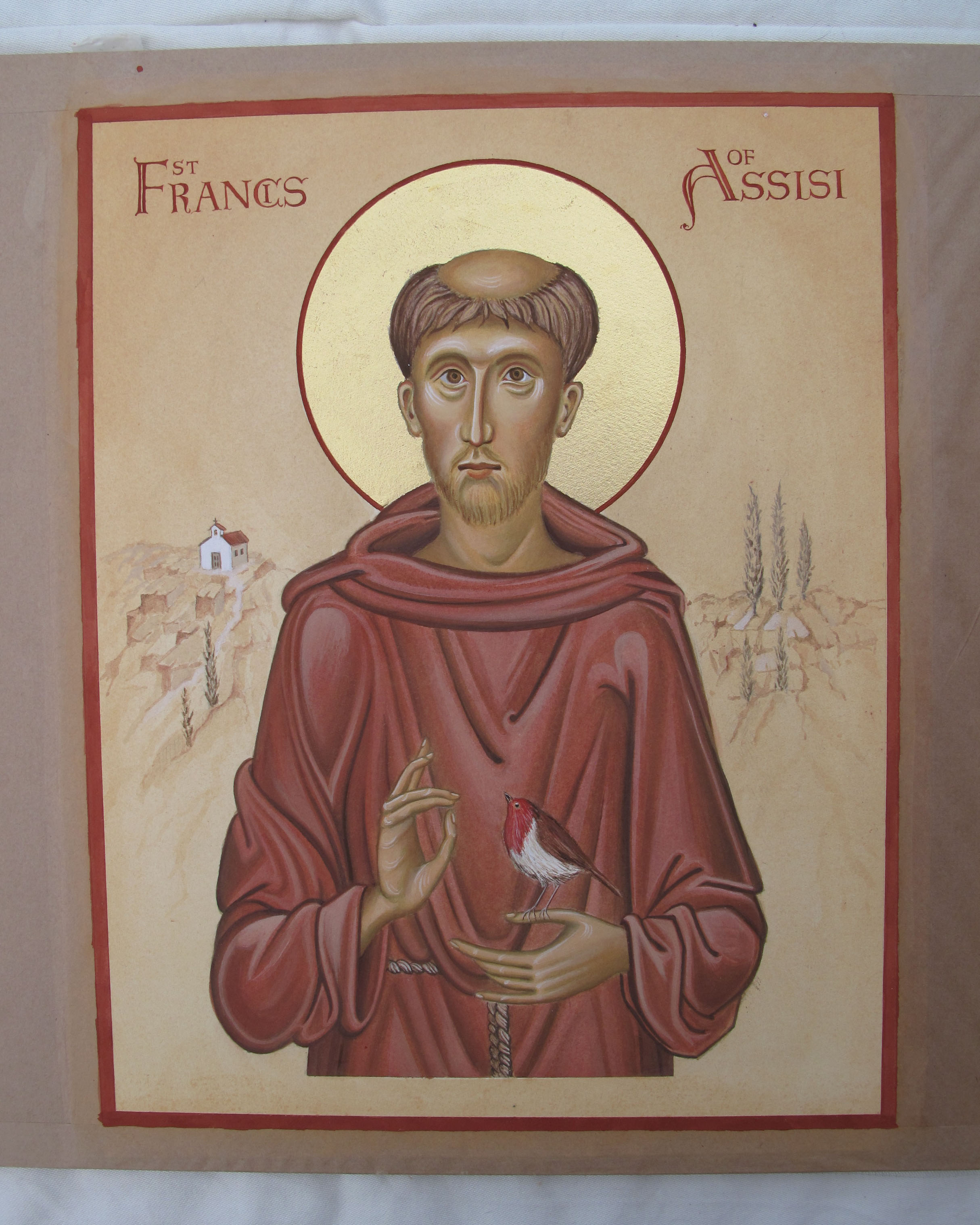
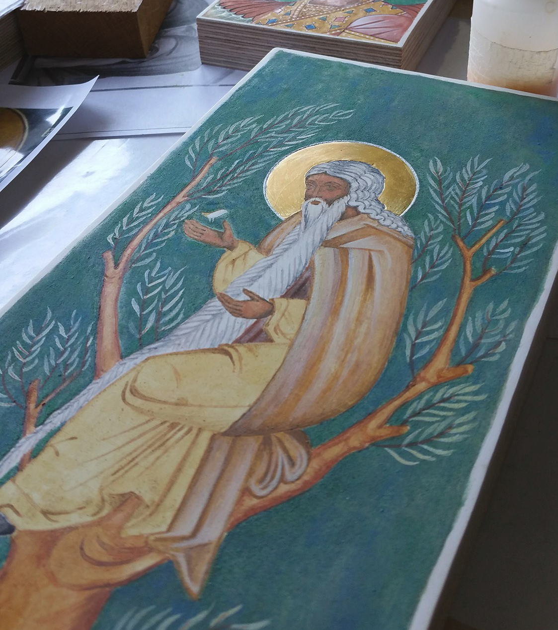
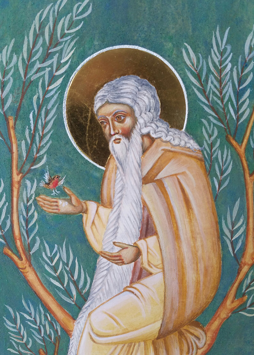
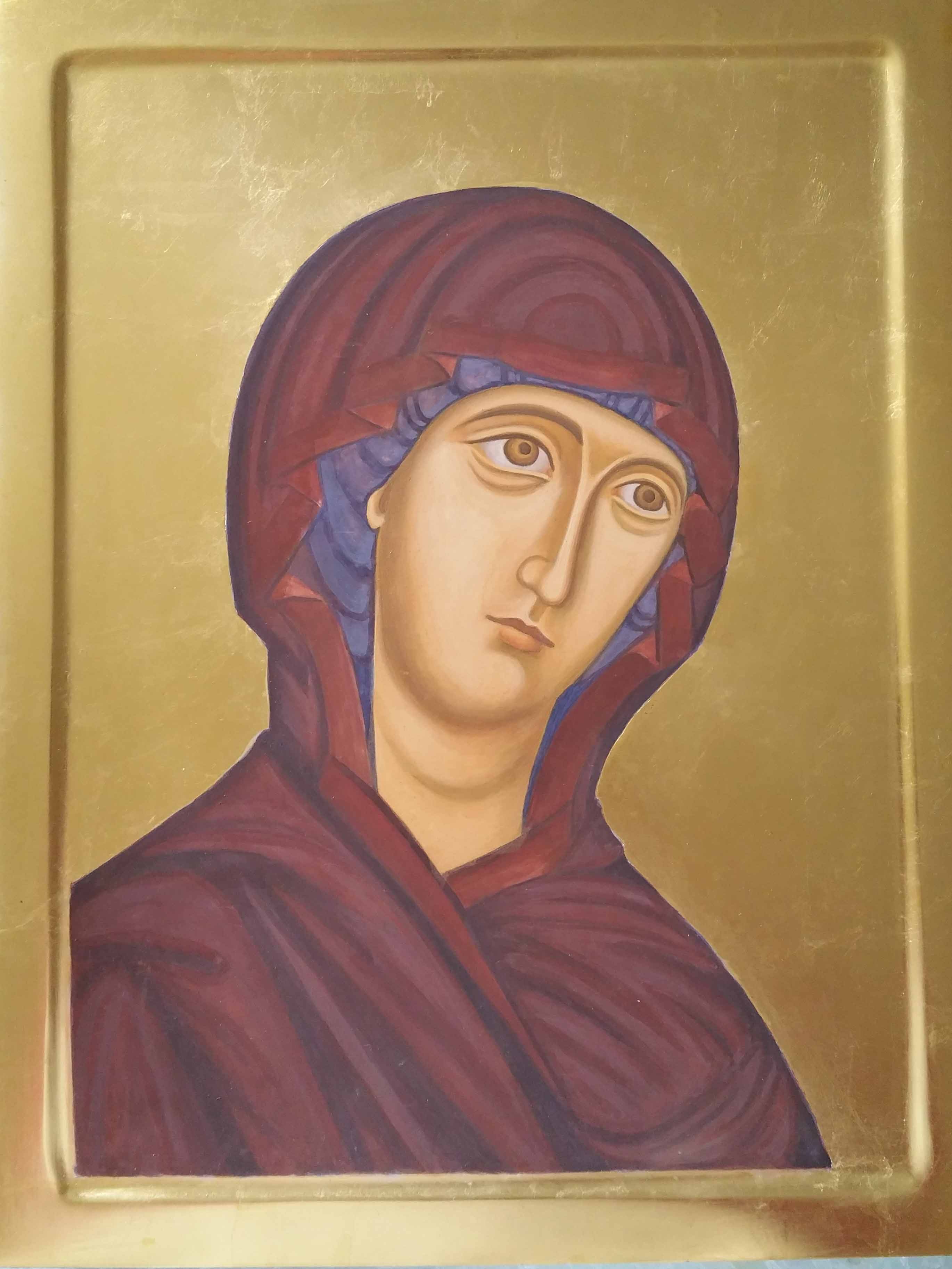
I kept the compass protection pads on so I could add the halo outlines as soon as the sky had been painted. That’s all for this post but I will sign off with a photo of the icon a bit further along.

underpainting icon of Council of Archangel Michael

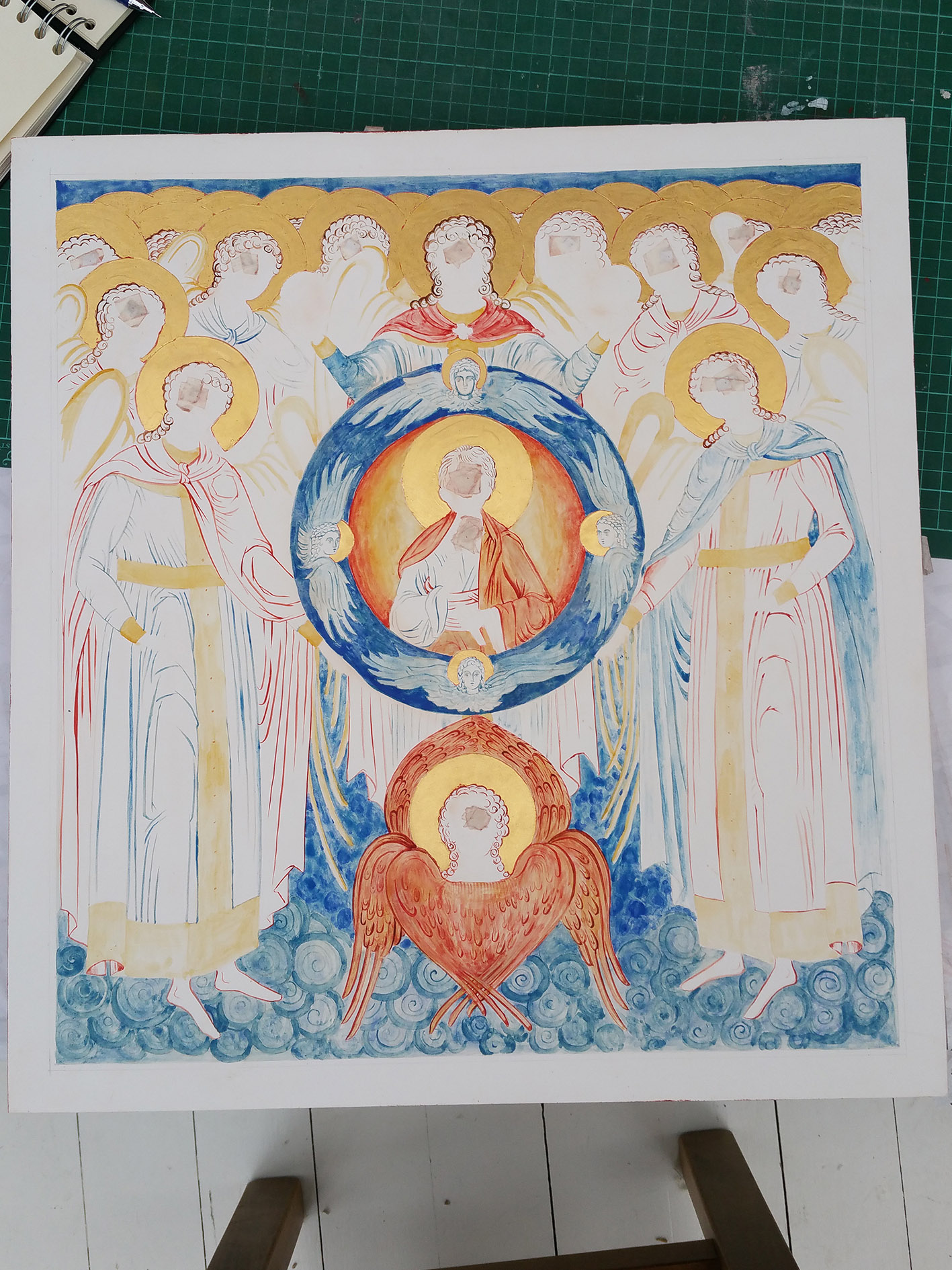
Outlines of figures applied and underpainting begins

Once again, thanks for reading!

Ronnie

St David the Dendrite (part 3 of 3)

Here’s the icon of St David taking shape. It is painted on a long thin board, 25mm birch ply. This post is mostly photos but always happy to hear from you if you have any questions.

icon painting studio

St David the Dendrite (tree dweller) of Thessaloniki

St David the dendrite of thessaloniki icon

Lines transcribed in red ochre on to gessoed board (photo enhanced for clarity)

The masking tape is to protect the gesso from the compass point.

terre verte pigment on icon

First washes of terre verte over background

adding a wash of lapis lazuli over the terre verte

Adding a wash of lapis lazuli over the terre verte

green background on icon of st david

Finishing background so I can add outline to halo

underpainting the face

underpainting the face

jaipur paint brush in use

David and Crystal visited India and brought me back a brush from Jaipur

completed icon (in part) of St David with his open hand feeding a robin

completed icon (in part) of St David with his open hand feeding a robin

7 membrane over face

Membrane applied in thin layers to face using yellow maimeri and a dash of english red ochre light.

Thanks for reading!

Ronnie

Lettering of the Melisende Psalter

hand made book of the Melisende letters

‘Melisende’ –  lettering from the 12th c

Long overdue, but here’s the last installment from my dissertation on lettering which would be lovely to see adapted for use on contemporary western icons. For the last subject, I chose the Melisende Psalter, an extraordinarily beautiful example of ‘East meets West’.

It was written in Latin and thought to have been produced in the scriptorium of the Monastery of the Holy Sepulchre, in the Crusader Kingdom of Jerusalem sometime between 1131 and 1143. It is attributed to the work of six artists, and a scribe who are thought to be of French or Italian origin as the work reflects their backgrounds.

The introduction features 24 full page miniatures of scenes from the life of Christ, with Greek inscriptions, painted with gold backgrounds.

Annunciation Melisende Psalter British Library crop.png

Detail from the Annunciation (image from the digitised British Library Manuscript)

The manuscript is held in the British Library Manuscripts Department (Ref Egerton MS 1139), London.   

The word psalter derives from the old English word psaltere/saltere which came from church Latin Psalterium and simply means ‘a volume containing the Book of Psalms’. These hand written and illuminated books often had other devotional material bound in as well and were most widely owned by wealthy lay persons. They predate the later emergence of the ‘Book of Hours’.

5-a-melisende

Letter A adapted from the Melisende Psalter

Looking at the letters in this manuscript, it was hard to know where to begin as there are so many examples to choose from. It really is a rich resource for both iconographers and calligraphers alike.

I decided to illuminate a few letters to bring out their qualities as stand alone designs. The letters are confident and stems terminate with a flourish and the double stems add a light but strong quality to the letters. This example is painted with Azurite and Malachite. I have applied a few washes of azurite over the malachite to get this velvety soft green.

letter B Melisende

Melisende letter B

This example is painted with lapis lazuli and malachite. I’ve washed a few layers of blue over the green to deepen the green and offset the brightness of the gold.

The letters themselves are on raised gesso – a slightly more flexible mix to the gesso used for icons. This is Patricia Lovett’s recipe and it gives a flexible surface which burnishes up a treat when gold leaf is applied. Patricia’s book ‘Illumination Gold and Colour’ gives more practical guidance on this and is on sale at Cornelissen’s in London (or by mail order)  where you can get all the materials needed to paint your own letters. If you do get a chance to visit Cornelissens in the next few weeks, you will see some of the work by the icon diploma students on display in the window – more about this in the next post.

Before I share the letters which I painted from this manuscript, I’d like to give you a taster of one of the illuminations in this psalter as how it’s a useful resource for icon painters.

magi bring ing gifts melisende

Melisende Psalter – Magi bringing gifts to the Christ Child, Image from the British Library Digital library

To see this image and others in the psalter, here’s the link to the British Library page.

I love the movement of the Magi and how their composition directs the viewer’s eye to observe them placing their gifts at the feet of the Christ Child under the stern direction of the angel. Even though these are tiny paintings, they are dynamic and vibrant.

Back to the lettering. I’ve attached an eight page document with a full alphabet of hand painted letters which are an interpretation of the letters in the Melisende Psalter. Feel free to print them off or save them till later for use on your own icons. I would love to see them in use one day! 11-melisende-letters-v1

letter C Melisende gilded lapis lazuli

Letter C in Lapis lazuli – based on examples in the Melisende Psalter

Thanks for reading,

Ronnie

Northern Grace

monochrome study of st hilda of whitby on fabriano paper

St Hilda of Whitby

St Hilda had been left to one side as a drawing on stretched paper (fabriano artistico 300gsm hot pressed) for the past two years.  I chose to paint St Hilda because she is a local saint to me. When I was a youngster, Mum and Dad used to take us to Whitby on family trips and as a teenager, I worked in York Minster, close to where she was baptised, so she has always been there in the background.

The drawing was in preparation for my painted panel icon which I last wrote about here, but had always intended to paint it. Today was the day.

Here’s the drawing in full – I’ve darkened the photo so you can see my construction and correction lines. After erasing lines that might be distracting, I began painting using a blend of pigments which I know are really warm and earthy.

2 Hilda first washes of colour

Building up the tones

There are some pigment combinations which are lovely to work with – one of which is French Ochre Sahara and French Ochre Havanna. Pigments look quite soft on water colour paper.

3 Pigments ochre sahara

Mixing pigments

Mixing up pigments is best done separately (unlike how I’ve shown!) then add small quantities of the stronger colour to the weaker colour. A very strong pigment, such as English Red Ochre, would overwhelm any other pigment and has to be used sparingly when mixing.

When all the painting was done, I gilded the halo.

St Hilda work in prog Cruwys

Gilding paper is a breeze compared with water or oil gilding an icon boards!  I used Roberson’s acrylic gold size which works well with transfer gold . The size is painted on in two layers, thinned down with a few drops of water. The first layer seals the paper. (Tip: If you rub some washing up liquid into the brush before you use the size, it’s easier to wash out after and protects the brush).  I add a touch of red ochre to show where I’ve painted and to give some background to the gold.

5 applying gold size to halo

Applying gold size to the halo

It’s been good to reflect on the life of this strong northern saint, patron of learning and culture especially in these post-Brexit days. St Hilda lived through dangerous and difficult times – her father was murdered when she was a child. Baptised in 627AD, close to the place where York Minster now stands, she grew up as a noble woman but later became the founding abbess of a monastery in Whitby. More pertinently, as a Celtic Christian, she chose to graciously accept a vote at the Synod of Whitby which didn’t go the way she had wished. Quoting from this last link:

     ‘In Northumbria, along with the politics of the time, there were two strains of Catholic Christianity, and they could not be reconciled: Celtic and Roman. Celtic Christianity, which emanated from Ireland, was less structured than the Roman variety. The Celts were independent, wandering from place to place all over Europe, where they would establish centers of learning and teach. Celtic Christianity relied on monasteries and abbeys where the abbot was supreme rather than the cathedral and bishop system the Romans followed. The Romans viewed the Celtic brand of Christianity as “rural.”’

6 st Hilda monochrome gilded Cruwys.jpg

Completed study on paper

If you would like to read a little more about St Hilda, there is a good write-up about her life by the Order of the Holy Paraclete here.

We still live in troubled times and it helps to connect with the saints. Hilda was considered so wise that kings and princes sought her advice. The Venerable Bede describes her:

“All who knew her called her mother because of her outstanding devotion and grace”.

Thanks for reading,

Ronnie