Icon Diploma Student

Learning to see with the eye of the heart

Posts tagged ‘egg tempera’

Hello icon friends,
Good to be back to share what has been going on this last month. I set Gabriel to one side to for a short while to make way for the Prophet Moses – homework time!
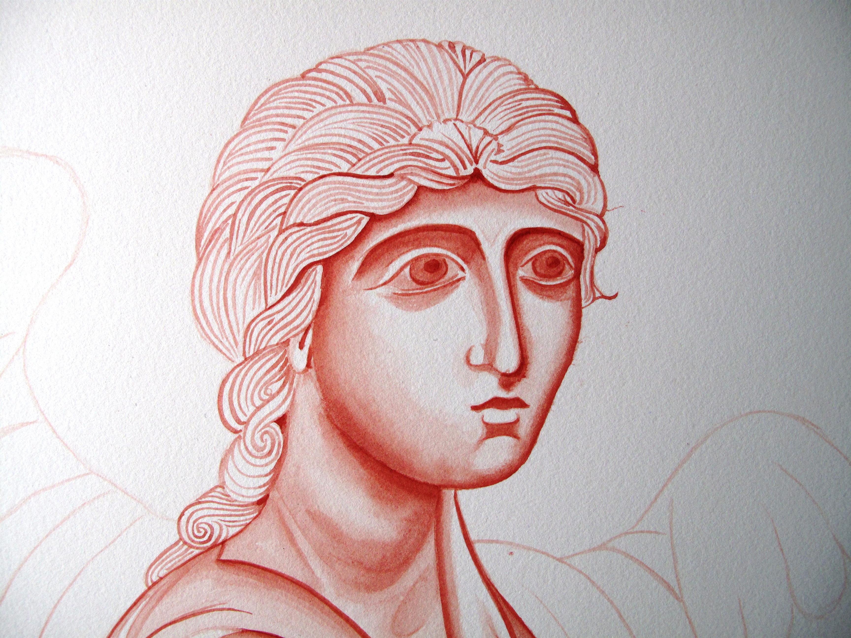
 

Moses detail

Moses detail

Now that we have our first six months behind us, there are signs of all our efforts beginning to bear fruit. It was wonderful to see over 24 homework studies from 12 students all laid out together, they made quite an impact. Let me tell you a little about this particular example
I have tried a different mix of pigments for young Moses: French Ochre Sahara and Avana (75% – 25%) just to explore a different colour. Aidan had said that each colour has a personality, some are more translucent or gritty and it is good to get to know their qualities.


Moses pencil outline

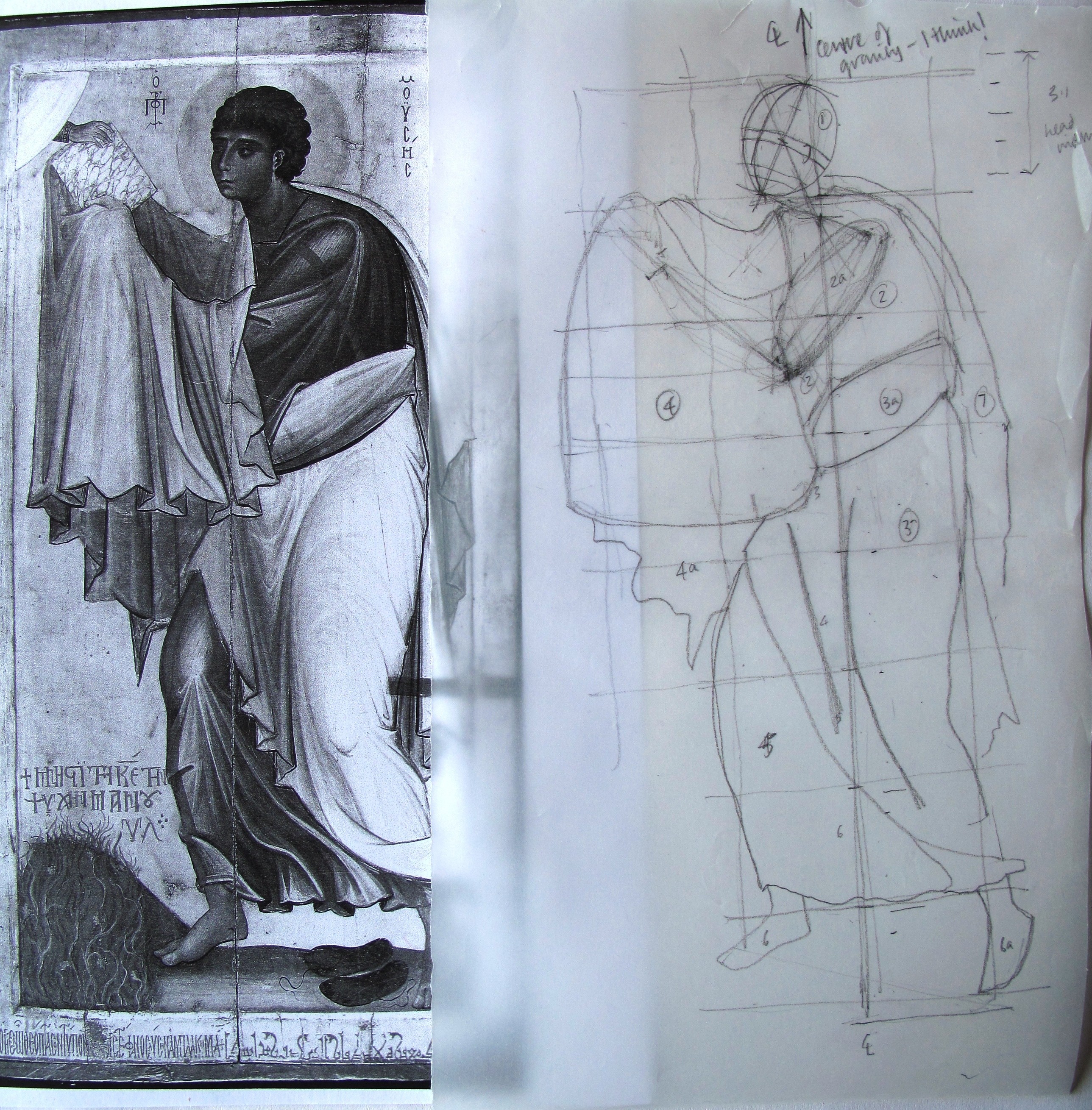
Icon of Moses, St Catherine’s Monastery, Sinai with sketch pencil outline to identify key forms

Aidan reminds us that when we start out, we should spend some time studying the icon before we begin to sketch. Look for the dominant movement, the centre of gravity, the direction that the body takes, the qualities that the person is portraying. Icons start with spiritual truths which are then expressed in matter. Study the main forms and don’t worry about the detail just yet. Is it dynamic or still? Check the proportions of the body in relation to the head, use your dividers to check relationships.

Spending time pencilling out the form on tracing paper helps me to identify some of these points. First I drew the centre of gravity then outlines around the main forms. I drew an axis on the head and divided the vertical line into head lengths. I found the array of garments a little perplexing to draw without some help so I drew a head-sized, free-hand grid either side of the vertical line.

Pencil sketch of Moses

Pencil sketch of Moses

The figure seems quite top heavy, but the whole image is balanced by the burning bush at the bottom. Once I was more familiar with the form, I was ready to set Moses out on my watercolour paper. I allowed 2cm for a border then divided the given area into 9 head lengths which allows for halo space and ground (approx. a head length).

Light wash over pencil outline

Light wash over pencil outline

I’ve learned that it is best to start with a very light wash over the main forms, then rub out the pencil before the drawing gets muddy. This is also the time to look again at the main areas of light and shade, look at which parts of the figure are nearest the viewer (the lightest) and which recede (the darkest).

I will leave you with my final piece and once again, thanks for reading!

Moses study complete

Moses study complete


Gabriel at Large

Gabriels face appears

Gabriels face taking shape

Hello again icon friends,

The image above represents a quick sidestep past another effort which ended up in the experience bin. I had started this stage quite pleased with my decision to stretch myself by working on a larger image. I transferred the outline of my final drawing of Gabriel on to A2 sized paper which gave Gabriel the space to outstretched his arm in full.

Transferring the final drawing

Transferring the final drawing on to unstretched A2 Fabriano Artistico watercolour paper

On went the image using a sheet of paper which I had rubbed with Armenian red bole (a red pigment) to act as transfer paper. Then I painted lightly over these lines to fix them.

Painting on the outline

Painting the outline on to the paper

So far so good. However, as I washed over the larger areas, the paper began to cockle.

Image of Gabriel 1

Image of Gabriel 1

I then got caught up concentrating on the face rather than building up the image lightly and evenly as a whole. I looked at the face in comparison with the original and decided I had gone so far adrift that it was only paper and I should start again, and start properly. I am sparing you a larger image of my first Gabriel who looks rather stern!

Gabriel looking nothing like the original!

Gabriel looking nothing like the original!

So, down to the DIY shop to buy an MDF board cut a little bigger than A2, together with some water colour tape and this time soak the paper in the bath for a few minutes, tape it to the board and let it dry. By this stage I had had enough, so I left the board and wet taped paper flat on the floor overnight and by morning it was dry and had stretched beautifully!

Gabriel with a softer face

Gabriel with a softer face

This time, I tried to develop the whole figure and garments at the same time. There are numerous mistakes with the garment folds which I realised as soon as we got the handouts on our next Icon session but at least I can see where I have gone adrift.

I have attached Aidan’s handout notes on painting standing figures and garments if you would like to find out more on this subject. I am concentrating on our homework for the time being but will come back to Gabriel in a few more weeks.

Day 7 Aidan Hart’s handout on standing figures 24 Feb 14

Adding shading to define the forms

Adding shading to define the forms

Gabriel underway

Gabriel set on the A2 paper

Thanks for reading!

The Spirit Gives Life

Warm greetings Icon Friends,

I have tried some different paper for my monochrome studies and I think it has made all the difference! I would love to know what you think. The study on the left is the second (fourth if you count pastel studies) attempt at painting the Virgin standing at the foot of the cross.

Image

So far, I have been using a rough surface, bright white paper for my monochrome studies and not been doing very well with blending the egg tempera. A fellow icon student suggested I try using a heavy weight (300gsm) hot pressed watercolour paper such as Fabriano Artistico or Saunders Waterford. Both are smooth, creamy coloured and gorgeous to work on, though with a slightly different texture. I have done a monochrome on both these papers to compare them.

I started with the Saunders paper and it was so much smoother to work on than the rough white watercolour paper. The paint flowed and blended without having to saturate the paper with water first although I did apply a light water wash before addressing a large area. I am gradually finding my way around the end of a paint brush – it really is a case of just getting on with it and learning as you go along. Aidan makes it look so easy but it isn’t!

The blending and overall appearance of this monochrome looks a bit better than my earlier attempt a few months ago. I have attached the work in progress photos as a pdf. The folds in the robes still have a long way to go though!Virgin at Foot of the Cross

I have finished writing up my notes and will attach them in stages. Day 4 Proportions of hands Ottoman Romanesque Carolingian examples

Next post will be about the Fabriano paper.

Thanks for reading and I will leave you with:

The seven canons


The Spirit gives life


The brush’s task is to incarnate spirit


Although you abstract, model form

According to the essential laws of nature


Usecolour to manifest the spirit


Organize the elements within the panel

To make an harmonious world


Remember there is an imperfect perfection

And a perfect imperfection


In copying, seek to unearth

The master’s techniques