Icon Diploma Student

Learning to see with the eye of the heart

Posts tagged ‘Angel icon’

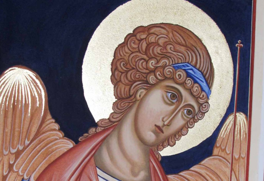
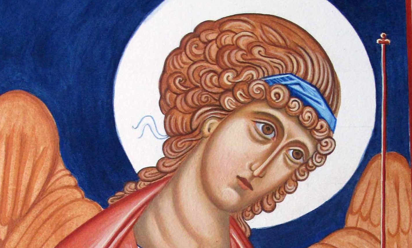
Archangel Gabriel – A Listening Ear

Every now and again, I’m asked how to get started icon painting. I always recommend painting monochromes on smooth (hot pressed) best quality watercolour paper. I recall the first time I saw some of these red ochre studies by Aidan Hart’s past students and I found them captivating. They were on the wall in a workshop given by Aidan Hart at Walcot Hall over 10 years ago.

Archangel Gabriel – large completed monochrome
Use a very thin light line of ‘English Red Light’ red ochre egg tempera with a sable brush to mark the outlines.

For the last few weeks, I’ve been having a bit of a sort out of my studio (and my overspill areas). Over the last few years I’ve gathered quite a gallery of work that’s lying unseen as I have no more wall space!

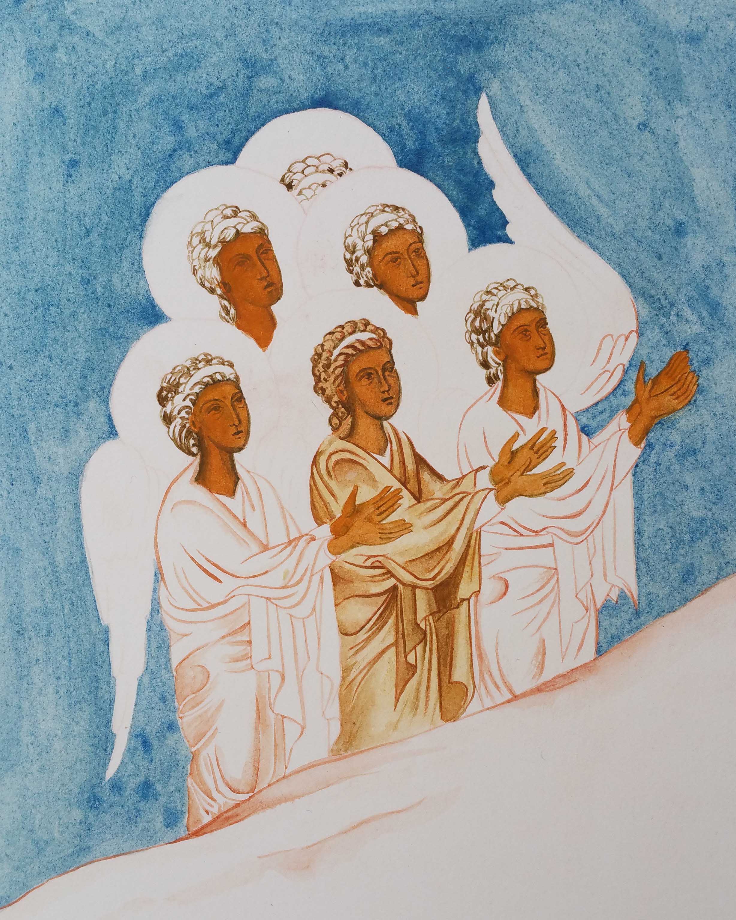
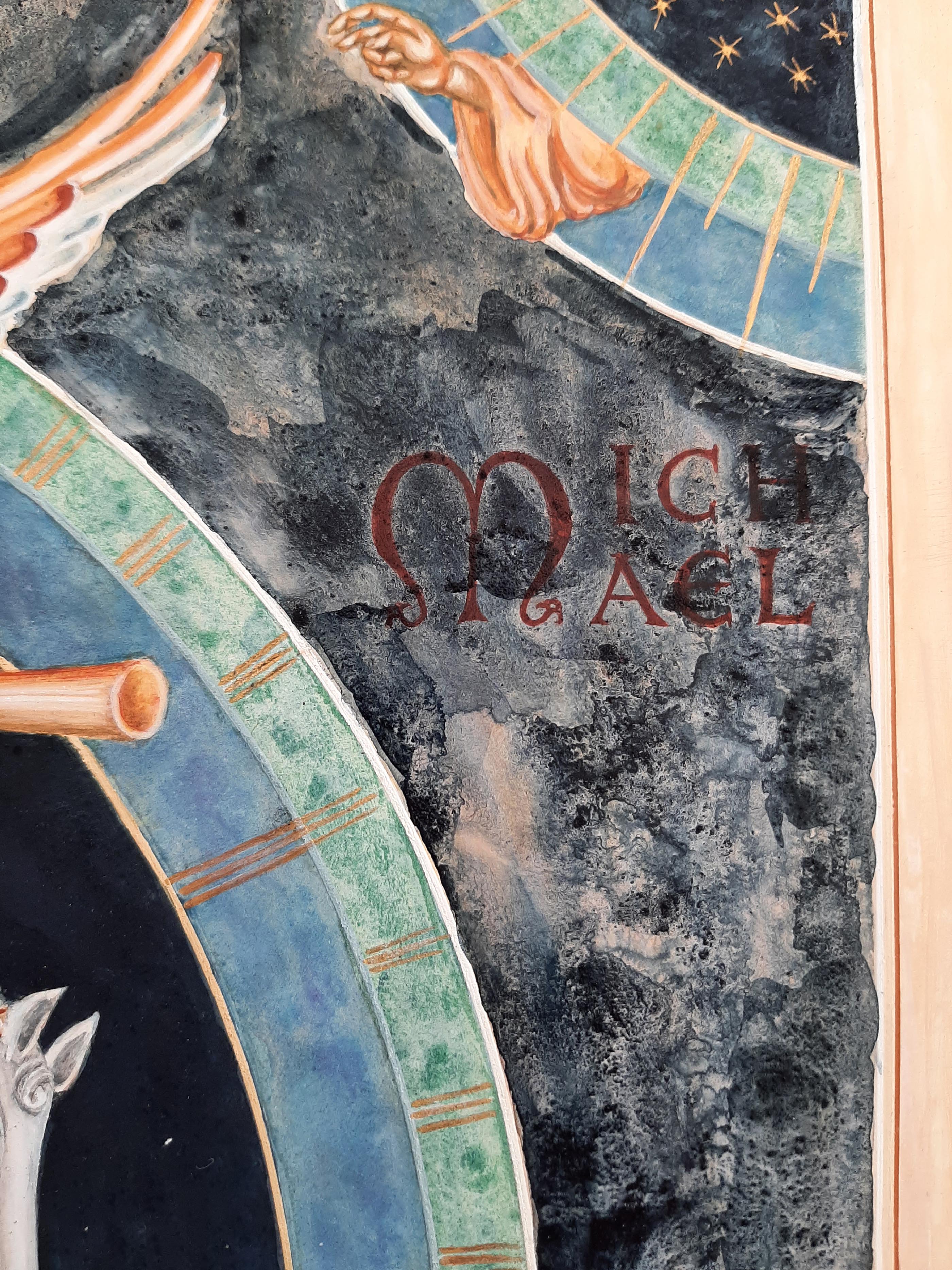
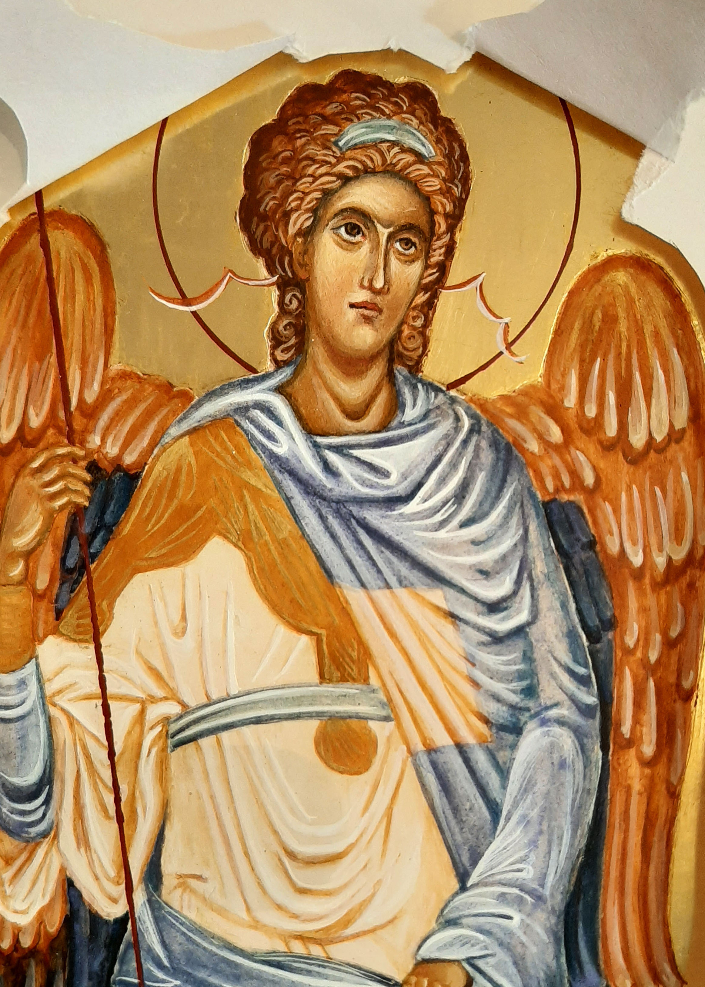
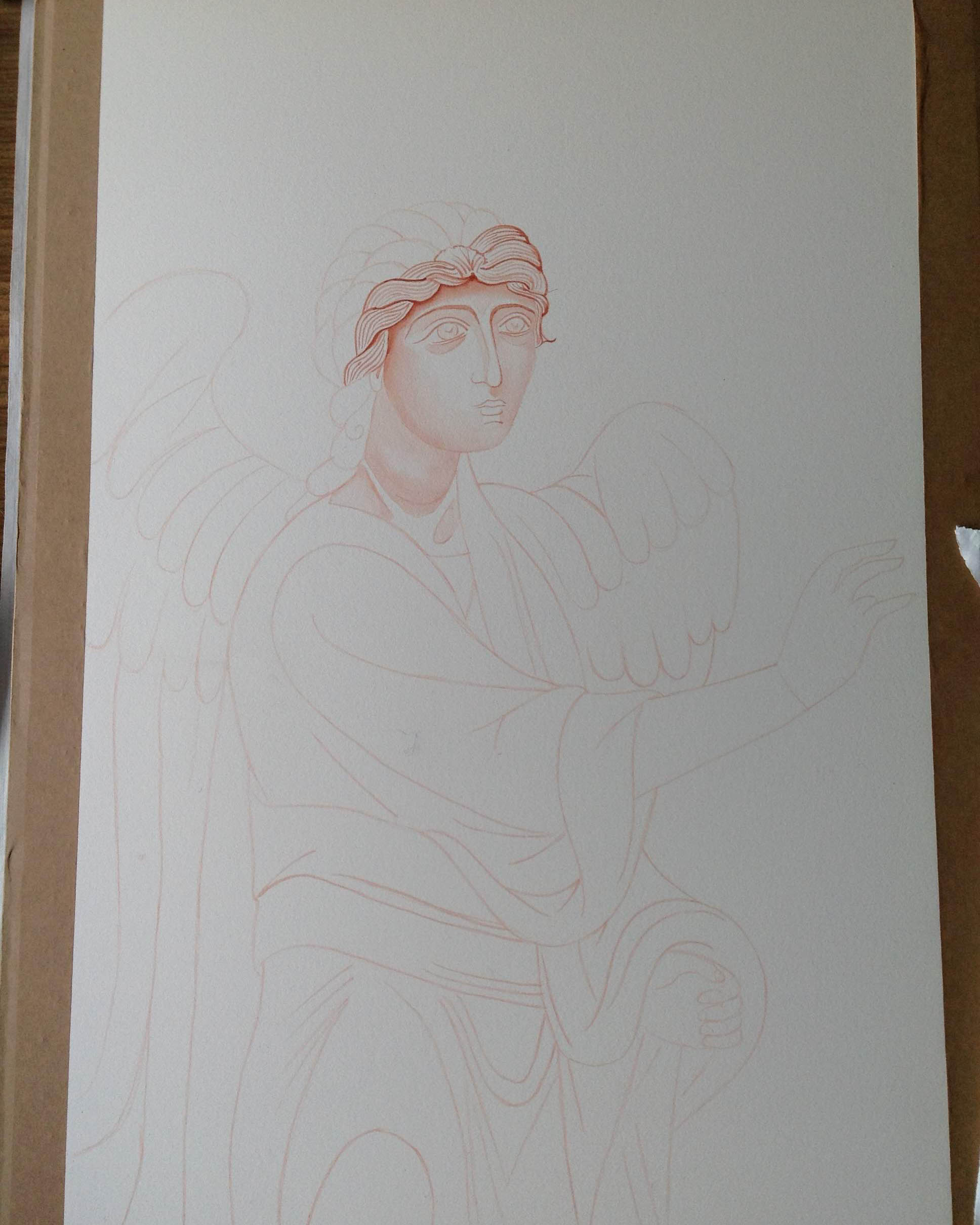
I made a decision to go through all my work and list it for sale in my Etsy shop as I can’t keep holding on to things – there’s no room to move! Also, letting go of things makes way for the new so let’s make a start with looking back over this large monochrome of Archangel Gabriel.

Gradually build up the shape of the face in very thin washes. I’ve been impatient with the dark hair lines

Before I go any further, I have already written about this monochrome here. It’s really interesting to reflect back on this post from 8 years ago as I’ve become a lot kinder to myself. I can see that things I once thought weren’t good enough actually were a great foundation – they just needed a bit more work and creativity. SO – if you are being hard on yourself – put your work away for a few years then revisit when you have had a few edges knocked off and away you go – again!

Building up the forms of the hair and face

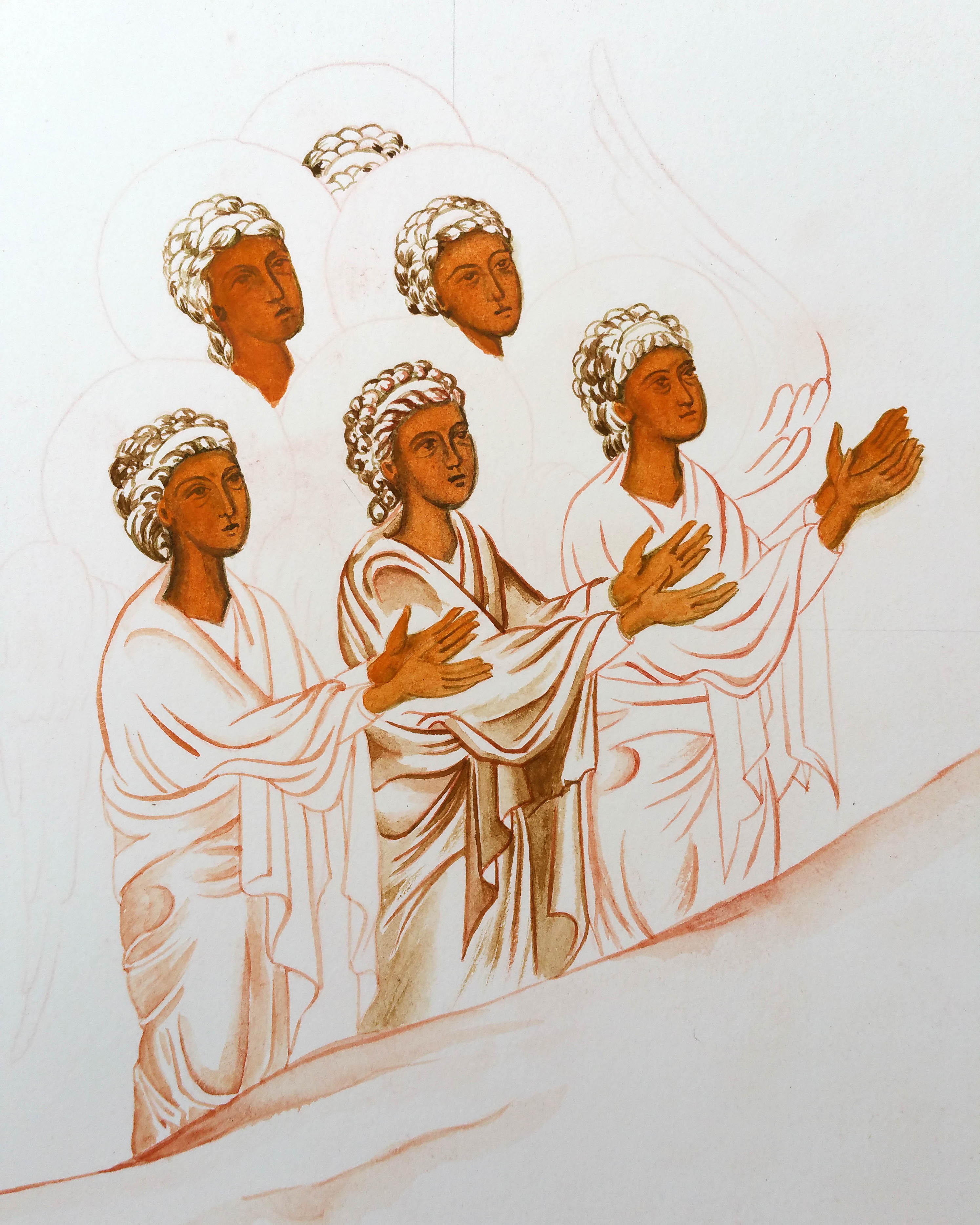
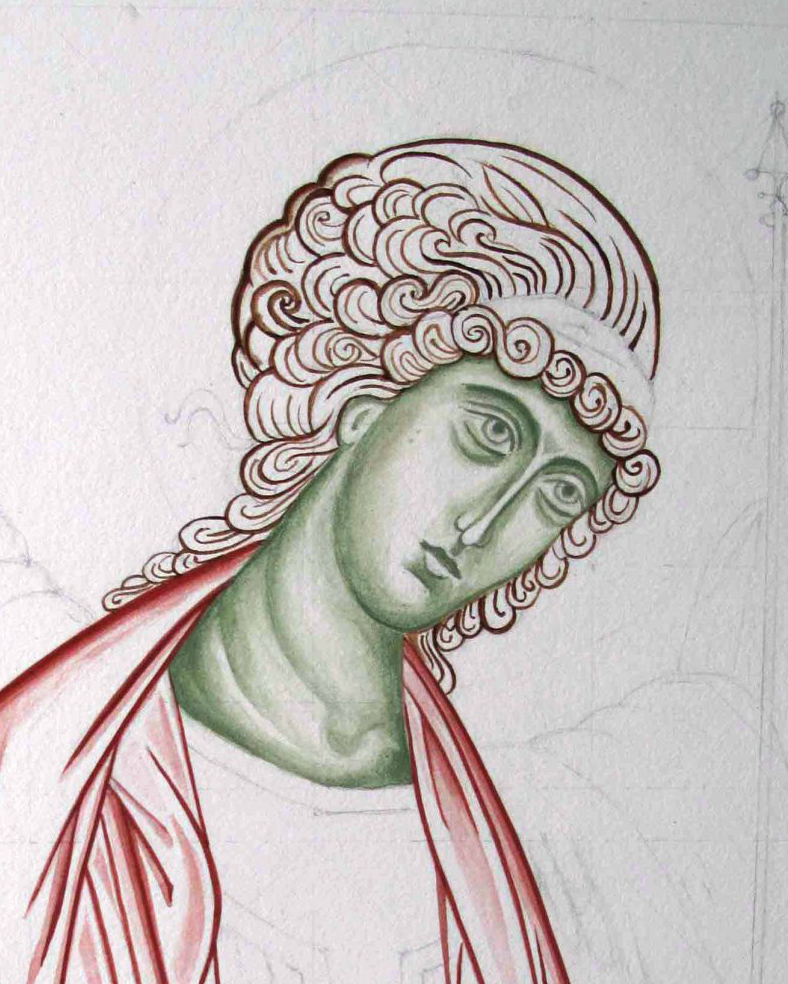
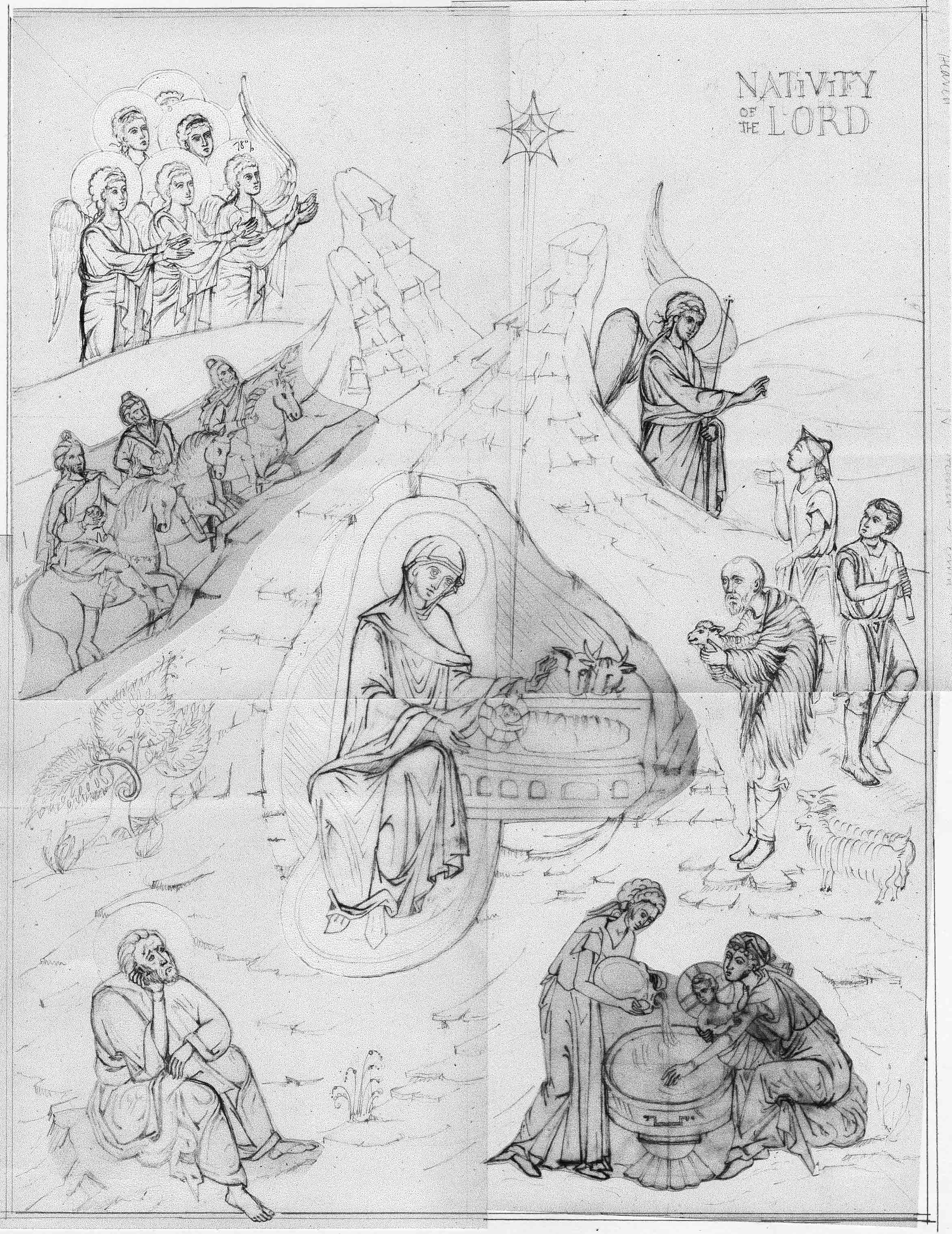
The best way to start as always is with a drawing. Sometime this too can be daunting so be kind to yourself – this is a learning process. You can always make a tracing of the icon you want to paint by outlining the main forms to get familiar with the shapes, shadows, proportions and lines. You could also try laying a grid over the prototype, then draw into your own grid at a larger scale. This can help you can anchor the key features.

With this monochrome – I drew onto a large sheet of cartridge paper (inexpensive paper is fine for this stage), then traced over and rubbed red ochre pigment into the back of the tracing paper. It is them ready to transcribe on to the watercolour paper. You could use pencil but the graphite smudges and I wanted to keep the paper clean.

The paper has been stretched with a damp sponge and taped to a board.

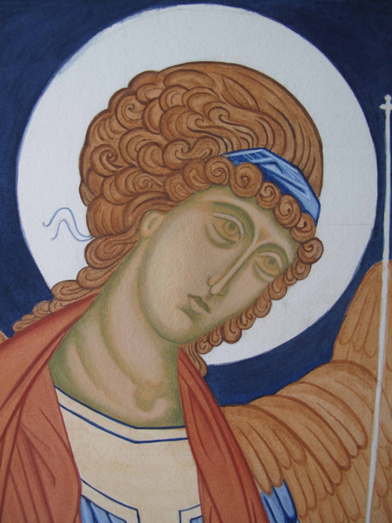
I use Fabriano Artistico Hot pressed watercolour paper, 300gsm. You can use other brands, but the weight and the hot pressed finish are really well suited to monochromes. I stretched this one but I didn’t really need to. Even though the paper can buckle, it can also be flattened as I discovered later. There are plenty of You Tube videos to help you do this but in short: face the artwork down on a clean dry sheet of paper, place a spray dampened sheet of paper over the back, then place a pile of books on top and leave for a few days. This works a treat.

The face of Archangel Gabriel…but there’s something missing…

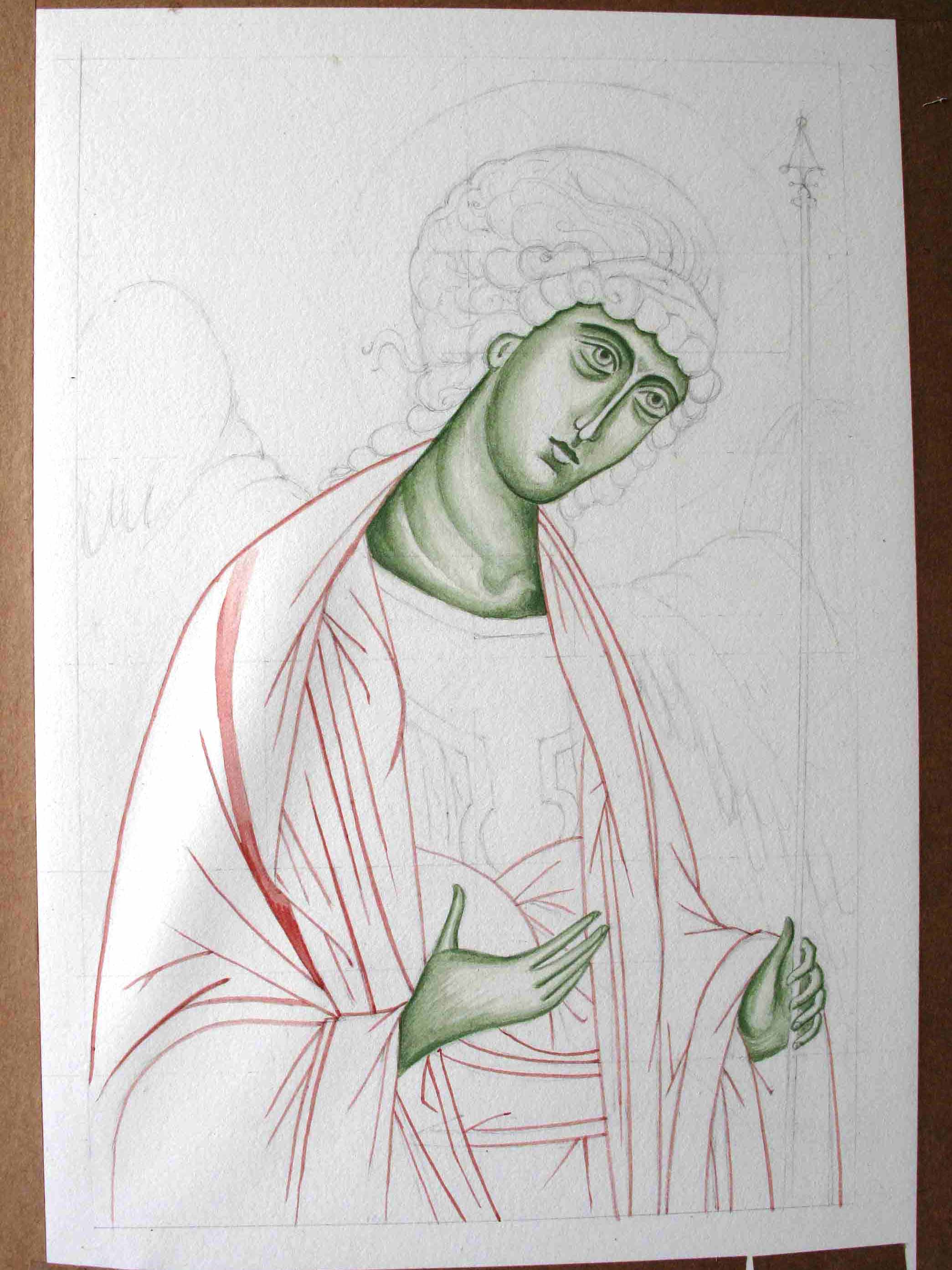
Once you have the red ochre line in place from the tracing – it’s best to fix it in place using a dilute mix of egg tempera in red ochre or whatever colour you are using – the red/gold/earth ochres all work well. I think the most valuable thing I’ve learnt from painting these is not to rush them – work in the finest layers you can and build up very gradually.

The almost finished Archangel – with a finely layered background of very thin washes of red ochre.

Looking back through my old notes from Aidan’s class, I wrote as follows:

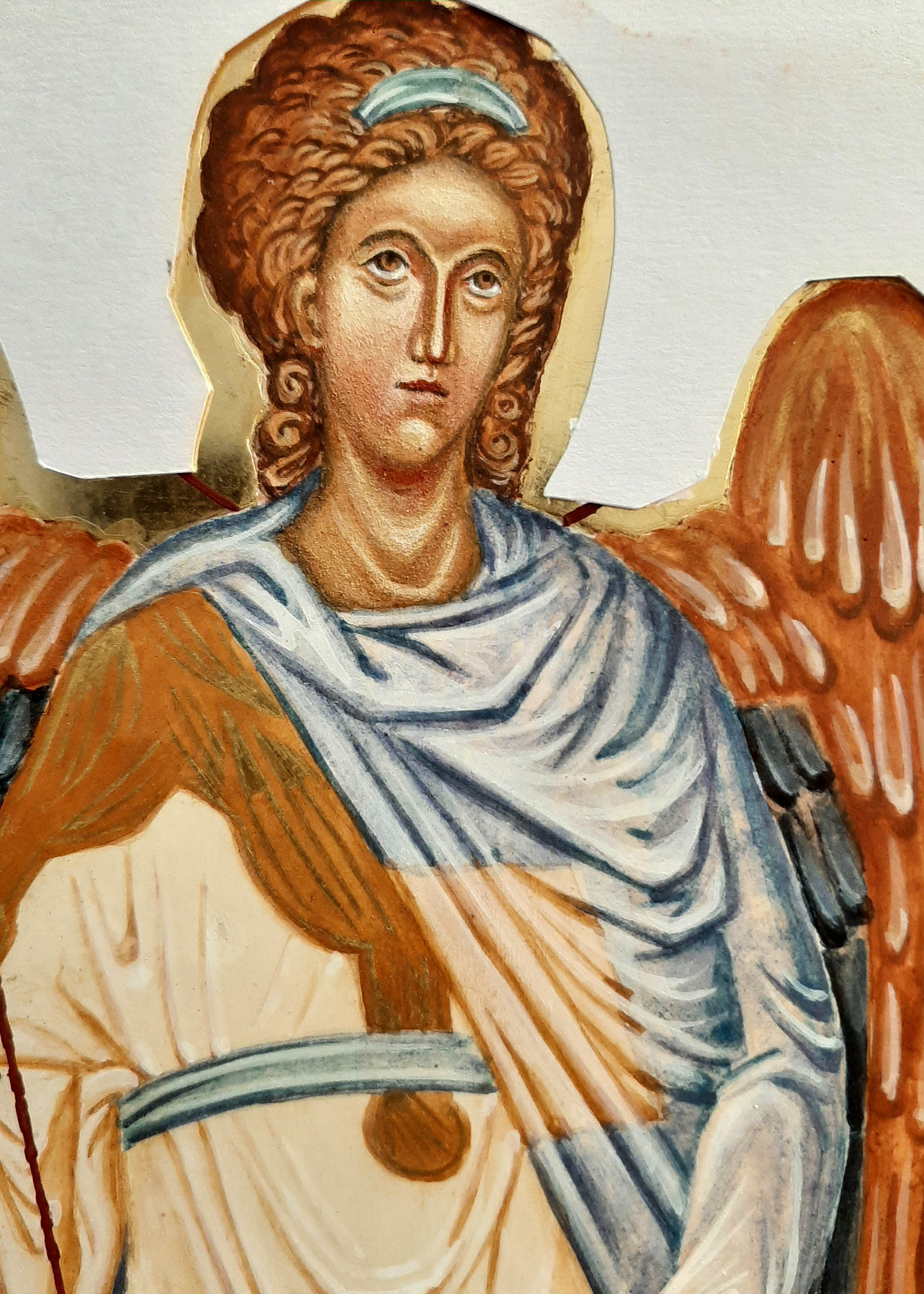
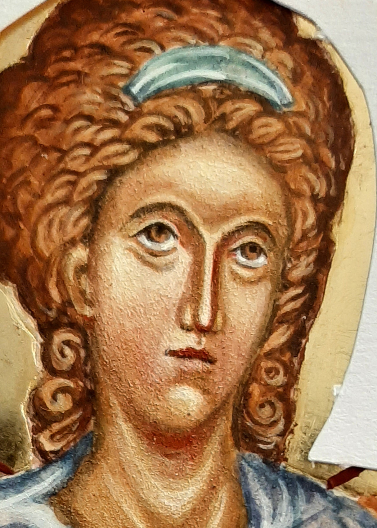
Eyebrows: When painting the eyebrows, the top line is soft and the ends are also soft. Look at an eyebrow, the hair is densest lower down, then feathers upwards (not as I have done here!). When painting the brow, show the graduation of tone. Facial features grow out of the background. Find the high point of the eyebrow in relation to the rest of the curved brow. Pay attention to the descent of the brow.

Lips: Look at the lips in profile, the light falls and hits the lower lip, the upper lip is drawker and in shadow. The lower lip projects and the recess below the lip is alos in shade. Note the gap at the corner of the lips.

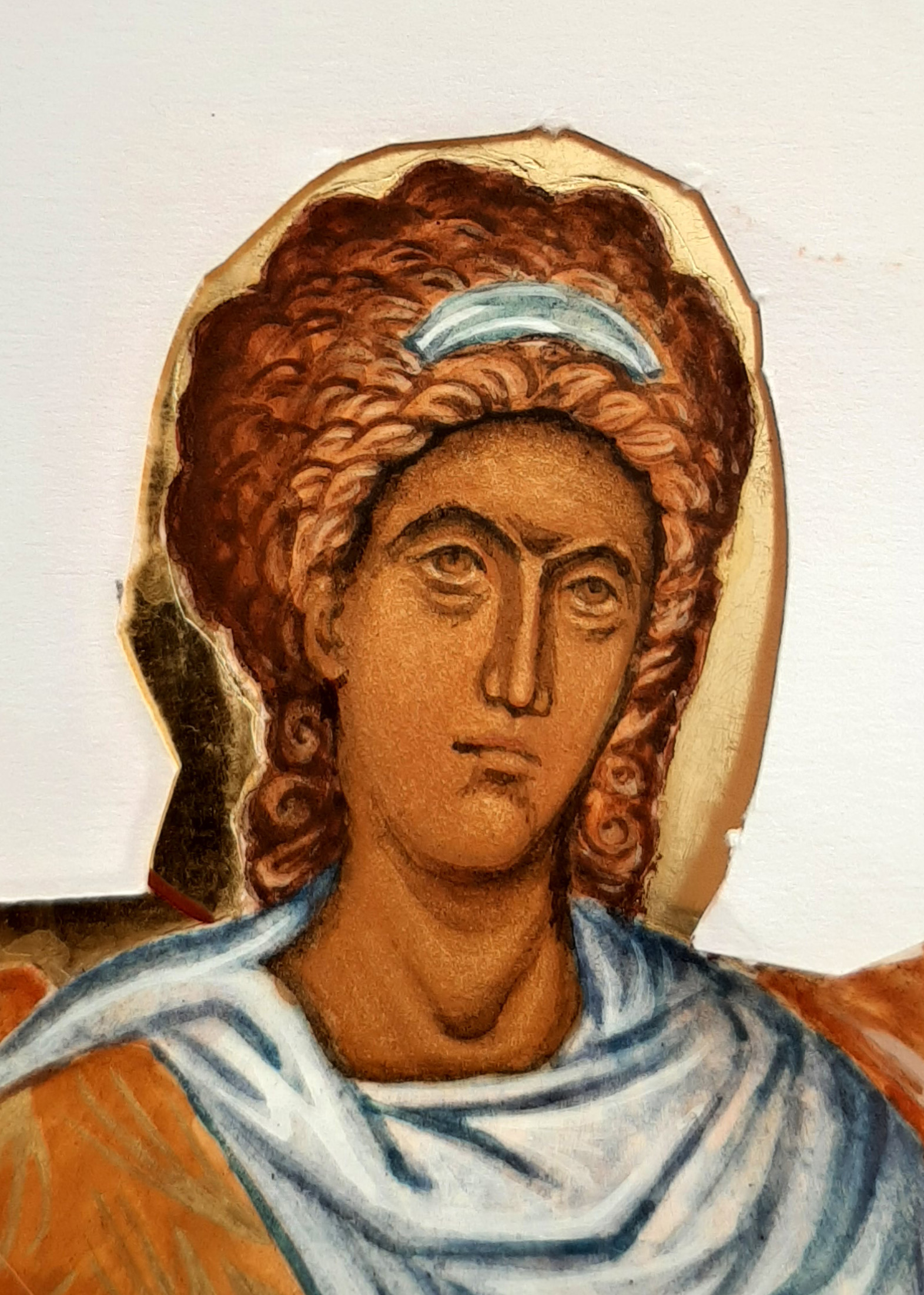
This monochrome of Archangel Gabriel has only had a few brief outings since my diploma. Once in a short lived exhibition at the Bar Convent in York and a couple of weeks on the walls of the Tolbooth, Lanark. Lockdowns – say no more!

Protect the icon with paper and start to map the outline of the head band

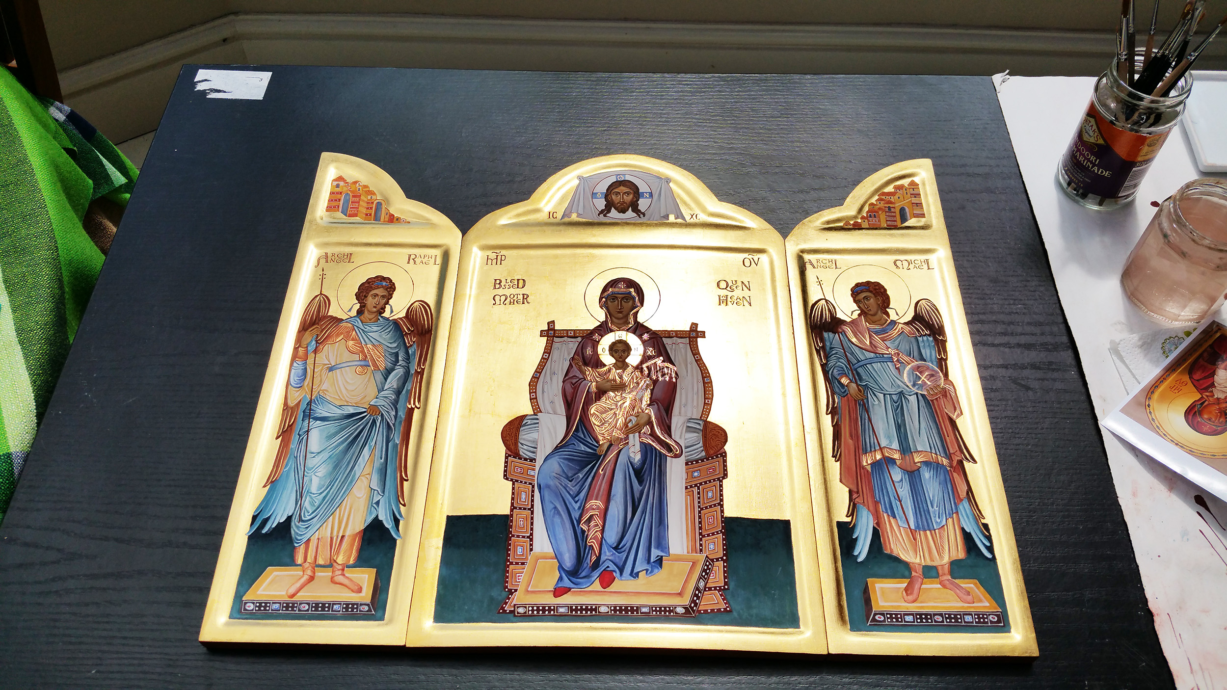
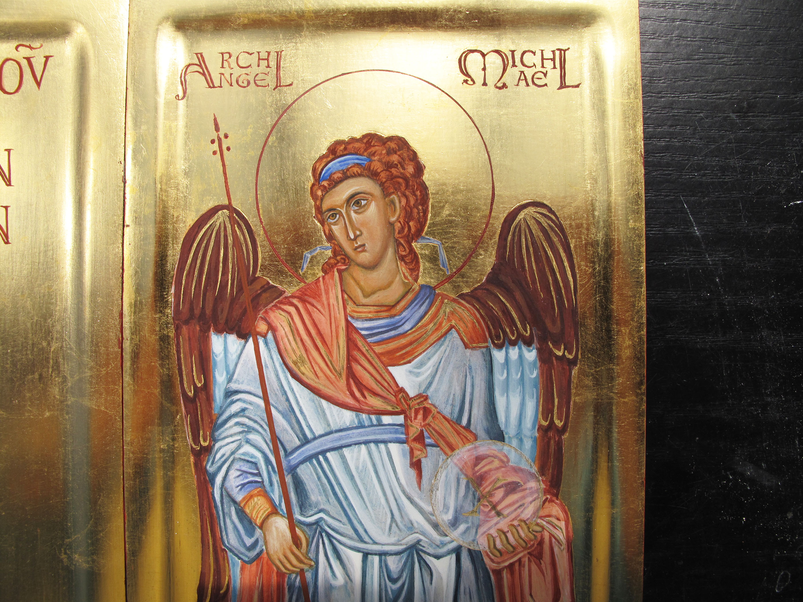
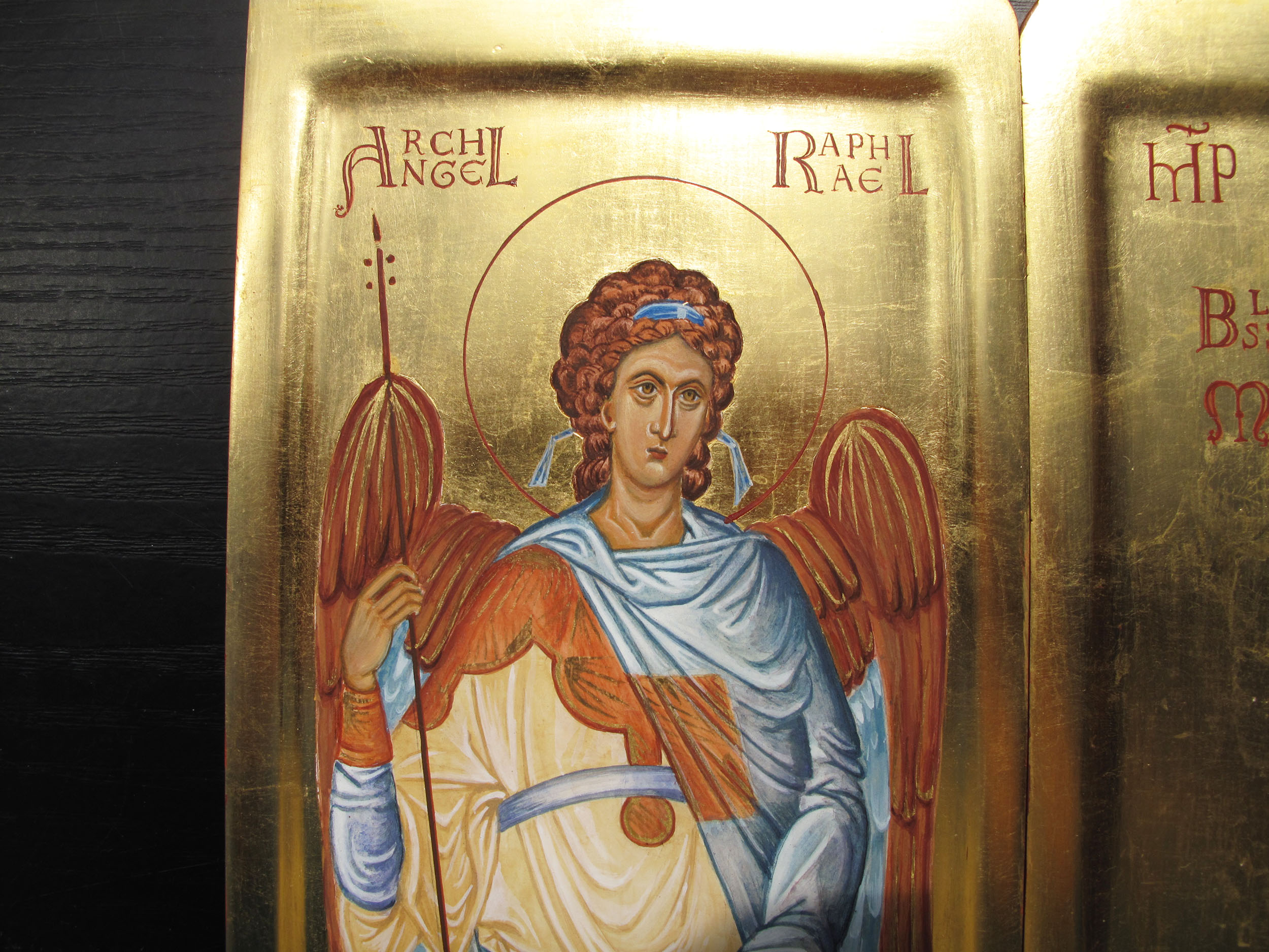
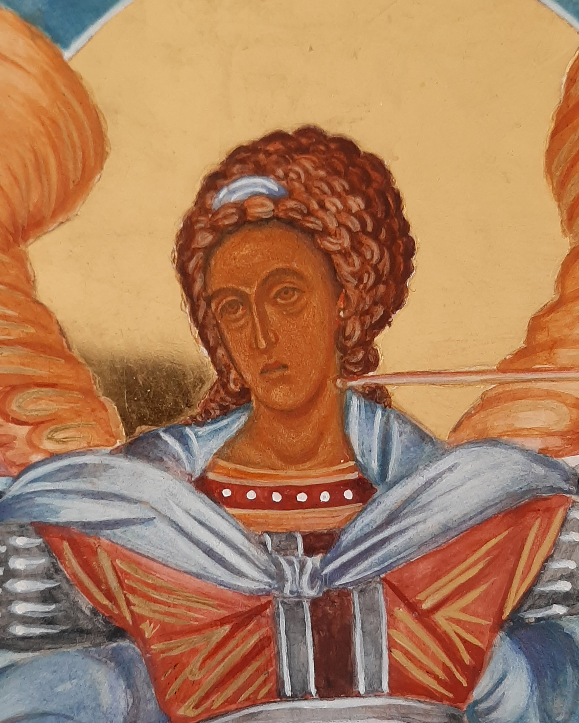
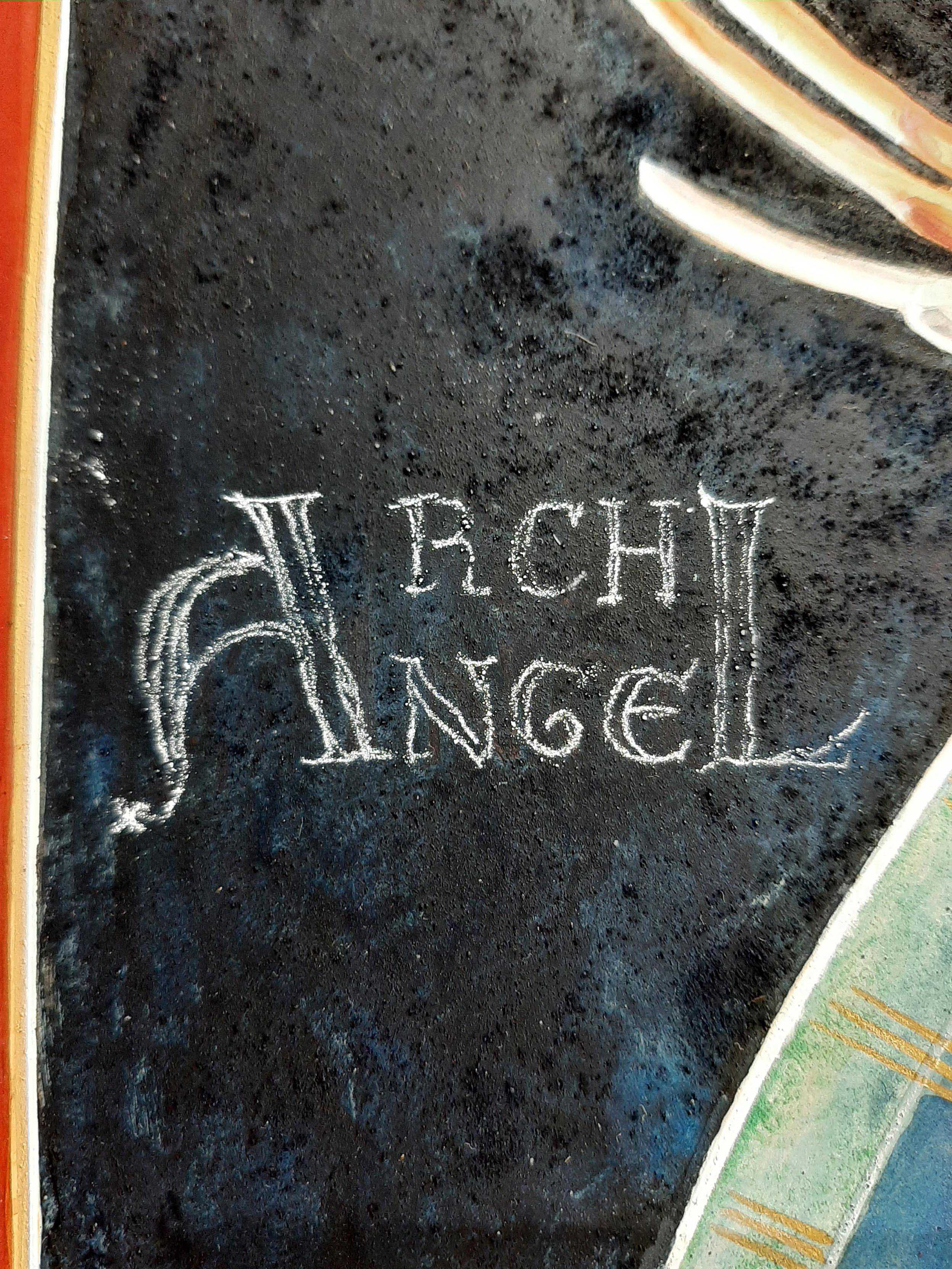
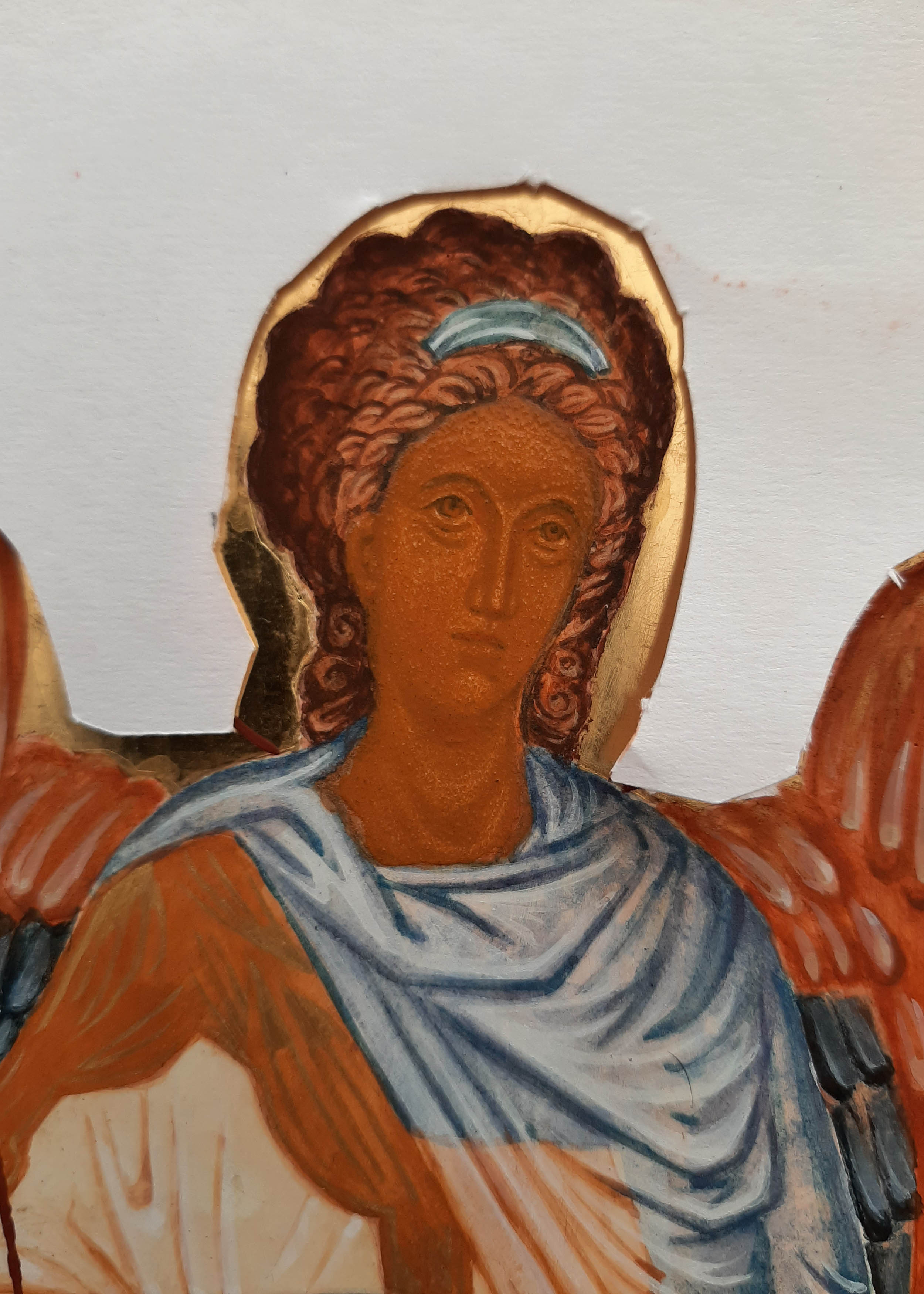
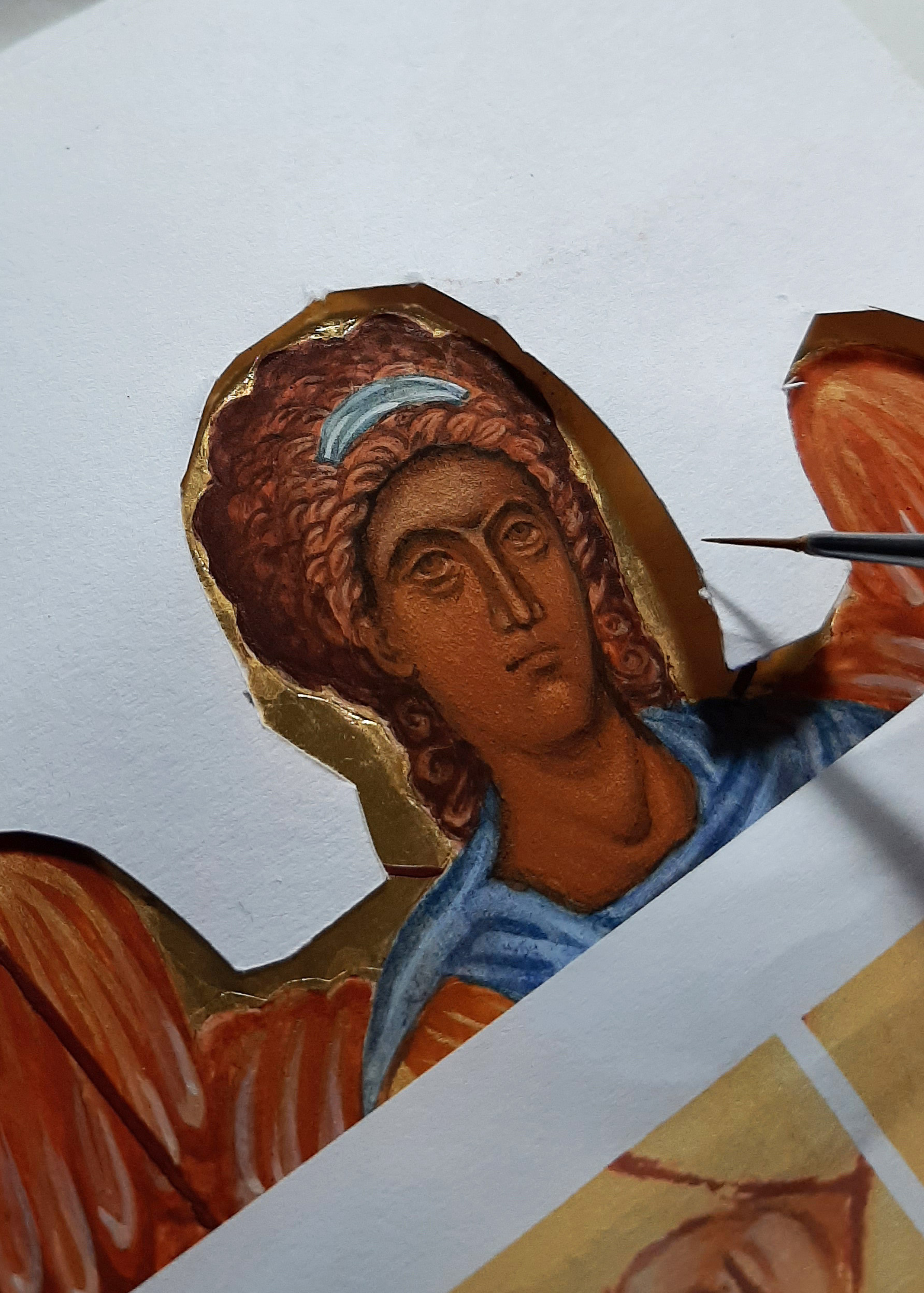
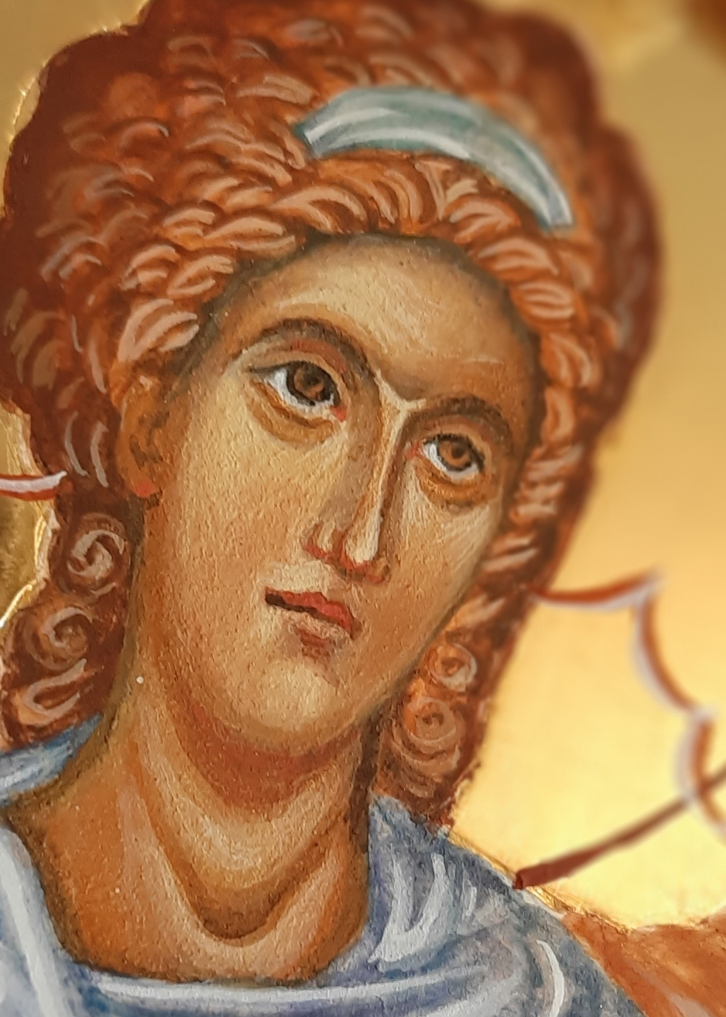
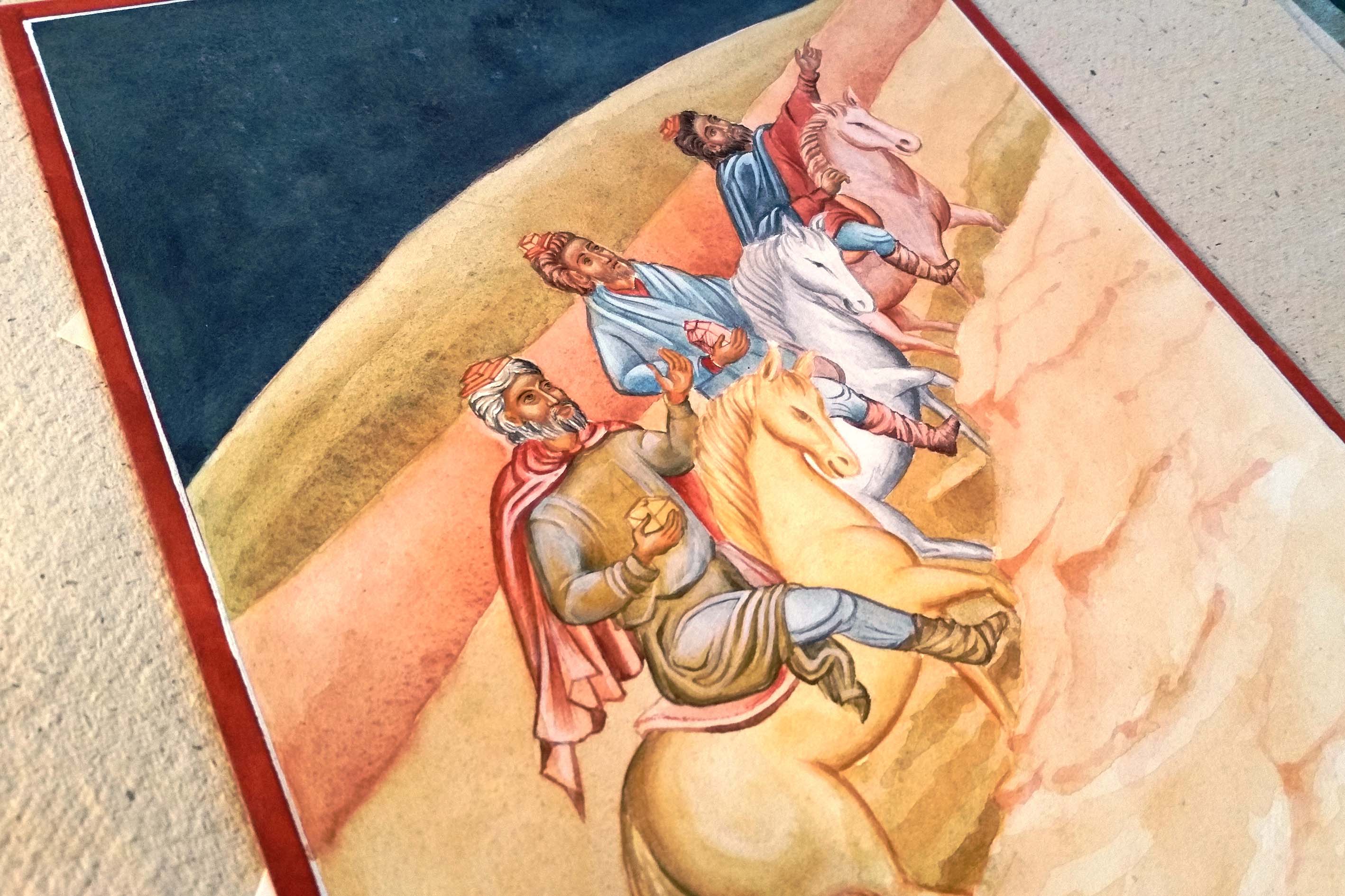
When I looked at this the other day I realised there was something missing…the hairband and ribbons! This is quite significant as Archangel Gabriel is the patron of communication and this goes two ways – listening and responding. The ribbons either side of the ears are symbolic of listening – important! I had based this icon on the prototype of the Ustyug Annunciation icon. This doesn’t show the ribbons but since I have learnt the symbolism of the ribbons – they are too significant to leave out – so on they go – very late but much needed additions.

Adding a film of titanium white to form the headband
Final headband and ear ribbons

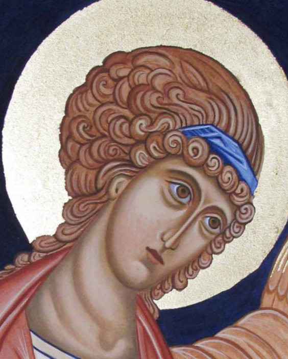
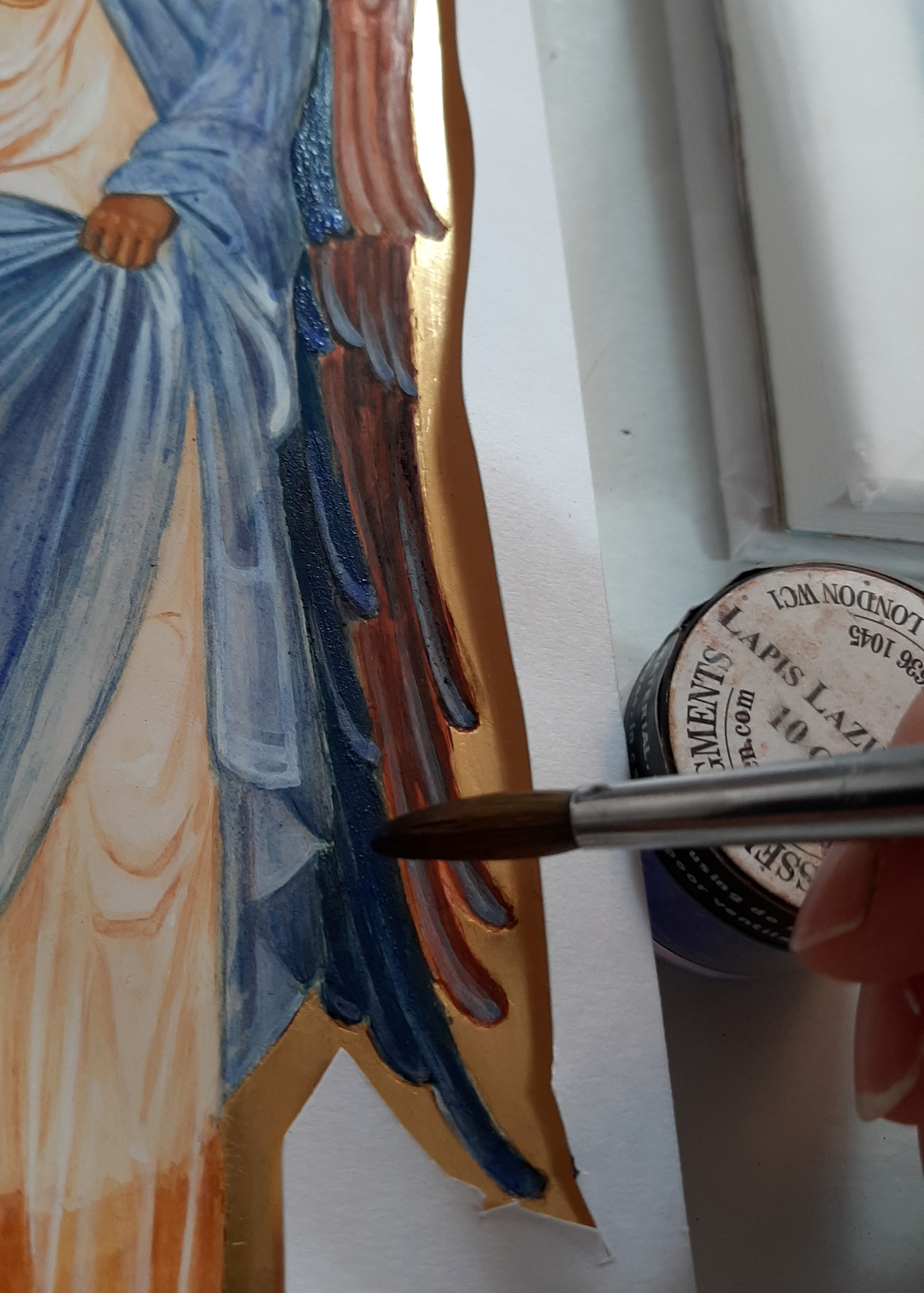
Gold leaf is not the best surface to paint over but I laid a dilute layer of egg tempera mix first, let it dry and built up in layers. I used quite a lot of egg mixed with the white pigment and applied it thinly. It goes on with a lot of beading at first but as it dries, each layer helps the next.

Finished monochrome of Archangel Gabriel.

The finished size of the overall mounted work is 50 x 70cm and now listed in my Etsy shop. Postage and insurance have shot up, especially overseas. The weight, packaging and protecting the glass of a large frame really bumps up the price so I’ve taken this out of its frame and will post in its mount and backing ready for the new owner to frame.

As always, thanks for reading and for still being here on this meandering path with me 🙂

Ronnie

Advent Three: A Multitude of Angels

The orchard is cloaked in darkness as I write and there’s a mid-winter owl hooting outside our window. There’s something magical about this time of year. For many, this is the busiest, most hectic time of year so I only want to share a few photos of the stages of painting this cluster of angels on paper.

This was a study for the Nativity icon – working on thick 600gsm hot-pressed paper. It’s a luxurious surface to work on.

The following photos show some of the painting stages – colours include English Yellow Ochre and French Ochre Havana with the skies in Azurite.

The halos are gilded with two layers of dilute pva glue applied to the paper, with red ochre added to give some depth. The halos are then gilded using transfer gold applied whilst the pva is still a little tacky.

Faces are worked up in layers starting with underpaintings in Terre Verte and washes of Red Ochre and Yellow Maimeri. Shadows and highlights built up to model the faces.

Here’s the final study in the Nativity workbook; deep azurite skies with a thin wash of indigo to deepen. We’re still in difficult times with another new variant on the rise. If you’re still here then I’d like to thank you for being with me.

Here’s trusting that you and yours are lovingly upheld by a cluster of angels over the days and weeks of Christmas-tide ahead. Stay well!

Thanks for reading – Ronnie

Michaelmas

As September gives way into darker evenings and mornings, it pulls back many memories of the ancestral hearth for our family. It’s a time of remembering our loved ones and lighting a candle. It is the time to honour the Archangels on the feast of Michaelmas.

This was a triptych which I painted for my sister – she had seen a small version years ago and loved the way the doors opened up for the big reveal and had wondered if I could ever paint one for her one day. I’m so glad I did!

The images for these two Archangels which stand either side of the Blessed Mother and the Christ Child are based on the frescoes of Chora in Istanbul, seen high up in the dome.

I’ve written about this triptych previously in this blog but for this evening, I wanted to include a sequence of work-in-progress photos of an icon which I painted on watercolour paper of Archangel Gabriel.

If you haven’t got a gessoed board ready prepared, some heavy 300-400gsm+ smooth hot pressed watercolour paper is a really beautiful surface to work on. If you can find cotton content paper then it will be archival and long lasting in the right conditions.

You will see from this photo that I’ve used a pencil grid to help draw the image – don’t hesitate to use all the help you can get as you go along. Turning the master image upside down to refer to also helps you to tune into the areas of light and shade, angles/directions, hard and soft edges and so on.

I have under-painted the face in the pigment Terre Verte. You could also use Yellow Maimeri and ivory black to get a different green.

I have used a mix of English Red Deep and French Ochre Havanna for the hair, wings and robes.

This is a thin wash of Yellow Ochre Maimeri and a touch of Red Ochre light for the membrane over the skin. The red ochres are really strong pigments so you will only need a diluted drop of it for warmth.

Adding the facial highlights in thin layers of Yellow ochre Maimeri and titanium white
Building up very thin layers to model the face
Adding shell gold to the wings

You can see this icon completed and framed together with a few other icons here on my Etsy shop page.

Final details of the red line around the halo and ribbons to denote listening

And finally to close this post on the Triptych – here it is complete in the UK and ready to fly to Australia – with my Aussie sis joining in a wee family gathering!

Triptych in UK – sister in Aus!
Sisters!

In the meantime, trusting you all into the care of our celestial helpers.

As always, thanks for reading,

Ronnie

White horse and Indigo skies part 2 of 2

As I said in my previous post, I felt that this icon wasn’t quite complete. It wasn’t just the modelling and highlights on Archangel Michael’s face – but I felt it lacked presence. Since I had glazed the entire icon, I was prepared to work on it as a whole. I started with the face and applied thin layers of French Ochre Havanna, that lovely warm pigment that blends and evens out the different flesh tones.

I’ve learnt to leave some time between the underpainting of the face and applying the highlights. Letting the new paint rest for a few days works well as it is too easy to make holes in the layers when it is fresh. This is a small face, only 2.5cm brow to chin, so I need to be careful!

In the meantime, I had made a decision to extend the dark skies beyond the circle to balance the mountain area. The beauty of well-tempered paint is that it forms quite a hard surface after a year or so. With the dilute egg glaze acting as an isolating layer, I could easily remove the new paint if it didn’t look right. I had also decided to firm up the border in a deep red ochre.

Here you can see the red letters disappearing behind the indigo.

Using tracing paper with some titanium white pigment rubbed into the back, I transcribed the lettering and painted it back on.

Going back to the face, I added the highlights back in, gave the hair a glaze of red ochre deep and a touch of ivory black and added the missing ribbons which signify listening.

I then added a wash of lapiz lazuli over the cloak and inner ring.

Final touch was to take the liner pen and draw the lines back crisply over the new red border. All in all, about week’s work but I was much happier with it!

You can see more details of the finished icon here and as always, thanks for reading!

Face up to the detail

This icon is of Archangel Raphael, one of a pair of standing angels which are based on the frescos of Chora in Istanbul, painted high up in the dome. As I mentioned in my last post, I was not too pleased with the expression.

To make a start adjusting the features, I covered the face with four or five glazes of French Ochre Havanna. This helps to return to the point where you make the first glazes over the underpainting.

Then, taking Ochre Avana and a very small amount of raw umber, deepen the hair, brow and jaw line.

I also decided to deepen the colour of the wings with a few more glazes of lapis lazuli to send them back so to speak.

In the photos below, I have added more layers of light glazes for the facial highlights. Somewhere along the line, the gaze of the angel moved to a different direction. The tiniest detail makes all the difference.

To summarise – the hair is deepened with red ochre and a touch of black. The right eye brow has been lowered and softened. The brow has been adjusted to remove the central highlight and instead bring the highlight towards the viewer. The highlights below the eyes adjusted. The nose is still a work in progress but the shape fits better with the face. The mouth has a warmth and the chin is less pointed.

I’m so glad I worked on these faces! It’s easy to leave things as they are when you have already put so much time into the icon but egg tempera is a wonderfully versatile medium and revives easily. Painting over faces with glazes is a straightforward way to make the adjustments that you know are needed. Another thing that helps is to take a photo of the face, turn it to black and white and print it off. That way, you can see clearly what isn’t working and what needs to be done.

Here’s the finished icon complete with the ribbons which symbolise Divine Listening.

The finished icon can be seen here .

As ever, thanks for reading!

Ronnie 🙂

Thy Perfect Light

1-christ-child-in-manger

For our third and final year, we each worked on a festal icon of our choice. We were invited to study different prototypes and design our own icon emphasising a particular aspect of the feast. I chose the Nativity, with a theme of praise and thanksgiving.

what shall we offer thee.jpg

Given all the figures in this icon, I set it all out to fit on a large birch ply board. To get some practice first,  I painted a few colour studies in egg tempera on very thick, smooth watercolour paper then mounted them all in a work book.

2-cover

I prefer working on the smaller individual studies as I found it a bit awkward to work on the large board – in many ways it wasn’t anywhere near large enough! I love how in frescos, the scenes are painted almost life size.

Nicholas orphanos.jpg

Church of St Nicholas Orphanos, Thessaloniki

The images which follow are mostly from my workbook.

2b-virgin-and-child

3-angel-cluster

For now though, I would just like to thank you once again for reading and for joining me as I make my way learning how to paint icons. The finished Nativity icon is available to buy from my Etsy shop

I wish you all a peaceful and blessed Christmas and will be back in touch in the New Year.

Ronnie

4-o-star-of-wonder

5-magi

6-st-joseph

Saint Joseph

7-nativity-cartoon-a4-ronnie-cruwys-resized

Archangel Gabriel – egg tempera on watercolour paper

angel gabriel

Archangel Gabriel on water colour paper

Hello icon friends, While I was recovering from the fractures, I was keen to get my arm painting or drawing again in some way. Since I was pretty limited in my mobility, I decided to make use of some pre-stretched water colour paper which was mounted on a board light enough to handle. I really liked the monochrome studies which we painted in egg tempera on paper and thought I would tackle some different garments as a way of practice before returning to make amends to the hashed up garments of St Francis.

egg tempera on paper

Drawing on to stretched water colour paper

This proved to be a delightful exercise and although it doesn’t have the translucency of painting on to a gessoed board, the results are surprisingly soft and gentle. It is also a great way of practicing if you don’t have an icon board to hand.

Underpainting garments, hair and face

Underpainting garments, hair and face

The paper is 300gsm Fabriano cold pressed water colour paper, which accepts the pigment really easily once it has been stretched. I dampened the paper again where I was painting large areas which helped to blend the pigments.

adding pigment to hair and wings


Underpainting the wings and adding membrane to hair

For the garments, I chose English Red Deep with a little Raw Umber and for the wings, I chose French Ochre Havanna with a dash of English Red Deep. The blue in the garments and hair band is Ultramarine Blue light with a dash of Raw Umber and the background is the same blue but with a little Ivory black added.

4a  angel

Adding membrane to the face and to garments

5a angelapply facial highlights

applying garment highlights

applying garment highlights

Highlights added to garments and face

Highlights added to garments and face

Applying gold leaf to the halo and wings

Applying gold leaf to the halo and wings

The original framed icon is available to buy in my Etsy shop here.