Icon Diploma Student

Learning to see with the eye of the heart

Posts tagged ‘Aidan HArt Icons’

Shell Gold Shine

agate burnisher on shell gold

Burnishing shell gold

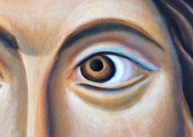
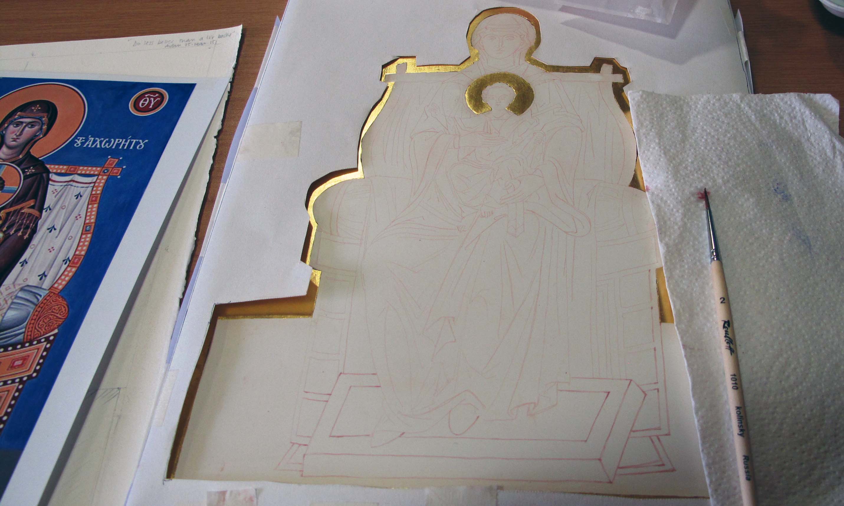
The finishing touches to this icon of the Blessed Virgin Mary (based on an icon in St Catherine’s Monastery, Sinai) has taken me almost as long as it took to paint!

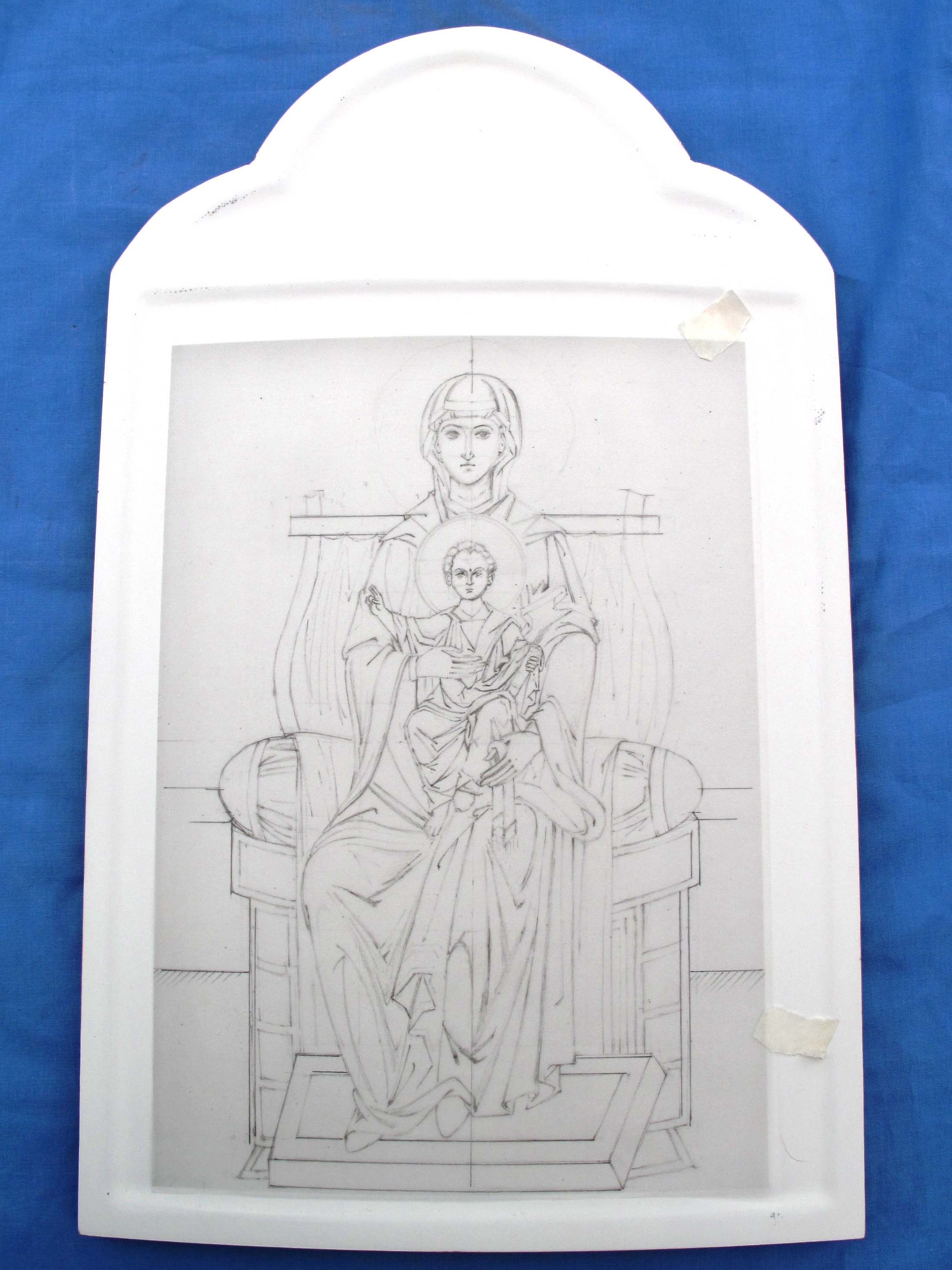
This was the stage I left it at two years ago.

1 edit blessed virgin mary

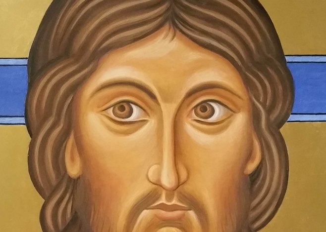
Still to finish: Halo, gold assist on robe, stars, lettering, warm highlights on face, paint sides red.

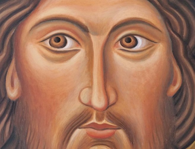
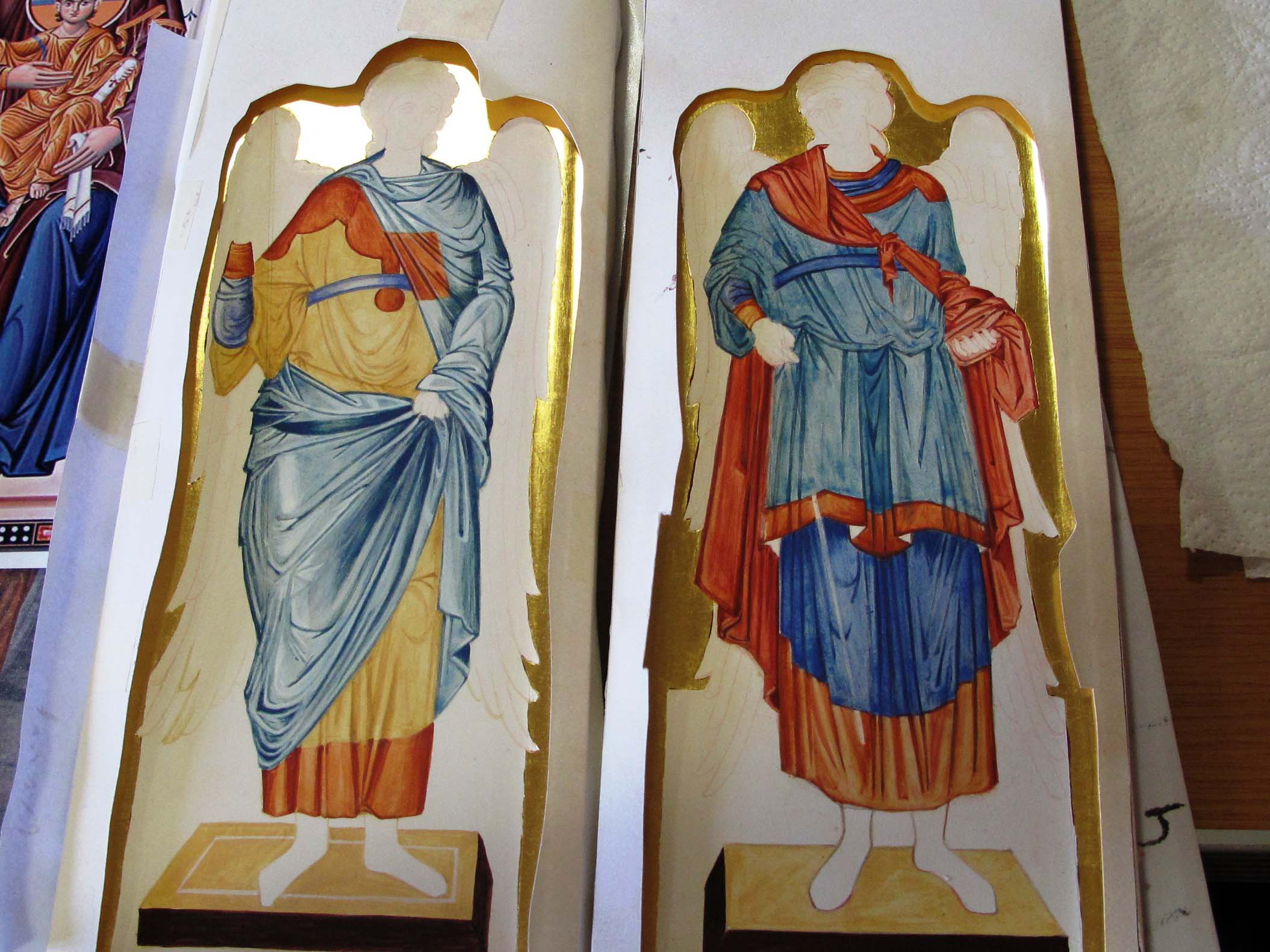
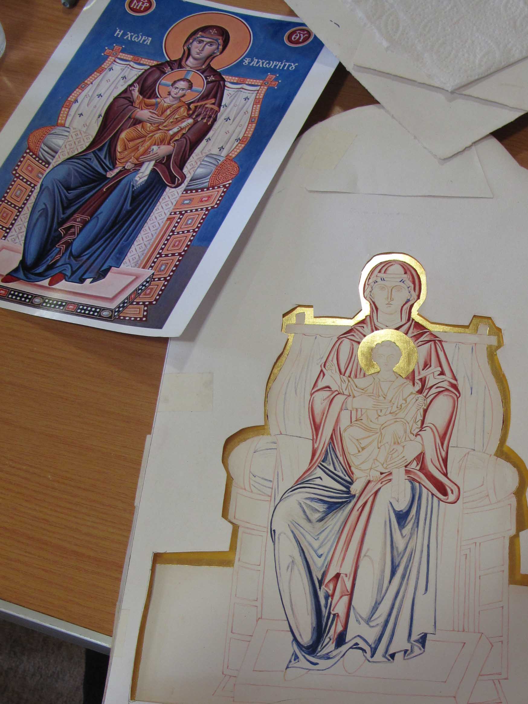
This is one of the first icons that I painted with Aidan. We worked on the mandilion in class and painted our second portrait format icon at home which I wrote about here. I chose the two prototypes from an iconostasis in St Catherine’s monastery, Sinai, here is the prototype.

As the two icons will be displayed as a pair, I worked on them together but I hadn’t appreciated the amount of work that goes into the last stages.

Virgin and Christ icons cruwys

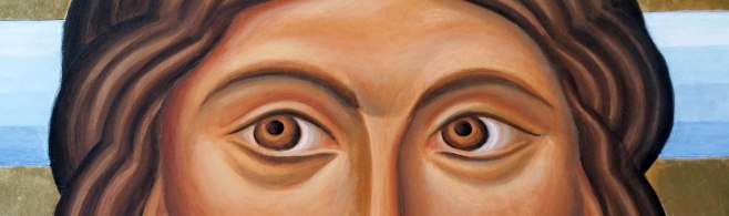
My first two diploma icons – unfinished

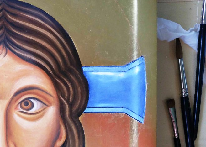
The halo takes a bit of practice. I used a compass with an ink attachment (like this example) and load the nib up with shellac and red ochre pigment. Do some sample lines until you get the right thickness to draw a line without blobbing – I haven’t mastered it yet so don’t want to lead you astray showing my technique. However, it helps to have the circle drawn to the right size on tracing paper to help locate the centre point. I used thick card to protect the surface of the icon from the compass point, though a wooden ruler with felt beneath would be better.

scribing halo

Setting up to scribe the halo

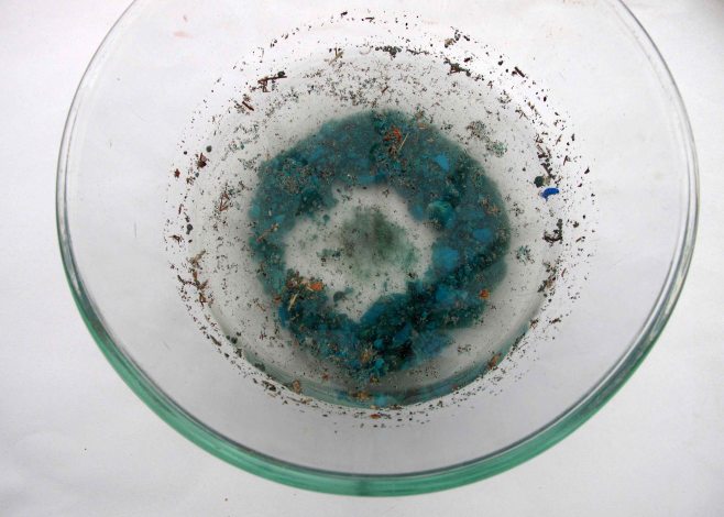
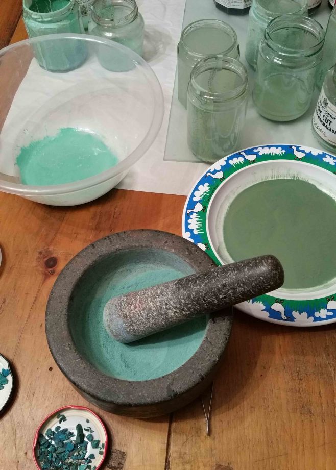
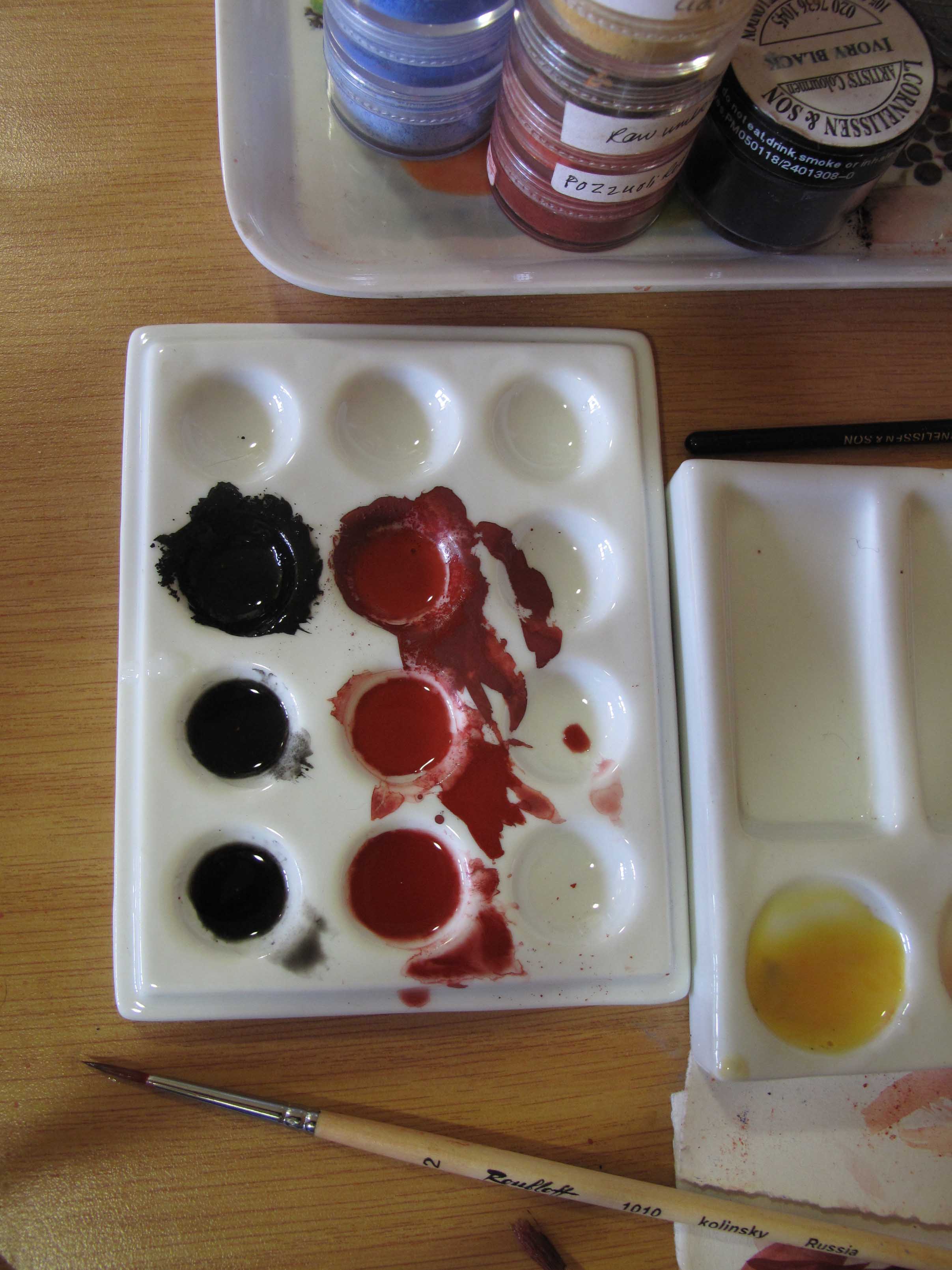
I wanted to learn how to make shell gold for the assist. It’s gold leaf ground down and washed so thoroughly that it becomes liquid gold when mixed with gum arabic. It can be applied finely with a brush and burnished to a high shine. I had tried to make it following instructions from my fellow students and various websites, but couldn’t get it to stick or to shine so I booked onto Anita Chowdry’s two day workshop in June.

liquid 24ct gold

Two books of 24 ct gold leaf being ground up by hand with honey

I had no idea just how much grinding, washing and filtering is required to get the rich shine but here’s a link to an example of one of Anita’s shell gold workshops. Anita will be writing a book about the technique so I suggest you sign up to her newsletter to learn more.

Applying shell gold

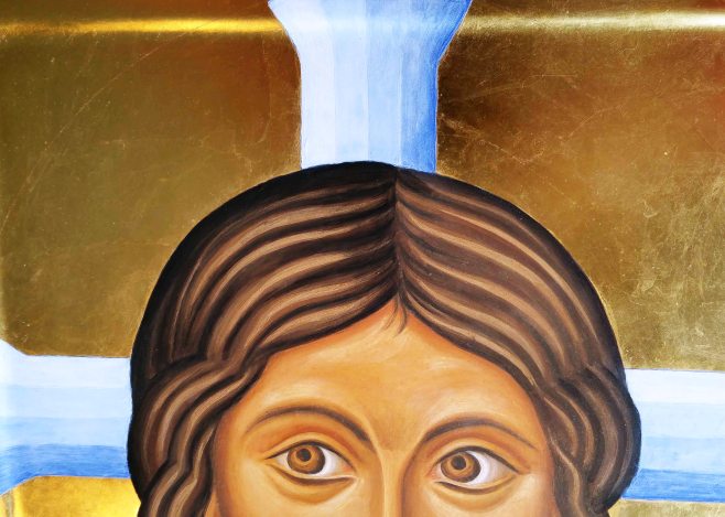
Painting shell gold assist on the Blessed Virgin’s head dress.

The icon is now away being photographed.

Sorry about the delay between posts. It’s pretty hectic getting things together for the exhibition. I intend to continue this blog after the diploma finishes as there is much I have still to share.

Thanks for reading,

Ronnie


Face lifts and highlights

banner mandilion

It’s now feeling uncomfortably close to the end of this course – and I haven’t finished one of my set icon pieces!  So, for the last few days I have knuckled down and revisited my first project, the Mandilion. It’s been untouched now for two years and looking back I’ve learned a bit but there is much more still to practice.

Before we go on, if you’d like to see the earlier stages of this mandilion project, you can look back here and a bit later here.

I deliberately stopped working on the mandilion as I wanted to get a bit more experience under my belt before I finished it. I’m glad I did as looking at it afresh, I could see quite a few things that need attention.

Before I set to work, I had a good look again at the prototype that I’m working from:

icon of Sinai Christ Pantocrator

Christ from the Grand Deeisis, St Catherine’s monastery, Sinai

mandilion  before editing.jpg

My version of the mandilion from two years ago.

Here’s the list of the main things to work on:

  1. Halo too bright. Vibrant lapis lazuli competes too much with the face.
  2. Left side is the ‘nearer’ side yet the righ eye is much bigger. Rebalance eyes and brow.
  3. Hair is a bit dull and lifeless.
  4. Facial tones lacks warmth.
  5. Strengthen eyebrows and shadows.
1 Rub out halo on mandilion.jpg

Scrubbing off the bright blue

Since it’s such a long time since I’ve worked on the icon, I started by applying a couple  of glaze coats over the entire face and hair to provide a key between old and new. When these had dried I then applied two thin glazes of French Ochre Havanna over the face (but not hair/eyes). Whilst it was drying, I made a start removing the bright blue halo and the unsightly black lines – what was I thinking?! I still wanted a blue halo but not as vivid, so I used a flat headed brush to soak the paint and scrub most of it off. The black lines had set quite hard though and I ended up carefully scraping them off with the tip of a blade.

3 halo and hair mandilion.jpg

Underpainting the halo and adding shading to the hair parting

I had seen a graded blue halo on a contemporary mandilion which I thought would work, and began by underpainting the bands of blue using lapis lazuli dark, titanium white and a touch of ivory black .

4 fine coat of white.jpg

When the paint is dry, I applied a weak egg glaze, then added a fine mist coat of white.

At first, the fine coat of white seems to cloak the colour too much but if it is applied as a thin layer, it soon dries much lighter and transulcent. It took three or four mist coats before the blues blended and softened.

While the paint was drying, I made a start on modelling the hair. I applied ivory black in thin layers to the parting and to the sides of the head to strengthen the form, paying attention to the ‘waves’ and the ‘ripples’.

5 modelling hair 2.jpg

To add a little warmth to the hair, I added a thin layer of English Red Ochre either side of some of the ripples towards the front.

Now for the eye surgery. The eye on the right was much too big, especially as it is on the receding side. I applied a thin layer of white over the upper eye lid and it looked green! I reduced the right hand side of the iris and lowered the shadow between lid and brow. When all dry, I then applied French ochre havanah over the eye flesh to help harmonise the colours.

eye op 1.jpg

Eye surgery – lowering the upper lid and lifting the lower lid

Then, on the pic below, you can see where I added the new line of the upper eye lid. I may revisit this eye, but it’s step in the right direction.


red and green

Red shadow under hair on near side to help it advance, green to the right

Warm colours advance and cool colours recede and you can often find faces with a wash of red somewhere on the near side and cool green on the far side.  On this icon, the left side of the face is the nearest, so I used a thin wash of red ochre under the hair line to add a warm shadow and a light green (cool)  on the right to help this side recede.

eye surgery 2

I added a little more cinnabar to the lips, corners of eyes, nose and ears (after this photo was taken) and will let it settle overnight.

Thanks for reading.

Ronnie

PS Prints and cards are now available to order from Smith York Printers.


Perfect Proportions: Anglo-Saxon Style

Aethelwold group

Hello icon friends,

Next along in the lettering posts is an example of some gorgeous Anglo-Saxon; the magnificent Benedictional of St Aethelwold. The original manuscript is held by the British Library and considered to be one of their greatest treasures: “A Masterpiece of Anglo-Saxon art”.

f70 r Christ in Majesty TRINITAS British Library

Lettering from St Aethelwold manuscript held by the British Library

The images have all been digitised and are available to see through the British Library’s website here. There is a great deal of embellishment on the images but zoom in past all this and have a close look at the way the garments have been painted on the figures in particular the colours, composition and fabric folds – some wonderful examples for iconographers.

f4r St Peter and 2 apostles crop brit Library

St Peter and two apostles

This entire book was written by the scribe Godeman for St Æthelwold, Bishop of Winchester from 963-984 and is one of the earliest and most significant surviving examples of the Anglo-Saxon Winchester scriptorium.

Born c AD 909, the aptly named Aethelwold “noble ruler”, was key to the transformation of English religious life. He initiated the reform of the Benedictine Rule which culminated with his written document Regularis Concordia.

Godeman, the scribe, was a monk at the Old Minster, Winchester. He may have belonged to the group of monks from the Abbey at Abingdon that Æthelwold placed in Winchester Cathedral as part of the renewal of the Benedictine Rule. The artist for the illuminations has not been identified although some scholars attribute these to Godeman too.

Here are just a few examples of the lettering in this manuscript – the British Library is a fantastic resource and there are many good quality images of this Benedictional available to study online.

Having studied as many examples of each of the letters available, here are my attempts to create a painted Anglo Saxon style alphabet which would suit icons which depict Anglo Saxon Saints, or saints contemporary with this period (listed at the end of this post).


PATER a.jpg

ET FILIVS a.jpg

I have saved the full set of letters which you can download and save to your desktop as a six page pdf document here: Aethelwold Letters 

Thanks for reading and I will leave you with some suggestions for saints which may lend themselves to icons using this script:

Some saints associated directly and indirectly with the manuscript:

St Swithun                            St Aethelwold     St Dunstan            St Cuthbert

St Æthelthryth                     St Benedict           St Vedast               St Stephen

St Aetheldreda                     St Edgar                 St Gregory

St Mary Magdalene             St John the Baptist


SOME SAINTS CONTEMPORARY WITH THIS PERIOD

Gaudentius (Radim Gaudentius) born 970 d 1020 Archbishop of Niezno

Firmian d 1020

Heribert of Cologne (Herbert) b 970 d 1021

Herve d 1021

Berward of Hildesheim b 960 d 1022 Bishop of Hildesheim

Theodoric of Orleans b 980 d 1022 Bishop of Orleans

Agatha Hildegard d 1024

Henry II, Holy Roman Emperor b972  d1024

Romauld 952 d1057

Fulbert of Chartres 970—1028 Bishop of Chartres

Elfleda (Ethelfleda) d.1030

963 Athanasius the Athonite buys the island of Kyra-Panagia from the                     Byzantine noblemen of Constantinople as a dependency of Mount Athos.


969 Olga of Kiev, grandmother of the Grand Prince Vladimir of Kiev

978 Edward the Martyr, King of England, March 18.

988 Dunstan, Abp. of Canterbury, May 19.

980 Translation of the holy relics of Birinus of Dorchester from Winchester to a new shrine, September 4 by St. AEthelwold.


Colour Crunching

3 Stones variety of colour

Variety of colour in a handful of washed ‘Chrysocolla’

A very happy New Year to you! Hope you are all blessed with a little peace wherever you are over these twelve days of Christmas.

Our final icon for the diploma course will be a festal icon. I have chosen the Nativity in which I am planning to use some soft earth colours. To get me set up for the year ahead, I’ve been crunching minerals to make my own pigments with some surprising results.

I had a small batch of Chrysocolla which I bought from the Lapidary Shop in Burslem, Staffordshire. This is a bright blue-green copper based mineral, closely associated with malachite and azurite.

1 Chrysocolla rough stones

Chrysocolla as rough cut mineral fragments

Before I began to grind it with a pestle and mortar, I separated out some of the brighter and darker pieces to divide it into three batches.  This post is mostly photos so please join me for a minute to enjoy the gorgeous rich colours which have emerged from this exciting mineral.


2 Chrysocolla washing stones

First wash the chrysocolla to remove debris, then let it dry out.

4 Chrysocolla colour variants

Grind with pestle and mortar before fine-grinding on the slab and muller.  Note the jars for levigating the finely ground mix scooped up from the slab.

Crunch about a tablespoon at a time until it is the texture of fine salt. Then tip the powder on to the slab, add a tablespoon of water and grind until really smooth, anything from 5 to 10 minutes with firm rotating movement.

The next few photos will give you an idea of the variety of greens which can be found in this mineral.

5 Chrysocolla.jpg

Add water by the spoon to the pigment. Use a plastic palette knife to scoope the mix back to the middle.

6 Chrysocolla

Copper green

7 Chrysocolla

Earth green

When the pigment is smooth and fine, use a spatula and a mop paintbrush to scoop up the mix and drop into a jar of water. Let it settle for half an hour, then pour off the top water into another jar and let that settle. Have another jar of water to rinse your brush in between batches and you will collect more pigment as you go along. I used over a dozen jars for this process.

8 Chrysocolla

Softer earth green

9 chrysocolla

Blue green

I poured the mix from the bottom of the jars onto plates as it dries out faster. When it’s dried, use a stiff brush and gather it into a jar.

10 Drying pigments

levigated chrysocolla pigment

Variety of greens all from separating and levigating the ground pigment.

To see Aidan Hart demonstrating this process in one of the diploma classes, please have a look at the You Tube video Aidan Hart demonstrates grinding azurite pigment.

I now have a great selection of greens! I also ground up some Haemetite, azurite, pyrites and malachite. All came out pretty well.

Thanks for reading.

Ronnie

jars of pigment

Array of green pigments all from the same batch of chrysocolla.

Fragments of beauty from 8th C Avranches

Avranches banner 2a
Painted letters in the style of 8th century French uncial hand

I began my dissertation for the Icon Diploma with lettering discovered in Mont St Michel, France.  The style is a majuscule script known as ‘uncial’, written in capital letters, in common use from the 4th to the 8th century by both Latin and Greek scribes.

I stumbled upon this exceptional 8th century lettering some fifteen years ago, whilst on a family holiday in Normandy. Mont St Michel is home to some beautiful illuminated manuscripts, some of which can be seen by request in the town hall at Avranches, nearby.

Guerison du Paralytique 1 rev.jpg

Guerison du Paralytique, from the Gospel of St Mark

Whilst there, I bought the book l’Enluminure Romane au Mont-Saint-Michel” by Monique Dosdat which includes several fragments from a Book of Gospels. There are only a few of these pages which survive – the author and dedication are unknown.

Their history is intriguing as they were discovered bound into a later manuscript, at Mont St Michel. The two pages are identified by their full titles:

  1. “Fragment d’un Evangeliaire, Vllle siecle, Annonce aux Bergers, Luke 2, 12. Avranches, BM, ms 48.
  2.  “Fragment d’un Evangeliaire, Vllle siecle, Guerison du Paralytique, Marc, 2, 5-12  Avranches, BM, ms 71.

The author Dosdat writes: “These pages are an impressive witness of a beautiful, perfectly legible uncial lettering, its characters uniting a classic uncial calligraphy born in 4th Century Italy under the influence of Irish round hand lettering”.

This scribe had mastered the art of consistency, spacing, layout and rhythm so that the text itself is a work of art.

So let’s look at the lettering as examples for use on icons. This script would lend itself to early Celtic or French saints. The following studies are my second attempt at translating this quilled hand into painted letters.  I have ‘waisted’ the uprights and some letters will need to be refined but feel free to print them off and use them if you wish. I can see the serifs on the letter ‘C’ are pretty clumsy – so use the body of the letter C instead.

ABCDEF

DDD

Looking at the two types of ‘D’ used in the same manuscript.

GIJKLN

OGEC

MAQ

The right hand stroke of the letter A is a little top heavy.

ORSTUV


PQLH


WXXYZ

These ‘X’ and ‘Y’ letters are my favourite!

Thanks for reading.

Ronnie

Hallowed be thy Name

Lettering on handmade book

Hand made book covers for the dissertation showing four different manuscript lettering styles.

Hello icon friends,

Part of  the icon course includes submitting a dissertation. This sounded quite daunting but Aidan has been great at keeping this in perspective explaining that it is really just an essay on a subject which we are passionate about – something we can share with the rest of the students. I will be sharing my subject in stages here and will start off with an overview of my subject.

I was encouraged early on in the course when Aidan spoke about illuminated manuscripts as a rich resource for western iconongraphers. I have loved calligraphy and illuminated manuscripts since I was at school and so my dissertation subject was waiting in the wings: ‘A comparative study of four illuminated manuscripts as a resource for lettering on contemporary western icons’.

Hand painted illuminated letters

Finished letter samples and bound lettering books

The best part for me about this subject was when, on the very first day of the course, Aidan explained how it is the name on an icon that makes it an icon:

We venerate the icon that bears the name”.

It struck me how important it was to apply the same care to naming the icon as given to painting the image itself. When we are named in Baptism, the sacrament leaves an indelible spiritual mark of belonging to Christ on the soul and thus our chosen name becomes an intrinsic part of who we are. Solomon declared that:

“A good name is rather to be chosen than great riches” (Prov. 22:1).

The significance of naming is a wonderfully rich subject but my dissertation is a practical one based on writing out alphabets interpreted from the lettering of four manuscripts, which I will briefly touch on here. I will go through each manuscript study in stages in subsequent posts.

The first manuscript I chose was a European example of an early 8th century uncial hand, taken from an unidentified manuscript from Mont St Michel which I named ‘Avranches‘ for the purpose of my study:

Avranches manuscript

Example of lettering from the Avranches manuscript

Avranches lettering

Samples of gilded lettering in the ‘Avranches’ style and the hand bound book of lettering.

Gilded letter G from Avranches

Gilded example of letter G from the ‘Avranches’ manuscript.

The second is the Anglo-Saxon Benedictional of St Aethelwold, written in Winchester 963-984, by the scribe Godeman.

gilded lettering

Examples of gilded letters and hand bound book of Aethelwold lettering

Aethelwold benedictional

Gilding the letter X from the Aethelwold Benedictional.

Gilded letter sample on heavyweight, hot-pressed watercolour paper, using gesso made from the recipe when I attended Patricia Lovett’s Gilding and Illumination skills course. Vellum makes the ideal surface for gilded letters but these are lettering studies rather than finished pieces.

Gilded letter X

Gilded letter X from the Aethelwold Benedicitonal

Gilded letters D and S

Letters D and S in the Aethelwold style

The third and fourth manuscripts were written about the same time but one written in Bury St Edmonds the other in the Holy Land – the latter providing context for my study.

lettering of the Bury Bible

Bury Lettering on the hand bound book of letters

The Bury Bible is an example of High Romanesque style, written c.1130-1135 AD, and is a spectacular work of art by the hand of Master Hugo, considered one of the earliest professionally documented artists in England.

letter A gilded in 23 ct gold leaf

Gilded letter A from the Bury Bible

letter N Bury Bible

Illuminated Letter N based on the Bury Bible manuscript

The Melisende Psalter was my fourth and final study.

melisend Psalter pic of dissertation work

Gilded letters and hand bound book of lettering based on the Melisende Psalter

It is written in the style known as ‘protogothic’ by a group of six artists and a scribe, thought to be of French or Italian origin, in the scriptorium of the Monastery of the Holy Sepulchre, Jerusalem, between 1134 and 1143 not long before the second crusade.

Illuminated letter A

Letter A from the Melisende Psalter, painted with Azurite and Terre Verte.

gilded letter B

Here’s B taken from the Melisende Psalter – painted in egg tempera with lapiz lazuli and terre verte.

My choice was also influenced by the availability of clear letter examples within the manuscripts. I was looking for enough images of each letter to study and compose an alphabet in the spirit of the original. That’s more than enough for now. Hope it has sparked a little interest in the subject!

letter C

Last example from the Melisende Psalter – letter C

Before I sign off,  I would like to say a big thank you to those who take the trouble to get in touch. I really appreciate hearing from you:-)

Thanks for reading.

Ronnie

Sketching Thessaloniki – a glimpse of an ancient land

Terracotta jars in Thessaloniki

Amphorae used in the wine and oil trade, 3rd to 6th Century, Thessaloniki, Greece

I’m not long back from our field trip to Thessaloniki, Greece; a once-in-a-lifetime experience. Travelling with a small group of icon diploma students, all passionate about our subject, we visited the mosaics and wall paintings in the ancient churches of Thessaloniki, led by Aidan Hart and supported by the Prince’s School of Traditional Arts.

The places we visited didn’t allow flash photography so most of my photos are a little too fuzzy to share here. However, I kept a sketch book and though most of these pen and ink drawings were done in 5-10 minutes, I hope they give you a flavour of the trip.

If you are really interested in looking at the wall paintings that we visited, here is a link which is well worth bookmarking and which I only discovered on my return, it’s a database of Byzantine art: Princeton University.

Hospitality from Harry at the Vlatadon Monastery

Hospitality from Harry at the Vlatadon Monastery – Greek coffee and ‘Greek Delight’

pen and ink sketch of 5th Century mosaics

Fragments of rich greens and blues of 5th century mosaics in the Church of Acheiropoietos

pen and ink sketch of Greek icon

500 year old icon of the ‘Hope of the Hopeless’

pen and ink sketch of Thessaloniki

Sketch of the apse and iconostasis in the Church of Archeiropoietos

pen and ink sketch of Greek cats

Basking Greek cats and a fragment of Roman archaeology

pen and ink sketch of Greek balcony

Balcony beside the Ecclesiastical Museum, Thessaloniki

agia Sophia pen and ink sketch

Looking toward the apse of Agia Sophia, Thessaloniki and the glow of the golden mosaics.

pen and ink sketch of Agia Sophia

Detail from the ceiling west of the dome of the Agia Sophia, Thessaloniki

tree sketch

Shape of a Greek tree in a planter

Well in the Crypt of St Demitrios, Thessaloniki, where the saint was martyred

Well in the Crypt of St Demitrios, Thessaloniki, where the saint (an officer in the Roman army) was martyred in AD303. The 7th C basilica was built on the ruins of a Roman bath complex.

Nicholas Orphanos

Nicholas Orphanos – wall paintings attributed to the school of Panselinos.

Hosios David Thessaloniki sketch

Mosaic of the ‘Beardless Christ’ in the apse of Hosios David, depicting the vision of Ezekiel, late 5th C

Finally, I will leave you with a few more sketches of life from the Museum of Byzantine Culture, Thessaloniki.

sketch of greek necklaces

Necklaces and bracelets – delicate and fresh colours from the 2nd to 6th centuries.

oil lamp Byzantine

5th century lamp of Thessaloniki – approx 80mm x 60mm

column capital

Cube capital engraved with a cross which is formed by four diagonally carved oil or wine amphorae.

Thanks for reading.

Ronnie

Angels of Chora

Archangel in Monochrome

Face of Archangel Raphael in a monochrome study

Warmest greetings icon friends!

Our summer visitors have all gone home, my dissertation for the icon diploma has been handed in (more on that in another post) and our icon classes resumed last week with Aidan Hart in time to celebrate the feast of St Michael and All Angels.

Having spent a couple of months away from the paintbrush, I felt I would benefit from painting a monochrome. Besides, I had already stretched some 300gsm watercolour paper (Fabriano Artistico hot pressed), and had the images already prepared in outline.

painting the lines of st Michael in monochrome

First lines applied on Archangel Michael in English Red Light pigment

These are the same images of the Angels of Chora which I am using in my triptych (see previous post).  I haven’t painted the faces on any of the figures in the triptych yet, so these monochromes have been helpful in getting me back in the painting groove.

Modelling icon garments

Building up the layers of pigment to model the garments.

archangels Raphael and Michael

Background added of pure azurite pigment

I really enjoy painting monochromes. It’s relaxing not having to think about colour and to simply concentrate on the form, looking at the areas of light and shade. I also wanted these studies to stand on their own, so I gilded the haloes and garment highlights.

If ever you feel daunted by the prospect of painting an icon, this is a really good place to start.

I love the deep blue-greys of the Chora angel backgrounds. They give a wonderful feeling of a heavenly sky. It is quite a challenge to match colours, for one thing, even if you know that the colour used was azurite, this can vary according to the quality of the stone and where it was mined. For these studies, I applied over a dozen washes of azurite – the pigment which I ground from a small rock bought from Burslem Lapidary shop, then a few washes of Indigo from Cornelissens.

I used acrylic gold size, applied in two layers, then after ten minutes or so, I applied some transfer gold leaf (from Wrights of Lymm) once it had gone tacky. If you add a pinch of red pigment to the size, it helps to give some depth to the background as well as show you where you’ve painted.

gold transfer leaf

Adding gold leaf to Archangel Michael’s halo

After applying the gold leaf to the halo, I then used a compass with a dip pen attachment to draw a circle to frame it. This is fiddly and I haven’t mastered it at all yet and ended up with a line thicker than I intended.

thick line around halo

Halo line a bit too thick.

I had used a sheet of cardboard over the image to protect the face/paper from getting a compass puncture mark right in the middle of Raphael’s brow. The thickness of the card had a knock-on effect of dislocating my circle by a few millimetres – I will try a sheet of acetate cut to size next time.

Here are the finished studies. They are not the best photographs but hopefully give you an idea of the end result.

monochrome archangel Michael

Complete study of  Archangel Michael

Archangel raphael

Complete study of Archangel Raphael in monochrome

That’s all for now.

Many thanks for reading. Ronnie

PS Aidan has recently been filmed whilst painting an icon and has been included as part of Simon Schama’s Face of Britain series.

PPS Prints and cards of Archangels Michael and Raphael are now available from Smith York Printers.

More on the Triptych: Azurite on Archangels Raphael and Michael

azupainting icon with azurite pigment

Azurite blue pigments on the icon of Raphael and Michael

This is a very short post as I am not long back from the icon course. Tomorrow I am meeting my American family, then we are all heading up to Scotland for a week. It will be a while before I can post again so here are a few pictures of work in progress taken during our latest icon session.

angels egg tempera

Figures of Archangel Raphael and Michael, building up washes and highlights.

TRIP 5a

Adding indigo to low lights increases depth in the fabric.

Trip 6

Adding a background and wings

wrapping up on day 3

Wrapping up on day 3

details on the cloth

details on the cloth

That’s it for now – good night all and thanks for reading.

Ronnie

Three days on a Triptych

icon class

Icon Diploma Students taken at Aidan Hart’s May session 2015

Hello icon friends and class mates,

I’m just back from a three day intensive painting our standing/seated figures. I brought my gilded triptych centre panel already prepared with the image transferred so I could start to paint in class.

icon outline drawing

Transferring outline on to gessoed panel

Just to rewind a little, I photocopied my drawing on to tracing paper to locate the outline prior to water gilding. After gilding, I rubbed red ochre pigment into the back of the tracing paper/drawing itself (rather than using an intermediary sheet), and using a fine propelling pencil with a fairly hard lead, transferred the image on to the board.

tracing paper drawing

Drawing of icon on tracing paper

Once all the main lines were transferred on to the board, a weak mix of pigment fixed the lines in place. I then began the underpainting and modelling of the garments.

underpainting icon

First stage of underpainting

Aidan suggested that I used Red Ochre for the Blessed Virgin’s upper garment as it has some blue in it. I also used Lapiz Lazuli Dark, a beautiful natural blue and Ivory Black to deepen both colours; all pigments are from Cornelissen’s.

ivory black and red ochre

Ivory black and Red Ochre pigments

Both pigments are very strong so I mixed them up separately first, then blended. For the underpainting I used a lovely size 2 Roubloff 1010 kolinsky sable brush which I had recently ordered from Vesta-k. It has a really sharp point and holds the pigment well.

underpainting garments

Building up the underpainting of the garments

I mixed black to the lapiz lazuli and red ochre in varying degrees to give depth to the underpainting. The deeper shadows are painted using a lot of black in the mix.

lapiz lazuli

First layer of membrane applied using a wash of pure Lapiz lazuli over the underpainting.

membranes on icon

Membranes on the garments

Pure red ochre and lapiz membranes washed over the underpainting with a very thin layer of lapiz washed over the red afterwards to unite the garments.

After several layers of membrane, I applied a nourishing layer of 20% egg 80% water and let it dry before going over the shadows and adding highlights. Aidan suggested fine layers of pure white dry-brushed over the membrane to give translucent layers of highlights.

The underpainting of the Christ Child is in English Yellow Ochre with a little Red Ochre added to model the form. The colours are painted quite densely as the garments will be gilded using shell gold assist. I understand from my class mate Lee that for the crispest, most gleaming gold lines, hand-made shell gold is the way to go – thanks Lee! Watch this space for adventures in making shell gold – I rang Wrights of Lymm for a couple of books of gold today!

three days work

Three days work

Thanks for reading.

Ronnie