Icon Diploma Student

Learning to see with the eye of the heart

Posts from the ‘Drawing icons’ category

Back Down to Earth

Image

Hello Icon friends,

A lot has been going on since I last posted. We had a wonderful family gathering in Perth WA, for my niece’s wedding. It was an entire week of celebrating – not only over a very happy couple, but also over my sister, the bride’s mum, who has made a monumental recovery since her bone marrow transplant last year. She is living proof of answered prayer and we made the most of every minute together. I know I am digressing but this day was terrific and I have to share a photo:

Wedding of Sophie and Pat

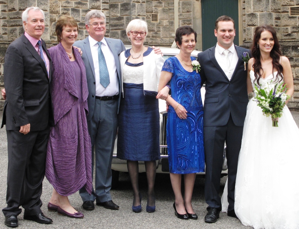
Some of my siblings, left to right David, Margaret, Denis, Veronica (me), Anne (bride’s mum), Pat and Sophie. My younger sister Stephanie had nipped off – it is hard to round up all six siblings even when we are together!

One of the first things I did to help settle me back down to earth was to start on my icon homework. We have set pieces for our course, one of which is the Mandilion – the Face Not Made with Hands, which must be painted on a board with the kivitos – where the wood is chiselled out to form a raised wooden border (more about this in a later post). Our set pieces mean that we explore a full range of icons from close up faces, to busts, standing and seated figures and festal icons with groups of figures.

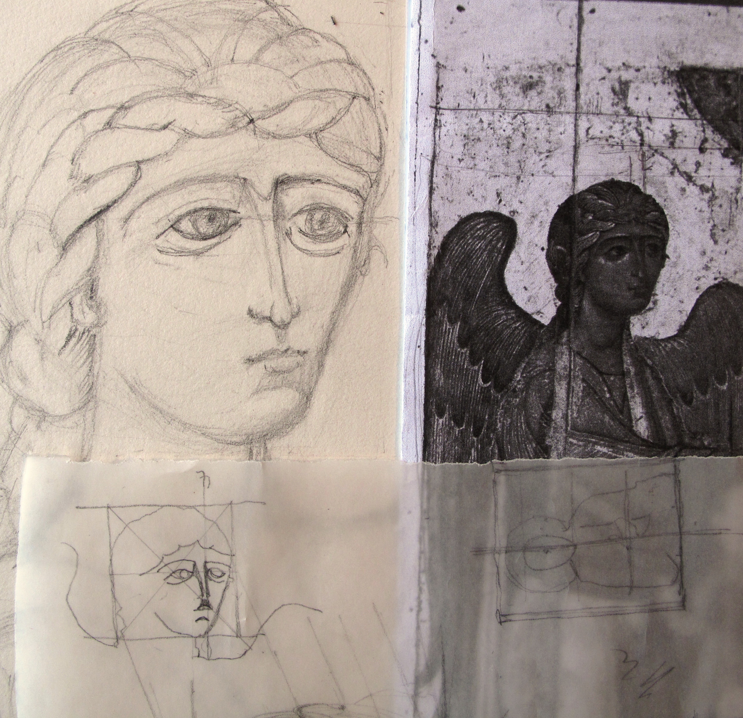
The hardwood icon panels with the kivitos are works of art in their own right, labour intensive though costly for the student. That said, I would really like to do the Mandilion close to life size together with a matching sized icon of Our Lady alongside. After a lot of searching through images, I was so excited to discover the perfect pair of images of the Virgin and Christ from the 13th C Grand Deeisis in amongst the icons of St Catherine’s monastery, Sinai. I will keep to the image of Christ for this post.

icon of Sinai Christ Pantocrator

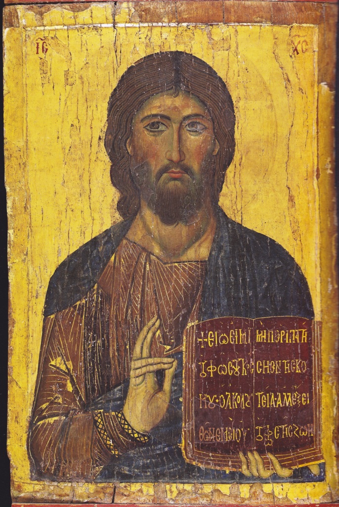
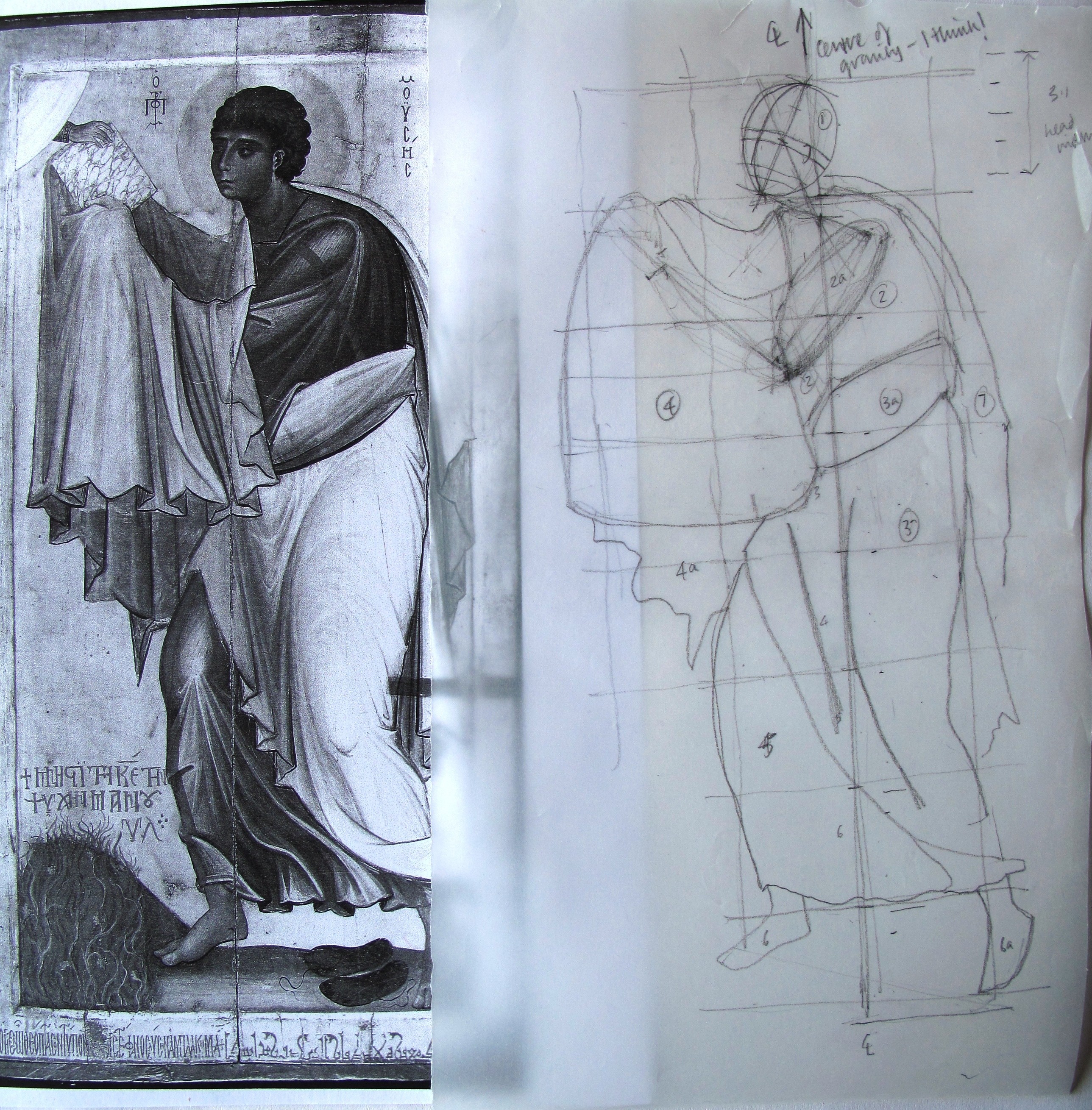
Christ from the Grand Deeisis, St Catherine’s monastery, Sinai

So our homework was to sketch or paint a monochrome study of our chosen mandilion.  I will come clean on my drawing – I pencilled out a broad grid. Now this is not the way to go in the long run! Aidan is trying hard to get us to draw without a grid, by learning to observe. It is no excuse but I was short of time (see above!) and wanted to prepare at least two drawings for him to check at our May session.

pencil sketch of the mandilion

Preliminary pencil sketch – the grid is NOT the way to go!

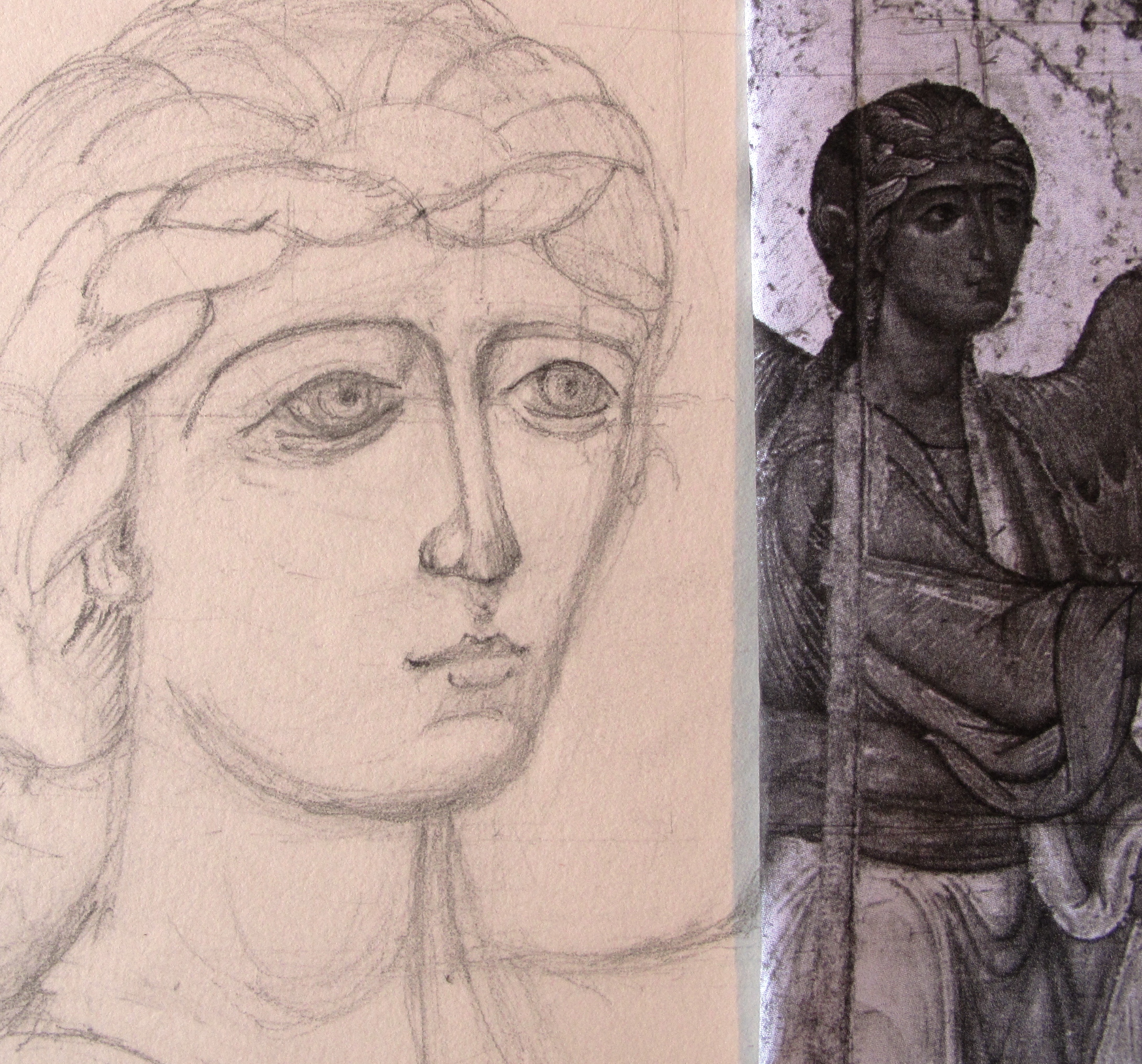
I should have thought a bit more at this stage but I was concentrating on the face rather than the whole composition. We are given a fixed rectangular proportion for the mandilion board and I have chosen 310mm x 400mm for mine. The face sits neatly into a square and the hair falls into the lower part. As the image I have chosen doesn’t have the falling hair, I should have considered this sooner so as to weave it more naturally into the composition.

Mandilion first wash

First wash in dilute egg tempera

Building up the image in light washes

Building up the image in light washes

Egg tempera washes on the Mandilion

Building up the depth of washes

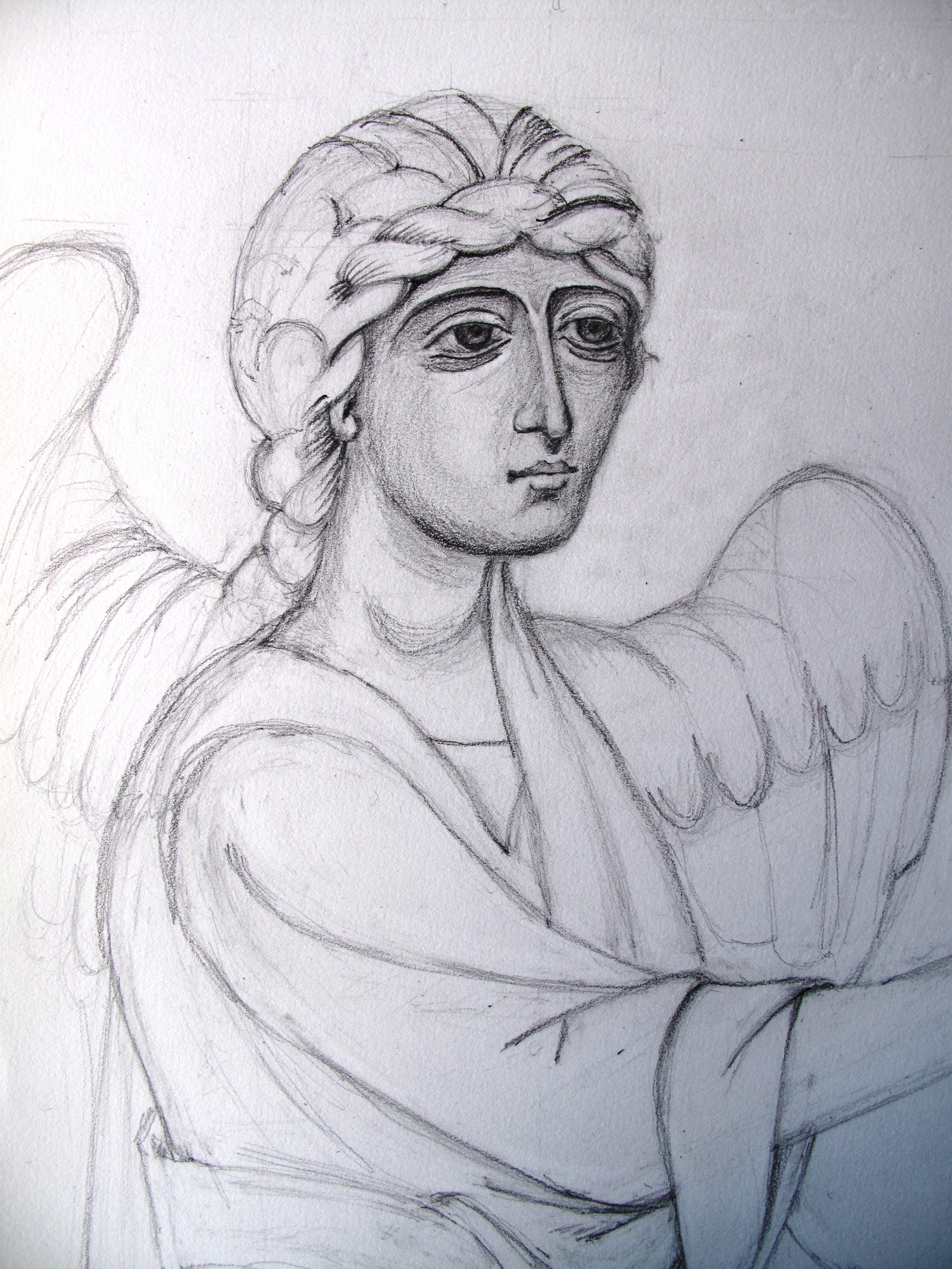
This is another point where I went adrift around the areas of flesh and beard. The moustache should taper more to the right to leave a channel of bare skin.  I also should define the beard and soften the edges. As you see, this is not the stage to paint on plaits!

Finished egg tempera mandilion

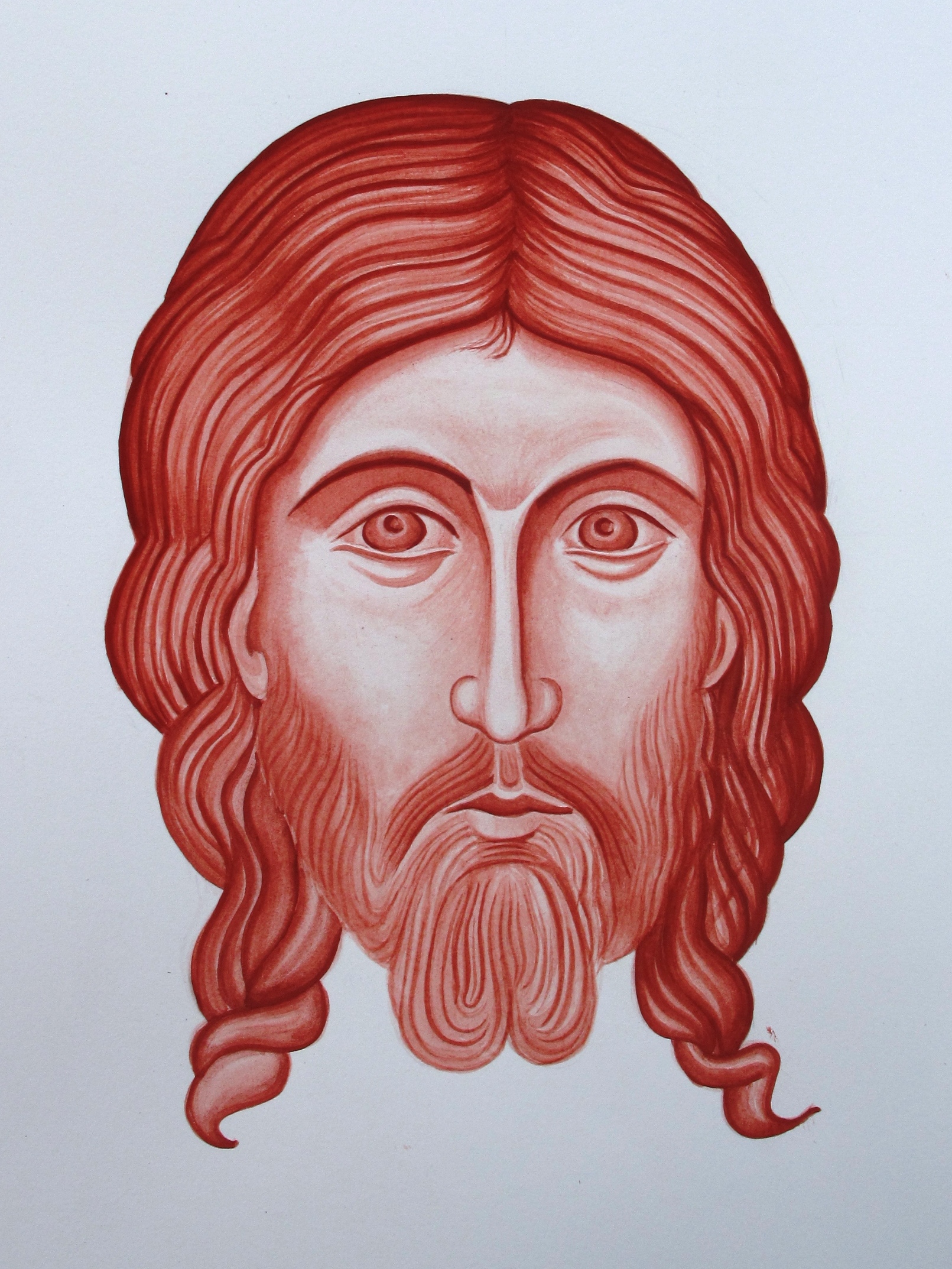
Mandilion study complete

In addition to these obervations, Aidan also showed me there was work to do on the nose, at the bridge and round the bowl and at the tip where the shading should be dark only below the nostrils.  The jaw line needs better definition too and the hair should fall further down to balance the composition.

I am really glad that I worked on this study and will repeat the process again soon as I need to increase the whole image by about 10% to fit more comfortably on my board. Painting the icon in monochrome first is a great way to become familiar with the subject and there is no better way than just getting stuck in and doing your best.

Thanks for reading!


A Glimpse Behind the Scenes (Part One of Two)

New sculpture of St Peter of York

The Eyes of St Peter of York

Hello icon friends

Part One: York Minster – a Glimpse Behind the Scenes

This is a step away from my usual posts. However, if you would like to take an armchair trip with me first to York Minster then, in part 2,  to the creative heart of Shropshire, then fill up your mug and join me here for the next few minutes. I have included links to websites with more in-depth articles; these will give you a much richer picture of the scope of what is going on. I have also tried to include photos of parts that are otherwise out of sight to give you a feel of our visit.

An offer not to be refused
An invitation by Andrew Arrol  Surveyor for the Fabric of York Minster, to see work in progress is a rare and privileged opportunity and certainly one to be accepted and shared.

View from the top of the east end of York Minster

The recently landscaped south entrance, viewed from the top of the east end of York Minster

As a former York resident, I recall the Minster being shrouded in scaffolding throughout my childhood. For years the residents only had glimpses of the mysterious work going on behind the hoardings. So, for me to be able to witness work at close quarters was a real joy and I was delighted that Martin Earle (fellow icon student) and his fiancee Katherine, could join me. Martin is working with Aidan Hart on the sculpture of Our Lady of Lincoln as I write, (more on this in part 2).

There is a much more open approach to the conservation work at the Minster and educational visits form part of Andrew’s remit. For an overview of what is going on with the works, click on York Minster.
One of our hopes for the visit was to see the newly carved St Peter, recently installed above the Great East Window. The original figure had been dismantled and studied although the severe erosion of the features meant a great deal of research before the new face of St Peter could be formed. The existing figure had been carefully analysed so that when the new figure was in place, it would include the same foreshortening of the figure to correct the view from the ground.

The original St Peter

The original St Peter badly worn by weather erosion

To give you an idea of where St Peter has been located – it is not far from the top of the lift shaft.

Martin and Katherine standing at the foot of the East end of

Martin and Katherine standing at the foot of the East End of York Minster

The new St Peter is a magnificent work of art, a seated figure of over six feet. An extract from York Minster’s weblink below reads: ‘It has been designed by Martin Coward of York Minster’s Stoneyard, who created scale models in clay, before a full size version of the approved design was sculpted and cast in plaster of Paris.  Martin is carving the top section of the figure, including the detailed head’.

The new stone figure of St Peter, in place above the east window.

The new stone figure of St Peter, in place above the east window.

There is a full description of the work behind St Peter on York Minster Revealed

New stonework indented into existing window arches

New stonework indented into existing window arches

Every stone has been surveyed and great care has been taken to maintain as much of the old masonry as possible. Each stone is assessed according to its exposure and position as to whether it can last well into the next century and replaced only if necessary.

Queen of Heaven

Queen of Heaven

There is a wonderful creative spirit with the stonemasons as they have been free to design the images that grace the uppermost parts of the building. Most of these will never be seen from the ground so here are a few birds eye views:

A tiny figure clings on to the tracery

A tiny figure clings on to the tracery

Plague Doctor carving

The Plague Doctor

Uzziah

Uzziah

Now taking you swiftly down from the heights to the very bottom of the building and into the crypt, to find the medieval stone carving of the Virgin of York, a subject very dear to both Martin and Aidans’ hearts, but more about that in my next post.

Virgin of york Minster

Virgin of York Minster

The inscription reads ‘SCA MARIa’ Saint Mary. Mary holds the infant whose hand is raised in blessing. Much is still to be discovered about this image such as the type of stone it has been carved from and the exact date. The scuplture is Romanesque in style with Byzantine influence and it is considered to be from around the 12th Century.  The damage could have been as a result of the 16th century iconoclasm or ocurred during the course of past building works. It was discovered in 1829 after a fire broke out in the Quire.

The Stone Masons at work in York  Minster

The stone masons at work in York Minster

There is so much more I could write about our visit such as the beautiful woodwork in the Chapter House, the repair work to the stained glass of the Great East window, more on the stone repairs and so on, but I want to pause here to acknowledge the masons. They are in a league of their own – master craftsmen and craftswomen par excellence!

To Andrew Arrol and your team – thank you so much for a truly memorable visit.


Hello icon friends,
Good to be back to share what has been going on this last month. I set Gabriel to one side to for a short while to make way for the Prophet Moses – homework time!


Moses detail

Moses detail

Now that we have our first six months behind us, there are signs of all our efforts beginning to bear fruit. It was wonderful to see over 24 homework studies from 12 students all laid out together, they made quite an impact. Let me tell you a little about this particular example
I have tried a different mix of pigments for young Moses: French Ochre Sahara and Avana (75% – 25%) just to explore a different colour. Aidan had said that each colour has a personality, some are more translucent or gritty and it is good to get to know their qualities.


Moses pencil outline

Icon of Moses, St Catherine’s Monastery, Sinai with sketch pencil outline to identify key forms

Aidan reminds us that when we start out, we should spend some time studying the icon before we begin to sketch. Look for the dominant movement, the centre of gravity, the direction that the body takes, the qualities that the person is portraying. Icons start with spiritual truths which are then expressed in matter. Study the main forms and don’t worry about the detail just yet. Is it dynamic or still? Check the proportions of the body in relation to the head, use your dividers to check relationships.

Spending time pencilling out the form on tracing paper helps me to identify some of these points. First I drew the centre of gravity then outlines around the main forms. I drew an axis on the head and divided the vertical line into head lengths. I found the array of garments a little perplexing to draw without some help so I drew a head-sized, free-hand grid either side of the vertical line.

Pencil sketch of Moses

Pencil sketch of Moses

The figure seems quite top heavy, but the whole image is balanced by the burning bush at the bottom. Once I was more familiar with the form, I was ready to set Moses out on my watercolour paper. I allowed 2cm for a border then divided the given area into 9 head lengths which allows for halo space and ground (approx. a head length).

Light wash over pencil outline

Light wash over pencil outline

I’ve learned that it is best to start with a very light wash over the main forms, then rub out the pencil before the drawing gets muddy. This is also the time to look again at the main areas of light and shade, look at which parts of the figure are nearest the viewer (the lightest) and which recede (the darkest).

I will leave you with my final piece and once again, thanks for reading!

Moses study complete

Moses study complete


Gabriel at Large

Gabriels face appears

Gabriels face taking shape

Hello again icon friends,

The image above represents a quick sidestep past another effort which ended up in the experience bin. I had started this stage quite pleased with my decision to stretch myself by working on a larger image. I transferred the outline of my final drawing of Gabriel on to A2 sized paper which gave Gabriel the space to outstretched his arm in full.

Transferring the final drawing

Transferring the final drawing on to unstretched A2 Fabriano Artistico watercolour paper

On went the image using a sheet of paper which I had rubbed with Armenian red bole (a red pigment) to act as transfer paper. Then I painted lightly over these lines to fix them.

Painting on the outline

Painting the outline on to the paper

So far so good. However, as I washed over the larger areas, the paper began to cockle.

Image of Gabriel 1

Image of Gabriel 1

I then got caught up concentrating on the face rather than building up the image lightly and evenly as a whole. I looked at the face in comparison with the original and decided I had gone so far adrift that it was only paper and I should start again, and start properly. I am sparing you a larger image of my first Gabriel who looks rather stern!

Gabriel looking nothing like the original!

Gabriel looking nothing like the original!

So, down to the DIY shop to buy an MDF board cut a little bigger than A2, together with some water colour tape and this time soak the paper in the bath for a few minutes, tape it to the board and let it dry. By this stage I had had enough, so I left the board and wet taped paper flat on the floor overnight and by morning it was dry and had stretched beautifully!

Gabriel with a softer face

Gabriel with a softer face

This time, I tried to develop the whole figure and garments at the same time. There are numerous mistakes with the garment folds which I realised as soon as we got the handouts on our next Icon session but at least I can see where I have gone adrift.

I have attached Aidan’s handout notes on painting standing figures and garments if you would like to find out more on this subject. I am concentrating on our homework for the time being but will come back to Gabriel in a few more weeks.

Day 7 Aidan Hart’s handout on standing figures 24 Feb 14

Adding shading to define the forms

Adding shading to define the forms

Gabriel underway

Gabriel set on the A2 paper

Thanks for reading!

Meet my mistakes!

Annunciation of Ustyug, Novgorod, 12th Century

Annunciation of Ustyug, Novgorod, 12th Century

Hello icon friends,

It is one thing hearing how to do something and another altogether applying it via the end of a brush or pencil. I set out to try another upper body monochrome of the Archangel Gabriel from the beautiful image of the Annunciation above and in the course of this I have befriended a whole group of mistakes – let me introduce a few!

I lightly sketched out the image ready to paint over but saw immediately that I had run into difficulties. First of all, I didn’t get the overall composition right.

Preliminary sketch of Gabriel

Preliminary sketch of Gabriel

I had set out the upper body study on A3 paper but in doing so found I had cut off the hand. This seemed to lose the whole point as the hands are so expressive of the whole message that the image contains. Looking at it now, for this exercise I should have zoomed in and concentrated on the face and upper arm, but I had started so I carried on.

Sketch comparisons

Sketch comparisons, finding the centret to identify where I am going adrift

Secondly, I couldn’t get the face, in particular the eyes, quite right.  I did a cross check between the original and my drawing by forming a simple square to enclose the head, then joined the diagonals to find the centre point of reference. I was pleased to see that the point landed in exactly the same spot on my drawing, but it showed immediately where the rest of the face had gone astray. The nose leant too far over and the eyebrows had fallen down.

Adjusting the features but there is still something not right

Adjusting the features but there is still something not right – the eye on the right and the tilt of the head?

After a few days away from this drawing, I still couldn’t quite see where they were going adrift so I traced over the original eyes to clarify their shape and laid them over my drawing.

Tracing the profile of the originals to identify where I am going wrong

Tracing the profile of the original eyes to identify where I am going wrong

One slight move of of one feature has repercussions elsewhere so the brows, nose, mouth, cheek profile all got adjusted and brought into alignment. I suppose that speaks on another level too, to always go back to the source to bring something of ourselves that is out of step back into alignment.

The eyes on the left after being adjusted.

The eyes on the left after being adjusted.

Sketch of Gabriel near completion

Sketch of Gabriel near completion

With all the rubbing out and rearranging I had made quite a mess of my paper. I thought hard about all that I had learnt and decided that I would take a bit of a leap and redo the whole image again but on larger paper. So, next time I will tell you about how I made a fresh crop of mistakes as I move onto A2 paper. Thanks for reading!