Advent Four: Shine with Joy

Wishing a peaceful and healing Christmas to you all.
Thanks for your company this year.
Ronnie
PS You can see the complete Nativity icon here.


Wishing a peaceful and healing Christmas to you all.
Thanks for your company this year.
Ronnie
PS You can see the complete Nativity icon here.


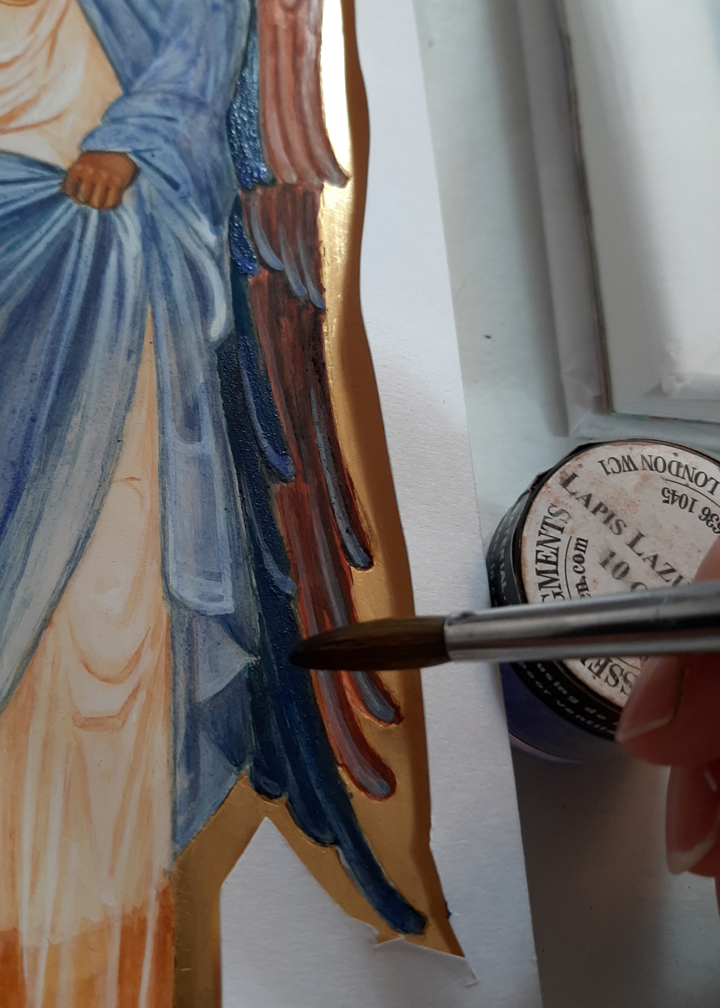
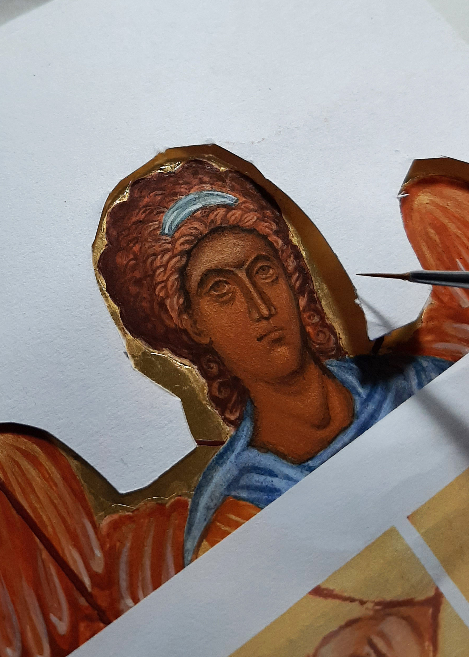
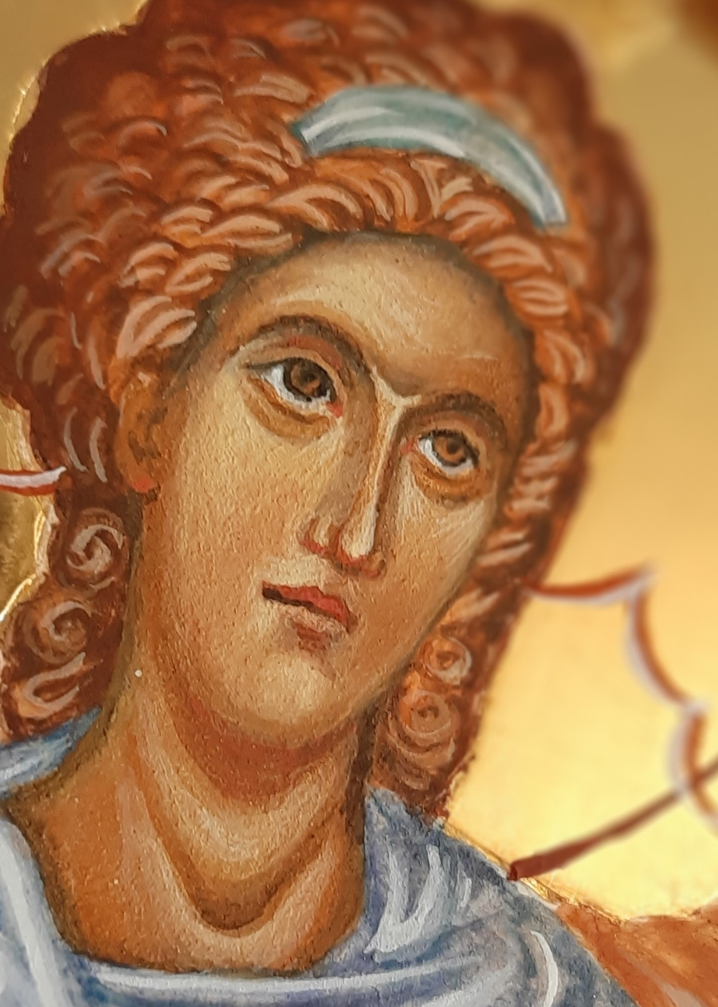
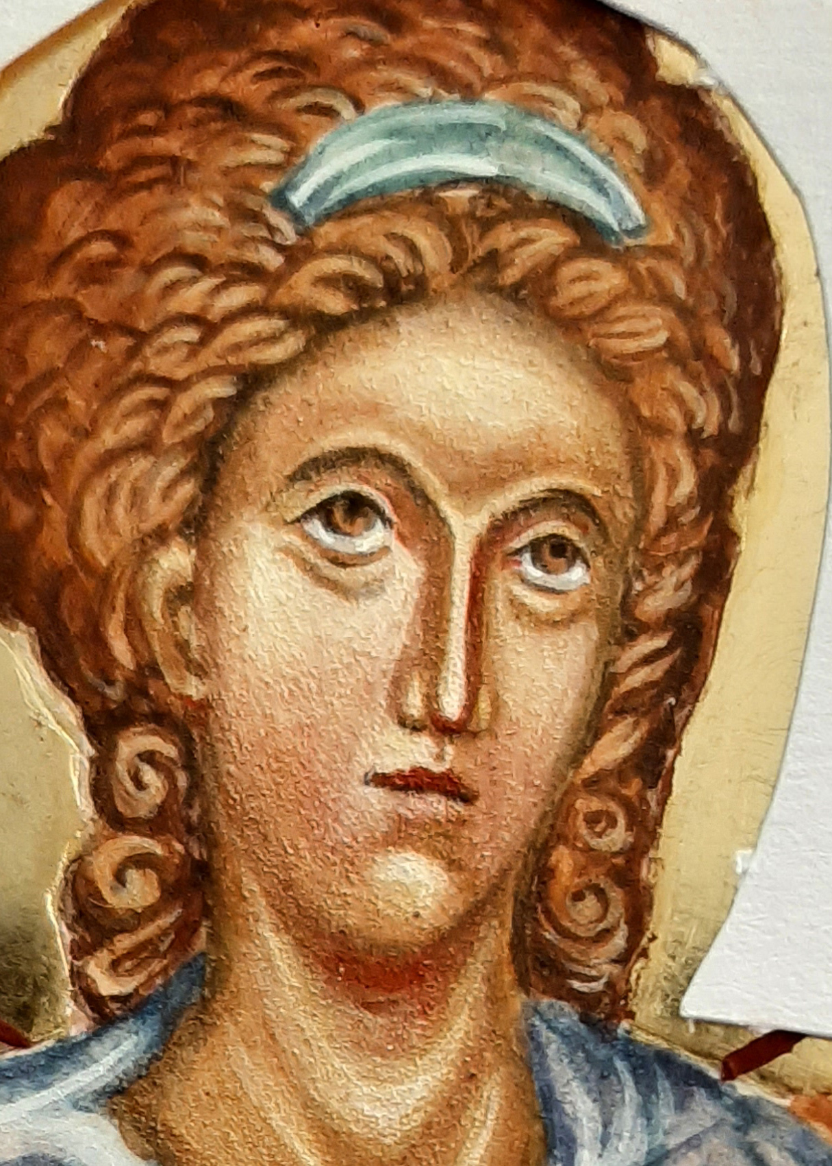
The orchard is cloaked in darkness as I write and there’s a mid-winter owl hooting outside our window. There’s something magical about this time of year. For many, this is the busiest, most hectic time of year so I only want to share a few photos of the stages of painting this cluster of angels on paper.
This was a study for the Nativity icon – working on thick 600gsm hot-pressed paper. It’s a luxurious surface to work on.
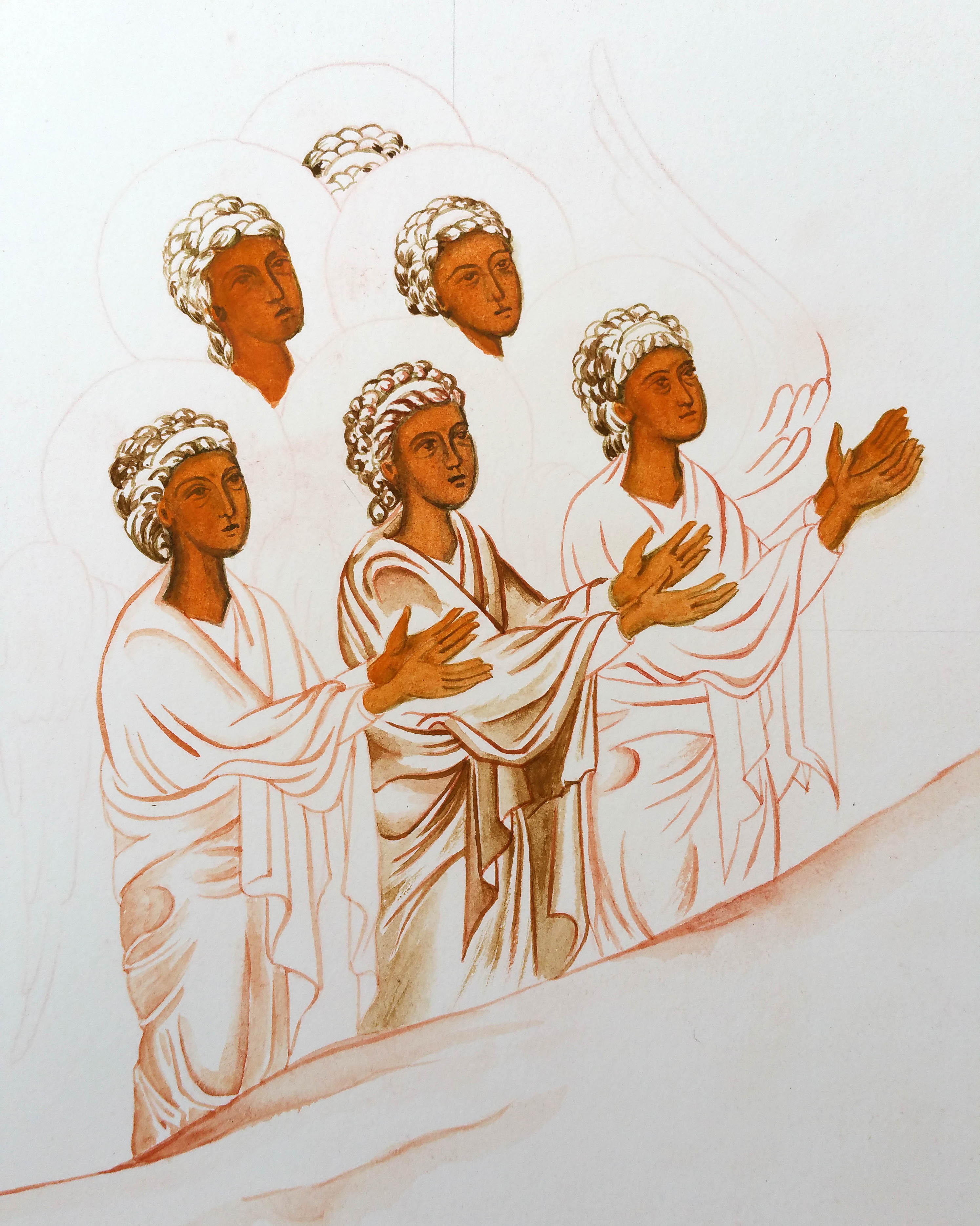
The following photos show some of the painting stages – colours include English Yellow Ochre and French Ochre Havana with the skies in Azurite.
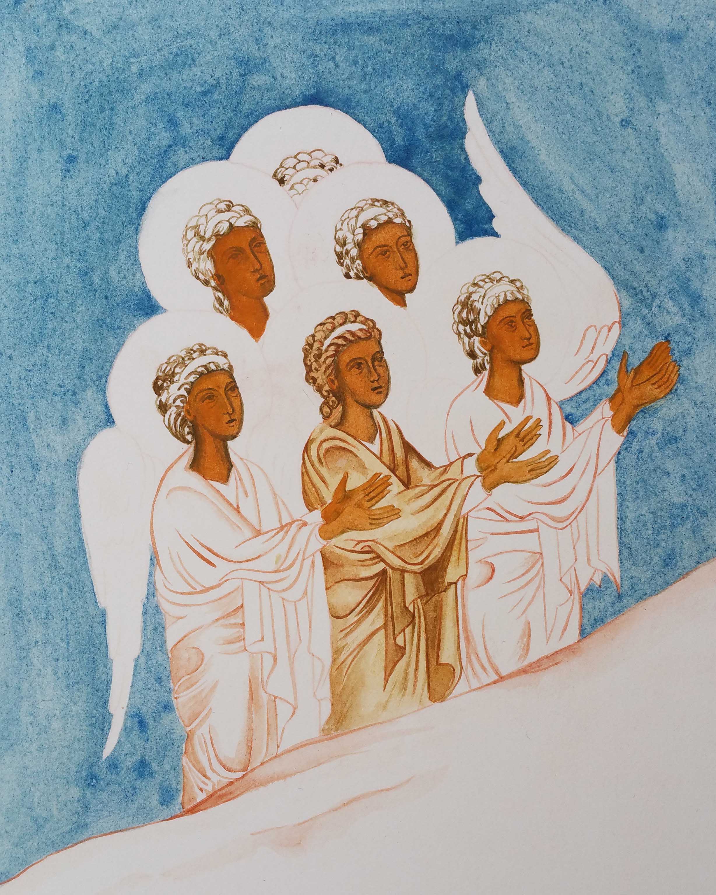
Faces are worked up in layers starting with underpaintings in Terre Verte and washes of Red Ochre and Yellow Maimeri. Shadows and highlights built up to model the faces.

Here’s the final study in the Nativity workbook; deep azurite skies with a thin wash of indigo to deepen. We’re still in difficult times with another new variant on the rise. If you’re still here then I’d like to thank you for being with me.
Here’s trusting that you and yours are lovingly upheld by a cluster of angels over the days and weeks of Christmas-tide ahead. Stay well!
Thanks for reading – Ronnie


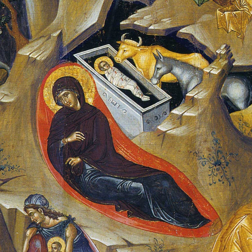
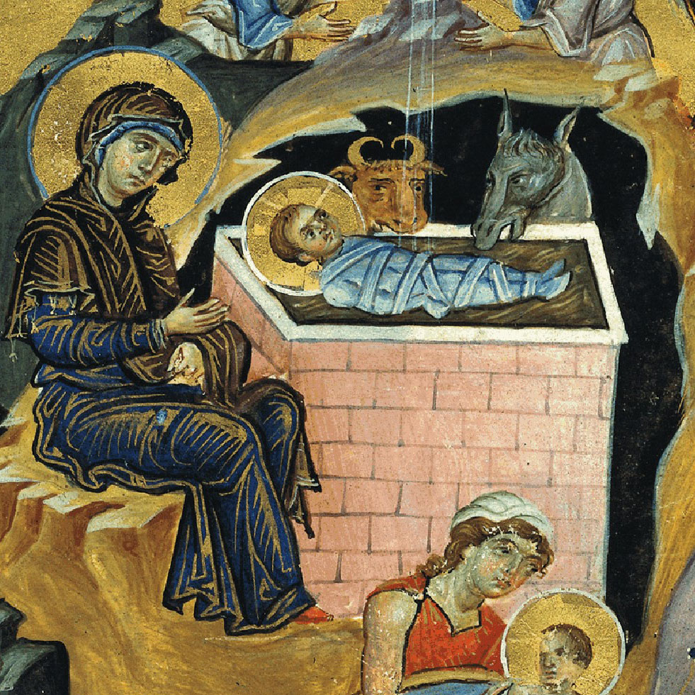
The profoundly beautiful Armenian Nativity created by T’oros Roslin in the 13th Century remains my favourite Nativity icon. I painted my own version on vellum back in January 2016 in preparation for the Festal Nativity icon (on a large gessoed panel) which was part of the final year of the Diploma.
This is a silly busy time of year for many of us but I’m posting this here now for you to find sometime in future when you do find a quiet moment.

The primary shepherd on the large Nativity icon (above left) was a direct reference to the figure in the Armenian Nativity scene. I liked his expression and woolly tunic! (If you want to refer to the finished diploma icon you can see it in more detail here).
Caput Mortuum is a mysterious rich deep maroon colour and looks to me the colour used in the Armenian Nativity original. The name translation from Latin is ‘dead head’. In the Merriam Webster Definitions dictionary we find one definition “alchemy : the residuum after distillation or sublimation” also “a red iron-oxide pigment made by calcining iron sulfate“. To me it’s the colour of an aubergine and when placed next to lapis lazuli, the colours sing.

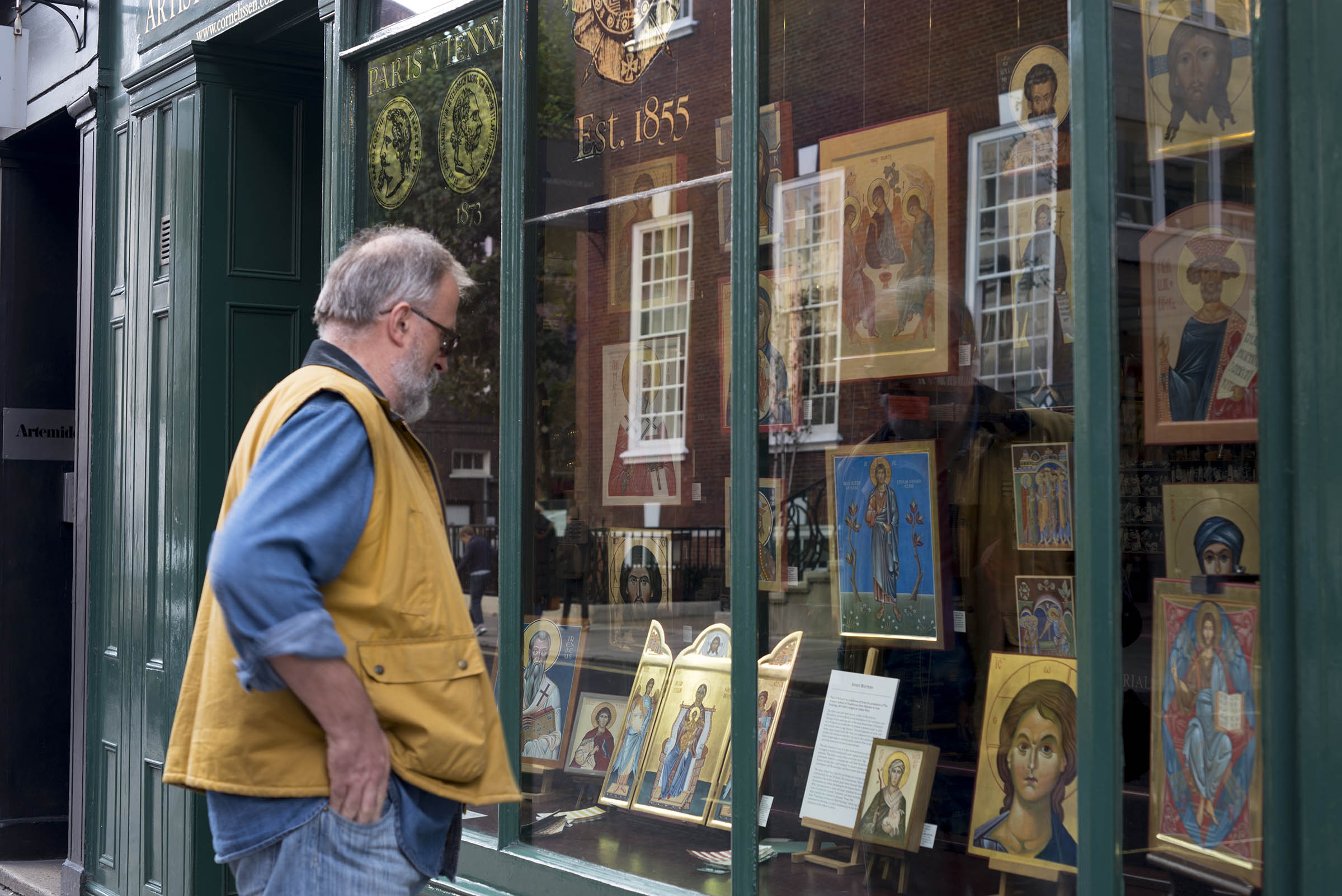
Reflecting back to the time that I painted the Armenian Nativity, you’ll have no idea how over the moon I was to participate in the exhibition curated by Patricia Lovett and held in the window of Cornelissen’s . It was all part of the Heritage Craft Week 2016 which I wrote about here. If you’ve never heard of Cornelissen’s then treat yourself to a minute inside their London shop here.


Patricia – if you are reading this, that exhibition and subsequent synchronicities led to the class of 2013-16 final-year diploma icons being displayed in the same window (below) and repeated three years later with the next icon student intake – THANK YOU!
Back to work…
These shepherds have been shuffled around to get a balanced composition. Photocopying and cutting out the figures allows you to move them and see how they work in relationship to one another. It’s interesting how small shifts can make a difference in how your eye is led around the figures and around the overall composition.
Lines are transcribed onto the panel by rubbing red ochre onto the back of your traced drawing. The lines are fixed with a dilute mix of egg tempera in red ochre. Applying a dilute mix means it’s easy to blend into the layers that follow.
Yellow Ochre Maimeri and Ivory Black pigments mixed together give a lovely green for underpainting flesh tones – an alternative to Terre Verte which can be a bit sticky.
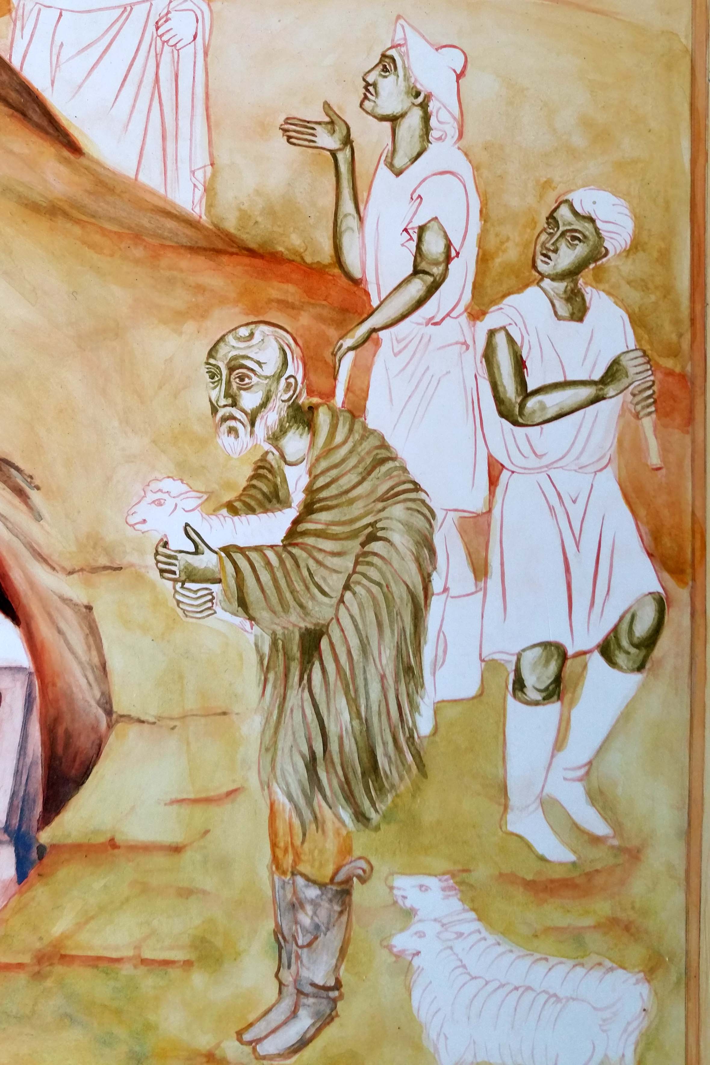
Since I had this earthy mix, I used it to under-paint the garments of the primary shepherd. I’ve used thin washes of earth ochre pigments to build up the landscape.
Colours vary here as I’ve taken photos at different times of the day.


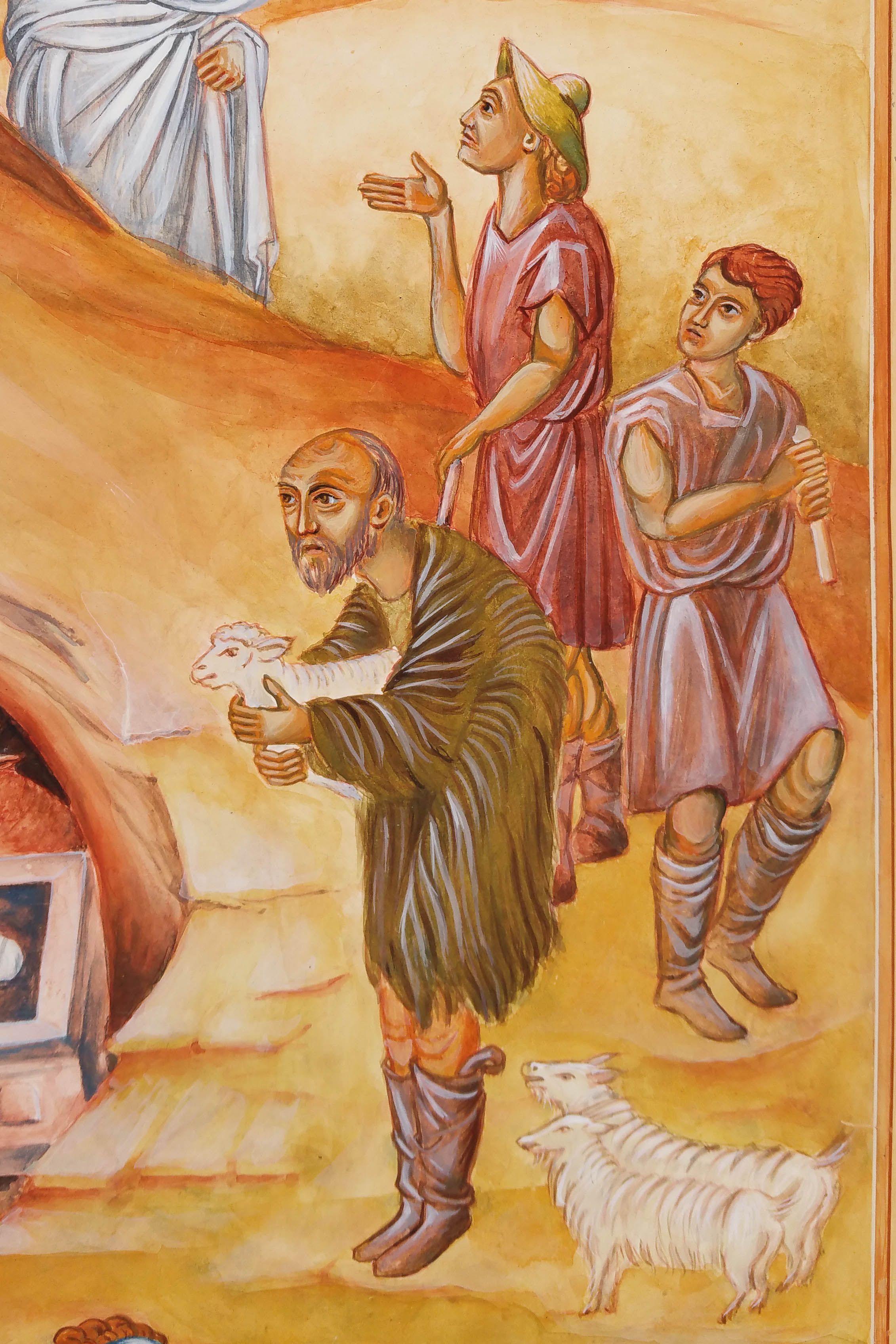
Let’s close this post on these shepherds – almost finished. Just a few more highlights to add on their faces and hair.
Thanks for reading, whenever that might be 🙂
Ronnie

It’s Advent as I write and timely to reflect on some of the foundation work for the Festal Nativity Icon which I worked on in the third and final year of the diploma course (2013-16) with Aidan Hart. I know that this is a silly-busy time of year for many of us but you don’t have to read it now – it’s here for later!

Before I get started, I also want to say that the British Association of Iconographers have an online exhibition ‘Icons Emerging from Lockdown 2021’ sharing the work of over 46 icon painters. The work is worth leaving this page right away and having a look!
Back to the Nativity icon – In this post, I want to look at the starting point of the icon – looking at the choices and decisions behind the composition.
We were invited to work on a festal icon of our choice and to design a new composition which emphasised a particular aspect of the feast. I chose the Nativity – with the theme of praise and thanksgiving so beautifully expressed here in the Festal Menaion – Nativity Vespers:

We were encouraged to study good examples of our chosen festal icon referring to frescos and manuscripts. At first, the variety of prototypes felt overwhelming (just google ‘orthodox nativity icon‘) but I have a particular love of manuscripts and one in particular spoke to me with its beautiful simplicity – the Armenian Nativity by Toros Roslin, painted in the 13th century, so much so that I painted a reproduction on vellum (blog post here).

In October 2015, we made a course field trip to Thessaloniki to explore some of the beautiful icons and frescos that reach back into antiquity. In particular I loved the frescos of St Nicholas Orphanos Church (14thC), including this one of the Nativity. You can get a flavour of this trip in my post here.

Looking at the layout of the Orphanos fresco, light from heaven is directed vertically to the Christ Child, centrally placed in the heart of the cave where high contrast and curved lines frame the Blessed Virgin. Your eye is then led gently down and around to take in all the surrounding figures and back to centre.
The most perplexing aspect of the composition for me was settling on a layout of the Virgin and Child which are diverse as you can see from a few examples below. I felt that it was unusual for a mother to turn away from her child, let alone this one!

I made a start on the cartoon – sketching out the overall composition on a large sheet of cartridge paper cut to the size of my gessoed panel (53 x 42cm). To help keep things fluid at this stage, I made separate sketches of each cluster of figures which I was able to photocopy, cut out and move around. I had also been working on the figures and colours in a workbook (you can see some examples here).
It was important to align the composition with our chosen theme and to allow the viewer’s eye to flow and pause in a rhythmical and meaningful way around the icon. You can see on this example, I had shown the Virgin looking towards her infant being bathed by the midwives – I wasn’t entirely happy with this but this was the exploration stage.
Looking back at my notes I have found some helpful comments from Aidan and Sr Petra Clare:
It was somewhere during this exploration stage that I came across the translucently beautiful work of the Romanian master iconographer Gabriel Toma Chituc. This detail from his Nativity icon was an answered prayer for me as it expressed so eloquently the union of heaven and earth, Mary placed vertically and the Christ Child horizontal with the light of the star reaching into the cave.

For the ancient Greeks, the cave symbolised the convergence point of divine or cosmic energies and was considered a sacred point where the soul could enter earth and subsequently leave and return to earth.
I will close here for now showing the cartoon transferred on to the panel, using red ochre rubbed on to the back of the traced paper image and setting the lines with a dilute mix of red ochre tempera. If you would like to see the finished icon, you can see it here.
As always, thanks for reading and wishing you a peaceful and blessed Advent.
Ronnie

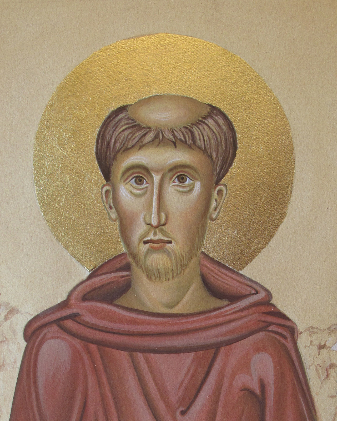
Today, 4th October is the Feast of St Francis. I’d like to share some of my work from my student days on Aidan Hart’s diploma course when we were encouraged to paint monochrome studies on watercolour paper. I found these studies a little less intimidating as they were ‘only on paper’ rather than the gessoed boards which we had all spent several days preparing.

I knew I was going to paint an icon of St Francis on a gessoed board so wanted to prepare a study on paper first.
However, instead of painting a monochrome, I decided to see how painting an egg tempera icon on paper would turn out. The drawing above is taken from one of Aidan Hart’s icons of St Francis. This is the traced outline over the pencil sketch which I made from his prototype which you can see here.

I can’t find any record photos of the underpainting on paper but it would have been with thin layers of Terre Verte pigment and a few washes of the Yellow Ochre Maimeri mixed with a tiny dash of English Red Ochre, applied in thin washes.
The process on paper is the same as on a gessoed board – I followed exactly the same steps.
Returning to the icon on paper, you can see both the underpainting of face and garments have had ‘membranes’ of colour and I’ve begun to add some facial shading and highlights.
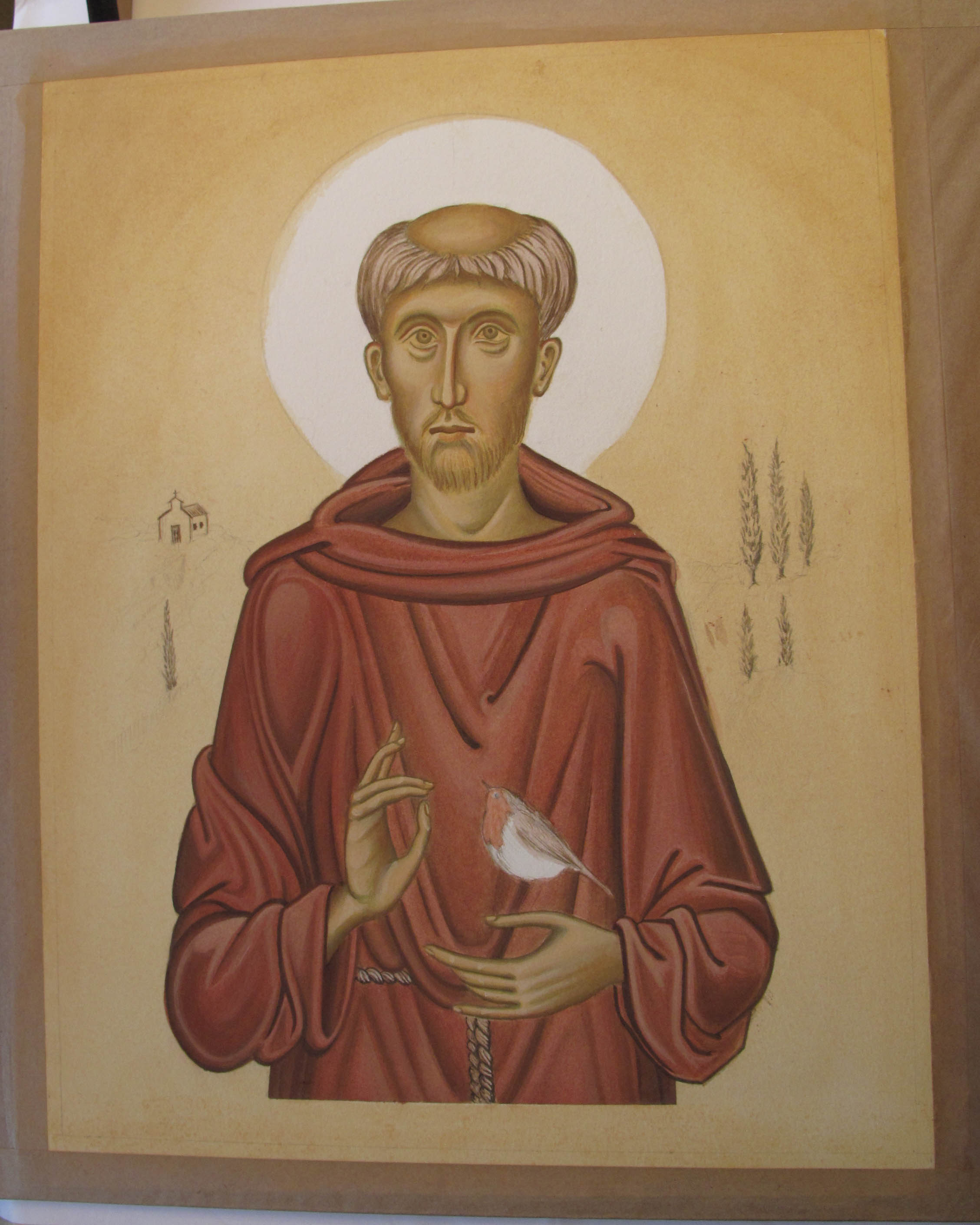
I like faces to have soft highlights – I have often added the brightest areas only to wash them back with French Ochre Havanna so they blend in. There is a lot of flexibility in egg tempera – it is surprising how thin washes of one pigment over another can help things sit better together.


Finally we arrive at the lettering and gilding the halo.
Working on paper, I applied a dilute coat of upva glue (flexible when dry) over the surface to be gilded – this acts as a seal over the paper. About 20-30 minutes later I applied a second less dilute coat and as soon as it was just about dry I applied 23.5 carat transfer gold leaf.
I referred back to the drawing for the centre point of the halo, placed a strip of cardboard over the face for protection from the compass point, held it all very steady and drew a circle around the halo. I pencilled out the lettering and then traced and painted them on.
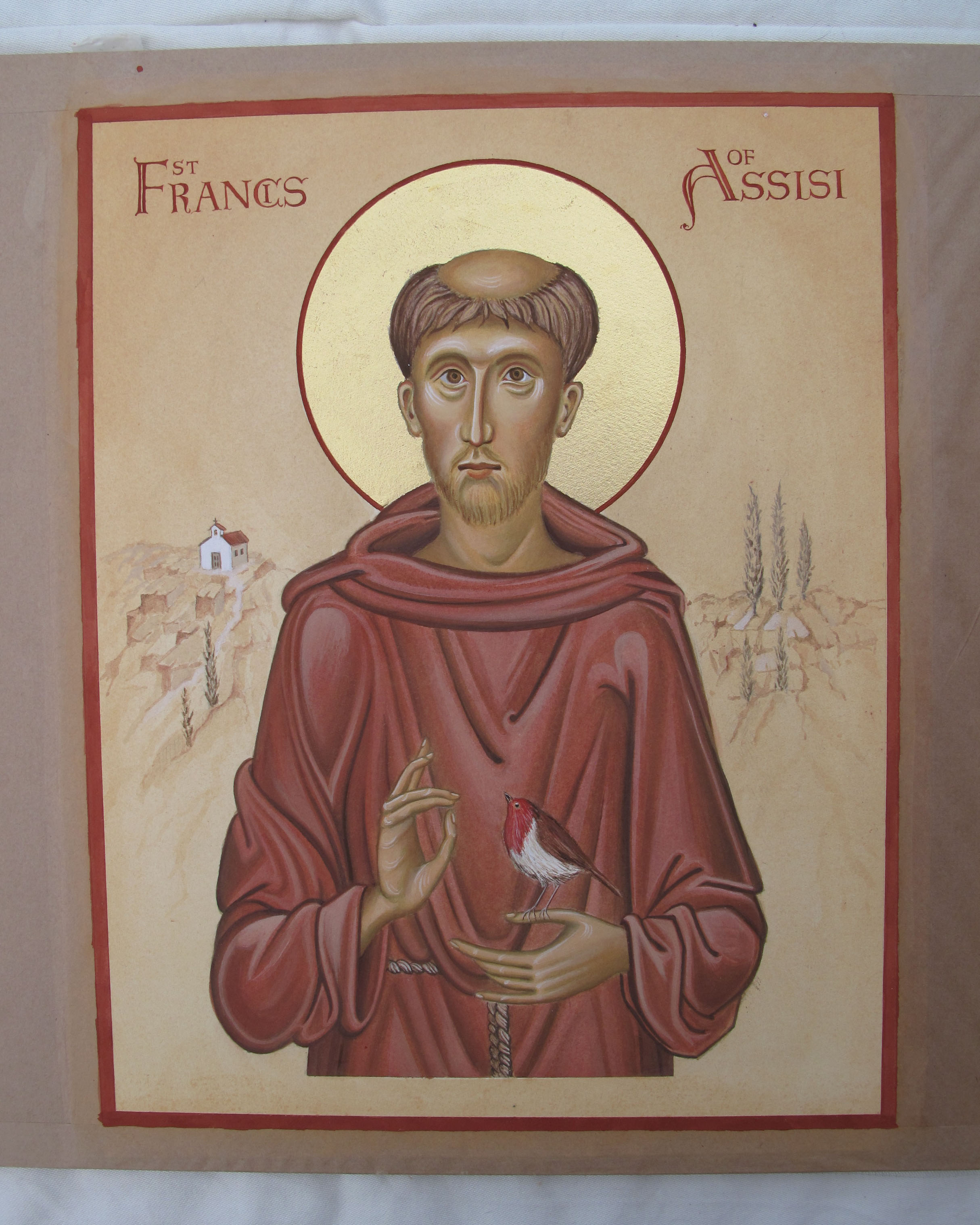
Finally, the work was framed and included in the final student exhibition at the PSTA in Shoreditch. It is now available to purchase from my Etsy shop here.
It’s almost the end of the day here but just in time to wish you peace and blessings on the feast of this gentle yet powerful saint.
Thanks for reading,
Ronnie

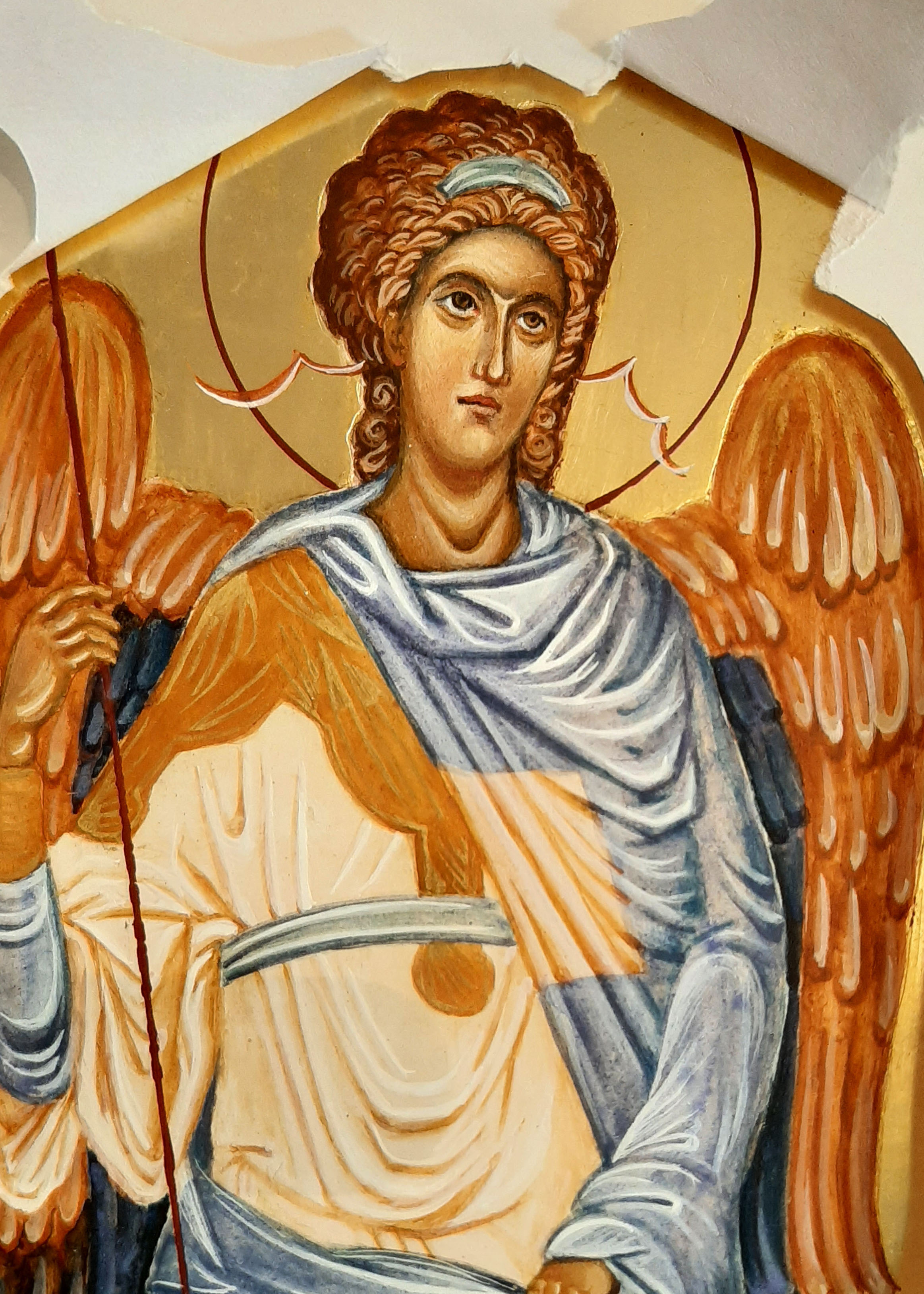
As September gives way into darker evenings and mornings, it pulls back many memories of the ancestral hearth for our family. It’s a time of remembering our loved ones and lighting a candle. It is the time to honour the Archangels on the feast of Michaelmas.
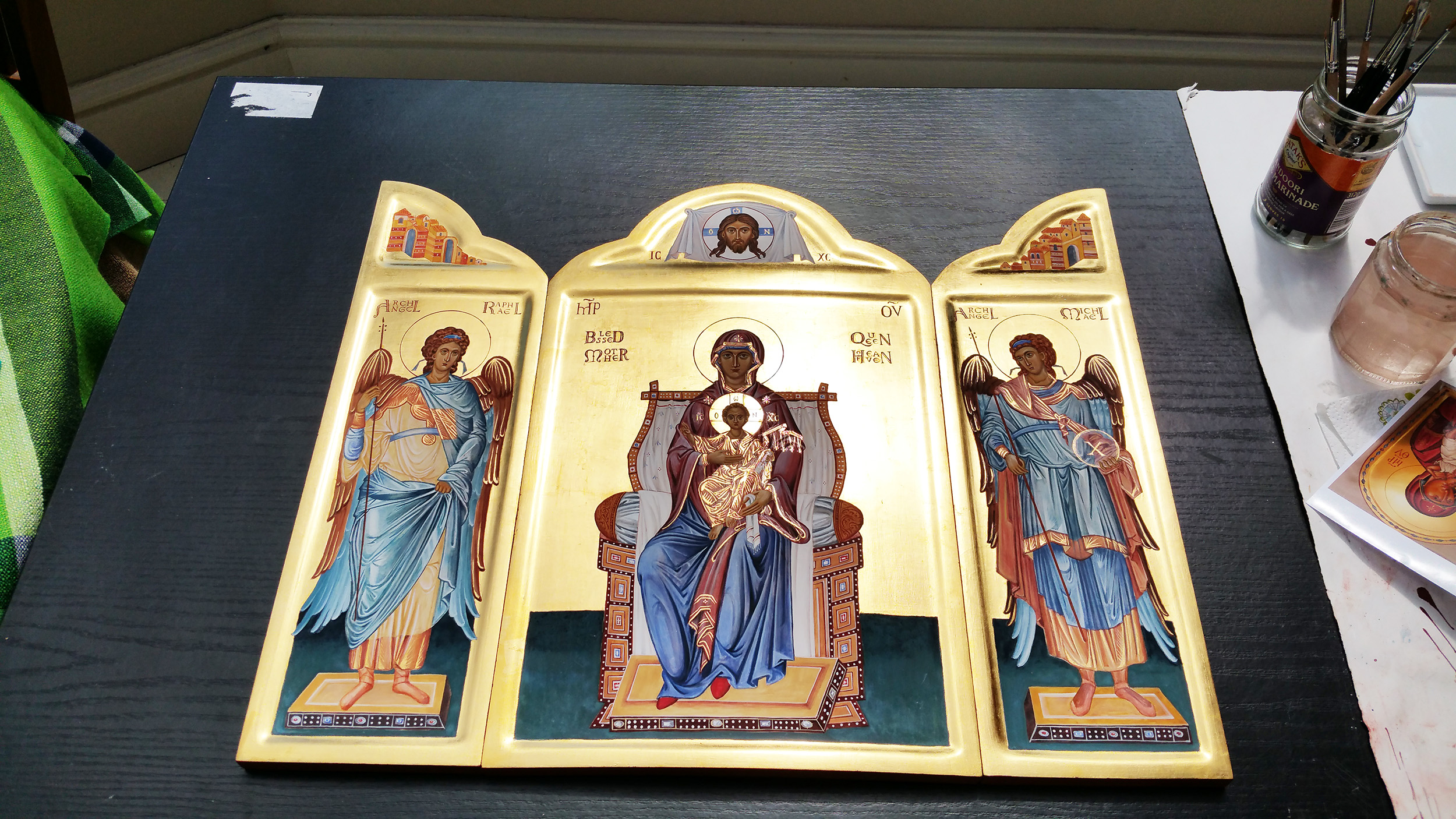
This was a triptych which I painted for my sister – she had seen a small version years ago and loved the way the doors opened up for the big reveal and had wondered if I could ever paint one for her one day. I’m so glad I did!
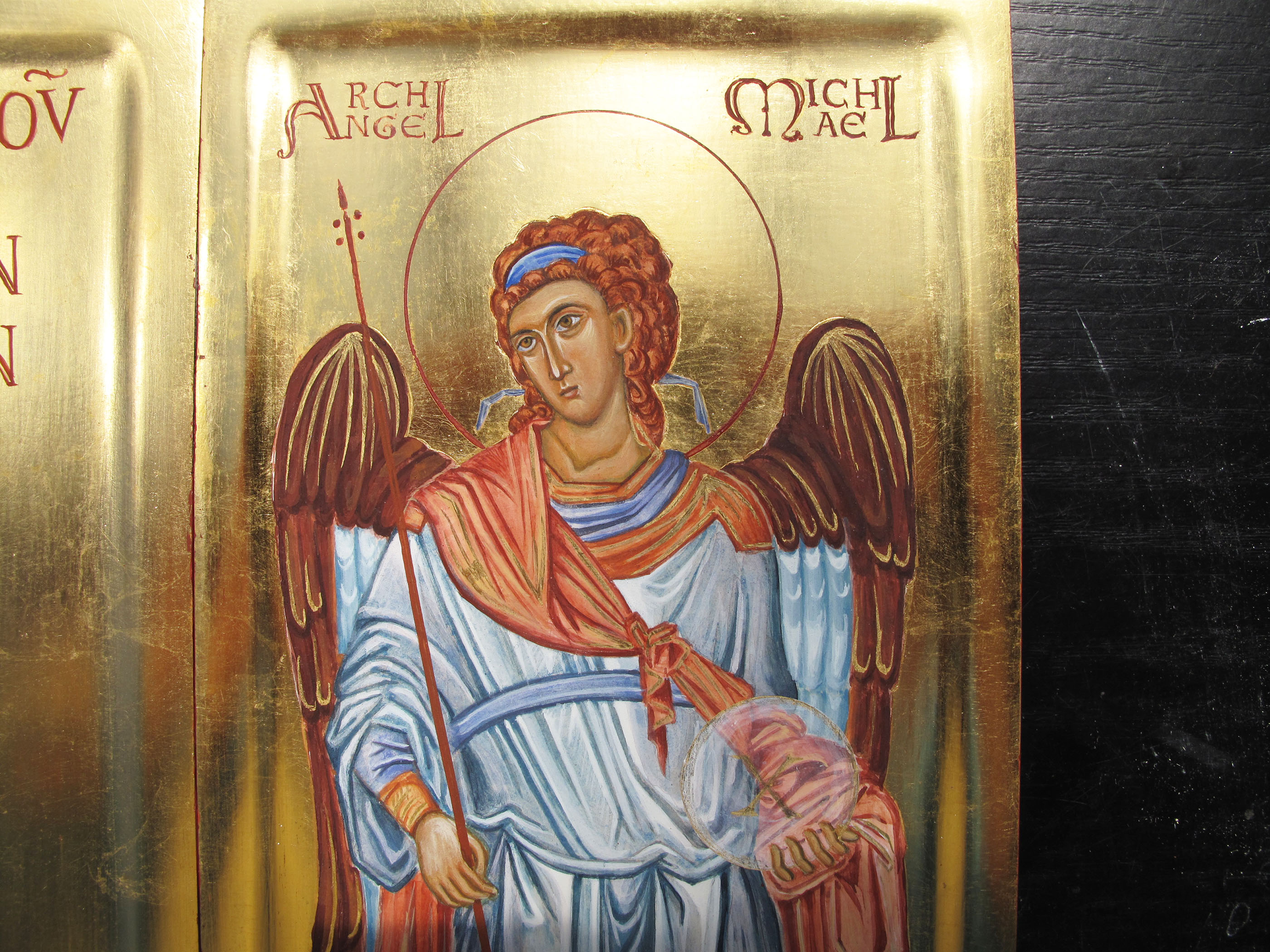
The images for these two Archangels which stand either side of the Blessed Mother and the Christ Child are based on the frescoes of Chora in Istanbul, seen high up in the dome.
I’ve written about this triptych previously in this blog but for this evening, I wanted to include a sequence of work-in-progress photos of an icon which I painted on watercolour paper of Archangel Gabriel.
If you haven’t got a gessoed board ready prepared, some heavy 300-400gsm+ smooth hot pressed watercolour paper is a really beautiful surface to work on. If you can find cotton content paper then it will be archival and long lasting in the right conditions.

You will see from this photo that I’ve used a pencil grid to help draw the image – don’t hesitate to use all the help you can get as you go along. Turning the master image upside down to refer to also helps you to tune into the areas of light and shade, angles/directions, hard and soft edges and so on.
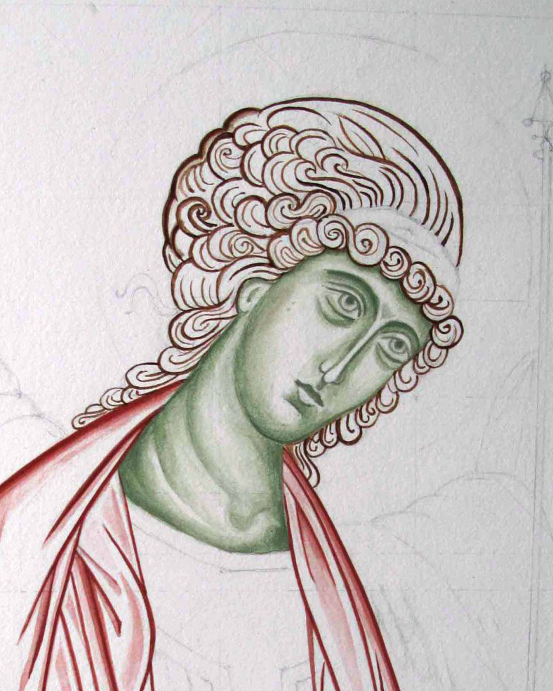
I have under-painted the face in the pigment Terre Verte. You could also use Yellow Maimeri and ivory black to get a different green.


I have used a mix of English Red Deep and French Ochre Havanna for the hair, wings and robes.

This is a thin wash of Yellow Ochre Maimeri and a touch of Red Ochre light for the membrane over the skin. The red ochres are really strong pigments so you will only need a diluted drop of it for warmth.
You can see this icon completed and framed together with a few other icons here on my Etsy shop page.

And finally to close this post on the Triptych – here it is complete in the UK and ready to fly to Australia – with my Aussie sis joining in a wee family gathering!

In the meantime, trusting you all into the care of our celestial helpers.
As always, thanks for reading,
Ronnie

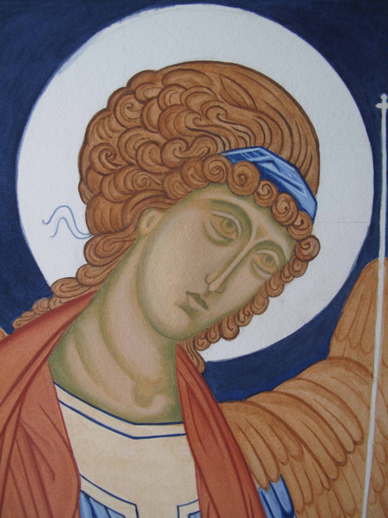
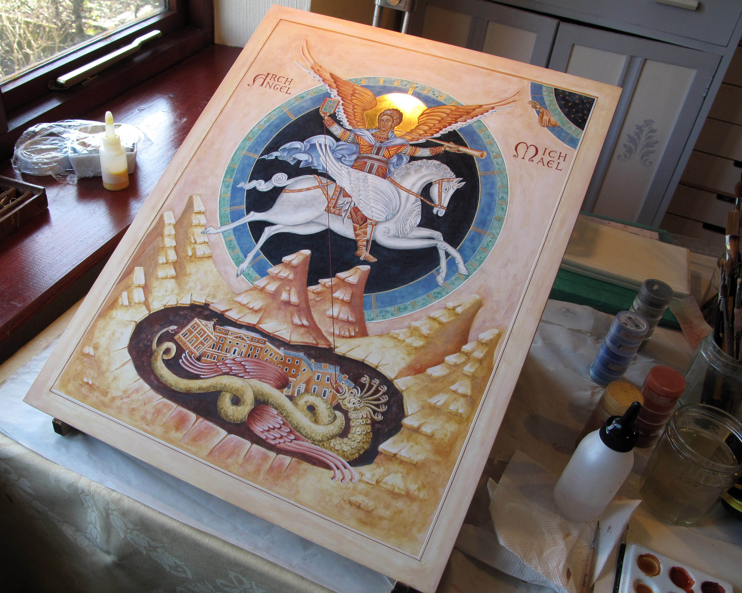
As I said in my previous post, I felt that this icon wasn’t quite complete. It wasn’t just the modelling and highlights on Archangel Michael’s face – but I felt it lacked presence. Since I had glazed the entire icon, I was prepared to work on it as a whole. I started with the face and applied thin layers of French Ochre Havanna, that lovely warm pigment that blends and evens out the different flesh tones.


I’ve learnt to leave some time between the underpainting of the face and applying the highlights. Letting the new paint rest for a few days works well as it is too easy to make holes in the layers when it is fresh. This is a small face, only 2.5cm brow to chin, so I need to be careful!
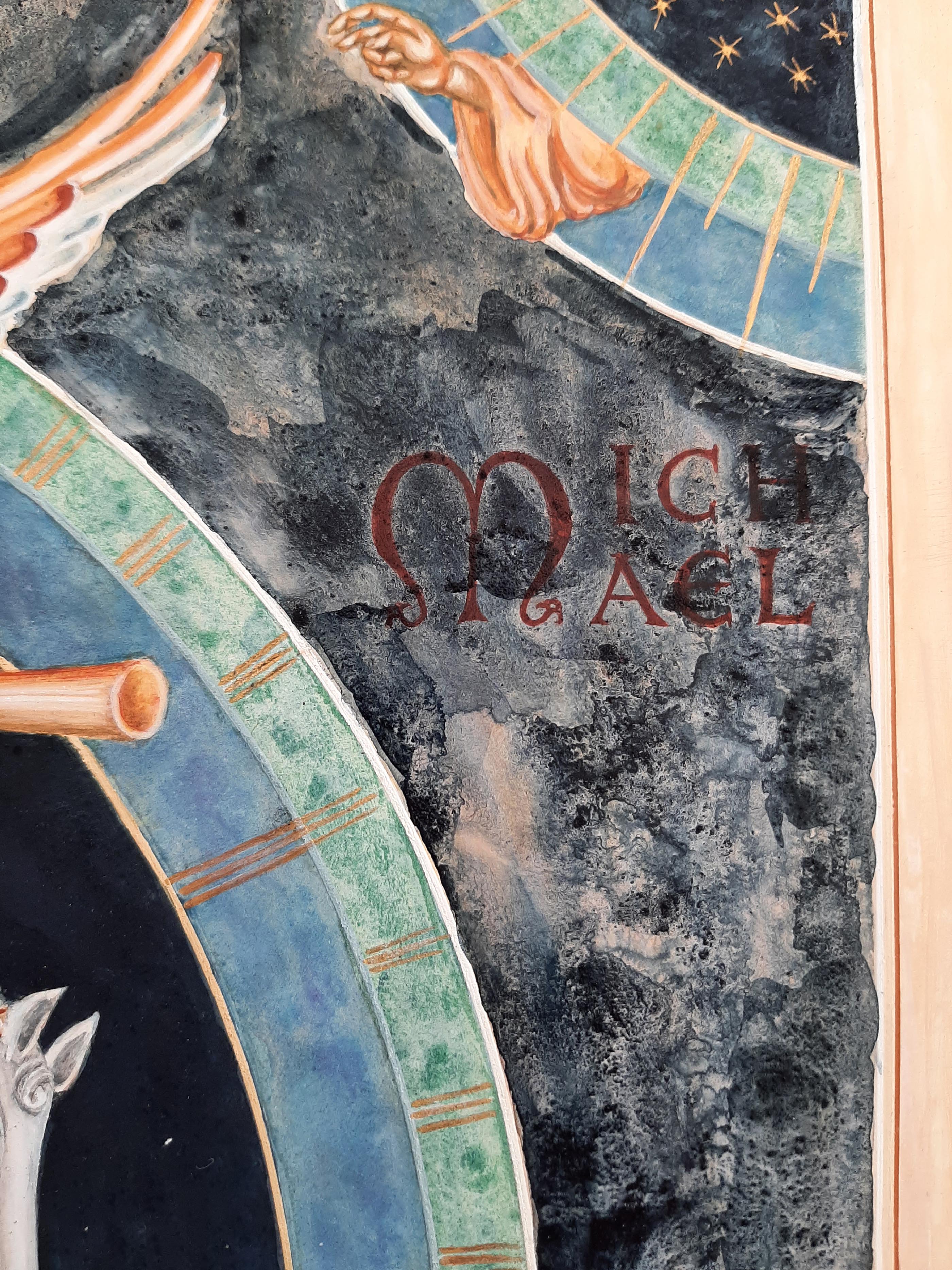
In the meantime, I had made a decision to extend the dark skies beyond the circle to balance the mountain area. The beauty of well-tempered paint is that it forms quite a hard surface after a year or so. With the dilute egg glaze acting as an isolating layer, I could easily remove the new paint if it didn’t look right. I had also decided to firm up the border in a deep red ochre.


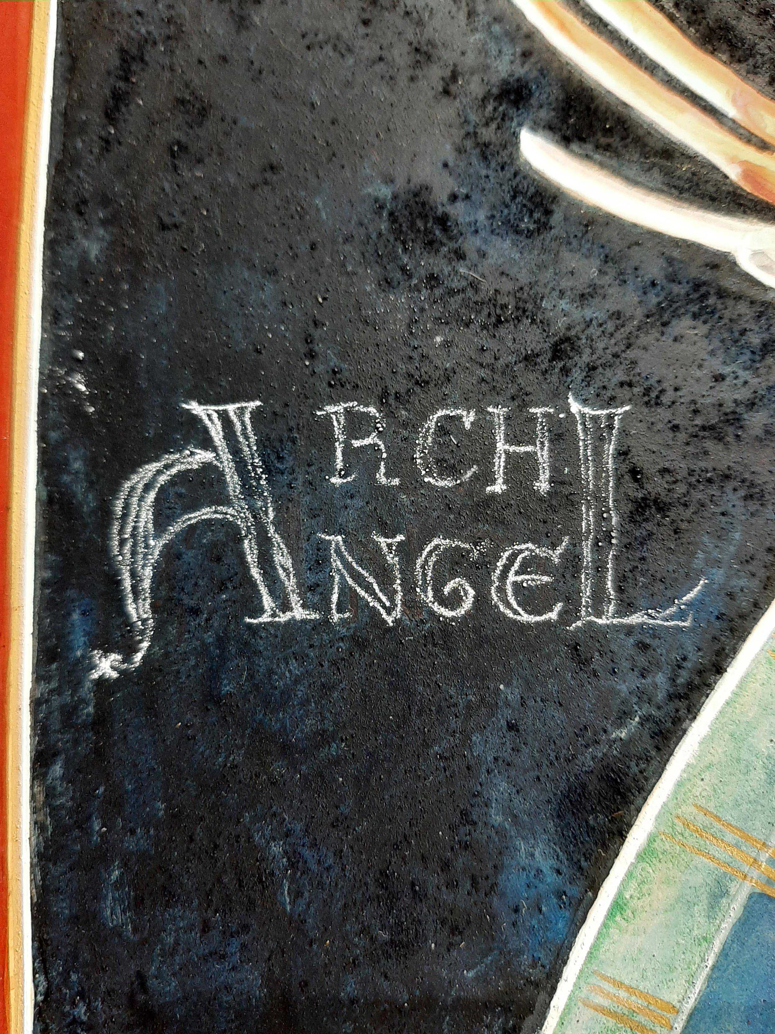
Here you can see the red letters disappearing behind the indigo.
Using tracing paper with some titanium white pigment rubbed into the back, I transcribed the lettering and painted it back on.

Going back to the face, I added the highlights back in, gave the hair a glaze of red ochre deep and a touch of ivory black and added the missing ribbons which signify listening.
I then added a wash of lapiz lazuli over the cloak and inner ring.

Final touch was to take the liner pen and draw the lines back crisply over the new red border. All in all, about week’s work but I was much happier with it!
You can see more details of the finished icon here and as always, thanks for reading!


Have you ever looked back on something you’ve done and thought there was something not quite right, but didn’t know what to do about it? I have a suggestion. Leave it for a few years, get on with learning, developing and practicing and then revisit it with fresh eyes and a bit of courage to dive in and make the changes as you see fit.

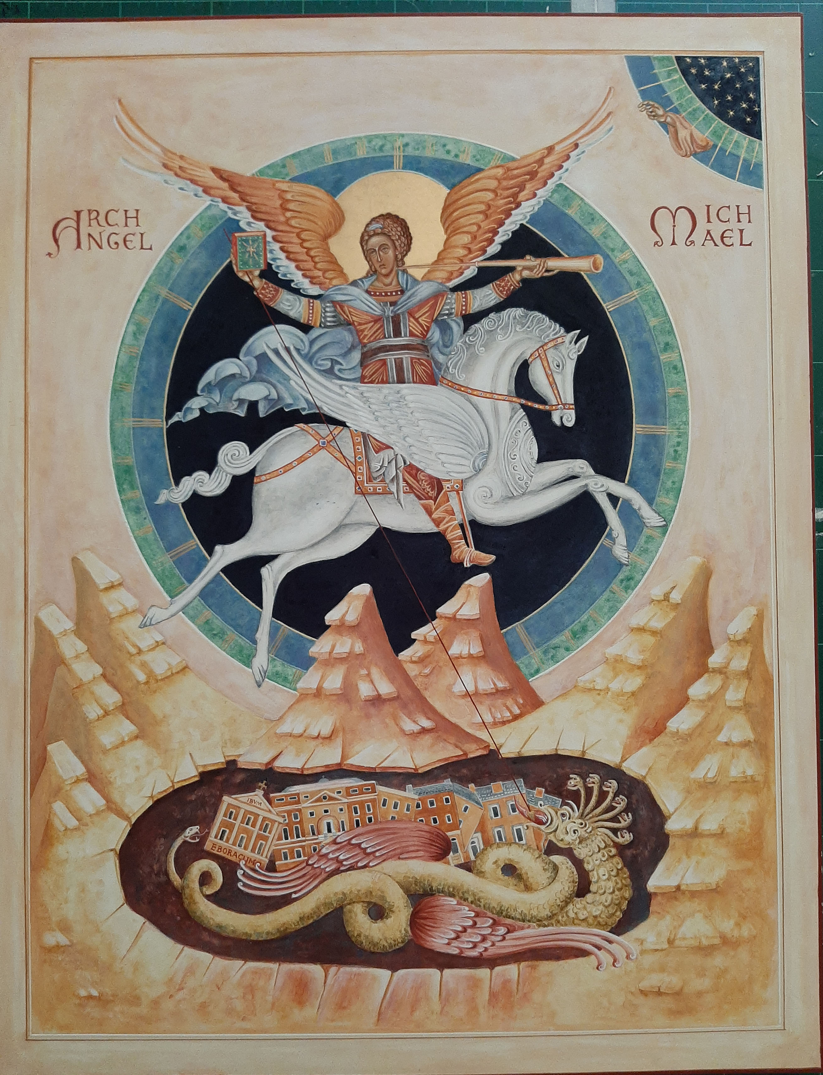
The icon above shows part of the completed icon ready to go to an exhibition in York in Spring of 2018.
At the time, I was happy with the composition, content and colours of this icon of Archangel Michael. It was one I had given a lot of thought to – I wanted to paint an icon to show the story of how many centuries ago, the sisters in the Bar Convent, York, had called upon Archangel Michael’s help during a mob riot and their small community was under threat. The Archangel appeared on the roof of the convent – astride a white horse – and the mob fled.

The Bar Convent, Blossom Street, York was my school between 1971-4. It has joined the archives on my Drawing the Street project along with the buildings opposite, including Blossom Street Gallery where I held an exhibition called ‘A Street of Angels’ back in Spring 2018.

The icon was based on apocalypse protoypes which refer to the Book of Revelation where ‘There was war in heaven: Michael and his angels fought against the dragon’. I felt it was a powerful example to reflect the experience that the sisters had at that time. I looked up a number of apocolypes protoytpes to work out my own version.
Here’s my drawing – full size at 53 x 42 cm.

All that said, whenever I looked at the icon, I felt that it wasn’t quite complete. I wasn’t happy with Archangel Michael’s face – the light/modelling of his forehead wasn’t handled well and so I set myself up to just work over the face. I started by waking up the surface using a thin glaze one 1 part egg mix to 10 parts water – but decided to glaze over the entire icon (apart from the gilding) to give myself room to work on it as a whole. I applied several glazes and left it to settle for a few days.

I will continue with the decisions and steps taken in the next post as I realised there were a few other things that didn’t feel right. If you have read this far and want to see how it turned out – you can see it here.
Stay well and thank you for reading and all the kind comments:-)
Ronnie

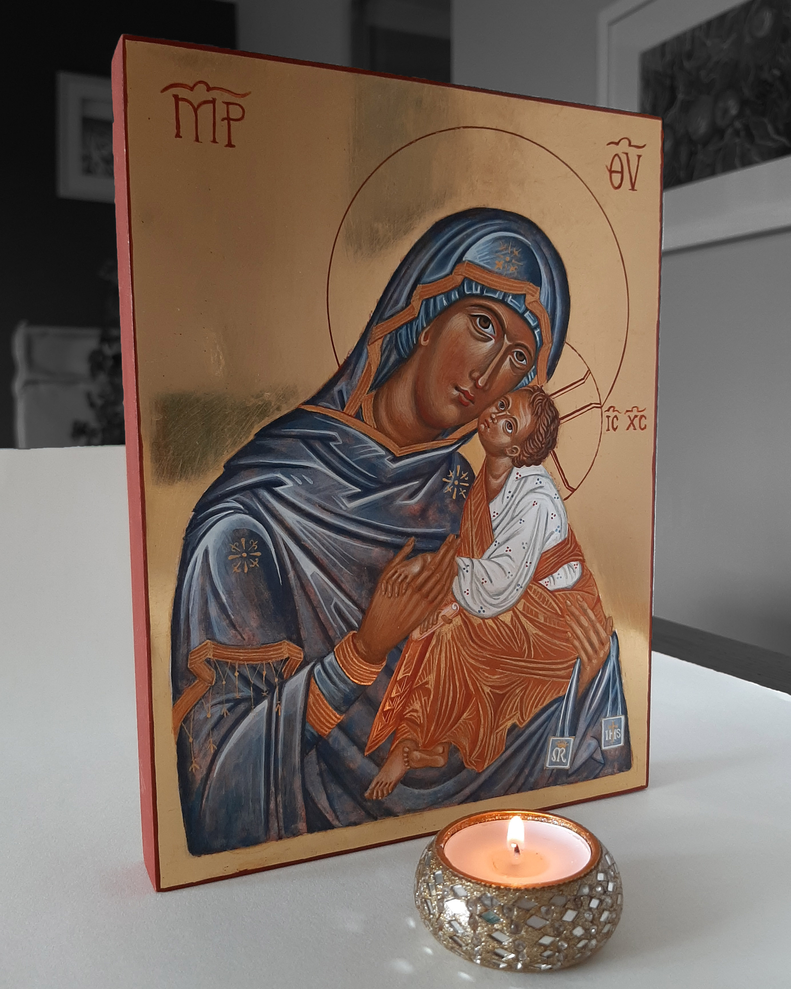
Our Lady of Mt. Carmel is the patroness of the Carmelite Order.
Har Ha-karmel is the Hebrew name for Mount Carmel, a mountain range in north-west Israel. The name dates back to biblical times and is derived from the Hebrew word kerem, meaning ‘vineyard’ or ‘orchard’, referring to the mountains’ fertile soil over the centuries. Since I live on the side of ‘Black Hill’ an Iron Age hill fort with grapes growing in the greenhouse (yes in Scotland!) and apples in the orchard, I can picture a place rich with human history.
Mount Carmel is mentioned as a holy mountain in ancient Egyptian records and was also sacred to the early Christian hermits who settled there during the 12-13th centuries. These early Carmelites built a chapel dedicated to the Blessed Virgin, calling her the ‘Lady of the Place’.
Our Lady is holding a scapular, known as a sacramental – a symbol of devotion to her.

The bright gold lines over the Christ Child’s garments are called ‘Assiste’ which I painted using 24 carat shell gold. I made this shell gold at a fantastic weekend workshop with Anita Chowdry when she had her studio on Woburn Walk, Bloomsbury. If you would like to make your own shell gold, Anita wrote a book describing the technique in great detail which is available as a downloadable book from her website above.
Making shell gold involves breaking down gold leaf into minute particles – washed away of any debris and mixed with pure gum arabic. It involves a lot of patience and a very clean room – no pet hairs! Hopeless for me now!
A year or so later and we were back down to London for UCL architecture summer show – which started with breakfast along Woburn Walk and a sketch. It is also not that far from Cornelissens where you can buy ready made shell gold – it’s a beautiful product but if you have the time, dedication and patience, but it is Anita’s recipe that really sparkles.

It’s not easy capturing the sparkle of the shine of water gilding and Assiste without seeing reflections of a mobile phone!

Here’s the finished icon painted a year or so ago. I’ve searched high and low for work-in-progress photos but they have been lost in the mix. The Virgin’s gown is painted mostly in lapis lazuli, with washes of red ochre and thin layers of Titanium white highlights, and French Ochre Havanna for the Christ Child’s garment. The background is water gilded in 24 carat gold.
The feast of Our Lady of Mount Carmel is celebrated on July 16.
Thanks as always for reading. The finished icon is now listed on my Etsy shop


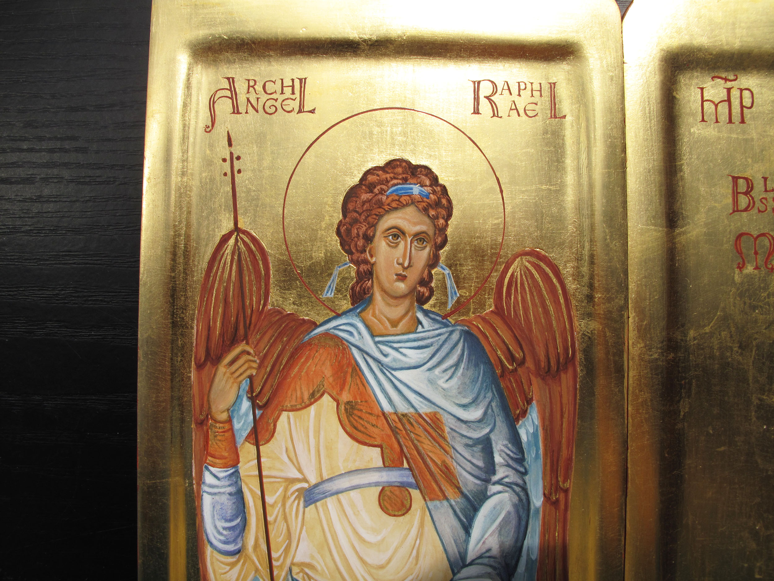
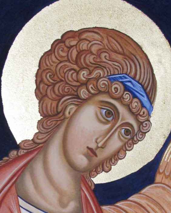
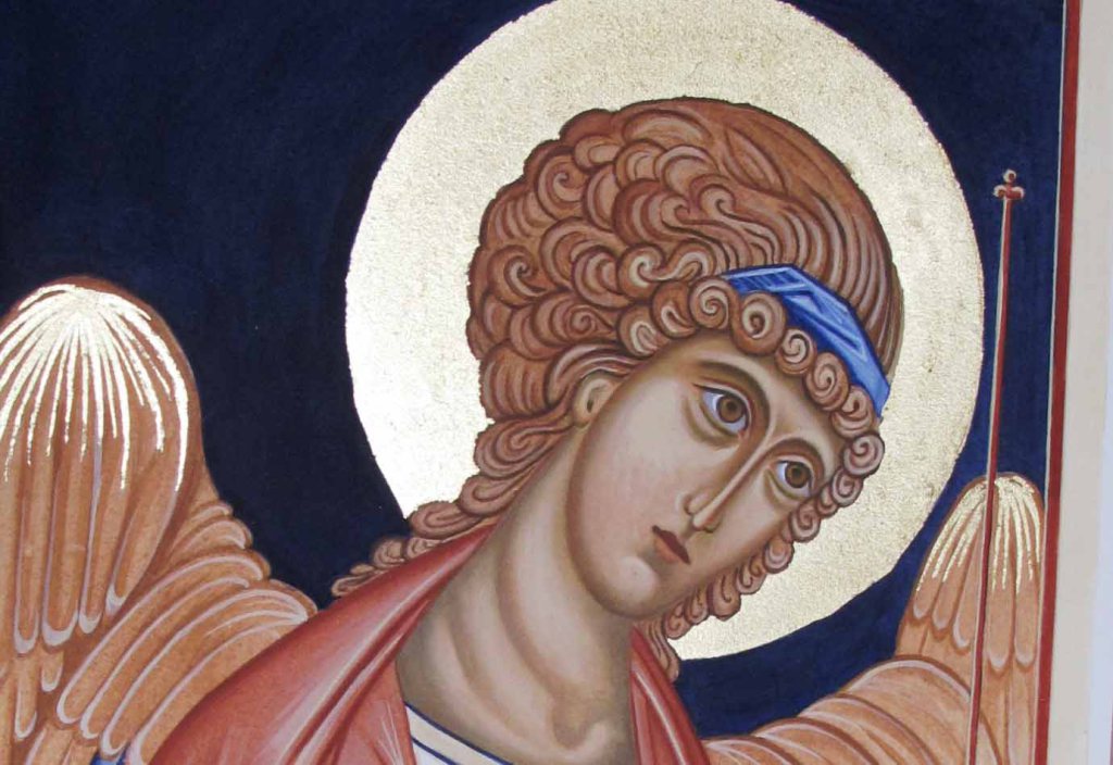
This icon is of Archangel Raphael, one of a pair of standing angels which are based on the frescos of Chora in Istanbul, painted high up in the dome. As I mentioned in my last post, I was not too pleased with the expression.
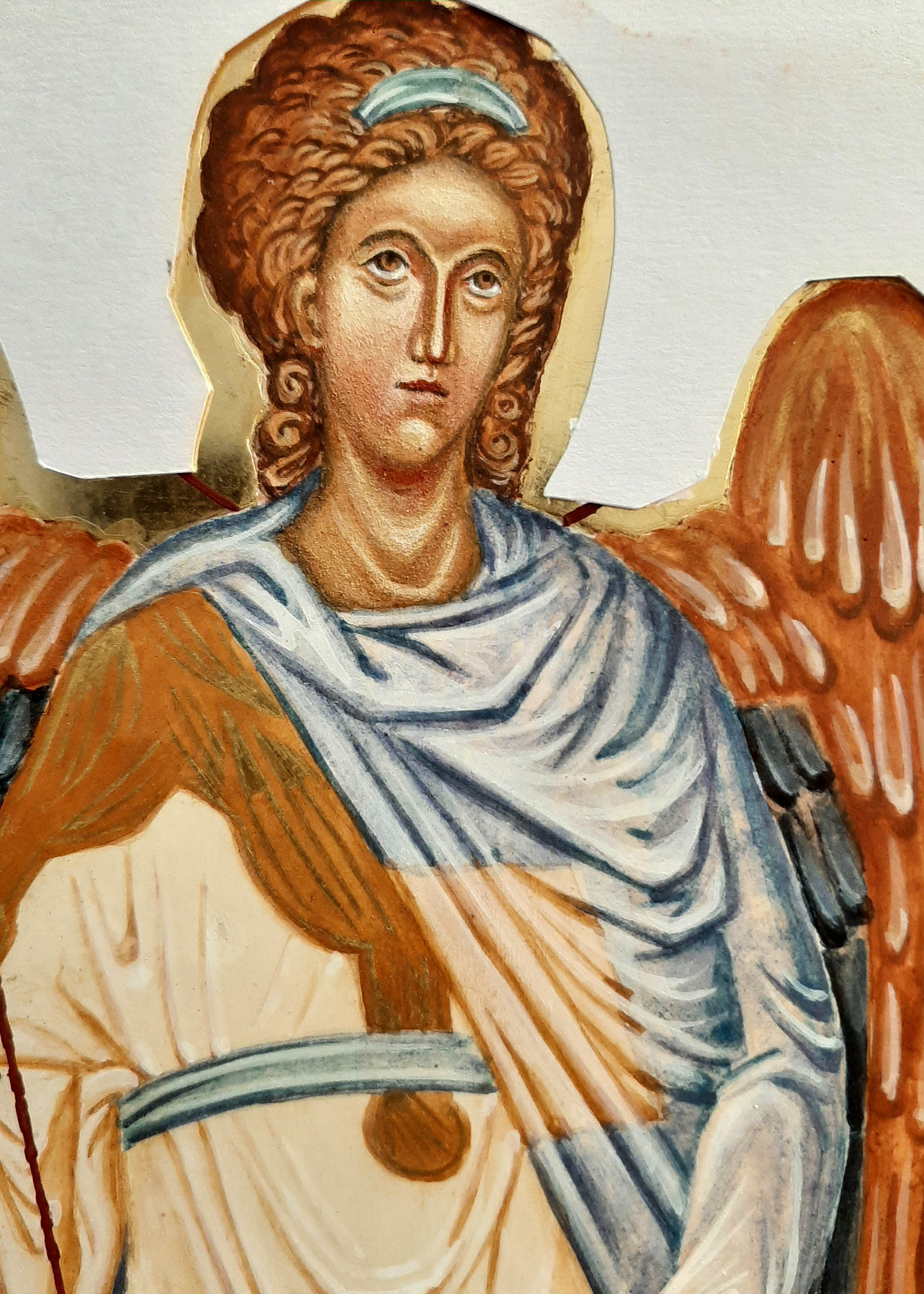
To make a start adjusting the features, I covered the face with four or five glazes of French Ochre Havanna. This helps to return to the point where you make the first glazes over the underpainting.
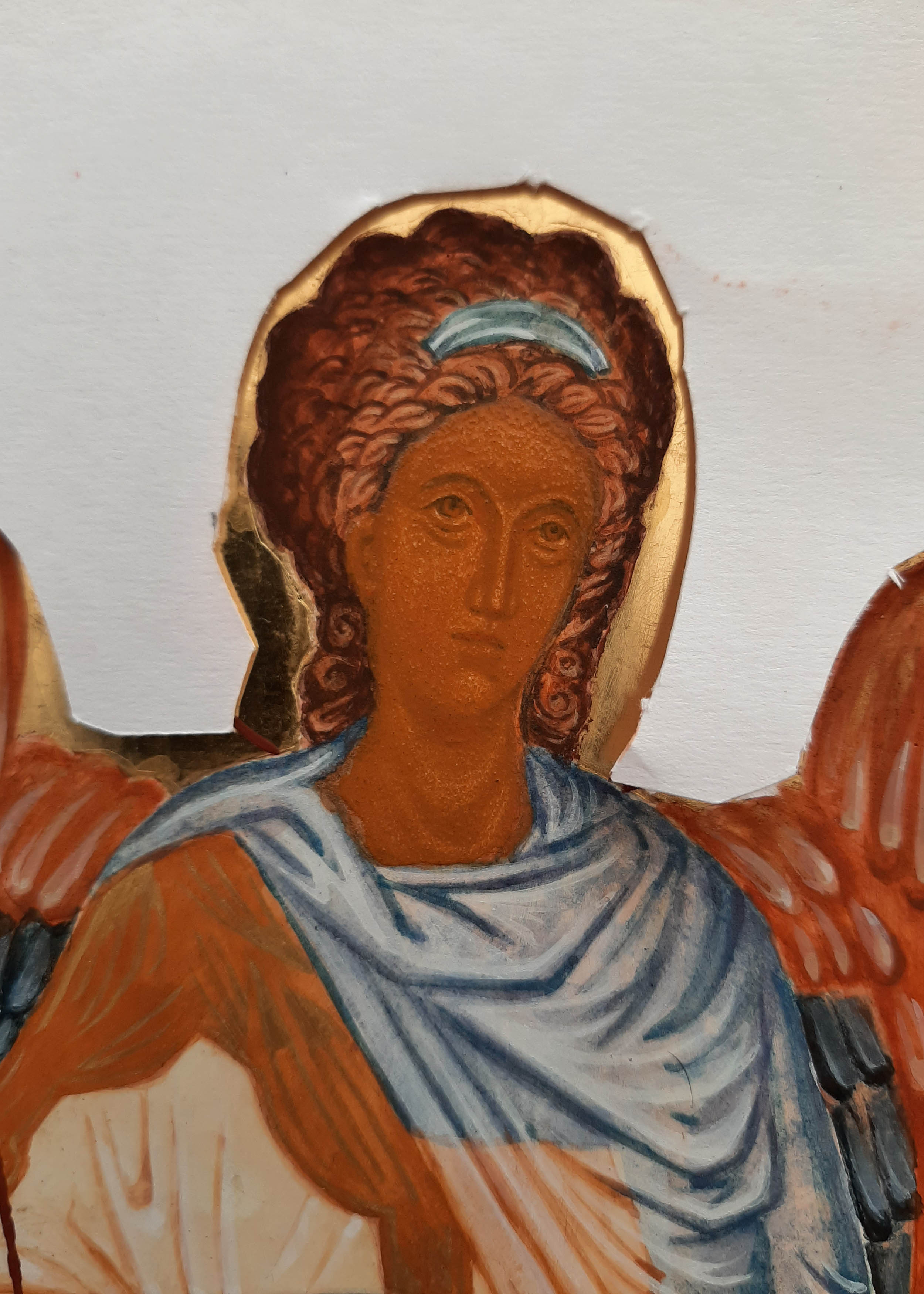
Then, taking Ochre Avana and a very small amount of raw umber, deepen the hair, brow and jaw line.
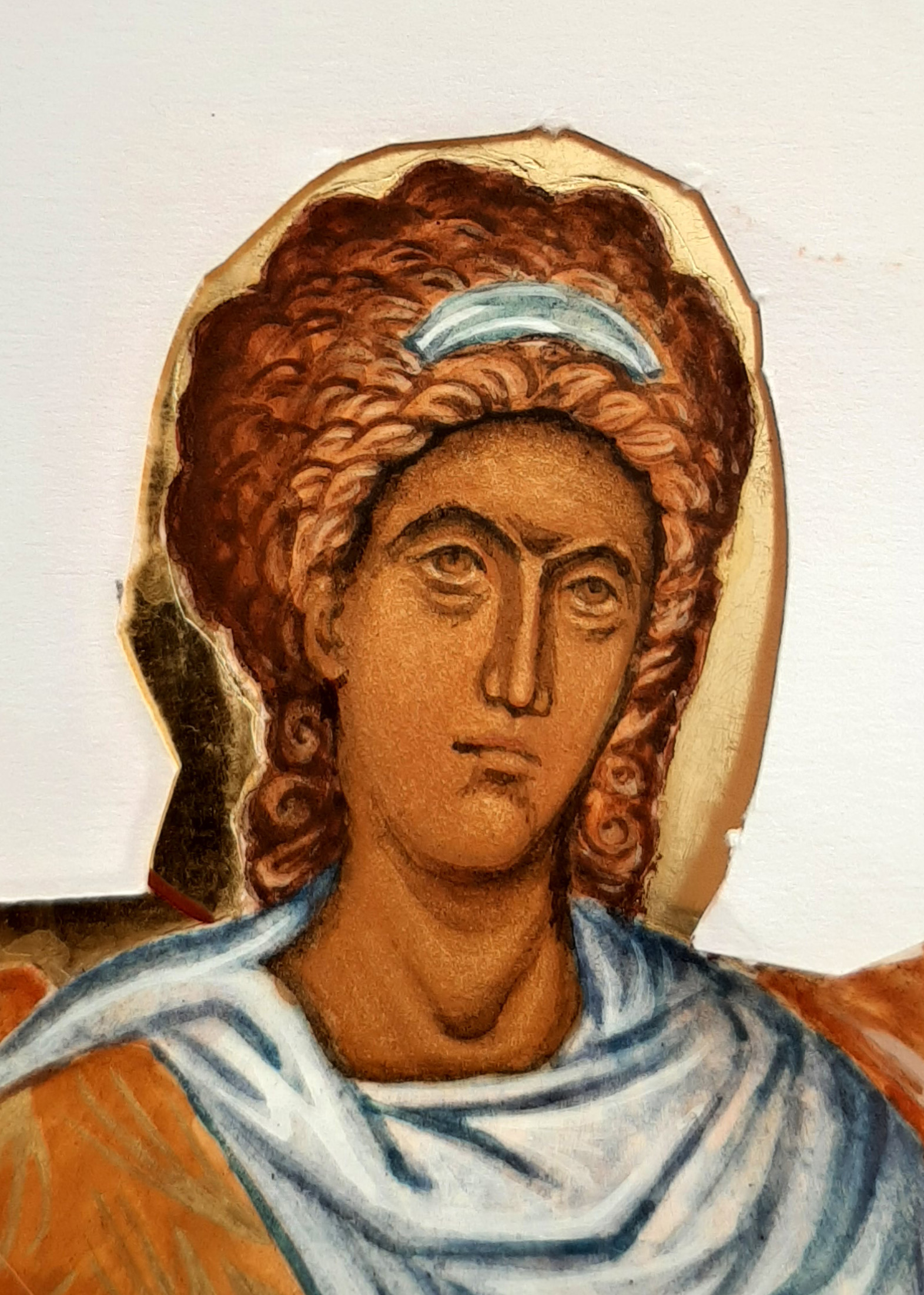
I also decided to deepen the colour of the wings with a few more glazes of lapis lazuli to send them back so to speak.
In the photos below, I have added more layers of light glazes for the facial highlights. Somewhere along the line, the gaze of the angel moved to a different direction. The tiniest detail makes all the difference.


To summarise – the hair is deepened with red ochre and a touch of black. The right eye brow has been lowered and softened. The brow has been adjusted to remove the central highlight and instead bring the highlight towards the viewer. The highlights below the eyes adjusted. The nose is still a work in progress but the shape fits better with the face. The mouth has a warmth and the chin is less pointed.
I’m so glad I worked on these faces! It’s easy to leave things as they are when you have already put so much time into the icon but egg tempera is a wonderfully versatile medium and revives easily. Painting over faces with glazes is a straightforward way to make the adjustments that you know are needed. Another thing that helps is to take a photo of the face, turn it to black and white and print it off. That way, you can see clearly what isn’t working and what needs to be done.
Here’s the finished icon complete with the ribbons which symbolise Divine Listening.
The finished icon can be seen here .
As ever, thanks for reading!
Ronnie 🙂
