Advent Two: The Shepherds Their Wonder
The profoundly beautiful Armenian Nativity created by T’oros Roslin in the 13th Century remains my favourite Nativity icon. I painted my own version on vellum back in January 2016 in preparation for the Festal Nativity icon (on a large gessoed panel) which was part of the final year of the Diploma.
This is a silly busy time of year for many of us but I’m posting this here now for you to find sometime in future when you do find a quiet moment.
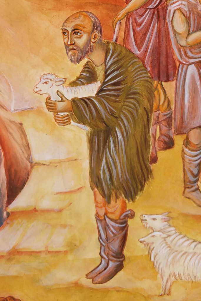

The primary shepherd on the large Nativity icon (above left) was a direct reference to the figure in the Armenian Nativity scene. I liked his expression and woolly tunic! (If you want to refer to the finished diploma icon you can see it in more detail here).
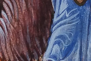
Caput Mortuum is a mysterious rich deep maroon colour and looks to me the colour used in the Armenian Nativity original. The name translation from Latin is ‘dead head’. In the Merriam Webster Definitions dictionary we find one definition “alchemy : the residuum after distillation or sublimation” also “a red iron-oxide pigment made by calcining iron sulfate“. To me it’s the colour of an aubergine and when placed next to lapis lazuli, the colours sing.
Reflecting back to the time that I painted the Armenian Nativity, you’ll have no idea how over the moon I was to participate in the exhibition curated by Patricia Lovett and held in the window of Cornelissen’s . It was all part of the Heritage Craft Week 2016 which I wrote about here. If you’ve never heard of Cornelissen’s then treat yourself to a minute inside their London shop here.


Patricia – if you are reading this, that exhibition and subsequent synchronicities led to the class of 2013-16 final-year diploma icons being displayed in the same window (below) and repeated three years later with the next icon student intake – THANK YOU!

Back to work…
These shepherds have been shuffled around to get a balanced composition. Photocopying and cutting out the figures allows you to move them and see how they work in relationship to one another. It’s interesting how small shifts can make a difference in how your eye is led around the figures and around the overall composition.
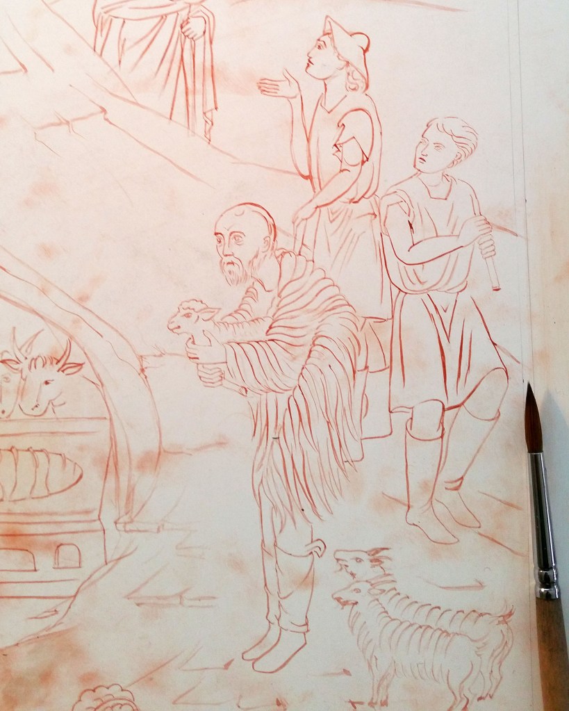
Lines are transcribed onto the panel by rubbing red ochre onto the back of your traced drawing. The lines are fixed with a dilute mix of egg tempera in red ochre. Applying a dilute mix means it’s easy to blend into the layers that follow.
Yellow Ochre Maimeri and Ivory Black pigments mixed together give a lovely green for underpainting flesh tones – an alternative to Terre Verte which can be a bit sticky.
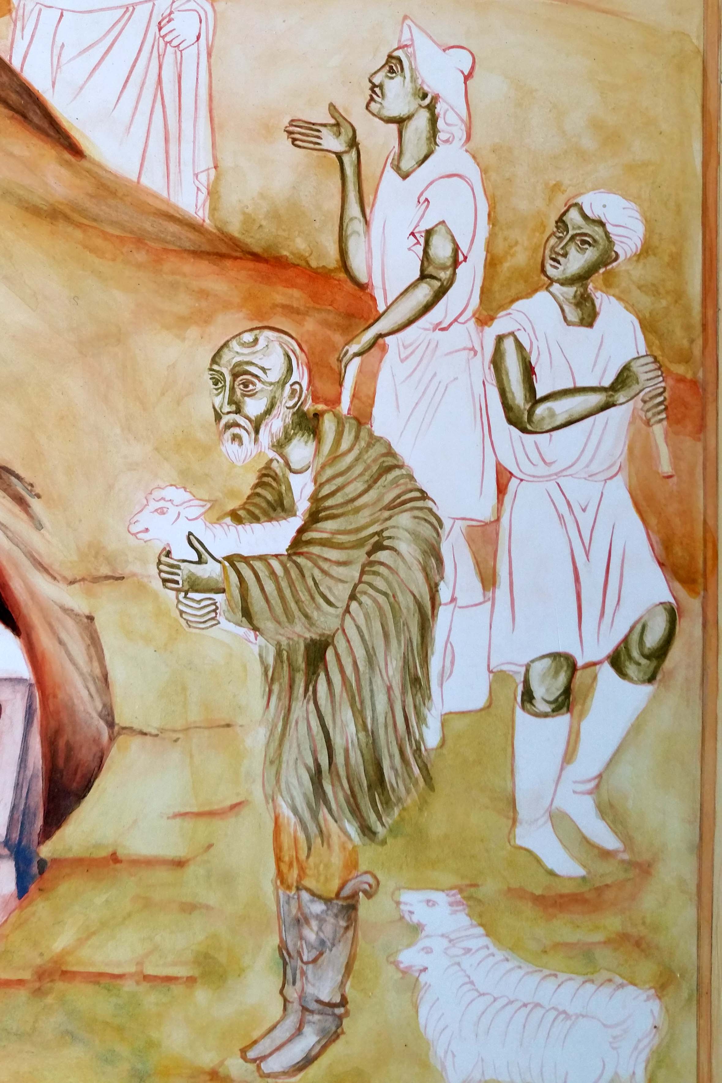
Since I had this earthy mix, I used it to under-paint the garments of the primary shepherd. I’ve used thin washes of earth ochre pigments to build up the landscape.
Colours vary here as I’ve taken photos at different times of the day.


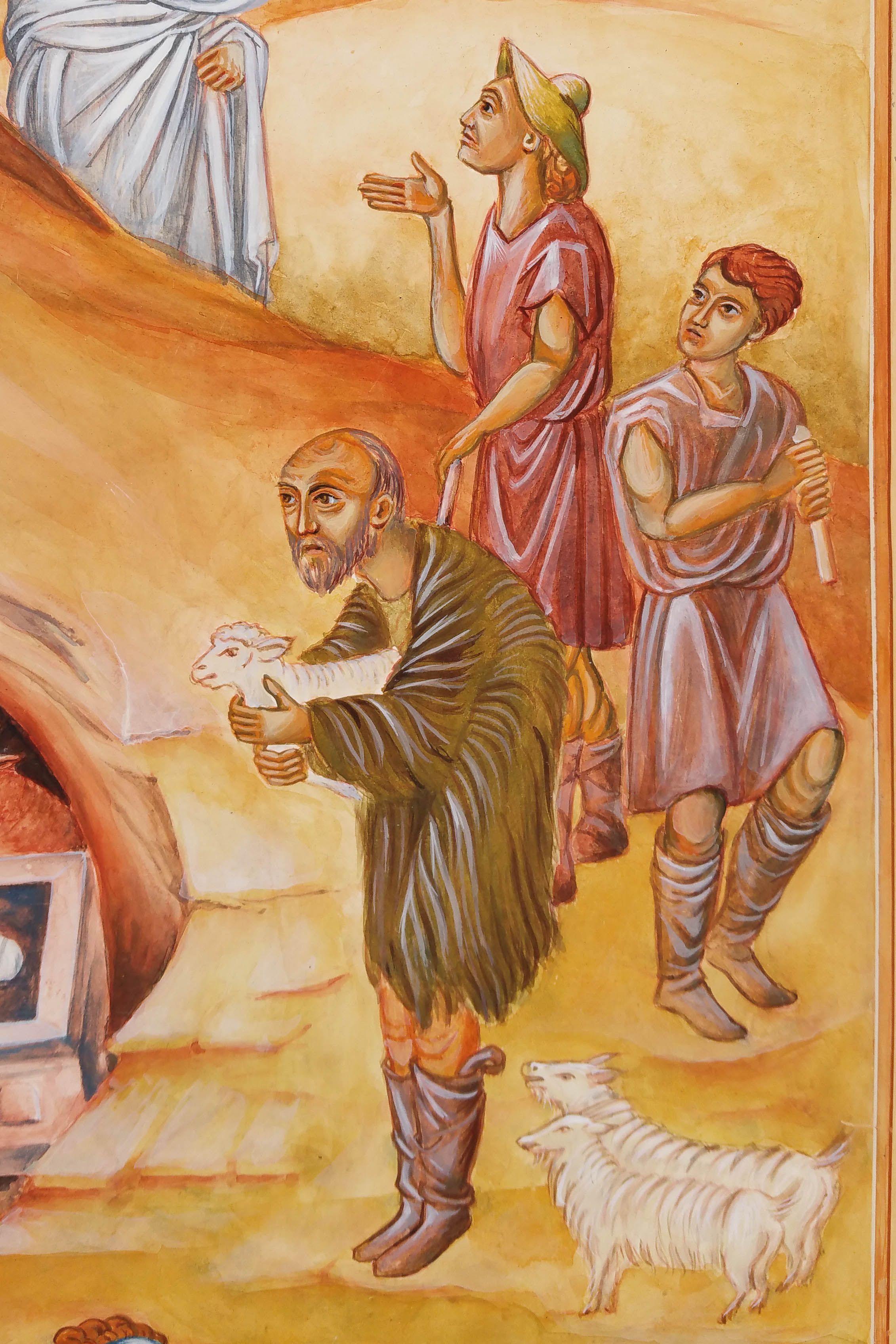
Let’s close this post on these shepherds – almost finished. Just a few more highlights to add on their faces and hair.
Thanks for reading, whenever that might be 🙂
Ronnie
