Icon Diploma Student

Learning to see with the eye of the heart

Posts tagged ‘red ochre pigment’

Wetfold drapery Romanesque style

Monochrome study of St John The Evangelist

Monochrome study of St John the Evangelist, from the Lambeth Bible

At the start of our course, Aidan asked us to practice painting figures in monochrome. My first few studies were pretty awful but when I got accustomed to the egg tempera, I really enjoyed painting the lively fabric drapery known as the ‘wetfold’ style which was used in the manuscripts of the Romanesque period.

This is an unmistakable style; the garments articulate the figures in sweeping curves. The style is seen in several great manuscripts of the period including the Lambeth Bible.

Illuminated manuscript, English, c.1146. From the Lambeth Bible, Ms.3, fol.258 v. London, Lambeth Palace Library.

Illuminated manuscript, English, c.1146. From the Lambeth Bible, Ms.3, fol.258 v. London, Lambeth Palace Library.

The above illustration also gives us a glimpse of the interwoven lettering of the period.

The next stage of my study of lettering for icons comes from possibly the most beautiful manuscript of the Romanesque period, the great Bury Bible. It’s largely the work  of Master Hugo (c.1130-1160), the earliest professional artist documented in England. He was a multi-talented craftsman who produced various items for Bury: a great bell in the crossing tower, a set of decorated metal church doors, and a beautiful cross for the abbey choir. Master Hugo’s places of origin and training remain elusive but there is some speculation that he travelled within Byzantium given his dramatic style of work.

It’s a rich source of imagery for iconographers looking for inspiration from an historic western perspective.

Red ochre painting of Aaron on watercolour paper

Monochrome study in ‘English red ochre light‘ of Aaron from the Bury Bible

Further examples of the wetfold drapery technique can be found in other manuscripts of the period, the example below also shows interesting examples of buildings and trees.

I’ve been busy working on my final icon for the diploma course – a large festal icon of the Nativity. It seems a bit odd to write about this in the middle of Lent so I will write about it a bit later! In the meantime, I will sign off with a taster of my lettering from the Bury Bible below.

Thanks for reading,

Ronnie

PS if anyone has an Instagram account, I have been posting photos of my work in progress under the name of icondiplomastudent, you can see it here.

a

 ‘A’ based on lettering found in the  Bury Bible


Three days on a Triptych

icon class

Icon Diploma Students taken at Aidan Hart’s May session 2015

Hello icon friends and class mates,

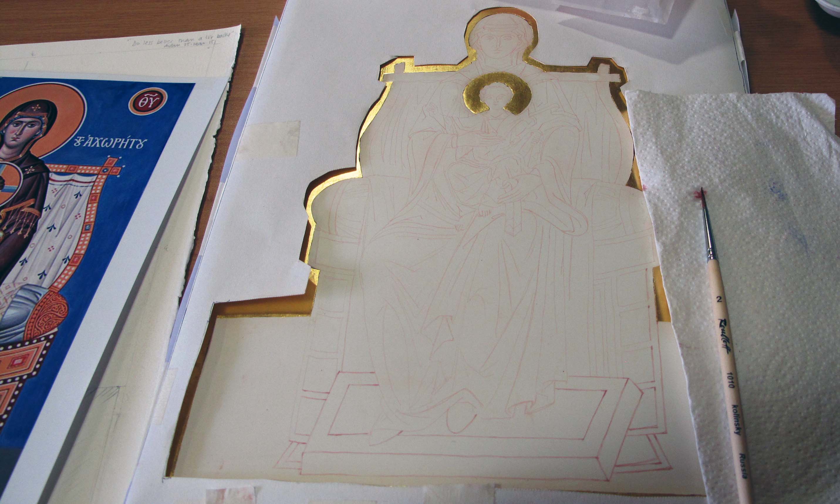
I’m just back from a three day intensive painting our standing/seated figures. I brought my gilded triptych centre panel already prepared with the image transferred so I could start to paint in class.

icon outline drawing

Transferring outline on to gessoed panel

Just to rewind a little, I photocopied my drawing on to tracing paper to locate the outline prior to water gilding. After gilding, I rubbed red ochre pigment into the back of the tracing paper/drawing itself (rather than using an intermediary sheet), and using a fine propelling pencil with a fairly hard lead, transferred the image on to the board.

tracing paper drawing

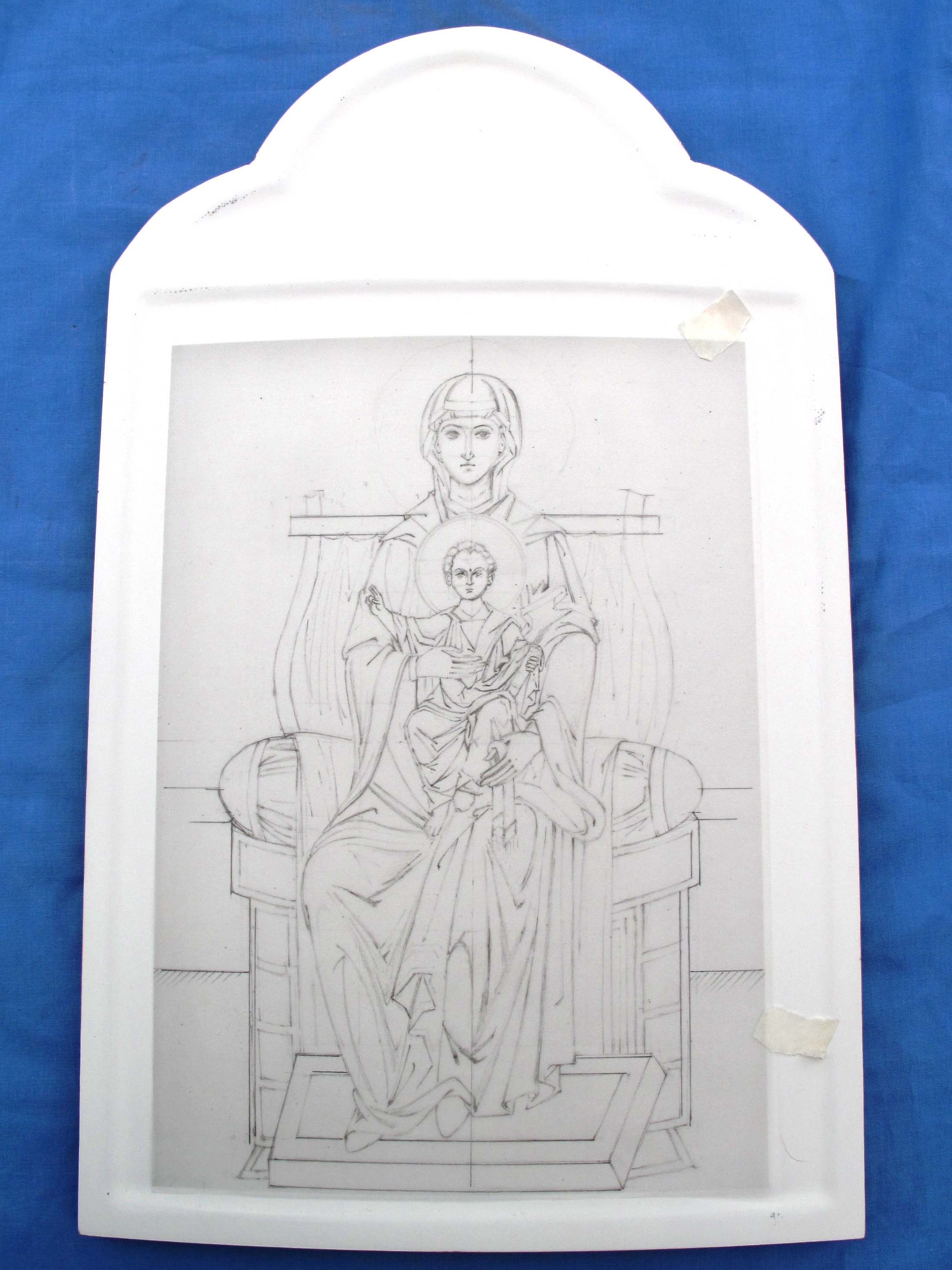
Drawing of icon on tracing paper

Once all the main lines were transferred on to the board, a weak mix of pigment fixed the lines in place. I then began the underpainting and modelling of the garments.

underpainting icon

First stage of underpainting

Aidan suggested that I used Red Ochre for the Blessed Virgin’s upper garment as it has some blue in it. I also used Lapiz Lazuli Dark, a beautiful natural blue and Ivory Black to deepen both colours; all pigments are from Cornelissen’s.

ivory black and red ochre

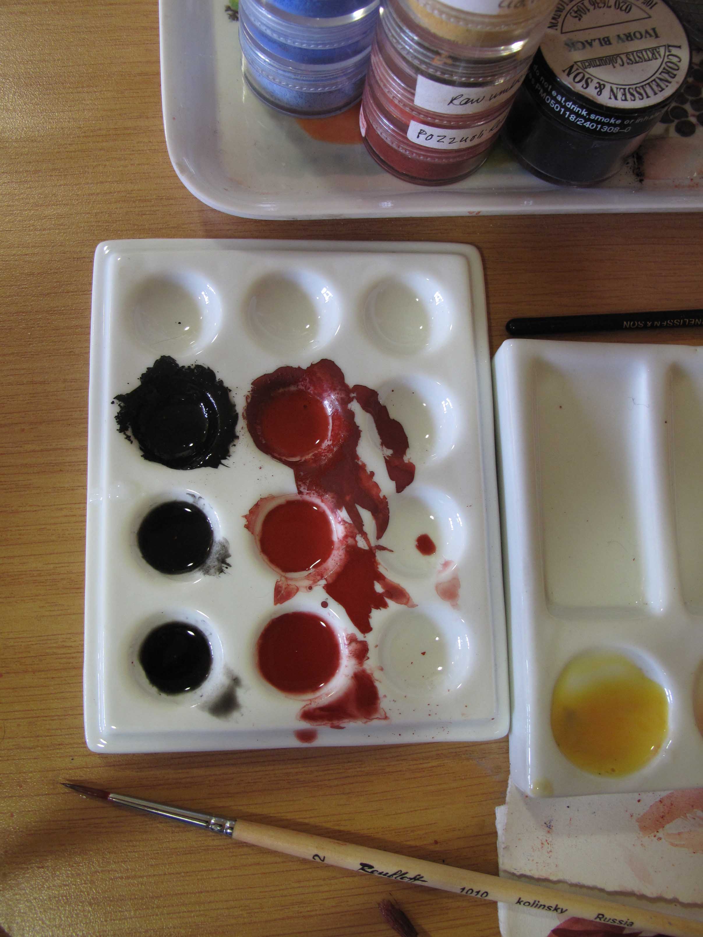
Ivory black and Red Ochre pigments

Both pigments are very strong so I mixed them up separately first, then blended. For the underpainting I used a lovely size 2 Roubloff 1010 kolinsky sable brush which I had recently ordered from Vesta-k. It has a really sharp point and holds the pigment well.

underpainting garments

Building up the underpainting of the garments

I mixed black to the lapiz lazuli and red ochre in varying degrees to give depth to the underpainting. The deeper shadows are painted using a lot of black in the mix.

lapiz lazuli

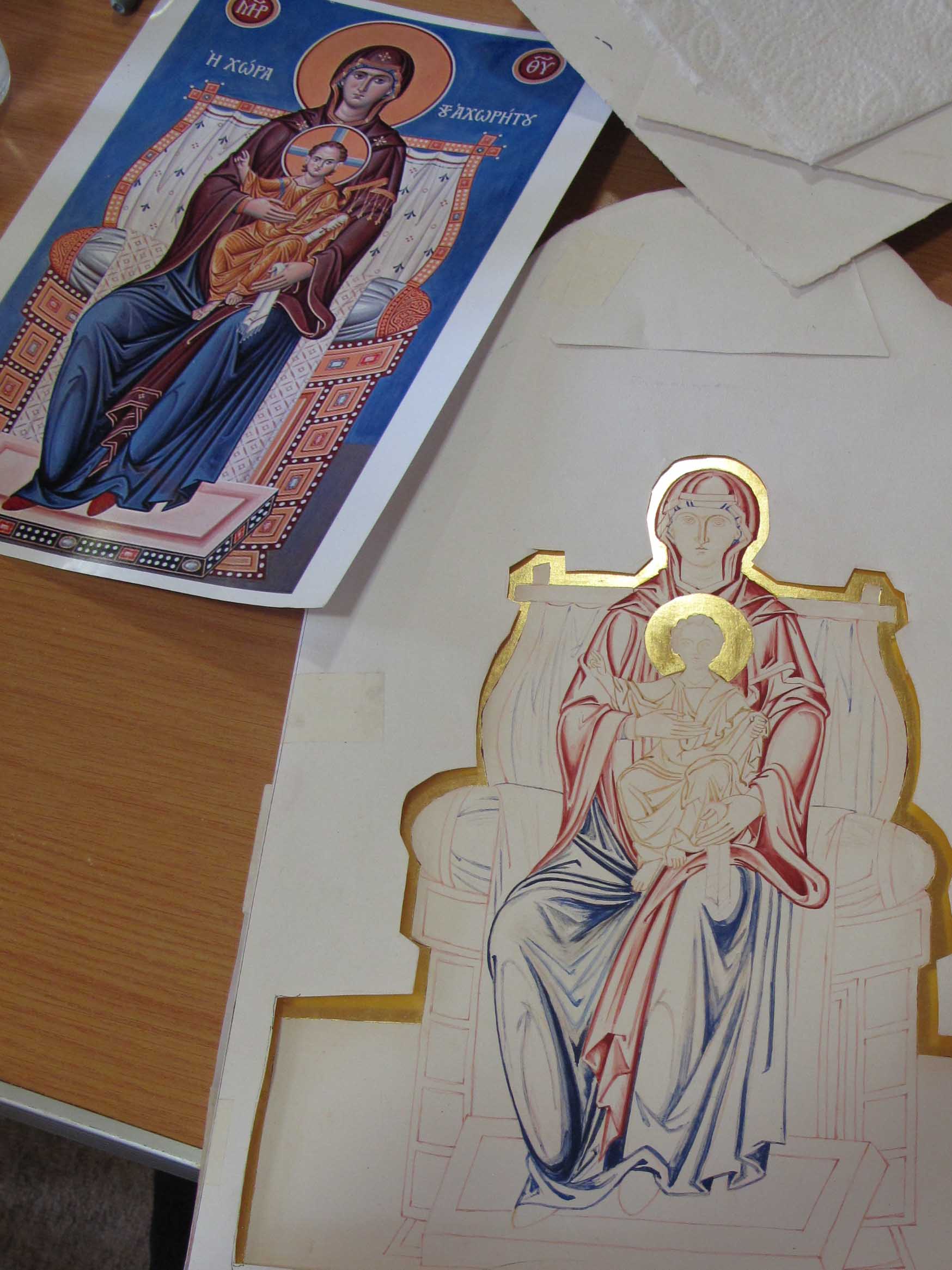
First layer of membrane applied using a wash of pure Lapiz lazuli over the underpainting.

membranes on icon

Membranes on the garments

Pure red ochre and lapiz membranes washed over the underpainting with a very thin layer of lapiz washed over the red afterwards to unite the garments.

After several layers of membrane, I applied a nourishing layer of 20% egg 80% water and let it dry before going over the shadows and adding highlights. Aidan suggested fine layers of pure white dry-brushed over the membrane to give translucent layers of highlights.

The underpainting of the Christ Child is in English Yellow Ochre with a little Red Ochre added to model the form. The colours are painted quite densely as the garments will be gilded using shell gold assist. I understand from my class mate Lee that for the crispest, most gleaming gold lines, hand-made shell gold is the way to go – thanks Lee! Watch this space for adventures in making shell gold – I rang Wrights of Lymm for a couple of books of gold today!

three days work

Three days work

Thanks for reading.

Ronnie

Sanding for St Hilda of Whitby

Icon board

Highlight surface scratches on a gessoed icon board by rubbing in red ochre pigment

St Hilda of Whitby

St Hilda (c614-680) showing adjustments I need to make to head and shoulders

My homework for the next diploma session, is an icon of St Hilda, referring to an image painted by Aidan Hart. The icon can be seen further below and also on his website Aidan Hart Icons. During my childhood, Whitby was a favourite seaside destination from our home in York. The sight of the ruined abbey looming over the cliffs was a vivid landmark against what was often a cloudswept sky. This dramatic photograph courtesy of Mark Davis Photography shows how the abbey forms such a striking silhouette against the east coast sky.

Whitby abbey

Photo of Whitby Abbey by  Mark Davis Photography  http://www.mark-davis-photography.com/yorkshire/whitby-and-the-east-coast/

To think that St Hilda founded an an abbey and community in this wild landscape is remarkable and gives an insight into the strength of her character.

Icon by Aidan Hart of St Hilda of Whitby

St Hilda of Whitby by Aidan Hart

For this icon, I am using a flat plywood board.  I will oil gild the halo so the sanding only needs to be taken as far as 600 grit sandpaper. If you over-sand the gesso, the paint won’t stick.  I’m using an icon board which I gessoed last summer which I also sanded up to 120 grit paper. With hindsisght, I should have sanded it right up to 600 grit, as it is much easier to work outside in the warm than indoors in a UK January! Sanding gessoed boards is a dusty process so be prepared. Put a few sheets of newspaper over your worksurface and have your vacuum cleaner and a dust mask to hand. You will also need a medium sized dry paintbrush to brush the gesso dust out of the sandpaper, a cork sanding block and all the different grades of sandpaper to hand. Looking back on Dylan Hartley‘s notes which he gave us at our gessoing session last year (click here for a pdf copy SANDING ICON BOARDS by Dylan Hartley), Dylan reminds us that you should choose a place to sand where there is raking light ideally with one main light source. This helps to show up anomalies and scratches. The first sanding is done with 80 grit paper, then work up through 120, 180, 220, 320, 400 and 600 grades. It is important to use these in sequence and ensure that any grooves left by the gesso brushing are smoothed away.

Sandpaper

Splitting sandpaper sheets and filing them by grade

In the UK, sandpaper is sold in sheets about A4 size. I hadn’t realised until Aidan showed us, that if you fold and tear the paper in half lengthwise, then tear these strips into three, you can get six pieces ready to wrap around your block. Given that you go through sandpaper very quickly, it is worth spending time folding, tearing and filing the different sized papers into envelopes which does helps the flow of work.

brusgh off clogged sandpaper

Keep brushing off clogged sandpaper

It is really important to brush the sandpaper often – as soon as you have sanded the board a few times, lift the block and brush. You can also vacuum up the clogged paper to save dust clouds forming. The whole process is a bit of a faff as my glasses steam up when I wear a dust mask and they get covered with dust! Rubbing in a pinch of red ochre with cotton wool is a really effective way of seeing where the scratches are hiding. Even with good raking light, it is easy to miss a scratch until you start painting – and they are difficult to disguise later.

red ochre pigment on gesso

Identifying scratches in gesso by using red ochre pigment

Looking closely at the photo above, you can also see the horizontal marks made from clogged up sandpaper.

finished icon board

Icon board finished to 600 grit paper ready for painting and oil gilding

That’s the board now ready for me to trace on the drawing. More on that next time. Thanks for reading!   Ronnie

PS To see a demonstration by Dylan Hartley gessoing icon boards – there is a clip on You Tube here