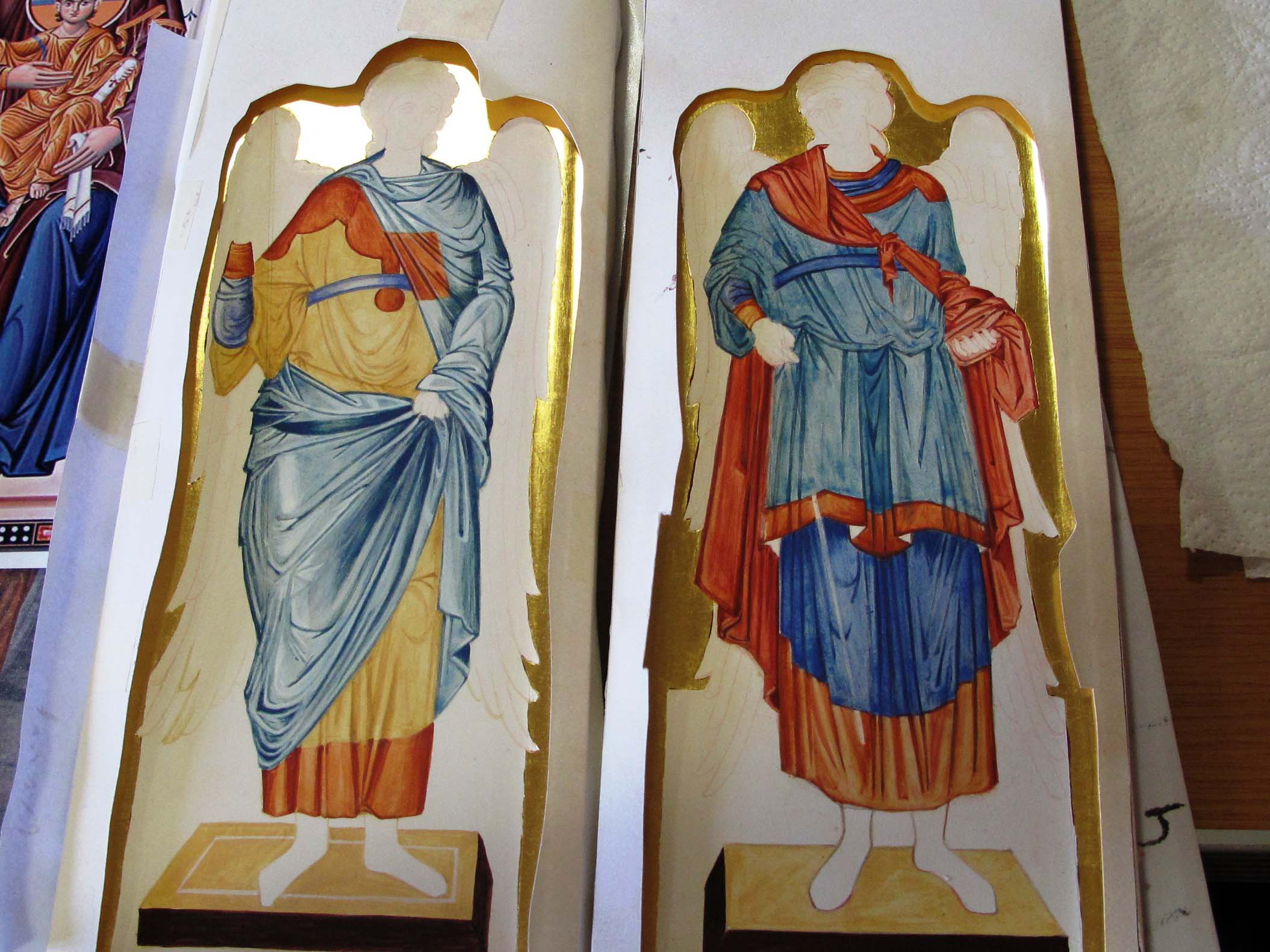
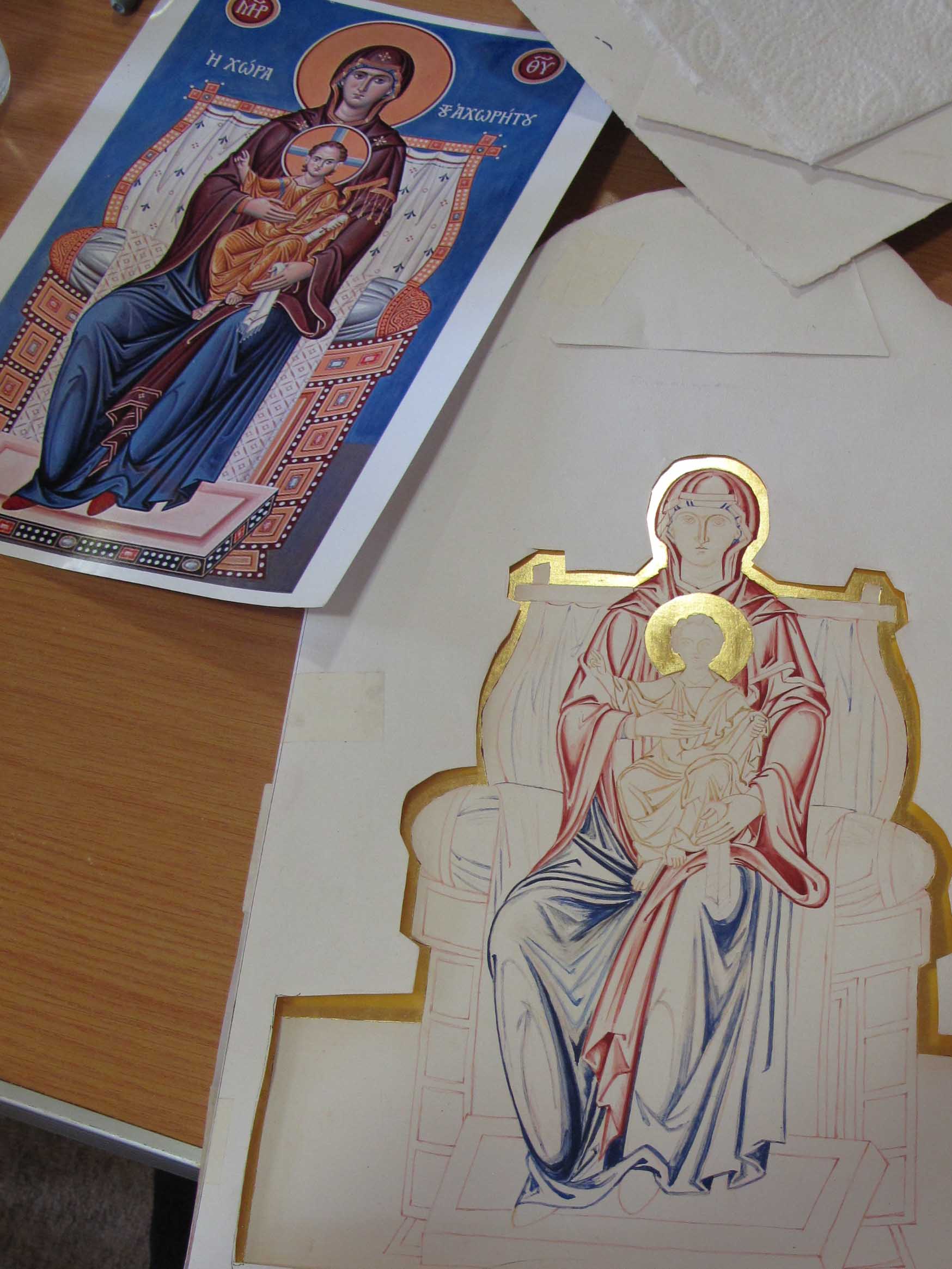
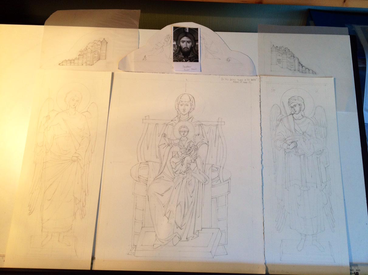
Icon Diploma Student

Learning to see with the eye of the heart

Posts by ronniecruwys

Angels of Chora

Archangel in Monochrome

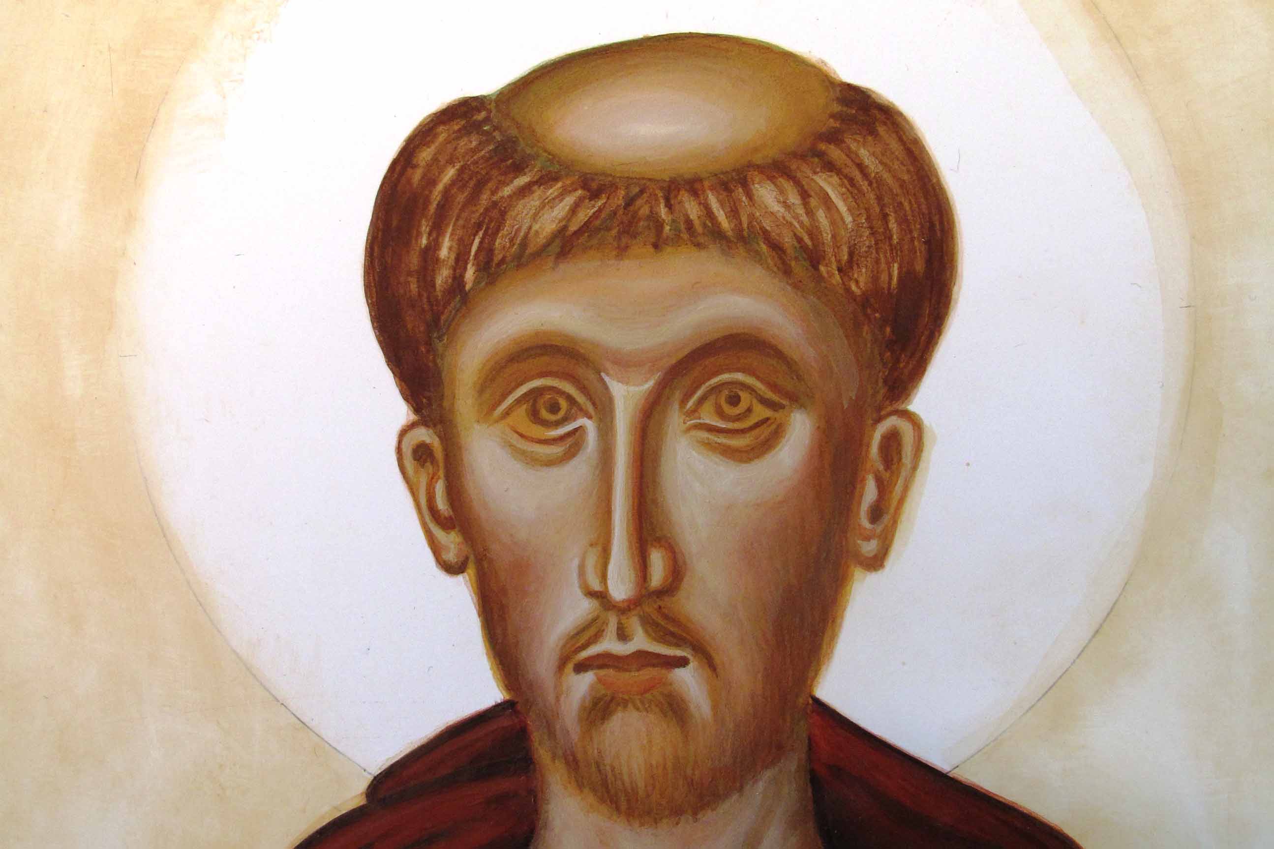
Face of Archangel Raphael in a monochrome study

Warmest greetings icon friends!

Our summer visitors have all gone home, my dissertation for the icon diploma has been handed in (more on that in another post) and our icon classes resumed last week with Aidan Hart in time to celebrate the feast of St Michael and All Angels.

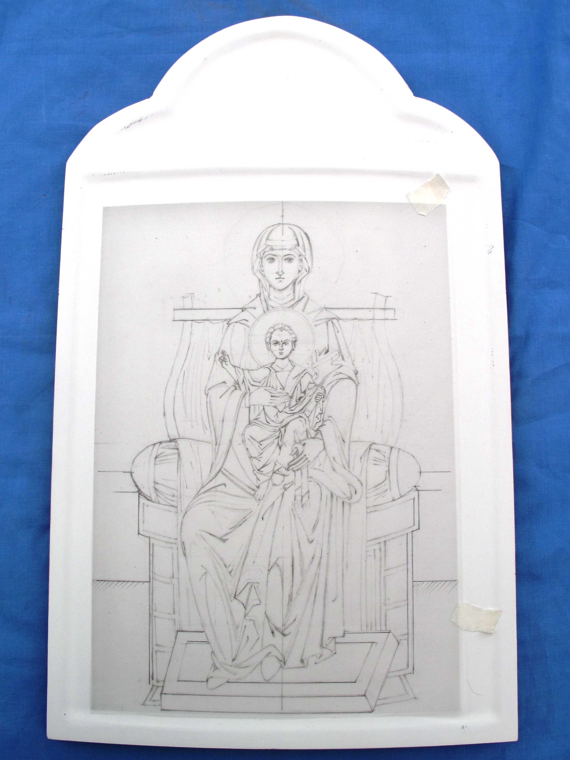
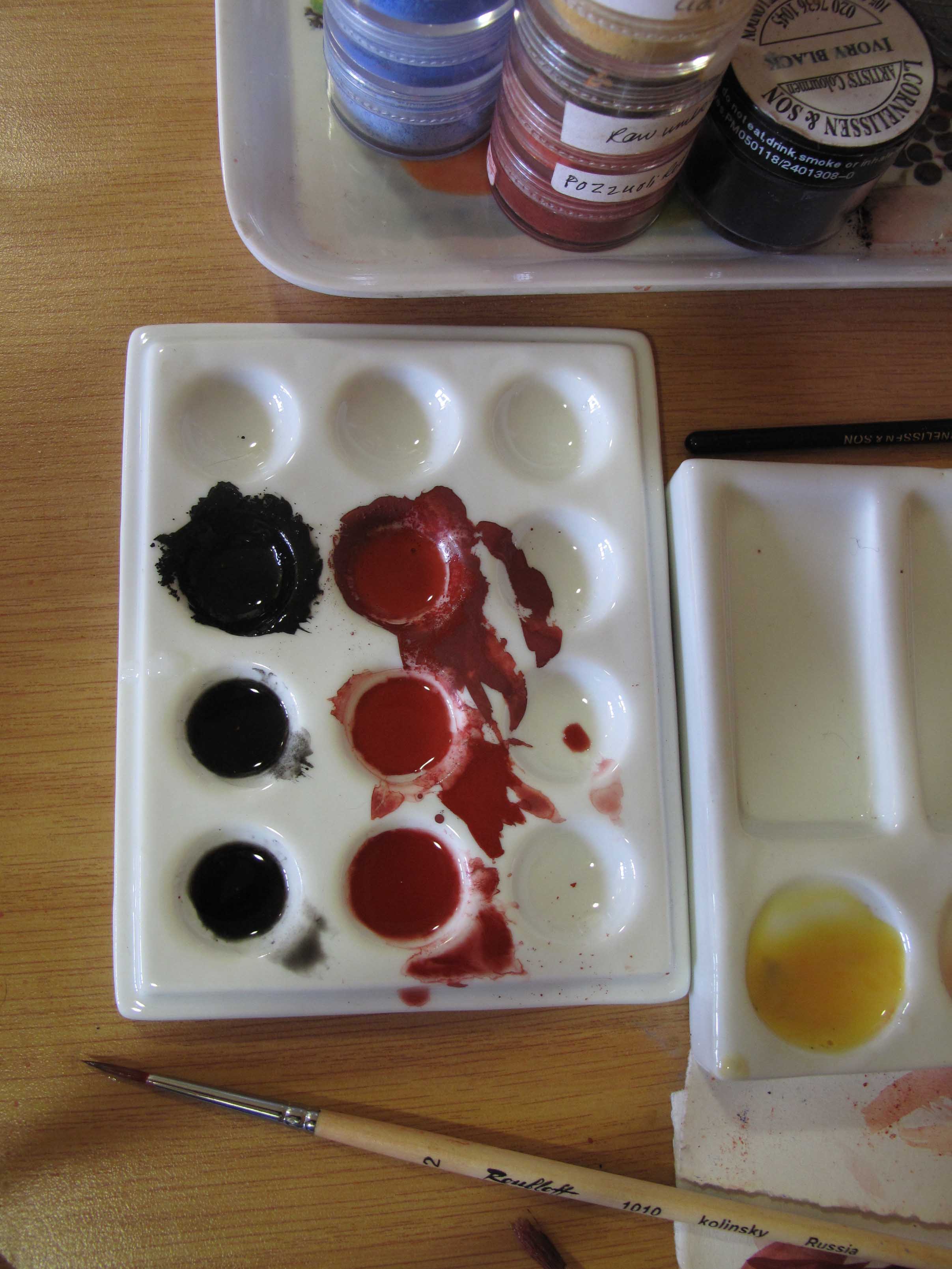
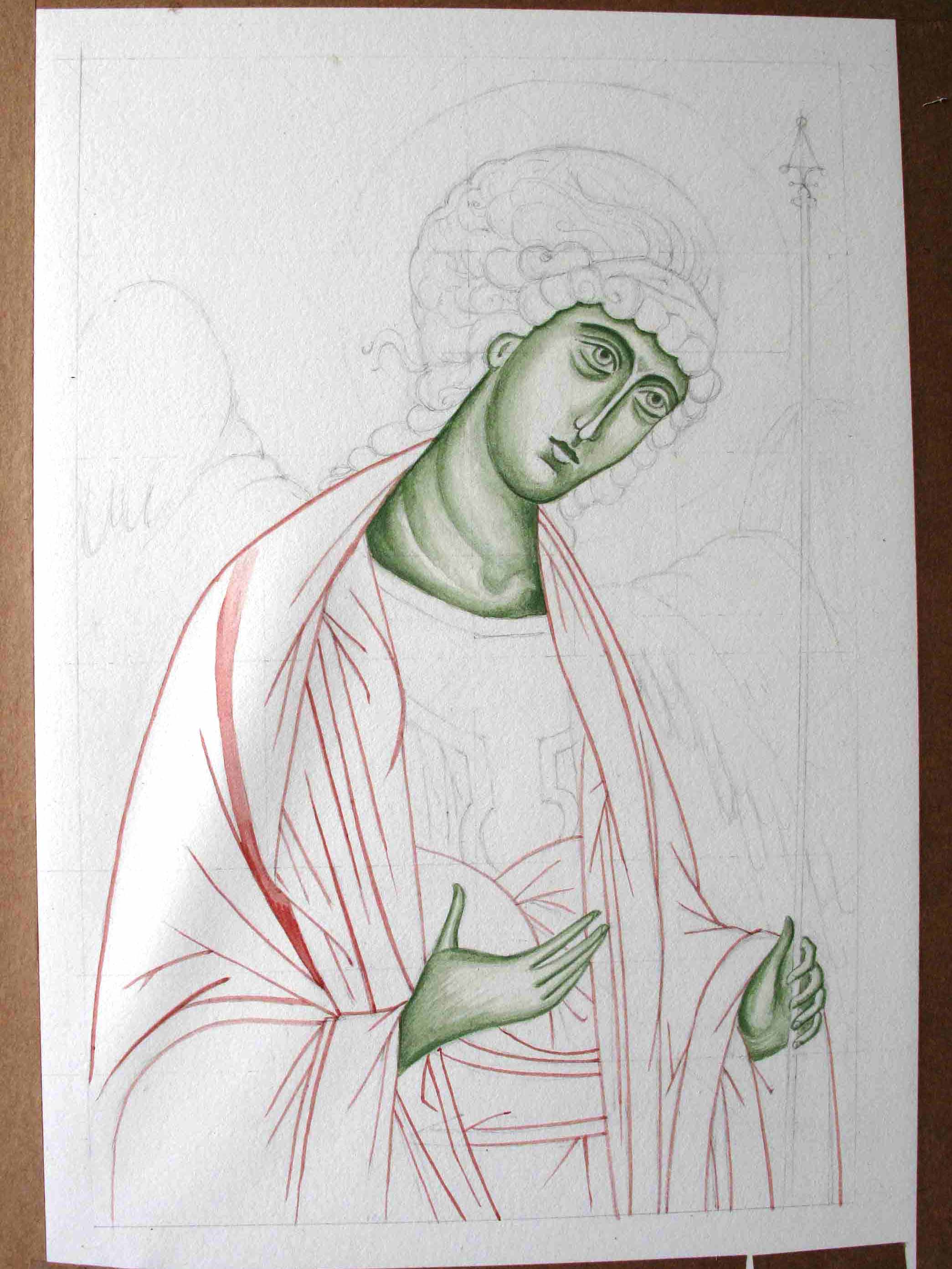
Having spent a couple of months away from the paintbrush, I felt I would benefit from painting a monochrome. Besides, I had already stretched some 300gsm watercolour paper (Fabriano Artistico hot pressed), and had the images already prepared in outline.

painting the lines of st Michael in monochrome

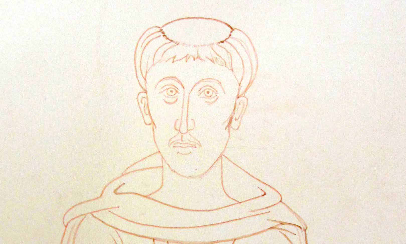
First lines applied on Archangel Michael in English Red Light pigment

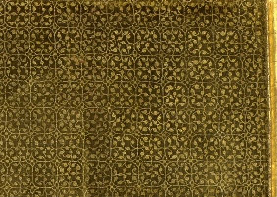
These are the same images of the Angels of Chora which I am using in my triptych (see previous post).  I haven’t painted the faces on any of the figures in the triptych yet, so these monochromes have been helpful in getting me back in the painting groove.

Modelling icon garments

Building up the layers of pigment to model the garments.

archangels Raphael and Michael

Background added of pure azurite pigment

I really enjoy painting monochromes. It’s relaxing not having to think about colour and to simply concentrate on the form, looking at the areas of light and shade. I also wanted these studies to stand on their own, so I gilded the haloes and garment highlights.

If ever you feel daunted by the prospect of painting an icon, this is a really good place to start.

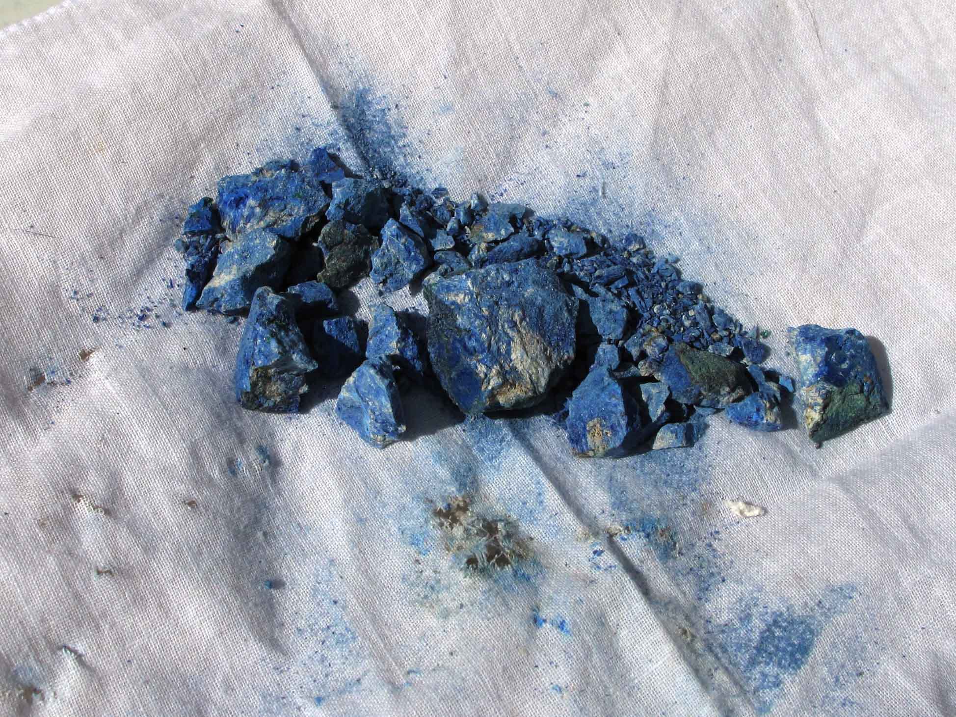
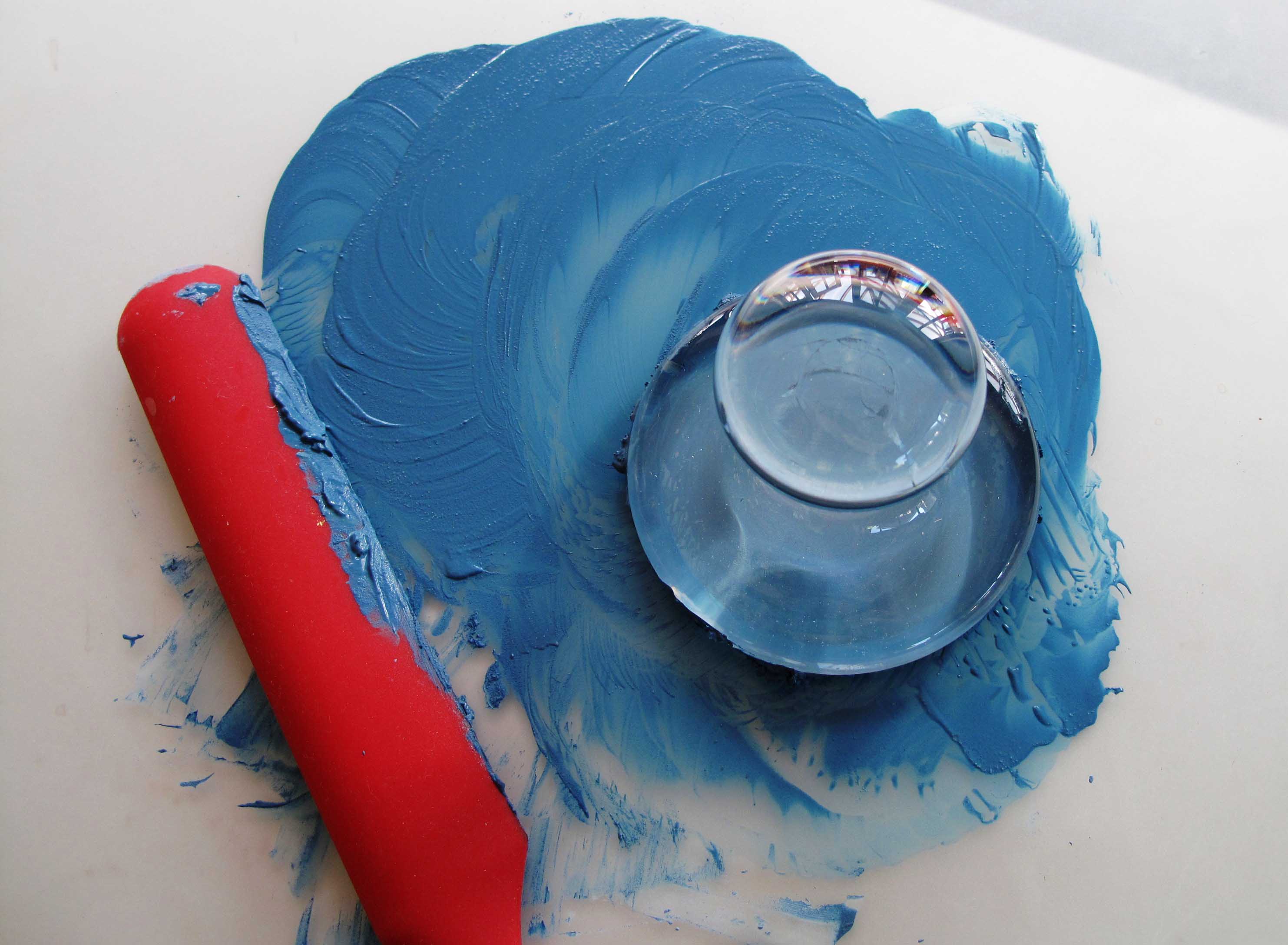
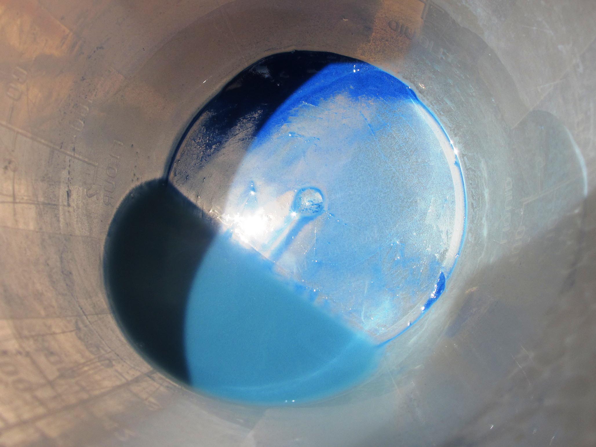
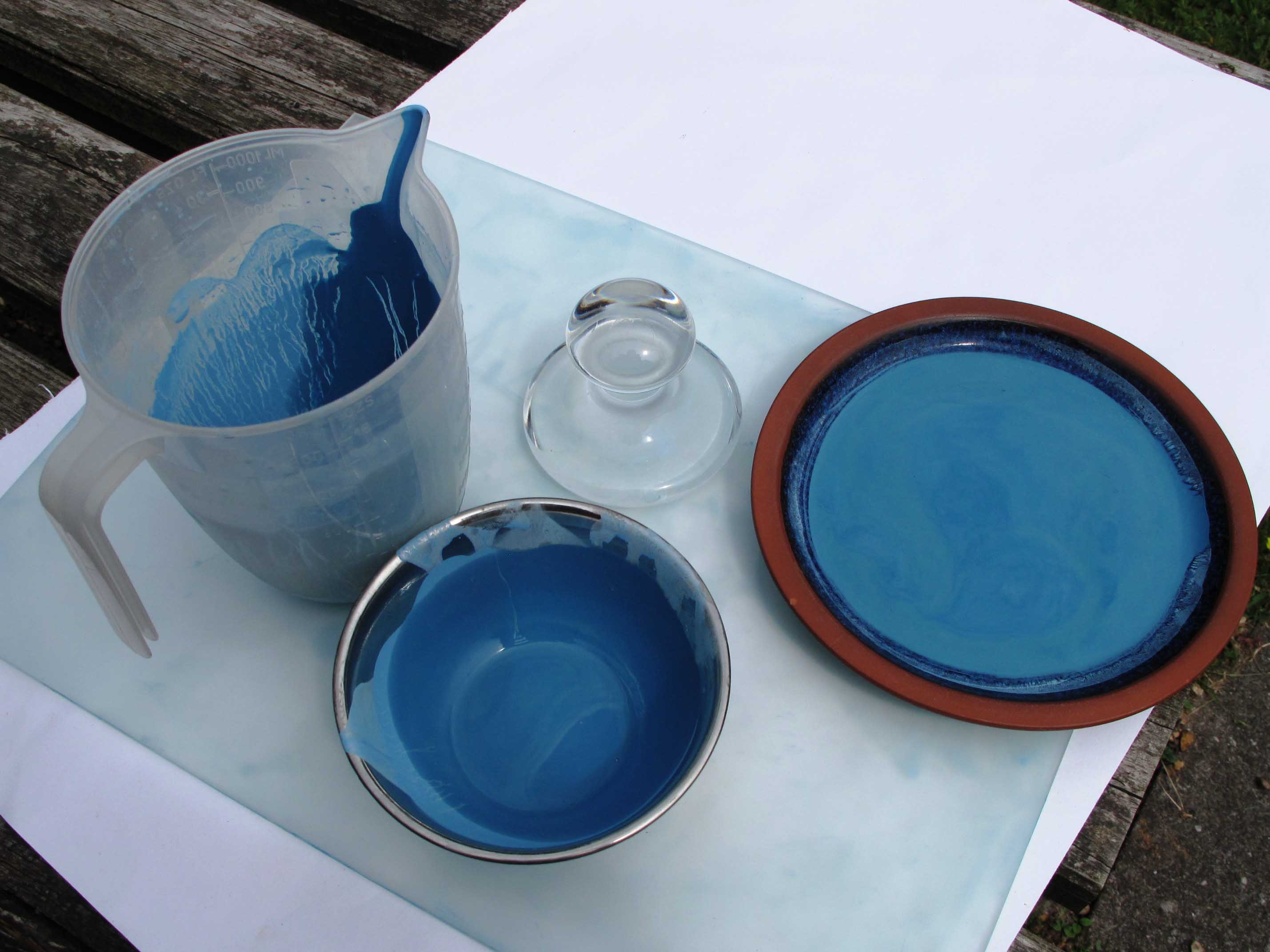
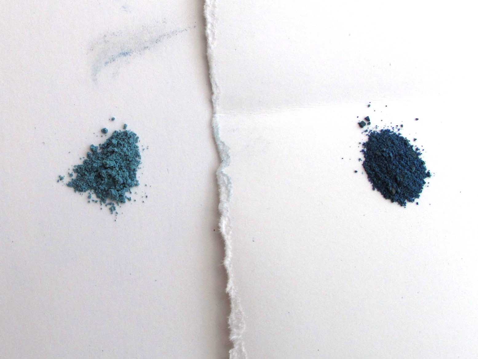
I love the deep blue-greys of the Chora angel backgrounds. They give a wonderful feeling of a heavenly sky. It is quite a challenge to match colours, for one thing, even if you know that the colour used was azurite, this can vary according to the quality of the stone and where it was mined. For these studies, I applied over a dozen washes of azurite – the pigment which I ground from a small rock bought from Burslem Lapidary shop, then a few washes of Indigo from Cornelissens.

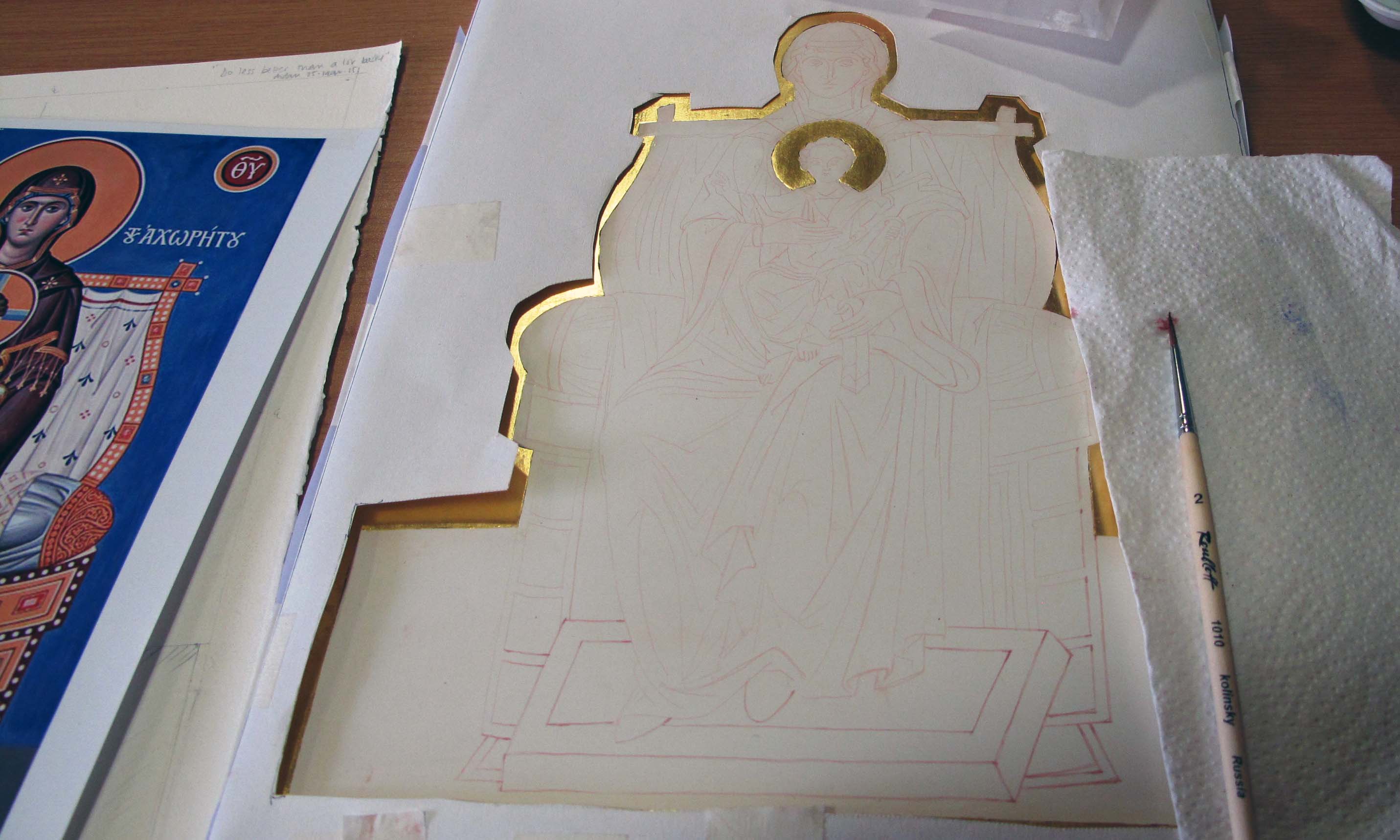
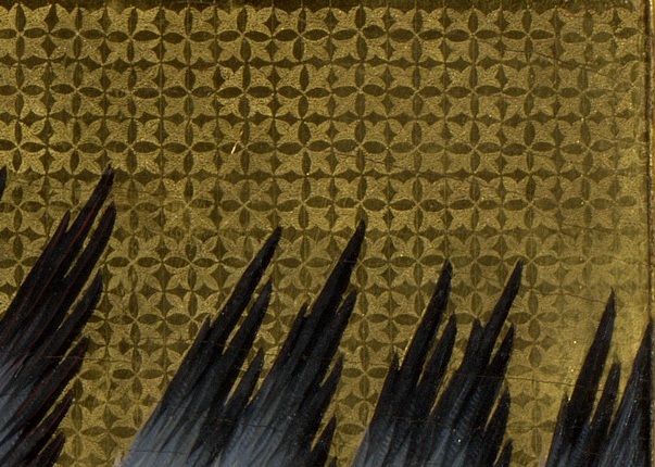
I used acrylic gold size, applied in two layers, then after ten minutes or so, I applied some transfer gold leaf (from Wrights of Lymm) once it had gone tacky. If you add a pinch of red pigment to the size, it helps to give some depth to the background as well as show you where you’ve painted.

gold transfer leaf

Adding gold leaf to Archangel Michael’s halo

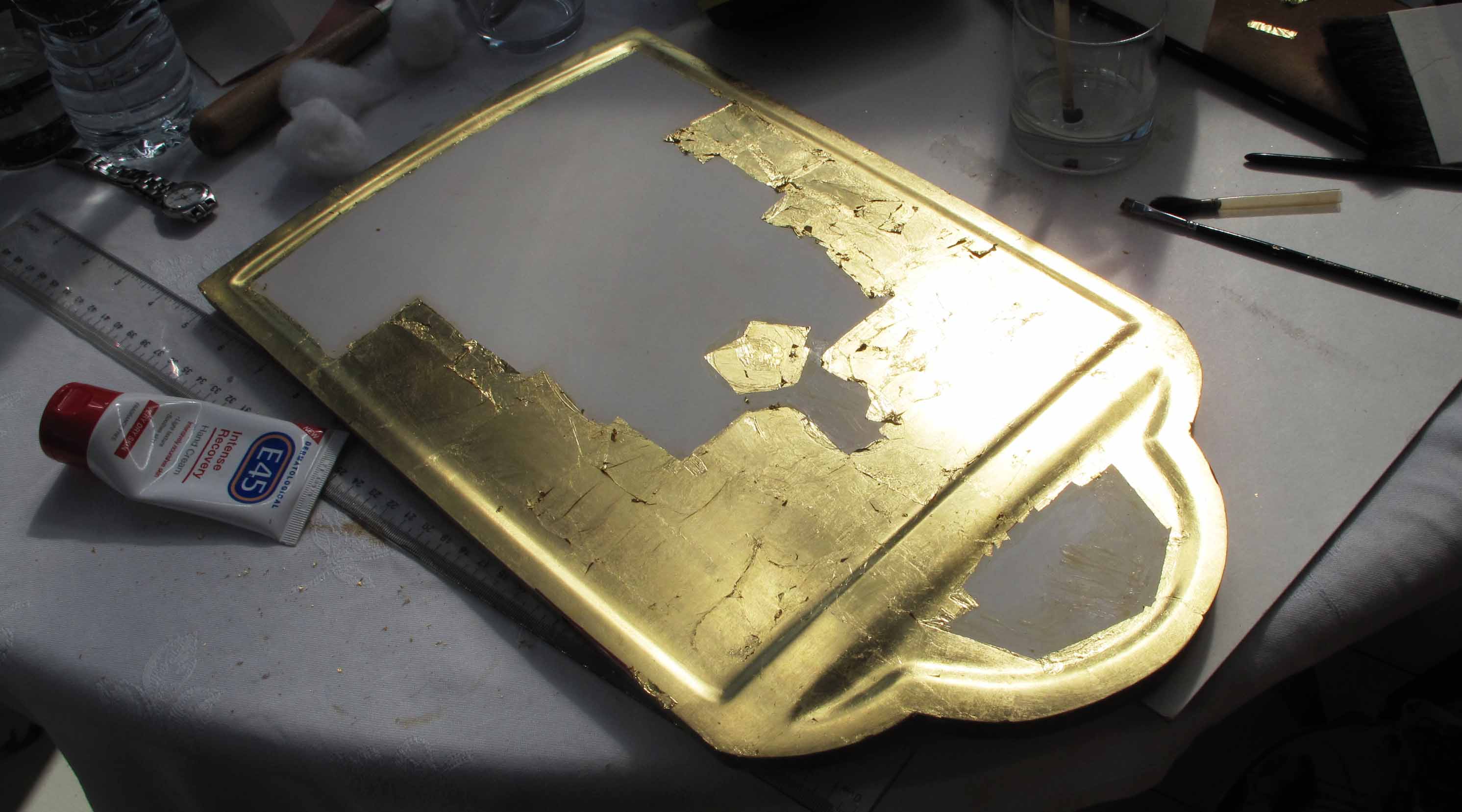
After applying the gold leaf to the halo, I then used a compass with a dip pen attachment to draw a circle to frame it. This is fiddly and I haven’t mastered it at all yet and ended up with a line thicker than I intended.

thick line around halo

Halo line a bit too thick.

I had used a sheet of cardboard over the image to protect the face/paper from getting a compass puncture mark right in the middle of Raphael’s brow. The thickness of the card had a knock-on effect of dislocating my circle by a few millimetres – I will try a sheet of acetate cut to size next time.

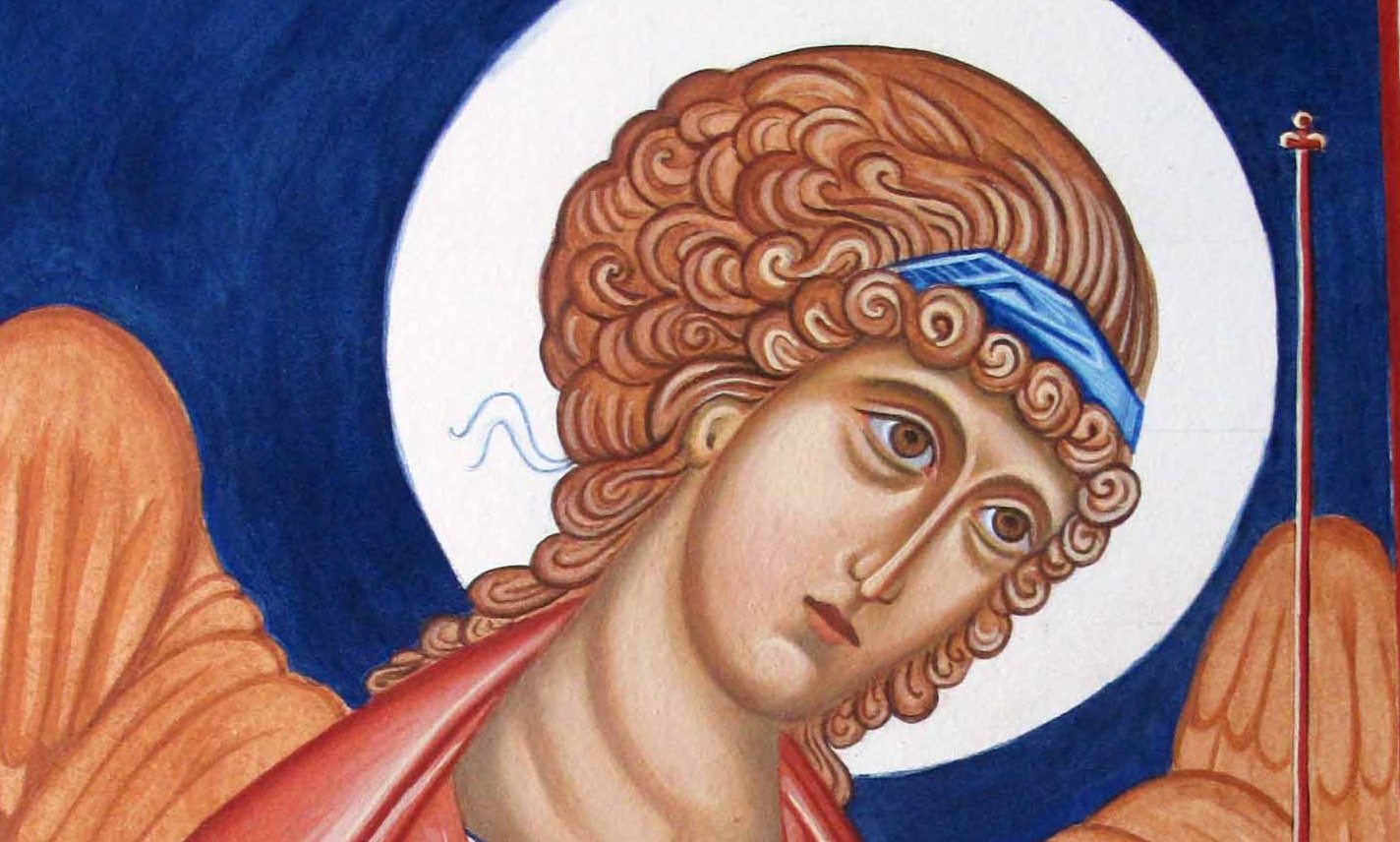
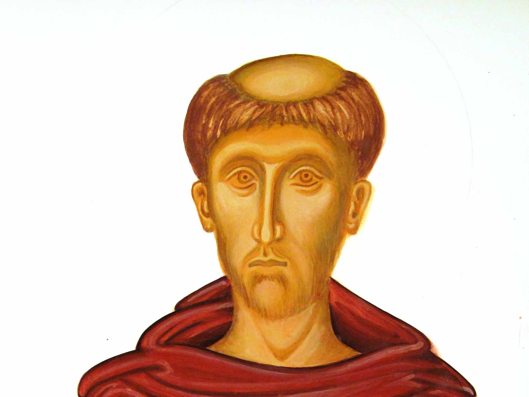
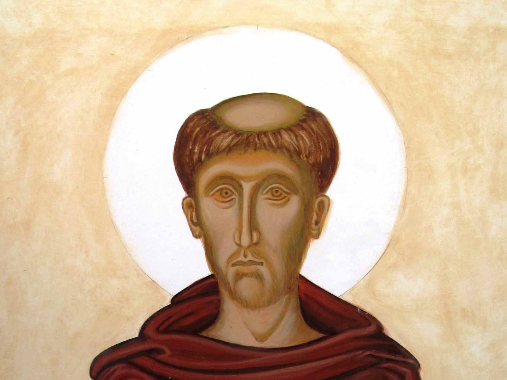
Here are the finished studies. They are not the best photographs but hopefully give you an idea of the end result.

monochrome archangel Michael

Complete study of  Archangel Michael

Archangel raphael

Complete study of Archangel Raphael in monochrome

That’s all for now.

Many thanks for reading. Ronnie

PS Aidan has recently been filmed whilst painting an icon and has been included as part of Simon Schama’s Face of Britain series.

PPS Prints and cards of Archangels Michael and Raphael are now available from Smith York Printers.

More on the Triptych: Azurite on Archangels Raphael and Michael

azupainting icon with azurite pigment

Azurite blue pigments on the icon of Raphael and Michael

This is a very short post as I am not long back from the icon course. Tomorrow I am meeting my American family, then we are all heading up to Scotland for a week. It will be a while before I can post again so here are a few pictures of work in progress taken during our latest icon session.

angels egg tempera

Figures of Archangel Raphael and Michael, building up washes and highlights.

TRIP 5a

Adding indigo to low lights increases depth in the fabric.

Trip 6

Adding a background and wings

wrapping up on day 3

Wrapping up on day 3

details on the cloth

details on the cloth

That’s it for now – good night all and thanks for reading.

Ronnie

Grinding pure blue pigment from Azurite

azurite pigment

Grinding Azurite

This time last year, I bought a small lump of azurite from the Lapidary shop in Burslem, Staffordshire. I made a start at grinding it up in a pestle and mortar but since I didn’t need it at the time, saved the last stage of fine grinding to a powder with a glass slab and muller till later – ie now.

I am working on a triptych (see previous post) where I would like the two standing angels to be painted in a heavenly sky blue so it’s been back to the grindstone to extract this gorgeous colour.

Azurite rock

Lump of pure Azurite, approx 2cm cube

Aidan Hart, demonstrated how to grind Azurite during class last year which I filmed. You can watch the process over here  https://www.youtube.com/watch?v=y-FHvAxwg9w.  It is an amatuer video so not very good quality, but it captures the process.

Breaking up azurite

First crunch of azurite

This was last years work, crunching up the rock with a small hammer. It’s surprisingly enjoyable as you see the blue emerge.

I bought a slab and muller from Patricia Lovett at her Gilding and Traditional Illumination Skills workshop some years ago. It really has come into its own now as I still have malachite, haematite and chrysocolla to grind up.

slab and muller with azurite

Use a glass slab and muller to grind up the pigment

I placed about a tablespoon of pre-ground up pigment on to the slab and added just enough water to make a paste then ground it up, clockwise and anti clockwise, scraping the pigment back into the middle until the paste glides smoothly under the muller.

Azurite paste and water

 Mixing with a little water makes the paste

Ray Kitten burmilla

Ray offering a helping paw

mopping up the azurite paste

Mopping up every last bit of paste with a palette knife and mop brush

blue azurite in the wash

A variety of blues emerging as you wash or levigate the pigment

particles in the bottom of the jug

Large particles give a deeper blue

pigment drying in the sun

Drying out the azurite pigment in the sun

pigment in dry form

Pigments at last! Samples show mine on the left and the darker pigment of a pre-bought pigment on the right.

This took the best part of a morning but I’ve made enough pigment to easily last me a year or longer. Next post will hopefully show some of this azurite in use on my triptych.

Thanks for reading,

Ronnie

Three days on a Triptych

icon class

Icon Diploma Students taken at Aidan Hart’s May session 2015

Hello icon friends and class mates,

I’m just back from a three day intensive painting our standing/seated figures. I brought my gilded triptych centre panel already prepared with the image transferred so I could start to paint in class.

icon outline drawing

Transferring outline on to gessoed panel

Just to rewind a little, I photocopied my drawing on to tracing paper to locate the outline prior to water gilding. After gilding, I rubbed red ochre pigment into the back of the tracing paper/drawing itself (rather than using an intermediary sheet), and using a fine propelling pencil with a fairly hard lead, transferred the image on to the board.

tracing paper drawing

Drawing of icon on tracing paper

Once all the main lines were transferred on to the board, a weak mix of pigment fixed the lines in place. I then began the underpainting and modelling of the garments.

underpainting icon

First stage of underpainting

Aidan suggested that I used Red Ochre for the Blessed Virgin’s upper garment as it has some blue in it. I also used Lapiz Lazuli Dark, a beautiful natural blue and Ivory Black to deepen both colours; all pigments are from Cornelissen’s.

ivory black and red ochre

Ivory black and Red Ochre pigments

Both pigments are very strong so I mixed them up separately first, then blended. For the underpainting I used a lovely size 2 Roubloff 1010 kolinsky sable brush which I had recently ordered from Vesta-k. It has a really sharp point and holds the pigment well.

underpainting garments

Building up the underpainting of the garments

I mixed black to the lapiz lazuli and red ochre in varying degrees to give depth to the underpainting. The deeper shadows are painted using a lot of black in the mix.

lapiz lazuli

First layer of membrane applied using a wash of pure Lapiz lazuli over the underpainting.

membranes on icon

Membranes on the garments

Pure red ochre and lapiz membranes washed over the underpainting with a very thin layer of lapiz washed over the red afterwards to unite the garments.

After several layers of membrane, I applied a nourishing layer of 20% egg 80% water and let it dry before going over the shadows and adding highlights. Aidan suggested fine layers of pure white dry-brushed over the membrane to give translucent layers of highlights.

The underpainting of the Christ Child is in English Yellow Ochre with a little Red Ochre added to model the form. The colours are painted quite densely as the garments will be gilded using shell gold assist. I understand from my class mate Lee that for the crispest, most gleaming gold lines, hand-made shell gold is the way to go – thanks Lee! Watch this space for adventures in making shell gold – I rang Wrights of Lymm for a couple of books of gold today!

three days work

Three days work

Thanks for reading.

Ronnie

Gilding the Triptych

gilding a triptcyh

Gilding a triptych

I’d like to share a few thoughts following my attempts to water gild the triptych. It’s Spring here in UK and I love the lighter days and milder weather. I opted to work in the conservatory for the even light and to be immersed in the burst of new green in the garden.  I often have cold hands so the warmth in here is wonderful for loosening up my fingers ready for gilding. It’s better to gild in cool, damp weather but I thought I might just get away with it being mild – nope, I didnt! So here is my first tip: if gilding a large area in warmer weather, do it in two or three stages as the bole dries out so quickly. You need time to burnish the gold whilst the bole is still relatively soft soon after double gilding. With hindsight, I should have gilded and burnished all the raised areas as one complete area first, then gilded and burnished all the flat areas afterwards.

raised border gilding

Gilding the Kivotos

Masking out the gesso was helpful as carefully scraping the gold off the gesso after gilding can take an hour or so. For the fiddly areas, I used a sharp scalpel to score along the edges in the same way as I did with the bole (See previous post). The other thing which helped was thirteen layers of bole. These were just enough to cover the tiny air holes in the gesso and the patches of scrim which had shown through. If you are about to gild, then I can recommend Aidan Hart’s class demonstration video clip here on You Tube.

gilding a door to the icon triptych

Double gilding over the first layer of loose gold on one of the doors

Masking fluid saves time scraping gold from gesso

Masking fluid saves time scraping gold from gesso

gilding kit

Some ingredients for gilding – cat drinking the water for brush-cleaning is optional!

A phone (switched off) makes a handy 10mm/half inch prop to lift the icon board so the water flows away from previously gilded areas. Hand cream is useful to rub on the back of your hand before brushing the squirrel tip across – this helps the gold leaf stick to the tip. Vodka is added to the gilding mix together with Buxton water (PH neutral). I used gold leaf, 23 and 3/4 carat loose, extra thick from Wrights of Lymm, Cheshire. The small jar contains size prepared from rabbit skin glue granules. Other gilding kit consists of a squirrel mop ( the large brush to the top right), a gilder’s cushion and gilder’s knife to cut the gold leaf. Having a cat in the midst is not ideal as hairs blow into the mix. However, at the moment our cat is still out-of-sorts having recently lost her companion and won’t settle unless she has company nearby. If you are about to water gild an icon – here is our class crib sheet of Gilders’ Tips which may help.

Gilding complete

Gilding complete

This actually looks a lot better than it does in real life but I am glad the gilding is done. Some parts are smooth, some pretty rough in spite of a solid week’s work. Here’s a close-up on the burnishing marks as a result of letting it dry out too much:

Burnishing marks

Burnishing marks

Once again, thanks for reading and all the best with your own endeavours. Ronnie

Triptych begins

Bole and water gilding a triptych

Gilding a Triptych

Hello Icon Friends,

I’ve begun work on a triptych for my sister Anne, in Australia. She made a lighthearted requests some 7 or 8 years ago, saying how much she would love to have one of those icons that ‘open out’. I never forgot her wish and it was wonderful when Aidan confirmed that standing and seated figures were part of the curriculum so my triptych could be included in the course work.

triptych treated with cuprinol

Treating the oak with Cuprinol

Dylan Hartley, in Ironbridge hand-made the quarter-sawn oak panels and gessoed them ready for me to sand. With the great benefit of hindsight, I should have asked him to treat them with Cuprinol in the workshop so they could be covered evenly on all sides – but it was only when I thought about posting the boards to Australia that I realised they would need to be treated due to their strict import regulations. A few days after I had applied the treatment and varnished the oak, the boards warped but the gesso was unharmed – no cracks.

sketch drawings for triptych

Planning the triptych layout: Upper panels include the Holy Face in the Mandilion, with Bethlehem and the New Jerusalem either side.

Anne had told me what she had in mind for this triptych: Arhcangel Raphael (the Shining One who Heals) and Archangel Michael, the Warrior, either side of the Blessed Virgin and Child. Aidan introduced me to the magnificent angels of Chora to adapt to fit the side panels – the original wall paintings fit in tapered panels set within a domed ceiling.

angel of chora

Detail of one of the Angels of Chora

Next stage was to prepare the gessoed panels by sanding in sequence through the grades of sandpaper from 80 grit to 1200 grit to prepare for water gilding. it took the best part of three full days to sand and bole the boards ready for gilding.

sanding the gesso

Sanding off the scratches and bumps in the gesso

sanding gesso

Sanding back too far

With all the irregular surfaces and curves covered in gesso, it was difficult to sand back enough to articulate the shapes without also revealing some of the linen scrim. As soon as I saw the scrim, I avoided the area and only smoothed it with the finer grades of sandpaper. It eventually covered (almost) under 13 layers of bole.

bole on triptych

Bole applied to triptych

It is very fiddly to apply layers of bole around narrow spaces so this time I masked the whole area out with masking fluid with a little added pigment.

masking gesso

Masking out the gesso before applying the bole

Before removing the masking fluid, I scored the edges to avoid lifting the bole.

Removing masking fluid

Removing masking fluid by scoring a clean edge with a sharp blade.

More on gilding in the next post – with a few tips on what not to do!

Thanks for reading,

Ronnie

Archangel Gabriel – egg tempera on watercolour paper

angel gabriel

Archangel Gabriel on water colour paper

Hello icon friends, While I was recovering from the fractures, I was keen to get my arm painting or drawing again in some way. Since I was pretty limited in my mobility, I decided to make use of some pre-stretched water colour paper which was mounted on a board light enough to handle. I really liked the monochrome studies which we painted in egg tempera on paper and thought I would tackle some different garments as a way of practice before returning to make amends to the hashed up garments of St Francis.

egg tempera on paper

Drawing on to stretched water colour paper

This proved to be a delightful exercise and although it doesn’t have the translucency of painting on to a gessoed board, the results are surprisingly soft and gentle. It is also a great way of practicing if you don’t have an icon board to hand.

Underpainting garments, hair and face

Underpainting garments, hair and face

The paper is 300gsm Fabriano cold pressed water colour paper, which accepts the pigment really easily once it has been stretched. I dampened the paper again where I was painting large areas which helped to blend the pigments.

adding pigment to hair and wings


Underpainting the wings and adding membrane to hair

For the garments, I chose English Red Deep with a little Raw Umber and for the wings, I chose French Ochre Havanna with a dash of English Red Deep. The blue in the garments and hair band is Ultramarine Blue light with a dash of Raw Umber and the background is the same blue but with a little Ivory black added.

4a  angel

Adding membrane to the face and to garments

5a angelapply facial highlights

applying garment highlights

applying garment highlights

Highlights added to garments and face

Highlights added to garments and face

Applying gold leaf to the halo and wings

Applying gold leaf to the halo and wings

The original framed icon is available to buy in my Etsy shop here.

Working with St Francis

st Francis

Work in progress on St Francis of Assisi

Hello icon friends,

A very happy Easter to you all and a warm welcome to the recent people following my blog. You have nudged me back to the desk to post some work after being away for far too long. Thank you!

I have a backlog of four icon boards to finish but thought I would start with a summary of work to one of my half figure icons – St Francis, chosen as I am so often calling on his help with one or the other of our pets. I can only trust St Francis knows best as he doesn’t always answer prayers with what I want to hear.

pencil sketch over drawing

Starting with a pencil sketch

I am referring to Aidan Hart’s image of St Francis (the one with him holding a robin) for this icon and began with a pencil sketch which I photocopied and went over with a black line ready to transfer on to a birch ply board prepared by Dylan Hartley.

lines transferred

Transferring lines using red ochre rubbed into a sheet of paper

light wash in red ochre on icon

Light wash of red ochre to define the forms

I have learnt to go very lightly with these first lines on the face, especially the lines on upper moustache and below the eyes. Use pigment with no egg so that the lines aren’t fixed and hard.

face underpainting of st francis

Underpainting the face and garments

I used Cornelissen’s Terre Verte with a dash of Stuart Stevenson’s yellow Ochre light to underpaint the face, making sure that it was dark enough to withstand 3-4 layers of membrane.The membrane was the same yellow ochre with a small dash of English Red Light.

membrane layer on face

First membrane layer applied to the face

membrane layers

Building up the membrane layers

I applied four membranes to the face as I was looking for a warm, even Mediterranean skin tone. The underpainting was just still visible. Some of the dry pigments brushed off as the egg tempera mix had got a little weak but I remembered the benefit of applying a nourishing layer of egg stock (approx 80% water 20% egg)  which helped stabilise the pigments.

face highlights

Adding highlights to the face

background layers

Building up the background layers

I am not going into the garments here as I made a bit of a hash of them! I used varying mixes of English Red Light and Ivory Black but I was too heavy-handed with the darks. I lost the translucency and almost sanded the whole lot off to start again, but Aidan thought they could be improved so I persevered. I am glad I did.  I recalled from one of the weeks spent at Walcott Hall that Avana is a pigment that can rescue many a difficult colour situation. I applied several thin washes and it seemed to soften the starkness of the red robes and evened the shading a little so I could almost start afresh with the highlights.

adding red ochre

Adding English Red highlights to cheeks, mouth, eyelids and nose

Adding light washes of English Red Light really adds warmth to the face. I still have the eyes to finish but the next stage is the background, halo and lettering and making good some of the highlights follwing my last class review.

Thanks for joining me here and if you are still reading, I am sorry I haven’t posted for so long as I had a bit of a set back when I fell and fractured my pelvis (in 3 places) and my drawing arm in two places – I only fell over our own back door step! I am well and truly on the mend now though and gradually catching up.

This post is dedicated to Leo; as I said not so long ago, we are only ever their keepers.

Thanks for reading.

Ronnie

Ollie and Leo

Ollie and Leo

Gilders’ Punch Tools

Cropped image of Annunciation from French manuscript

‘The Annunciation’ detail of an illumination I painted in 2004 – based on a French or Flanders manuscript, 12th C (original size approx 150 x 100mm)

Over ten years ago, I attended a series of workshops run by Patricia Lovett on gilding and traditional egg tempera painting skills. Patricia is enthusiastic, highly skilled and a natural teacher and part of our learning was to paint our own illuminations based on good quality examples of manuscripts. It was a wonderful introduction to the world of gilding on vellum and Patricia still runs these workshops from time to time, from her home in Kent.

I am particularly drawn to manuscripts of the Romansque period such as the one above, the original which is kept in the British Library and can be seen in The Illuminated Page by Janet Backhouse. For anyone interested in manuscripts, it is a wonderful  book. I bought my copy in the Blake Head Bookshop, Micklegate, York in 1997. The shop has long gone which is a great loss, but the book is a favourite and still available.

Having leafed through this book many times, I would often wonder how certain things were done, such as how a gilded background was tooled. Having spent long hours last summer learning to gild icons (see my earlier posts) it is really quite a challenge to get the smooth mirror gold shine of water gilding. For the example above, I used the tip of a gilders pointed pencil burnishing tool. Looking back on it now, it is fairly crude, but I was pleased with how the tiny indents sparkled when catching the light.

To see a startlingly impressive example of tooled gilding, from a later period (c.1395–1399) I would highly recommend a visit to the National Gallery in London, to see the Wilton Diptych.

Image of the WIlton Diptych

Image of the WIlton Diptych courtesy of http://en.wikipedia.org/wiki/Wilton_Diptych

detail of Wilton Diptych tooling

Detail of background tooling on the above image of the WIlton Diptych

detail of tooled gilded background

Tooled background of the second panel of the WIlton Diptych

Crown detail Edward Confessor

Detail of crown of King Edward the Confessor from the Wilton Diptych

It has puzzled me as to the tools that might have been used to do this exquisite work and have googled high and low for anything that might be suitable. I discovered a blog by the classical realist painter Jerry Berg who described some of the tools which he had bought from a shop in Florence.

gilders punch tools

Gilders’ punch tools courtesy of Jerry Berg’s blog

Jerry gave an example of how the tool worked and I think that this might be worth investigating. So, this morning I was delighted to receive Cosimo Tasinari’s four page catalogue in the post which I have scanned for you here: Cosimo Tassinari Firenze Italy

gilders punch tools

Gilders punch tools courtesy of Jerry Berg’s blog

Contact details: Piero P. Fantechi, Ditta Cosimo Tassinari, Piazza S. Maria Novella 2r, Florence, 50123 Italy.      Ph: 0039 055-287-869    Fax: 0039 055-287-869      tassinari@infinito.it

Gilding, Tooling, and Stamping Supplies; Type – Hand Engraved Brass; Bookbinding Tools; Dies; Stamps and Rollers, Typeholders; Steel punchers for icons-gesso. Will cut tools to your design; hand-engraved seals made. English spoken.

I usually don’t like shopping but I would love a visit to this shop!

Hope this is useful and thanks for reading.

Ronnie

Sanding for St Hilda of Whitby

Icon board

Highlight surface scratches on a gessoed icon board by rubbing in red ochre pigment

St Hilda of Whitby

St Hilda (c614-680) showing adjustments I need to make to head and shoulders

My homework for the next diploma session, is an icon of St Hilda, referring to an image painted by Aidan Hart. The icon can be seen further below and also on his website Aidan Hart Icons. During my childhood, Whitby was a favourite seaside destination from our home in York. The sight of the ruined abbey looming over the cliffs was a vivid landmark against what was often a cloudswept sky. This dramatic photograph courtesy of Mark Davis Photography shows how the abbey forms such a striking silhouette against the east coast sky.

Whitby abbey

Photo of Whitby Abbey by  Mark Davis Photography  http://www.mark-davis-photography.com/yorkshire/whitby-and-the-east-coast/

To think that St Hilda founded an an abbey and community in this wild landscape is remarkable and gives an insight into the strength of her character.

Icon by Aidan Hart of St Hilda of Whitby

St Hilda of Whitby by Aidan Hart

For this icon, I am using a flat plywood board.  I will oil gild the halo so the sanding only needs to be taken as far as 600 grit sandpaper. If you over-sand the gesso, the paint won’t stick.  I’m using an icon board which I gessoed last summer which I also sanded up to 120 grit paper. With hindsisght, I should have sanded it right up to 600 grit, as it is much easier to work outside in the warm than indoors in a UK January! Sanding gessoed boards is a dusty process so be prepared. Put a few sheets of newspaper over your worksurface and have your vacuum cleaner and a dust mask to hand. You will also need a medium sized dry paintbrush to brush the gesso dust out of the sandpaper, a cork sanding block and all the different grades of sandpaper to hand. Looking back on Dylan Hartley‘s notes which he gave us at our gessoing session last year (click here for a pdf copy SANDING ICON BOARDS by Dylan Hartley), Dylan reminds us that you should choose a place to sand where there is raking light ideally with one main light source. This helps to show up anomalies and scratches. The first sanding is done with 80 grit paper, then work up through 120, 180, 220, 320, 400 and 600 grades. It is important to use these in sequence and ensure that any grooves left by the gesso brushing are smoothed away.

Sandpaper

Splitting sandpaper sheets and filing them by grade

In the UK, sandpaper is sold in sheets about A4 size. I hadn’t realised until Aidan showed us, that if you fold and tear the paper in half lengthwise, then tear these strips into three, you can get six pieces ready to wrap around your block. Given that you go through sandpaper very quickly, it is worth spending time folding, tearing and filing the different sized papers into envelopes which does helps the flow of work.

brusgh off clogged sandpaper

Keep brushing off clogged sandpaper

It is really important to brush the sandpaper often – as soon as you have sanded the board a few times, lift the block and brush. You can also vacuum up the clogged paper to save dust clouds forming. The whole process is a bit of a faff as my glasses steam up when I wear a dust mask and they get covered with dust! Rubbing in a pinch of red ochre with cotton wool is a really effective way of seeing where the scratches are hiding. Even with good raking light, it is easy to miss a scratch until you start painting – and they are difficult to disguise later.

red ochre pigment on gesso

Identifying scratches in gesso by using red ochre pigment

Looking closely at the photo above, you can also see the horizontal marks made from clogged up sandpaper.

finished icon board

Icon board finished to 600 grit paper ready for painting and oil gilding

That’s the board now ready for me to trace on the drawing. More on that next time. Thanks for reading!   Ronnie

PS To see a demonstration by Dylan Hartley gessoing icon boards – there is a clip on You Tube here